New careers website strengthens calibre of applicants.
Client: NZ Super Fund

Double whammy: a strategically planned site positions the Guardians of NZ Superannuation as an employer of choice, and attracts a better and more diverse calibre of applicants.
The Brief
We had previously developed an employee value proposition (EVP) for the Guardians of NZ Superannuation to engage staff in the culture, purpose and values of the organisation. The next step was to replace the static careers page on the website with a compelling careers website to tell this EVP story and attract the right people.
The Solution
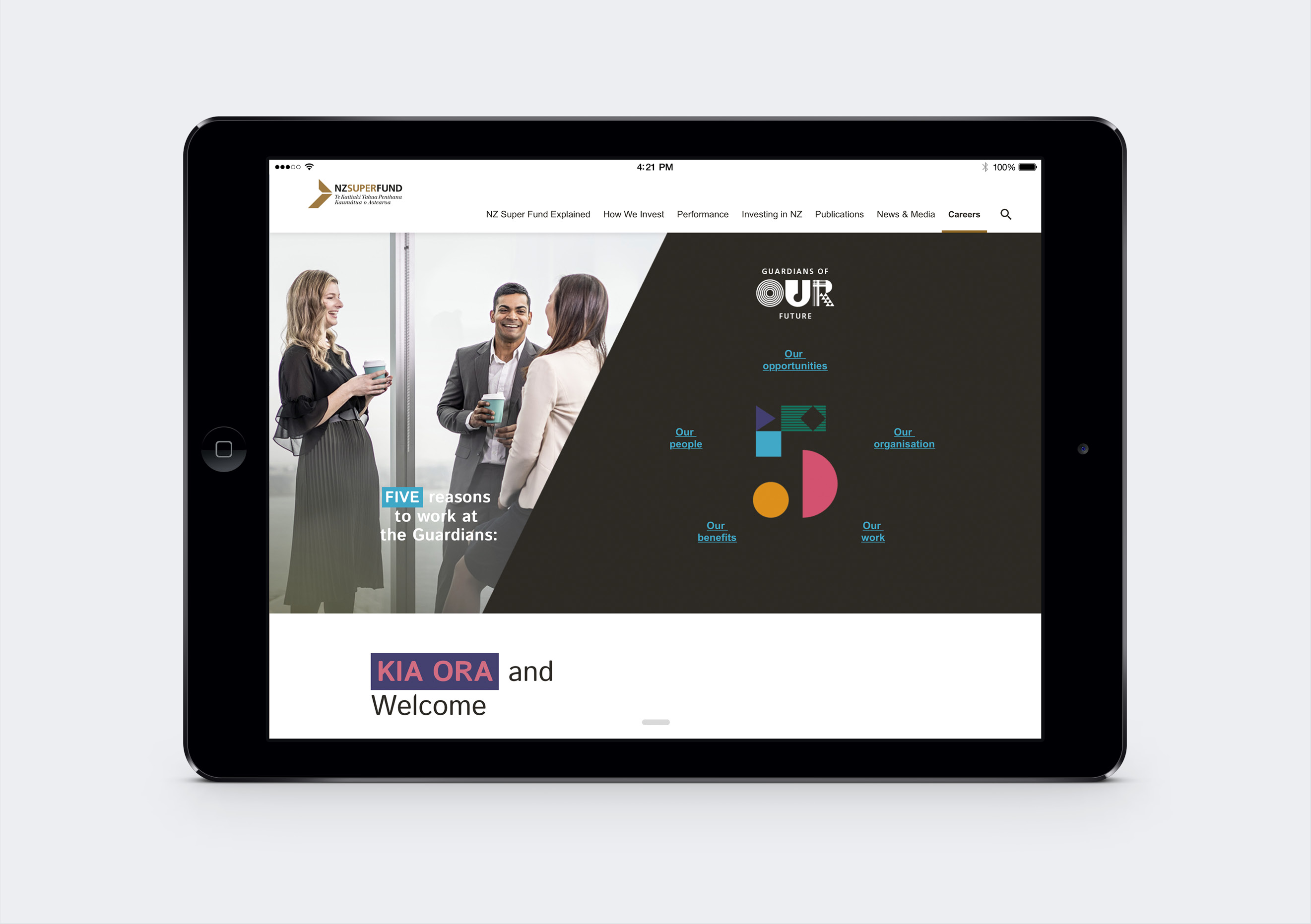
The careers site is a ‘site within a site.’ While it lives within, and uses the navigation of, the NZ Super Fund website, it also has its own look and feel – one that aligns strongly with the newly developed EVP.
Developing clear user journeys was critical to ensure users didn’t get confused as they moved from the main website to the careers site. Mapping out three primary user journeys and two secondary journeys helped us develop a clear strategy for the careers site. The key recommendations included:
- Make the EVP the hero – use this to drive the structure, design and content.
- Use staff to tell the story, connecting with the audience and providing a clear differentiation from the main site.
- Use a long-page scroll approach for page design, keeping the majority of the site one click away from the careers homepage.
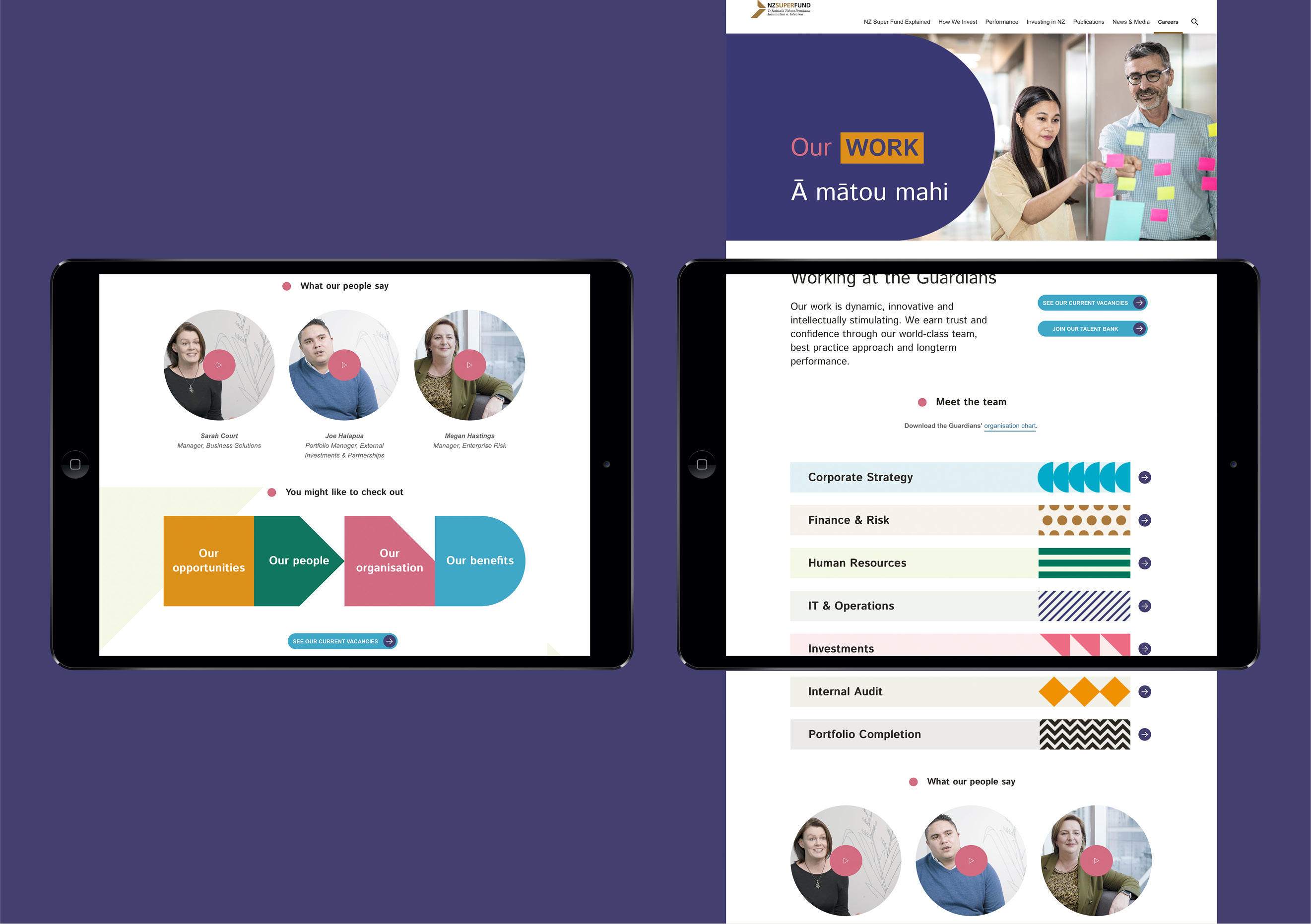
- Keep the words short, supporting them with video, imagery, illustration, diagrams and infographics.
- Add movement where possible to drive users to key content and to represent the energy of the organisation.
- Drive all user journeys towards applying for a role or adding their CV to the talent pool.
Wireframes were created and built into a prototype to test the journeys and key user interactions before moving into design. And a detailed content strategy helped the Guardians team develop video stories to illustrate the EVP and support the user journeys.
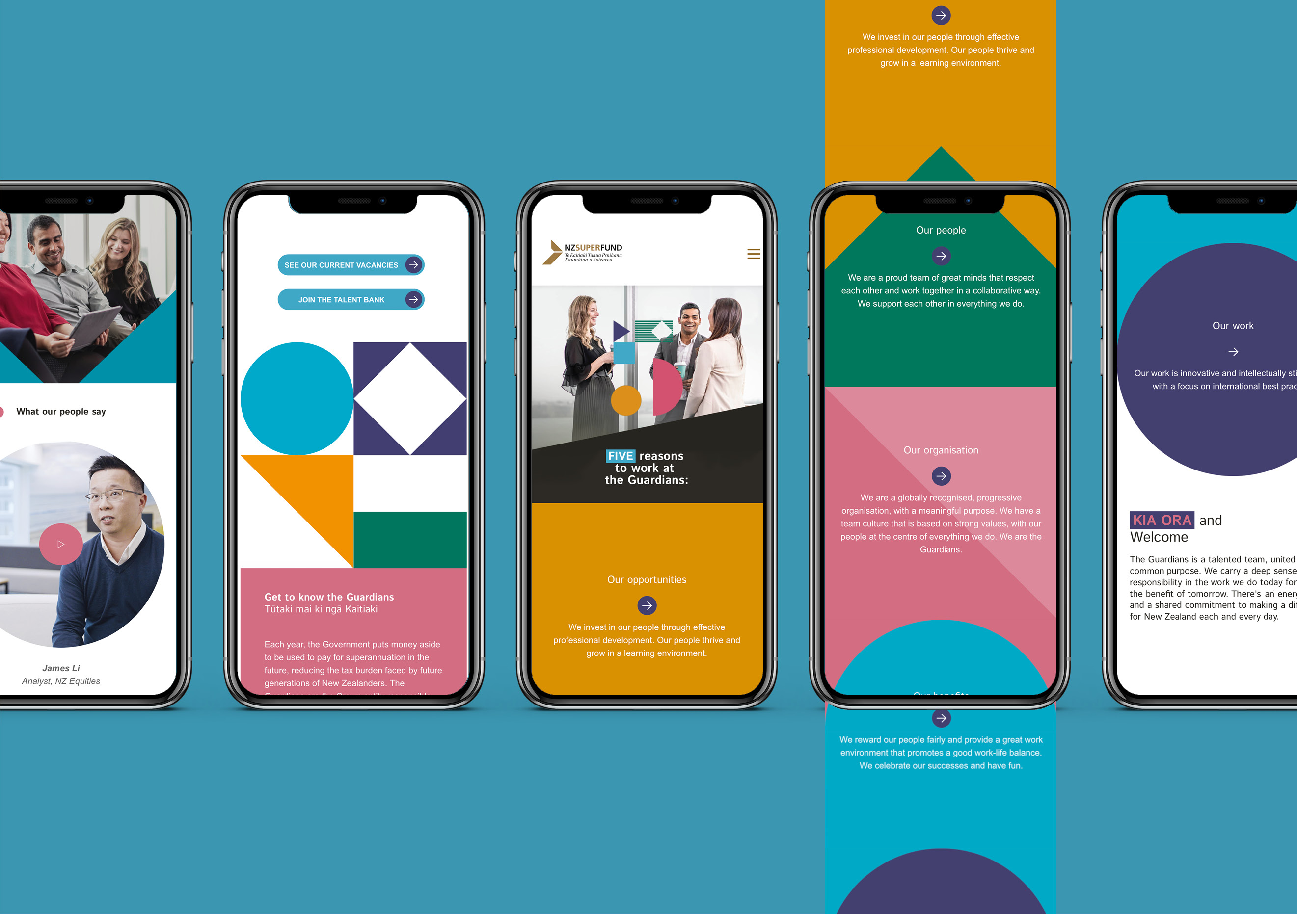
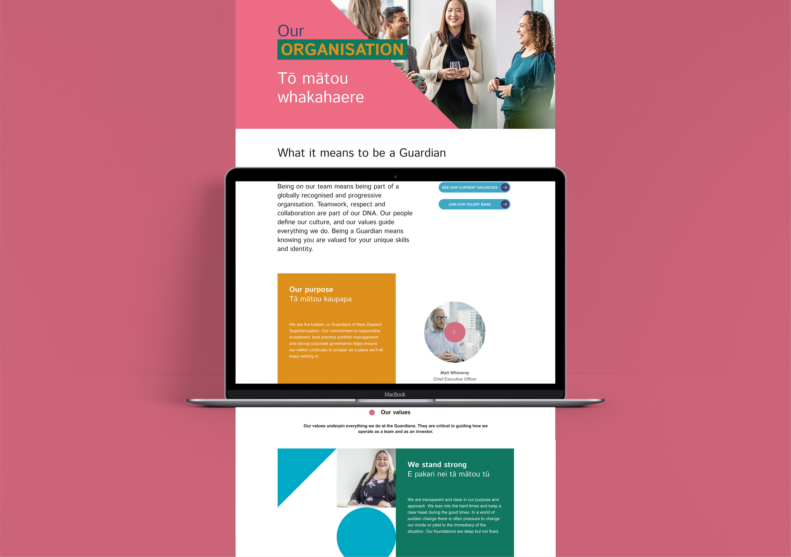
The five shapes and colours that form the EVP are a prominent feature of the design. They give it a modern, creative feel that reinforces the Guardians as a dynamic, fun and inviting place. Coloured shapes move on the screen drawing the user to the desired information and journeys. In other places, they become containers for showcasing EVP people stories or reinforcing key EVP messages.
The Results
The Guardians are proud of their career site. It provides compelling reasons for potential employees to join the team. It positions them as an employer of choice, helping attract a talented and diverse calibre of applicants.
