The Battle of Te Ruapekapeka
Client: Te Ruapekapeka
The story of the battle of Te Ruapekapeka Pā is an important moment in Aotearoa New Zealand’s history.
The Brief
Ten years ago we worked with Department of Conservation and Te Ruapekapeka Trust to design a website to capture this historical story. With the 175th anniversary of the battle approaching in January 2021, the Trust asked us to rebuild and evolve the site to deliver a richer and more diverse story-telling experience.
The Solution
Te Ruapekapeka is a rich story, with multiple perspectives all weaving together to tell a tale of people, places and events. Beyond the two sides of the battle – British and Māori – there are unique hapū versions of events, with many individual stories to tell. Our goal was to create a vehicle that allowed a balanced story to be presented, letting the user to experience it in a way relevant to them.
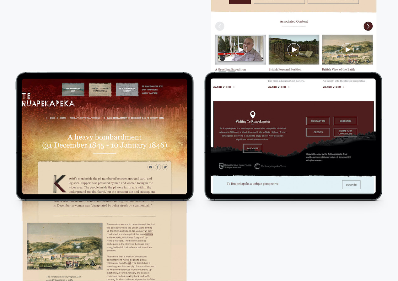
The first challenge was to create an open-ended site architecture that ensured threads of narrative were not lost but become starting points for new avenues of discovery. Simple user-journeys provide content choices at every click allowing site visitors to follow their interest. This meant creating a complex, but simple-to-apply, framework that sees all content associated to key themes and topics.
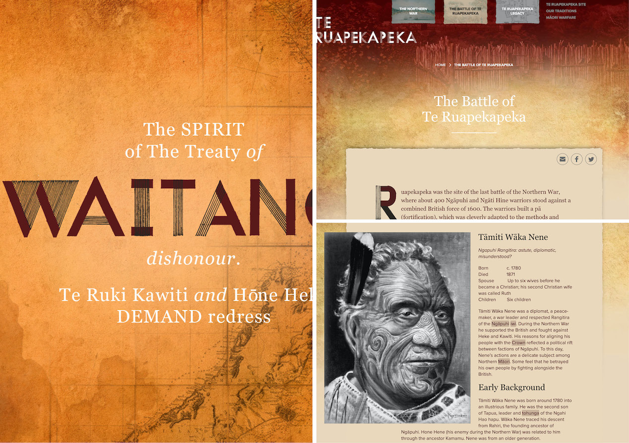
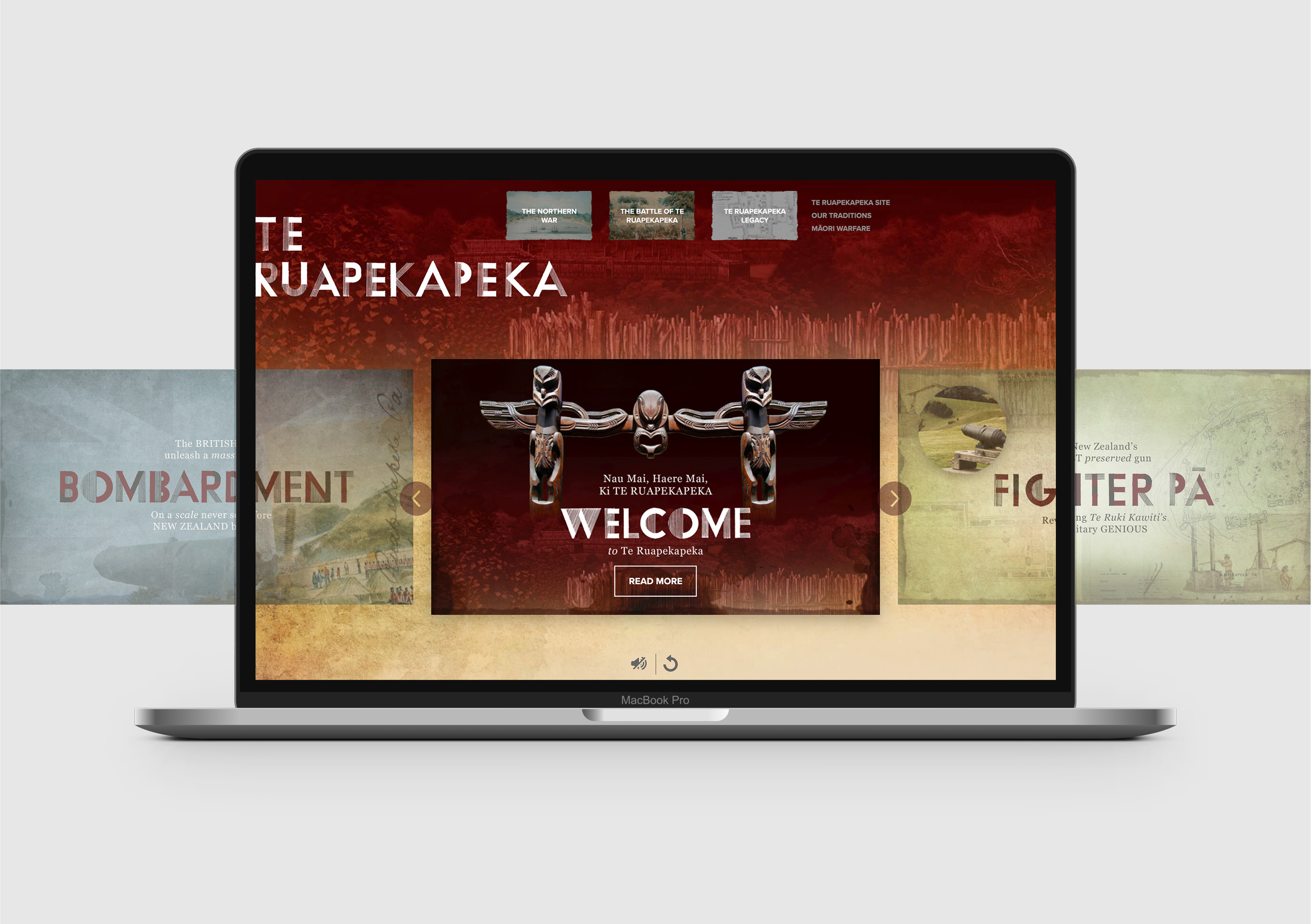
Ten years ago we developed the logo and visual elements for the site. The goal this time was to advance the design, rather than reinvent, to create a more visually accessible and connected experience. The updated solid version of the handcrafted typeface gives it more screen presence and offers stronger representation of the pā’s fortifications. To achieve a richer and more diverse visual story we extended the original red and black colour palette with a range of colours inspired by the battle and the pā’s environment.
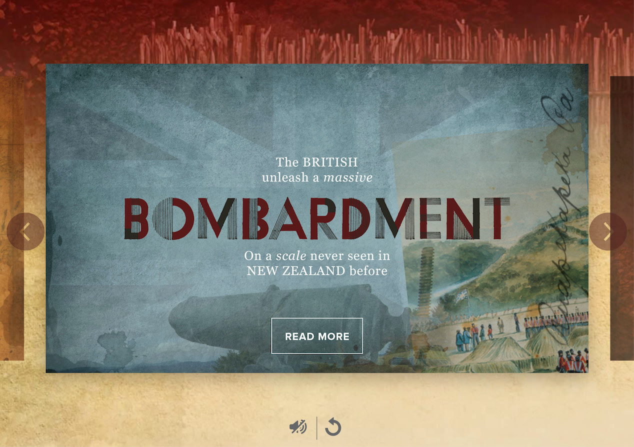
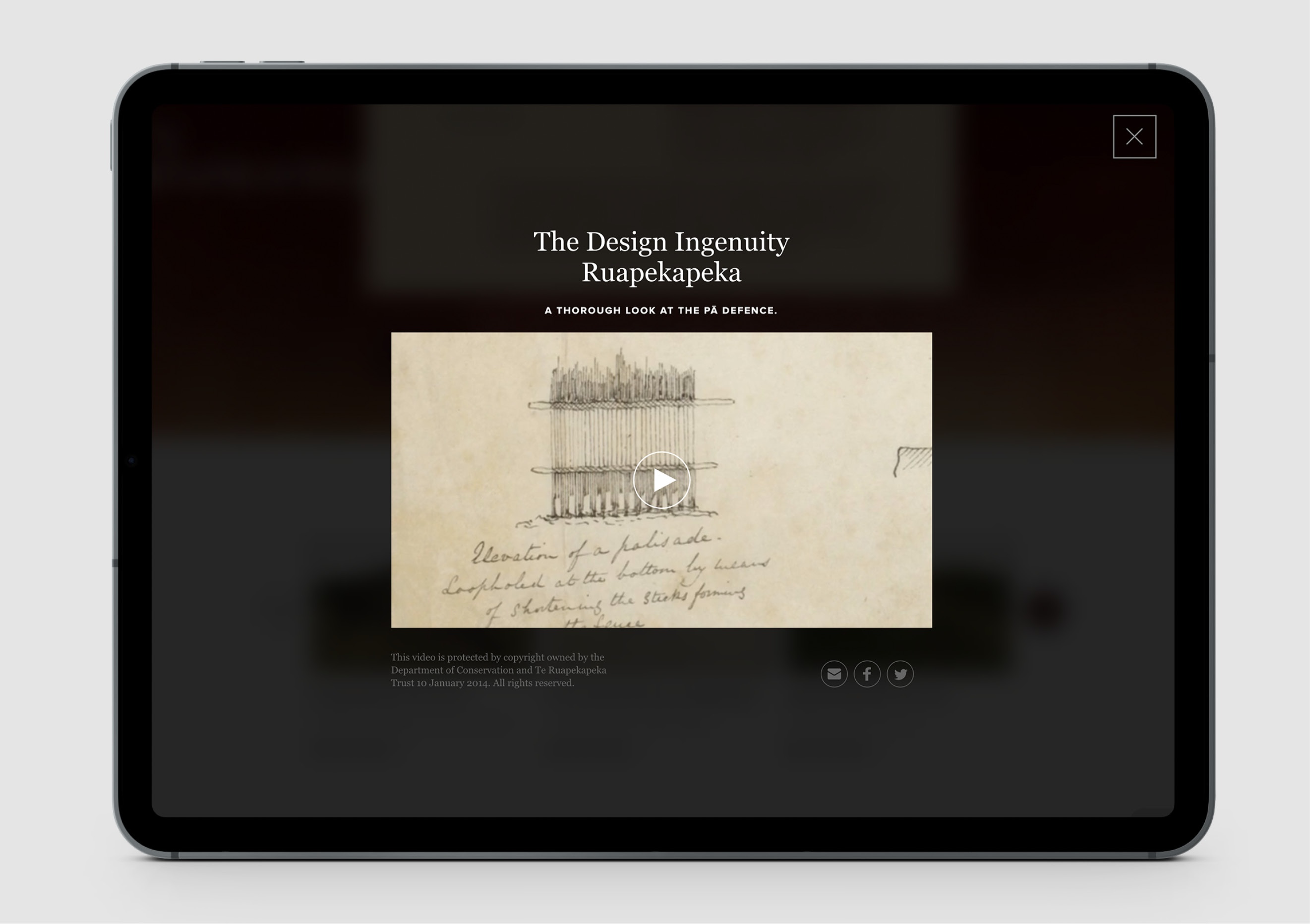
Textural qualities are used across the site to enhance the historic significance and authenticity. Layering of graphics reinforces that there are many perspectives and that sense of finding stories in stories. Vintage textures from old documents and drawings, along with scripted handwriting, enhance a feeling of depth.
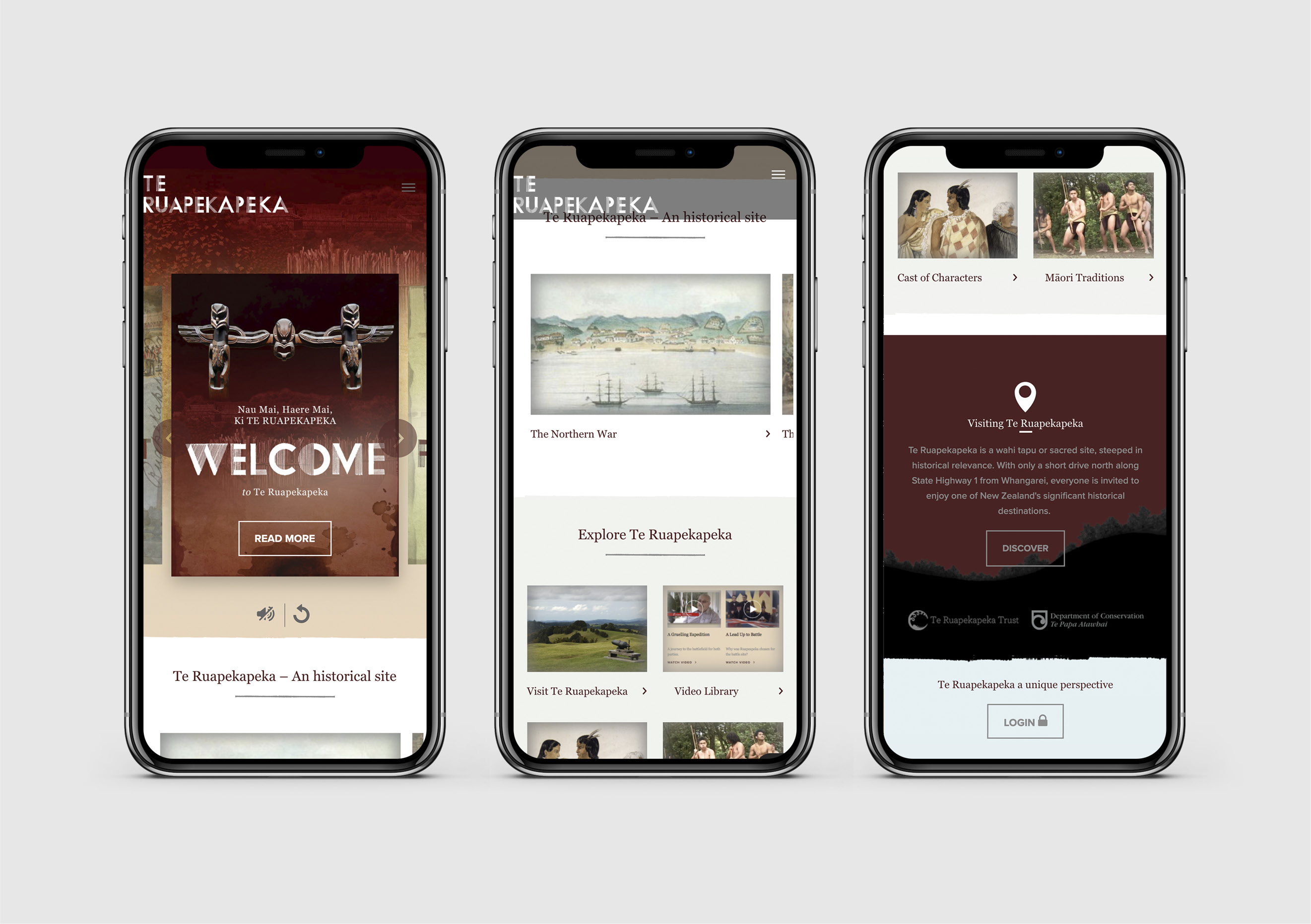
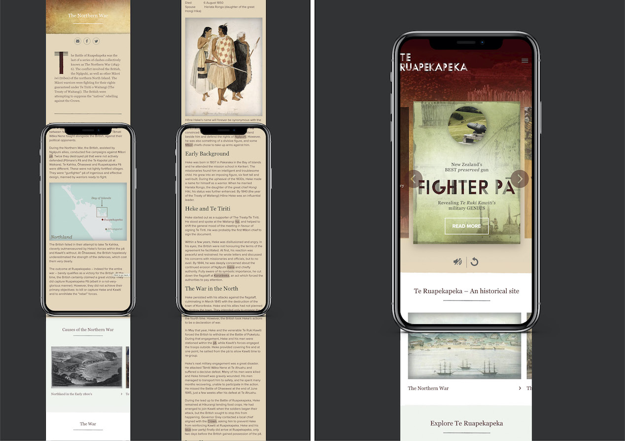
To help the Trust tell their stories in a more engaging way, careful consideration was put into the gracefulness of movement, hierarchy and feel of the site. Subtle animations, parallax, sound and small micro-interactions bring the user experience alive. This is supported by a number of functional enhancements including the visual promotion of related content, numerous ways to navigate the site, more forms of rich media and a more considered responsive experience.
One of the most significant developments was the creation of a secure curated content area where specific hapū stories could be preserved for future generations. Authorised users can add new content, deciding what can be shared publicly and what remains their own treasured history.
On invitation from the Trust, the project kicked off with a site visit, highlighted by the rich stories of the place proudly told to us by local leaders. With COVID lockdowns this project had a long gestation period allowing us to further deepen our level of understanding of the topic and our relationship with the Trust.
The Results
The client put their trust in us to deliver, fuelling our passion to do the best job possible for them. We’re very proud of the finished product and what it delivers for the Trust.
