Balanced engagement
Client: Argosy Property
GOLD: 2017 INOVA WEBSITE EXCELLENCE AWARDS

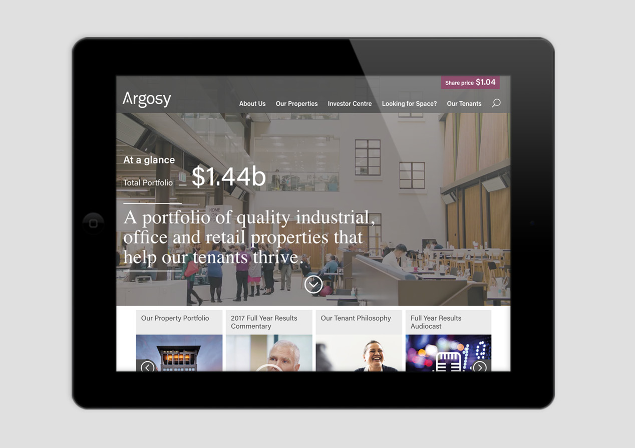
Argosy’s story is about balance, offering a range of property types, sizes and locations across retail, office and industrial.
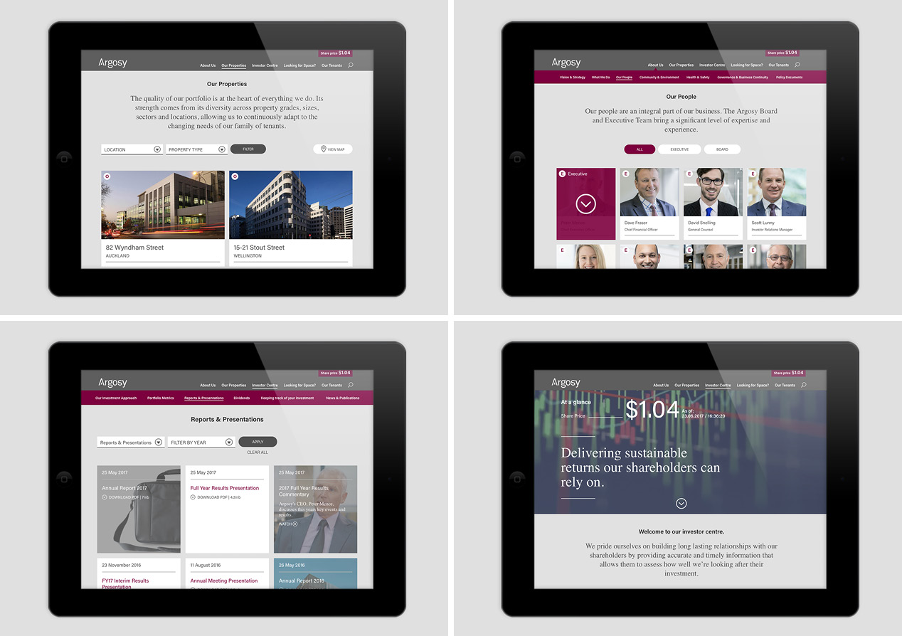
Our challenge in developing their new website was to capture the quality and variety of their portfolio and to illustrate the difference this balance makes to tenants and investors. With three key audiences – investors, existing tenants and potential tenants – we created a unique journey for each, all feeding off a database of core property information.
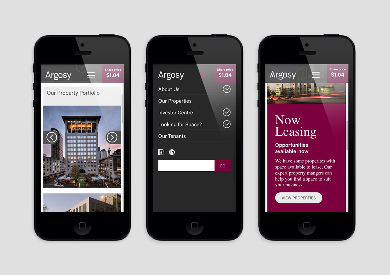
The overall feel is a quiet calm while still being modern and dynamic. Images, video, animated movement and micro-interactions help deliver a subtle experience for all users. The refined and uncluttered pages, along with intuitive navigation, add to that sense that everything is in balance.
All audiences are actively engaged with the site and its content. The investor section is structured and organised, reflecting the expert discipline that underpins Argosy’s careful management of their portfolio and investors’ money. The ‘Looking for Space’ section, on the other hand, has a sales orientation, engaging audiences on what matters most to them.
Overall, it’s a site that feels considered and easy to work with. Just like Argosy.


