Same, but different
Client: NZ Super Fund
A dynamic careers website with a clear call to action that follows the user throughout their journey.
The Brief
Our client at The Guardians of New Zealand Superannuation, the manager of the NZ Super Fund, approached us to enhance the careers section of their website. Specifically, they had three objectives in mind:
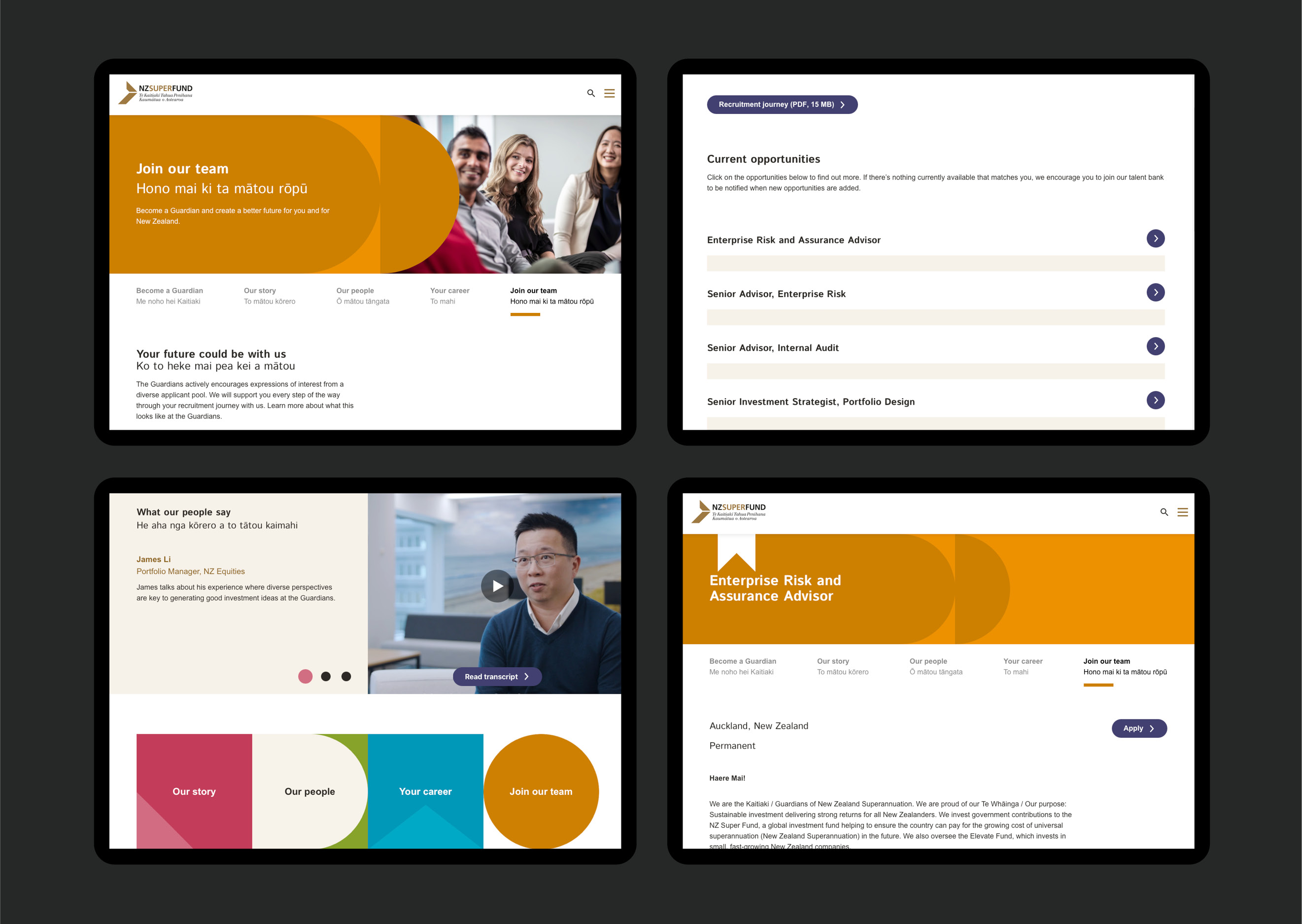
- Make the user journey singularly geared towards getting visitors to sign-up to the talent bank;
- Improve the mobile experience, given many applicants are younger and likely to be engaging via their phone, and analytics showed a significant amount of traffic was coming from mobiles; and
- Design a way for the careers section to seamlessly integrate with the wider NZ Super Fund website while also adopting the dynamic and creative aesthetic of the employee (EVP) identity we developed for them a few years earlier.
The Solution
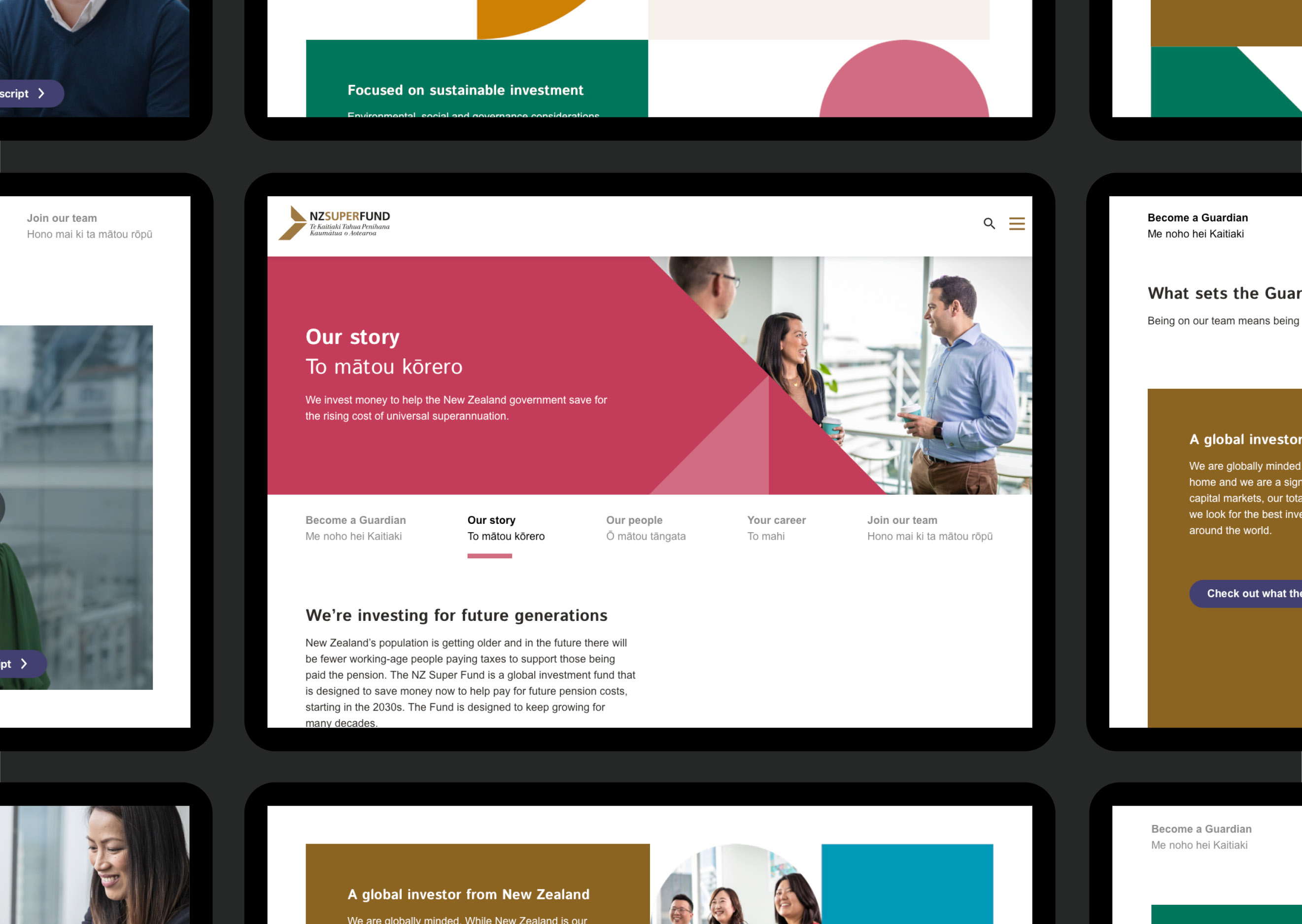
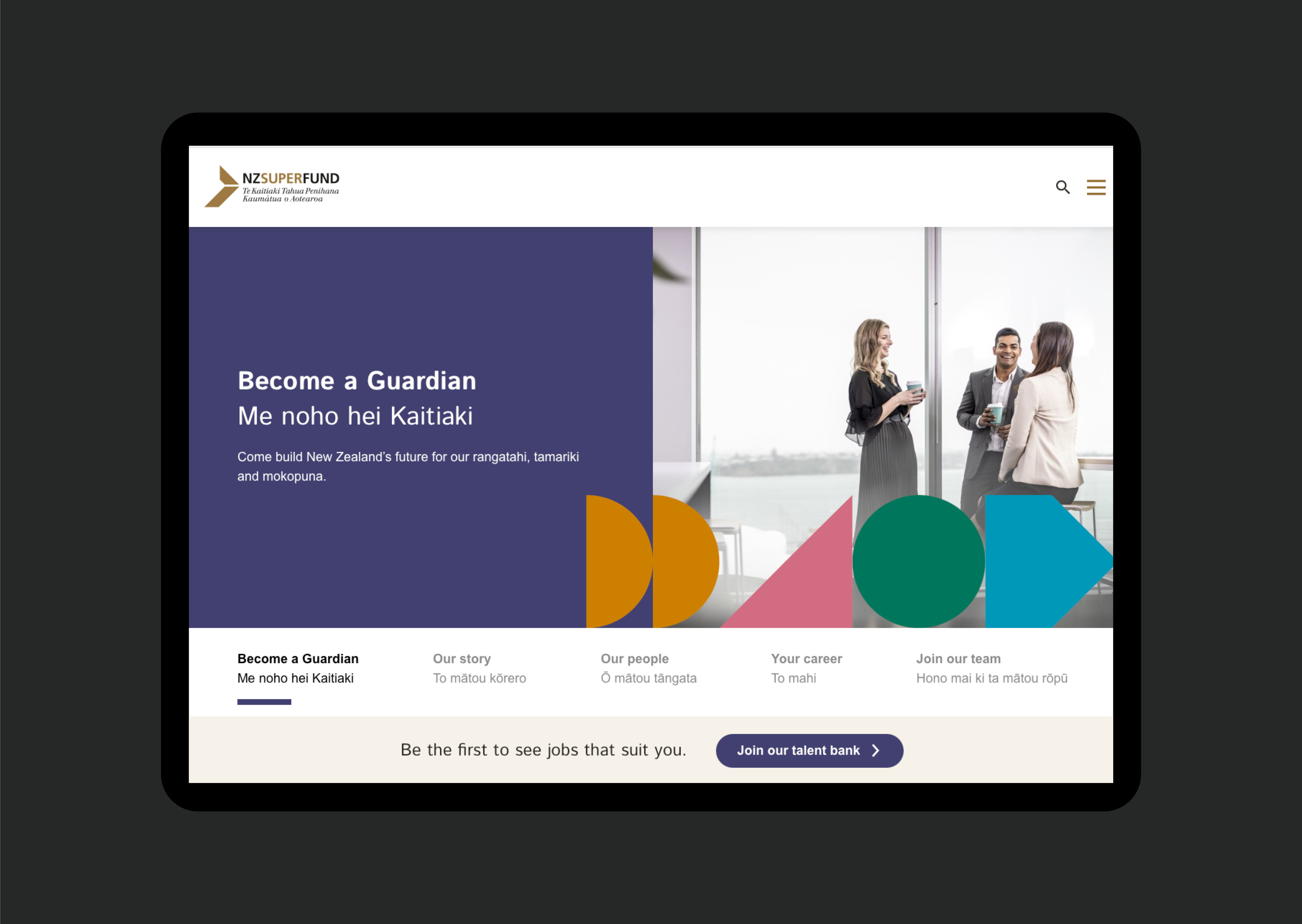
We started with design rather than structure. When working with an existing site you have to start with the templates and blocks available. Looking at these we considered how we could evolve and adapt them to work better with the EVP brand. The design challenge was to maintain the style of the overall corporate website and identity while also conveying the energy and excitement of the EVP identity.
We worked through a number of stepped design approaches, using examples of how it could be applied on each page, to engage our client in the design process. With the design principles agreed, we moved to wireframes and a clickable prototype that walked our client through the proposed page structures, navigation elements and overall user journey.
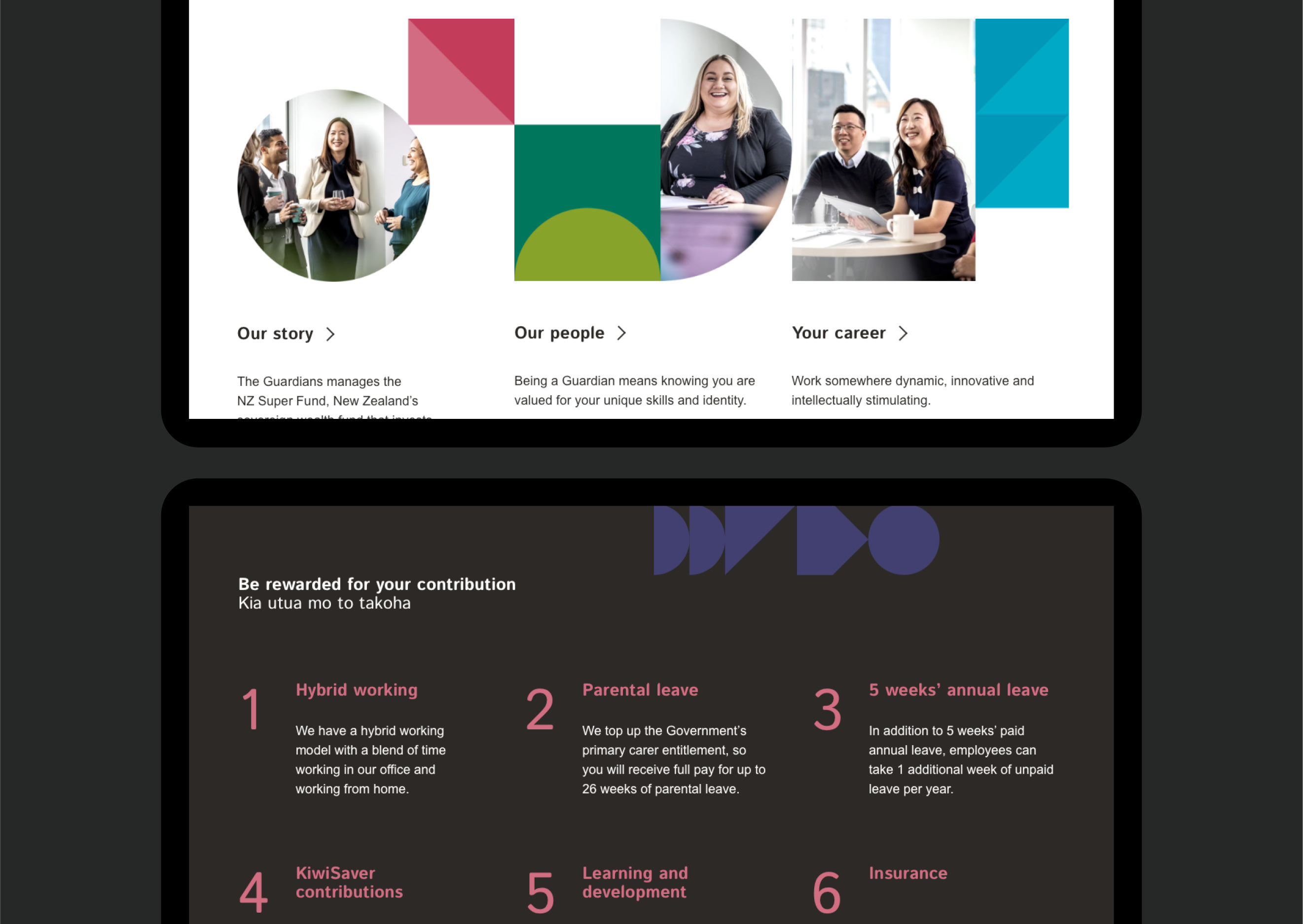
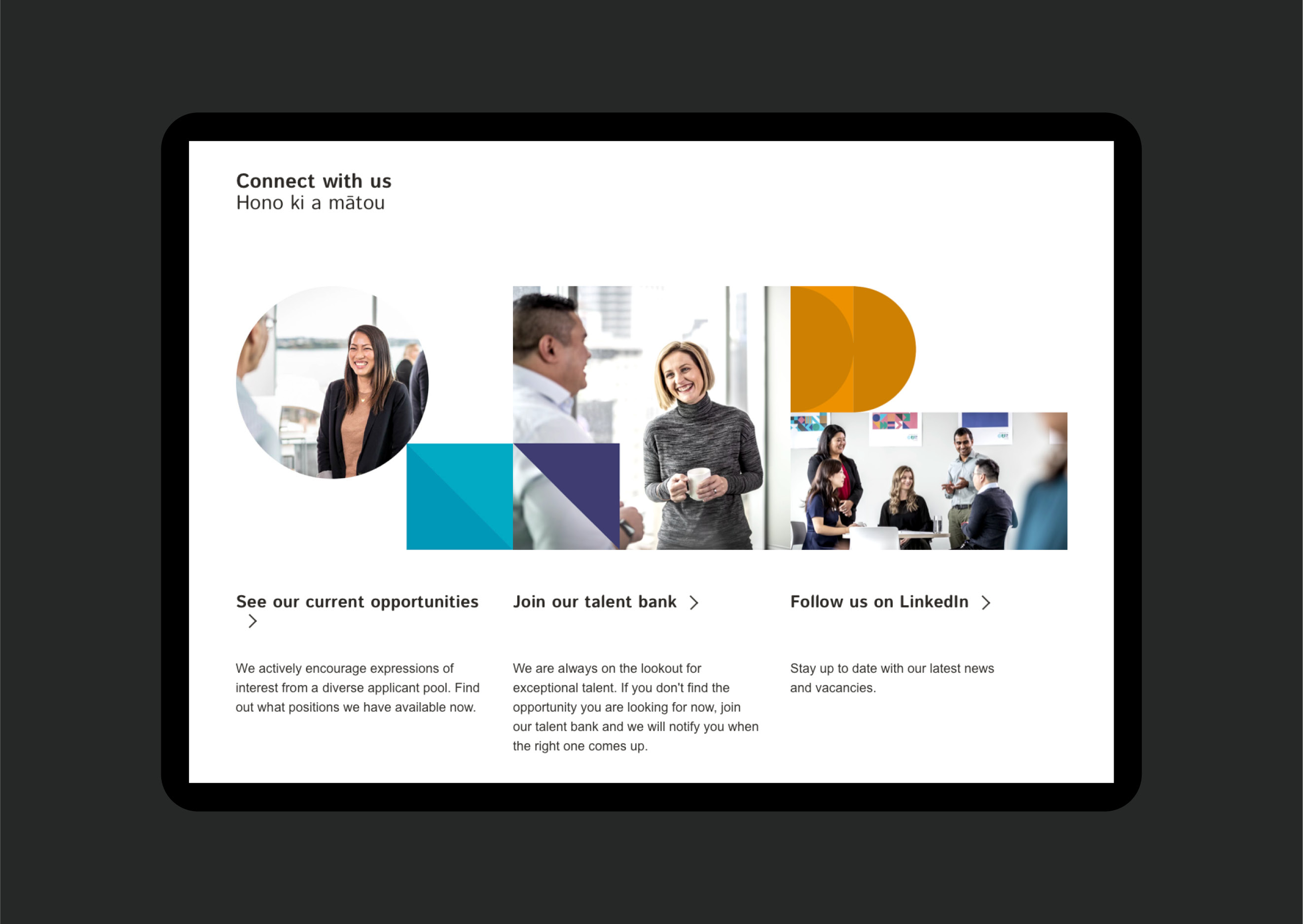
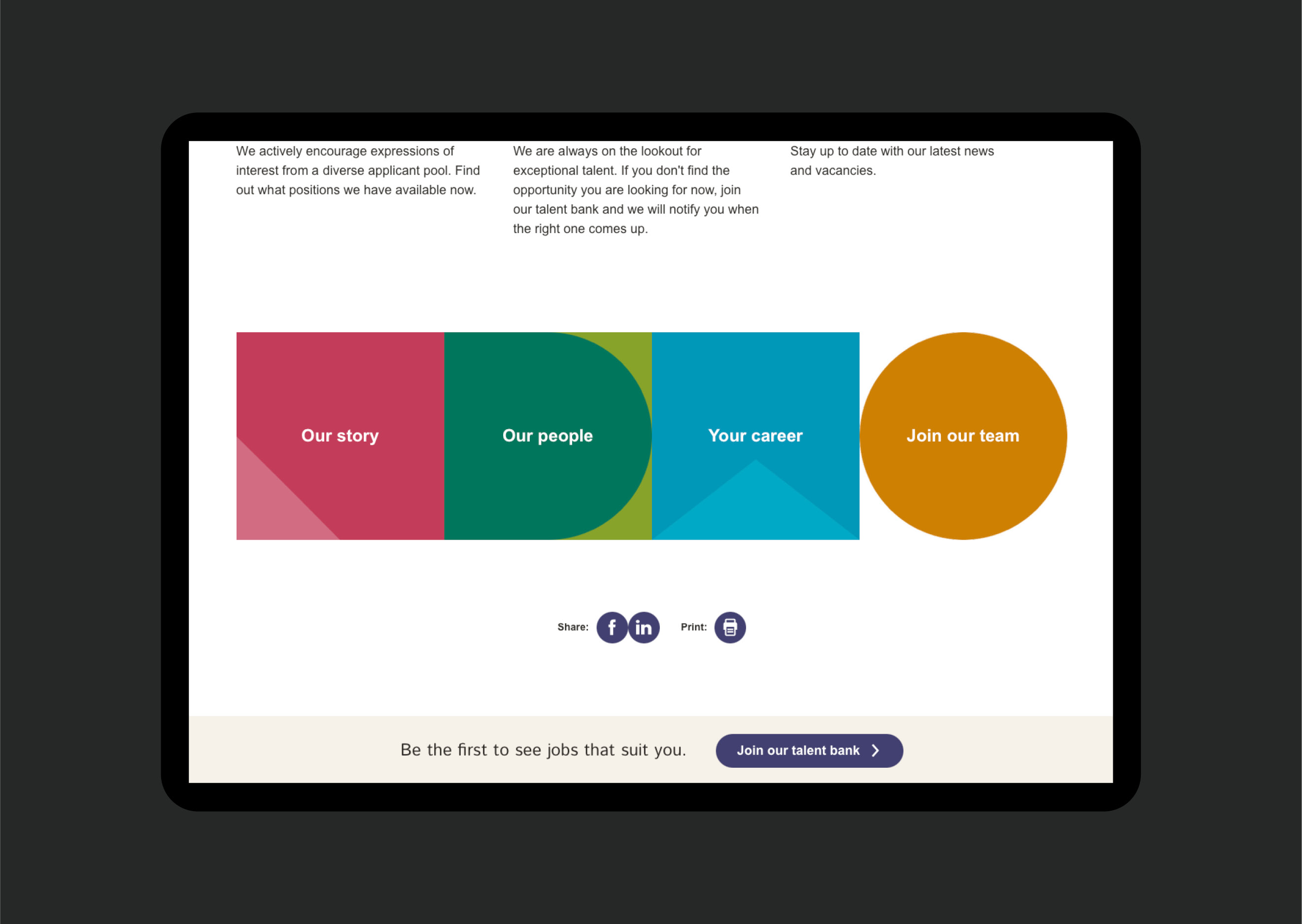
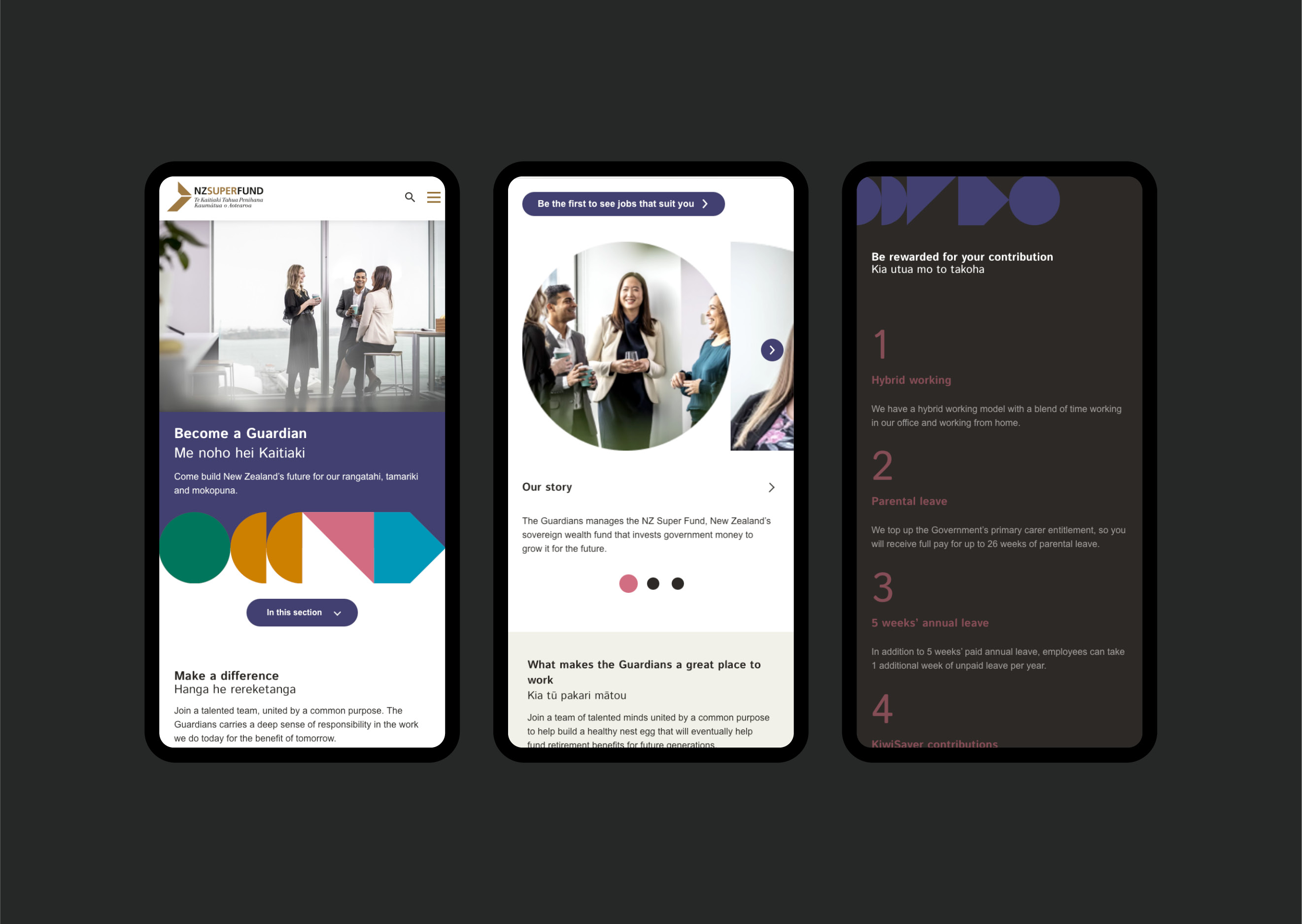
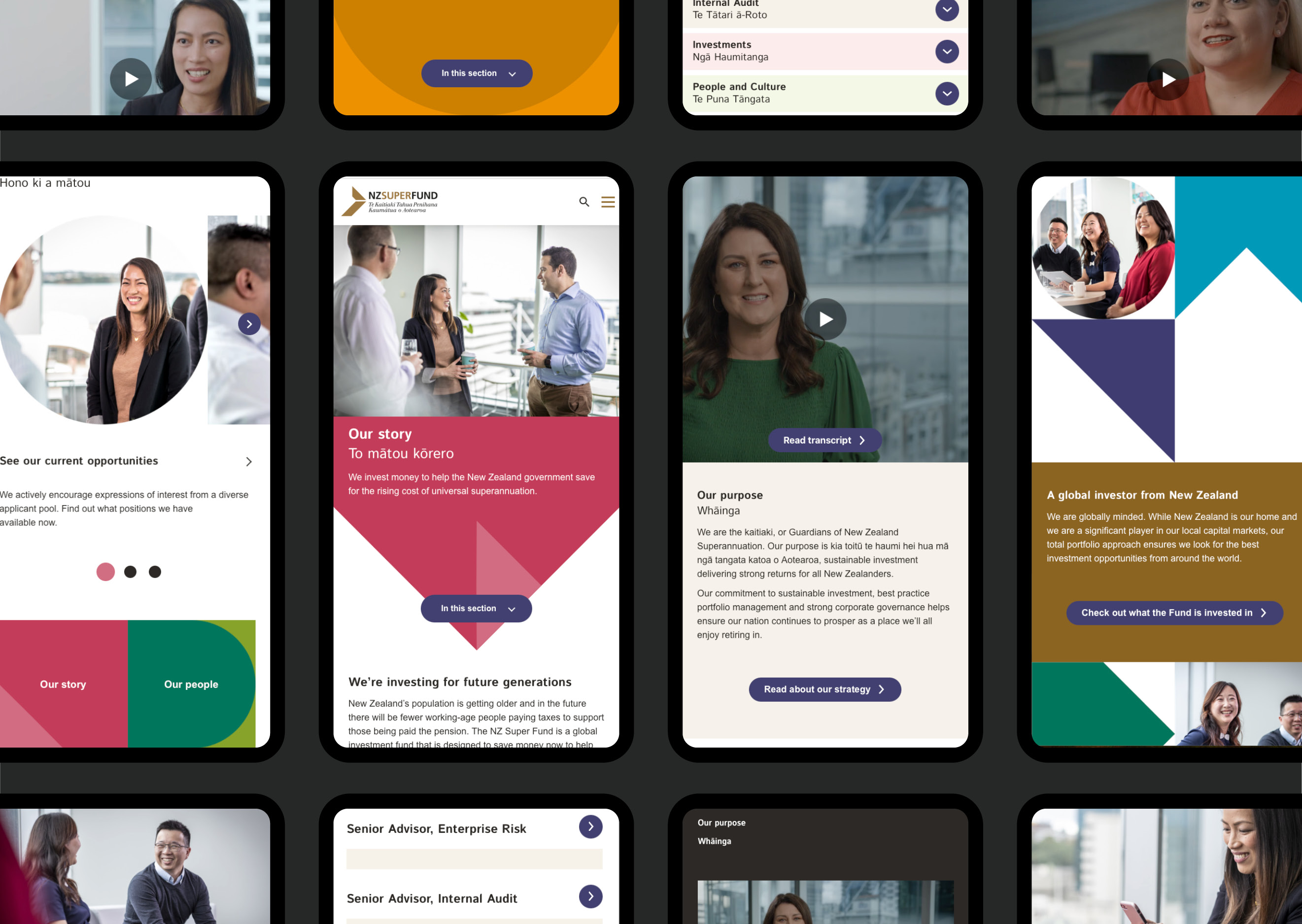
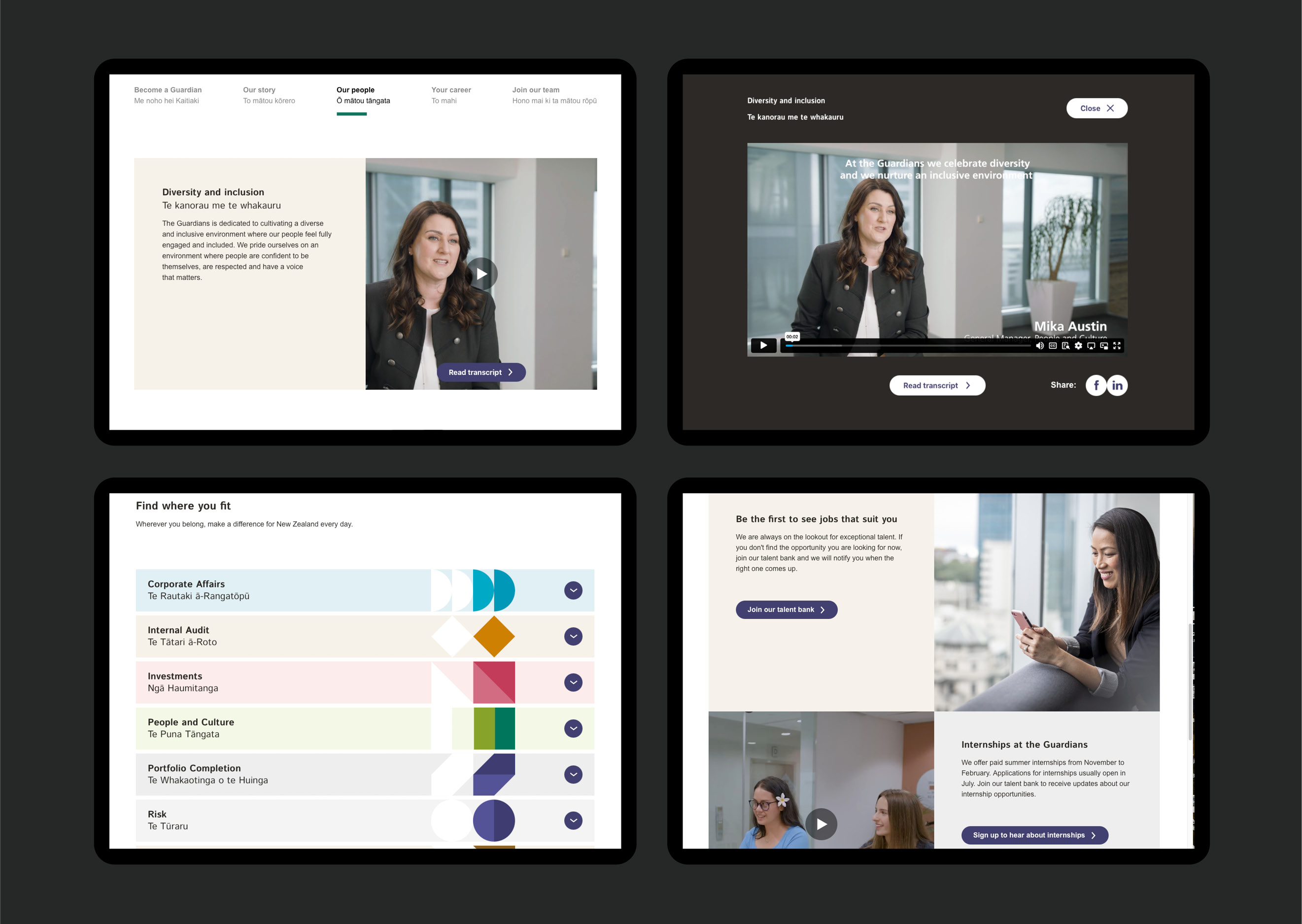
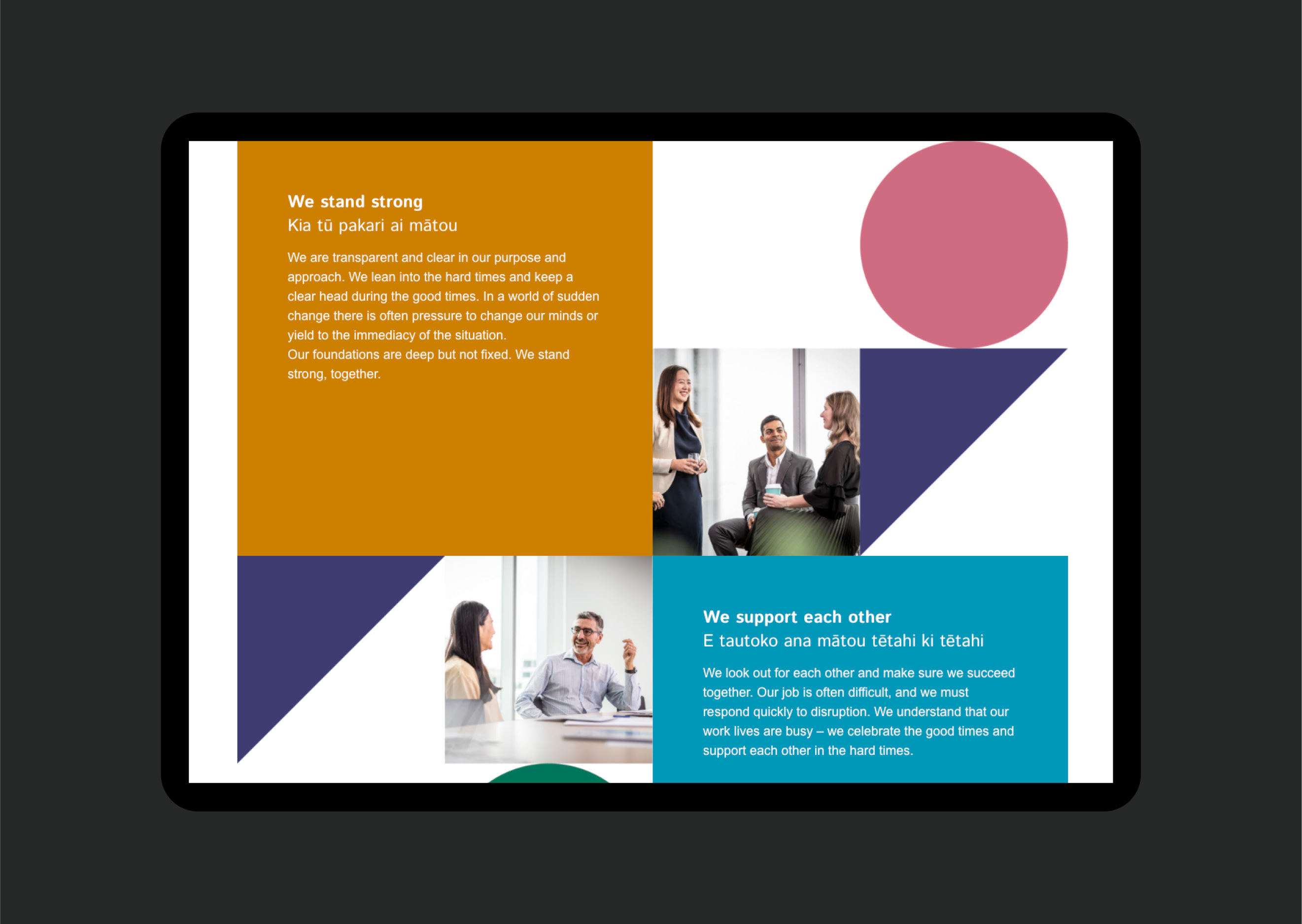
The EVP brand is high on colour, uses five inclusive shapes to represent the idea that ‘whatever shape you are, you belong here’ and is rich in imagery of their team. These features became the key design elements across all pages of the careers site.
Along with reprioritising how and where content was presented, we moved to an ever-present ‘Join our talent bank’ call-to-action that follows the user throughout their journey. Additional promotional content blocks were created to outline the key reasons and benefits to join up.
With the mobile experience, we moved away from the previous responsive web-design approach which resulted in an inconsistent experience on mobile. The new adaptive approach saw each page designed specifically to deliver a more consistent experience, despite the smaller screen and a longer-scroll format. Each page was designed to maximise the user experience based on the current content, while also future-proofing aspects if content changes later.
Accessibility and video content play key roles in effectively communicating the career opportunities at NZ Super Fund, so ensuring high colour contrast levels for text, clear functionality, transcripts and video captions were also key design considerations for both desktop and mobile.
The Results
Our client was delighted with the outcome, praising both the fresh and vibrant quality of the experience delivered and the seamless way this section feels different – but the same – as the wider NZ Super Fund website. The project was delivered on time and on budget. And even though it’s only been live for a short while, analytics already suggest increased traffic on the talent bank journey.