Clarity amid uncertainty
Client: Watercare
ARA AWARDS 2022. FINALIST - ONLINE REPORTING (PUBLIC SECTOR)
Despite Three Waters upheavals and volatile weather, Watercare’s long-term strategy is the key to quality and reliability.
The Brief
Watercare’s inter-generational infrastrucure planning and long-held sustainability accountability have for many years been the backbone of telling their story of quality, consistency, and reliability. In the most recent years, this story has been more holistically framed through the integrated reporting lens. Building on this consistent strength is the soundest communication strategy for Watercare, however the environment they operate is evolving rapidly, in some cases beyond their own control.
Quietly acknowledging Watercare's 10th anniversary this year, our communication challenge was two-fold: Evidence their planning record as capability to deliver a steady water supply whatever uncertainty lies ahead; and reflect a more customer-centric and connected organisation with a shift in visual style.
The Solution
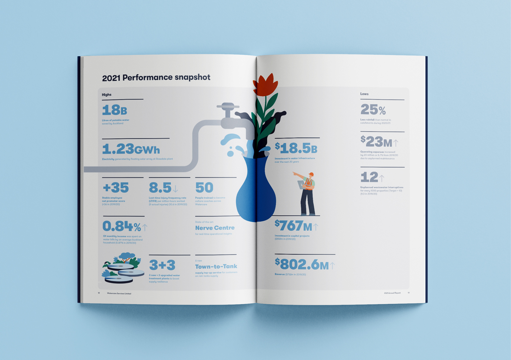
From a messaging point of view, succinct clarity was the key. We recommended framing Watercare’s plans and actions between what they can directly control and those they can’t but are seeking to influence - like climate change and proposed water reforms. These propositions were expanded upon using both storytelling and data as evidence.
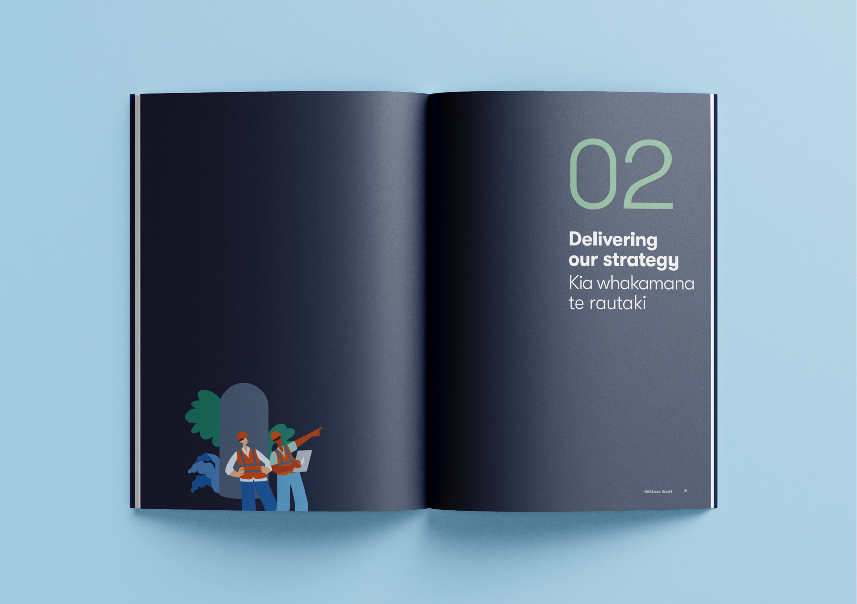
We accepted the brand evolution permission with alacrity, shifting Watercare’s persona to more accurately mirror their customer focus – a softer, more fluid visual style, utilising gentle illustrations and an engaging colour palette.
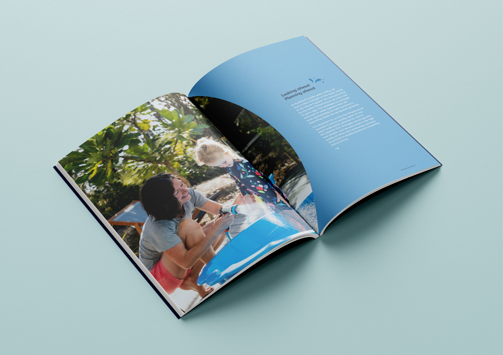
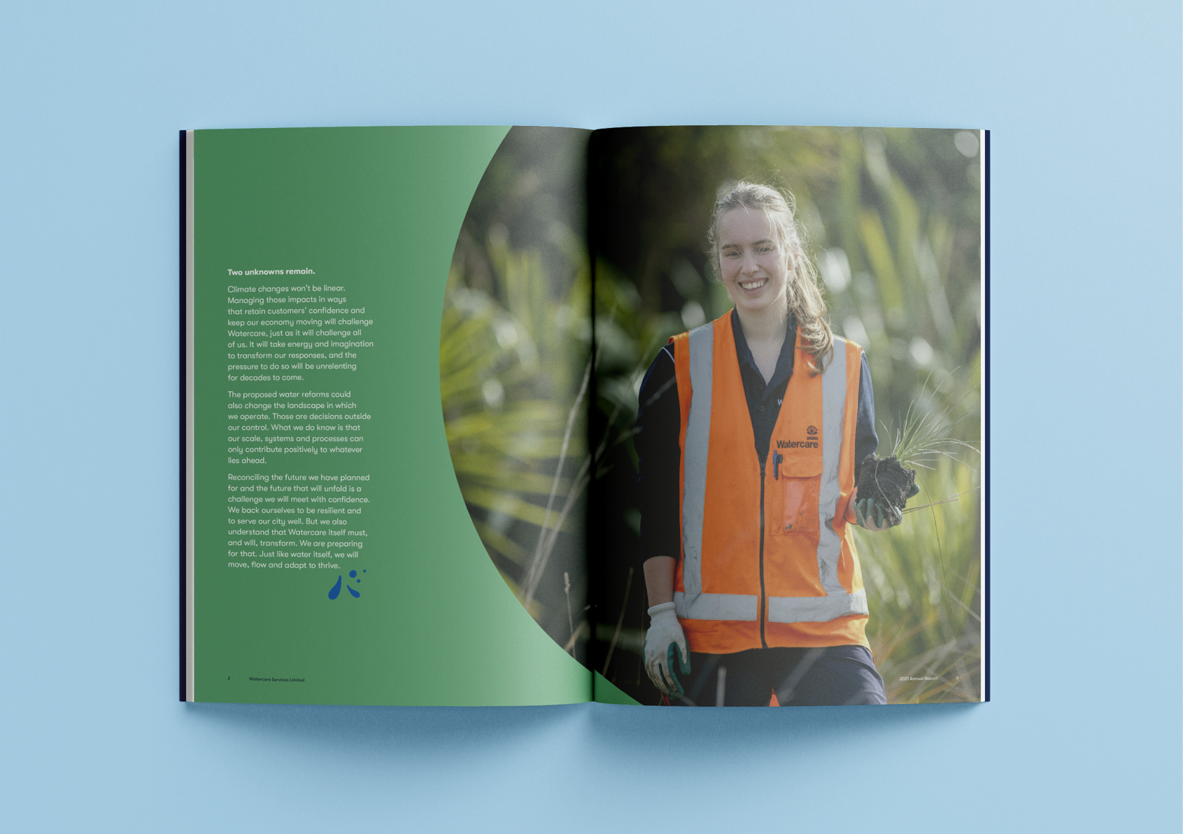
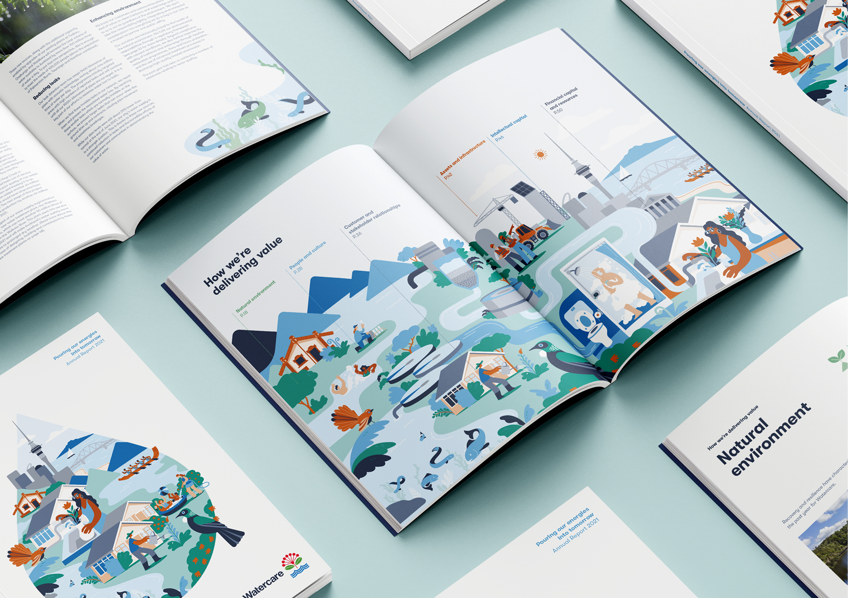
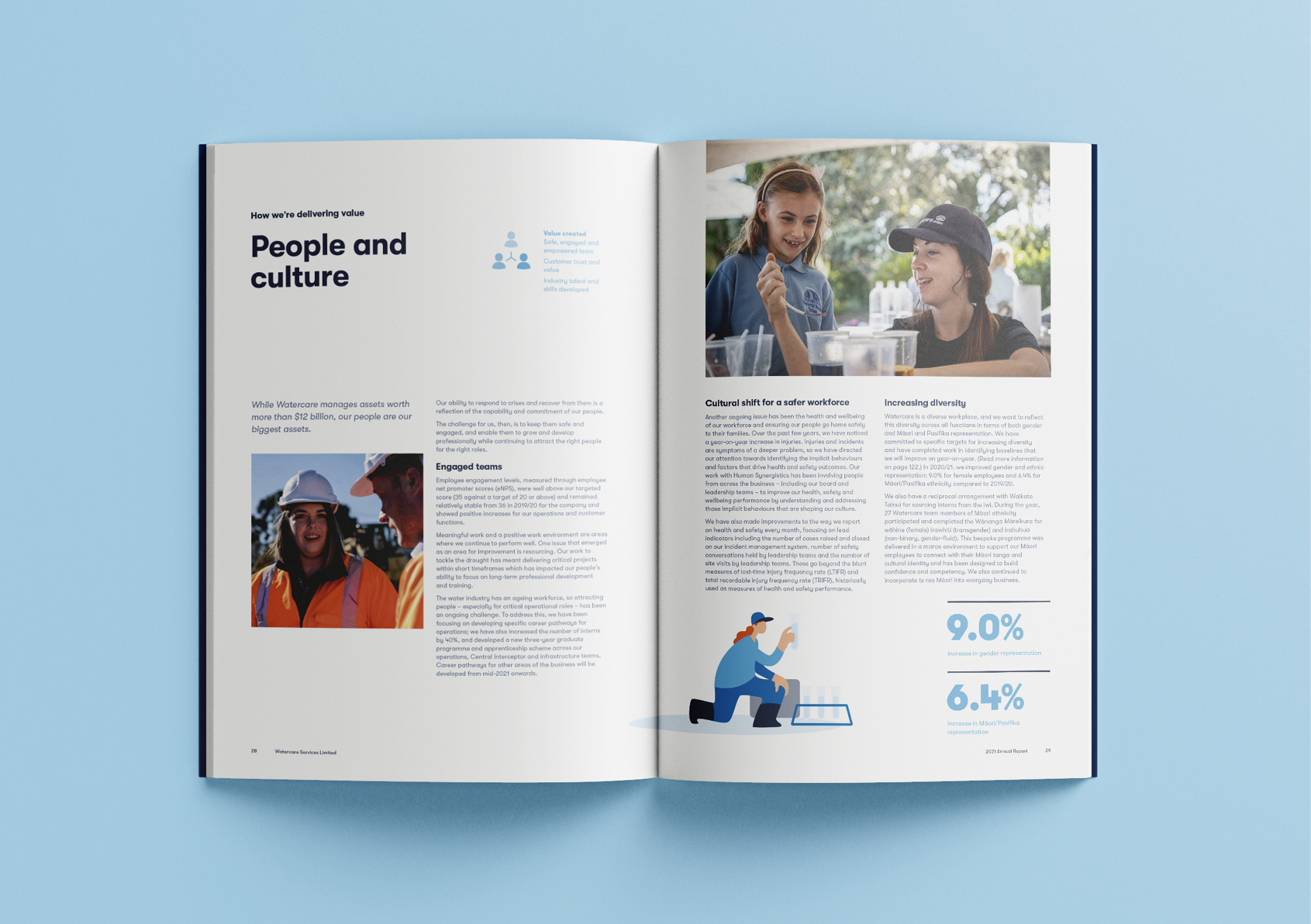
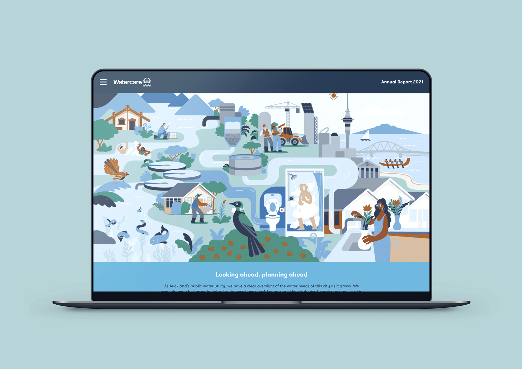
Imagery has always played a key role in Watercare’s communications and this time the focus was firmly on people and the value of water to them and their communities. Stylised water graphics, working in combination with imagery, further heighten the desired relatable, friendly feel. This is further enhanced by a subtle font change, introducing more rounded forms, that help create that sense of an open and easy conversation.
Utilising the existing Water for Life palette, orange was added to create the energy, vibrancy, and warmth needed to deliver a more optimistic tone.
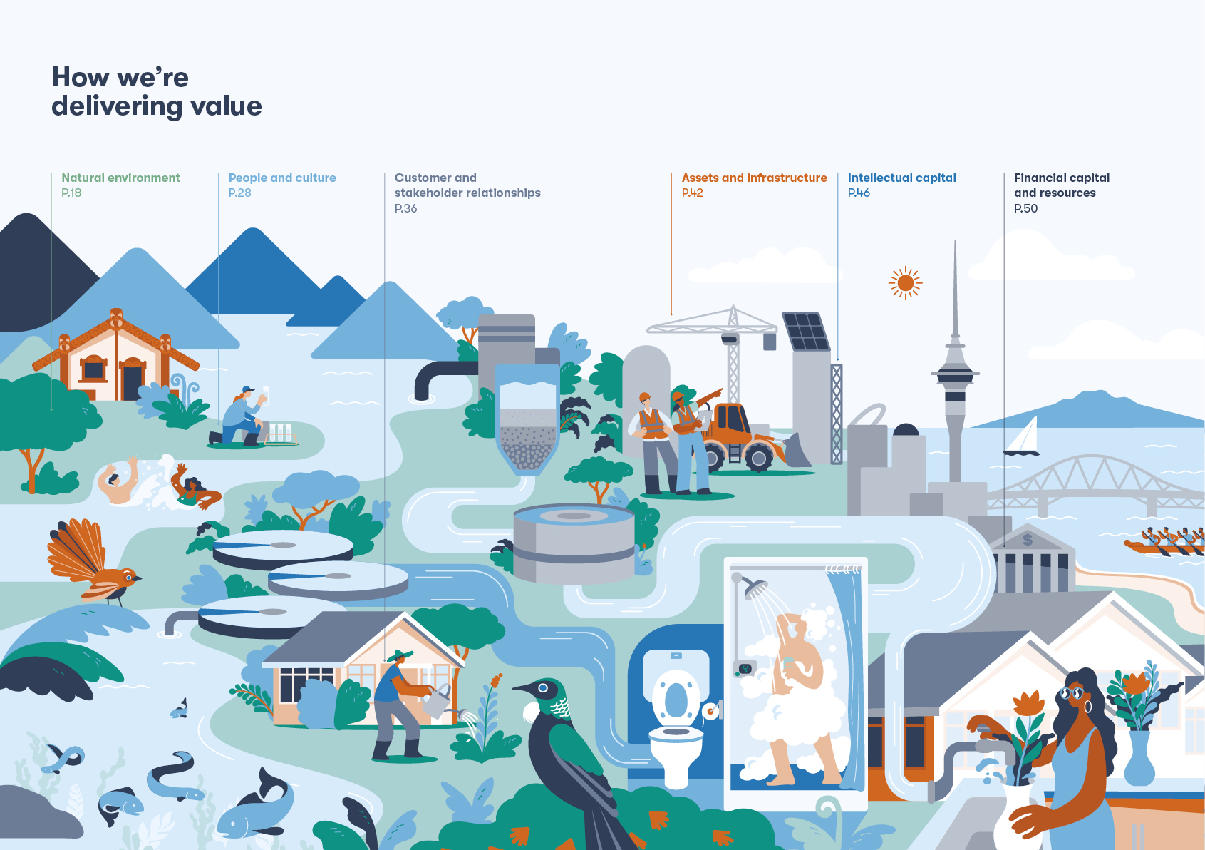
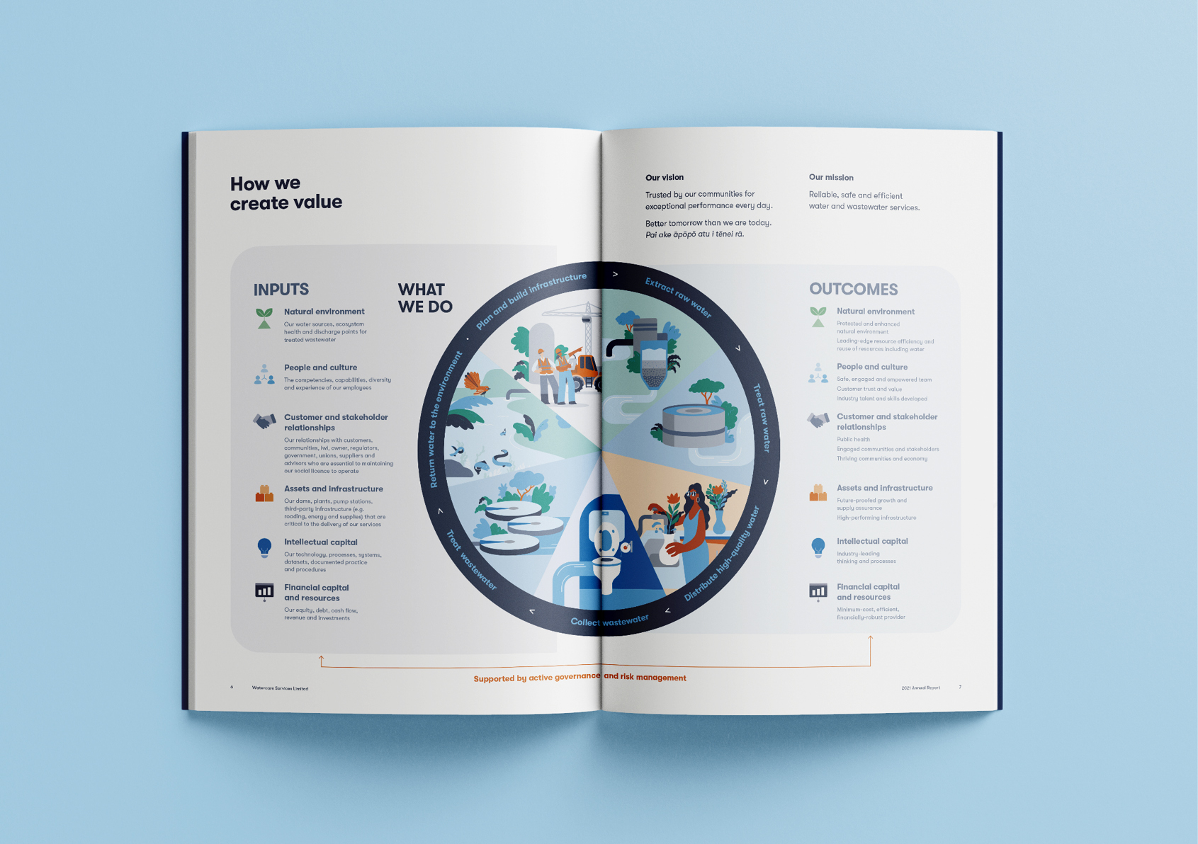
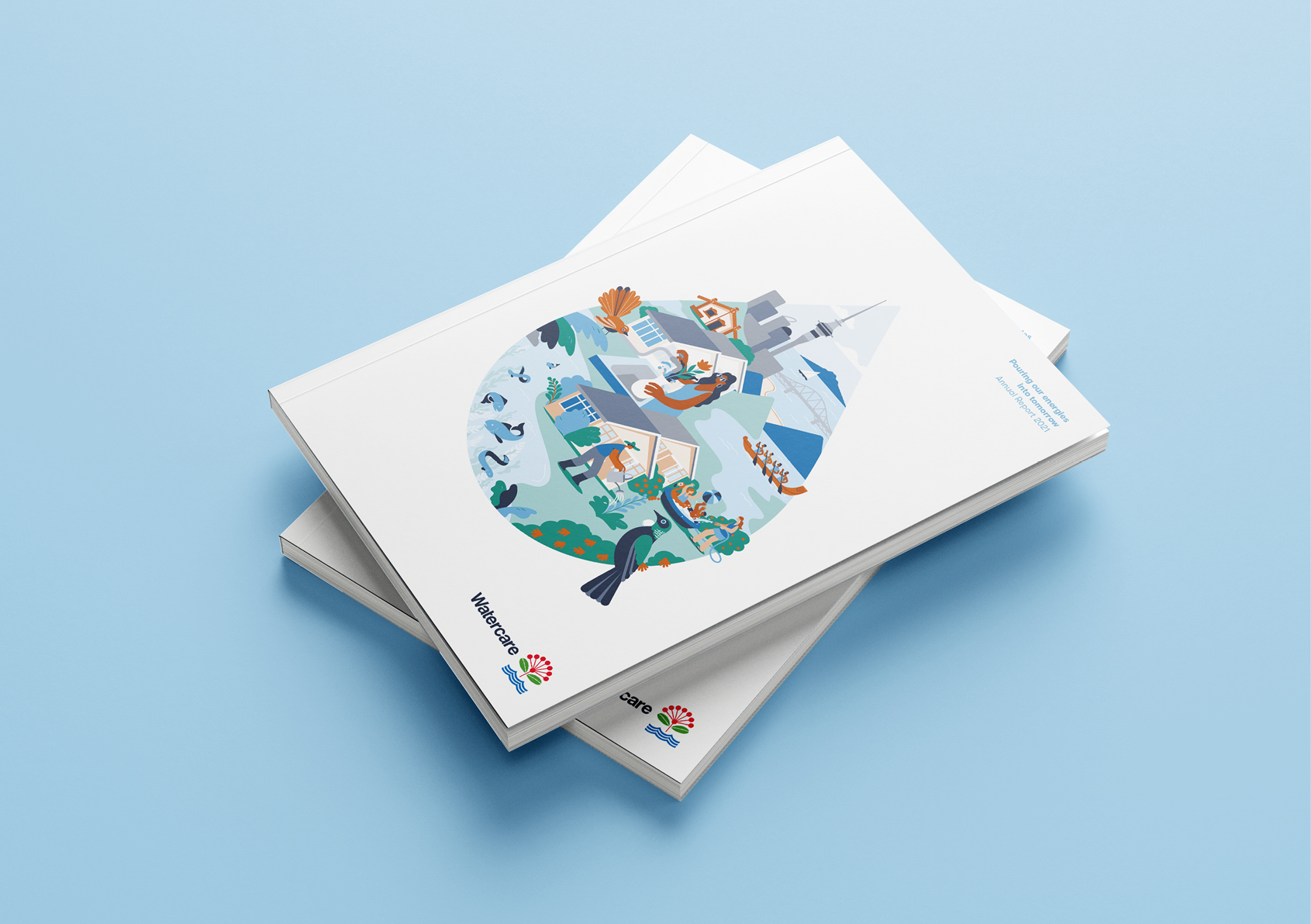
Arguably the introduction of an illustration is the most important element in elevating the message and driving approachability. The organic illustration becomes the key vehicle to tell engaging stories about what Watercare stands for and to show complex processes, ecosystems, connections with the community, and the outcomes being delivered for Auckland’s people. The style selected is both friendly and figurative, giving licence to play with scale. This works as larger connected illustrations to tell the big ecosystem stories on the cover and in the introductory pages and broken down to become visual highlights that bring facts, figures, and details to life.
The Results
The result is a quite significant shift in the feel of Watercare’s visual expression, establishing a reset for other communication and marketing activities that followed this report. The client commented that “this design evolution, together with the clear messages in the report, is helping further position Watercare as a trusted and approachable part of the Auckland community.“