20 years of outperforming expectations
Client: NZ Super Fund
ARA AWARDS 2025: WINNER - ARA ANNUAL REPORT OF THE YEAR
ARA AWARDS 2025: WINNER - BEST OF FINANCIAL SERVICES SECTOR
ARA AWARDS 2025: GOLD AWARD.
This report was the winner of the overall Annual Report of the Year at the 2025 Australasian Reporting Awards (ARA); the report's fourth win in the last five years. This year's report also represents the Fund's 20th year of performance.
The brief
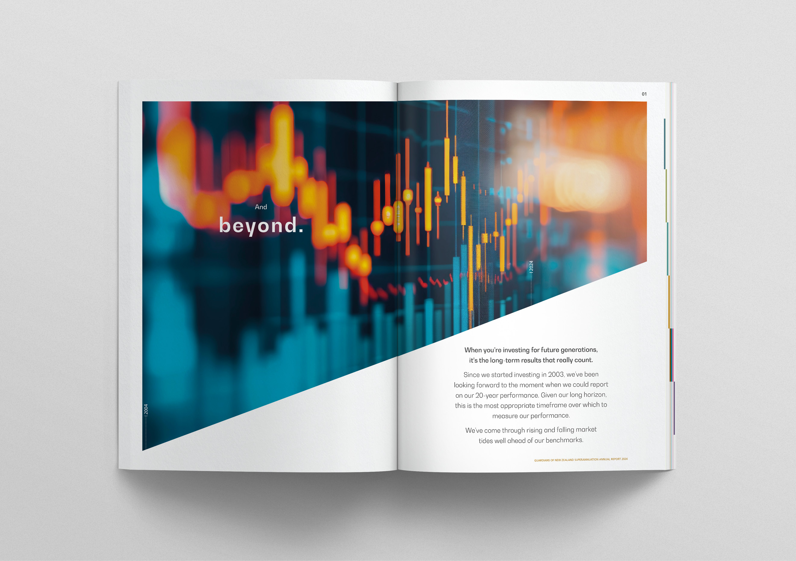
Our brief for the Guardians of New Zealand Superannuation (the Guardians) 2024 annual report was to develop a creative and messaging platform that strongly communicated ‘20 years of delivering to our purpose.’ The NZ Super Fund (the Fund) has a long-term focus, and this was the first time they were able to report performance on a 20-year rolling basis. The Fund has come through the market ups and downs well ahead of its performance benchmark. While the Fund’s performance was world class, they have remained grounded, focused on what they can build on to keep delivering strong performance for the next 20 years and beyond.
The solution
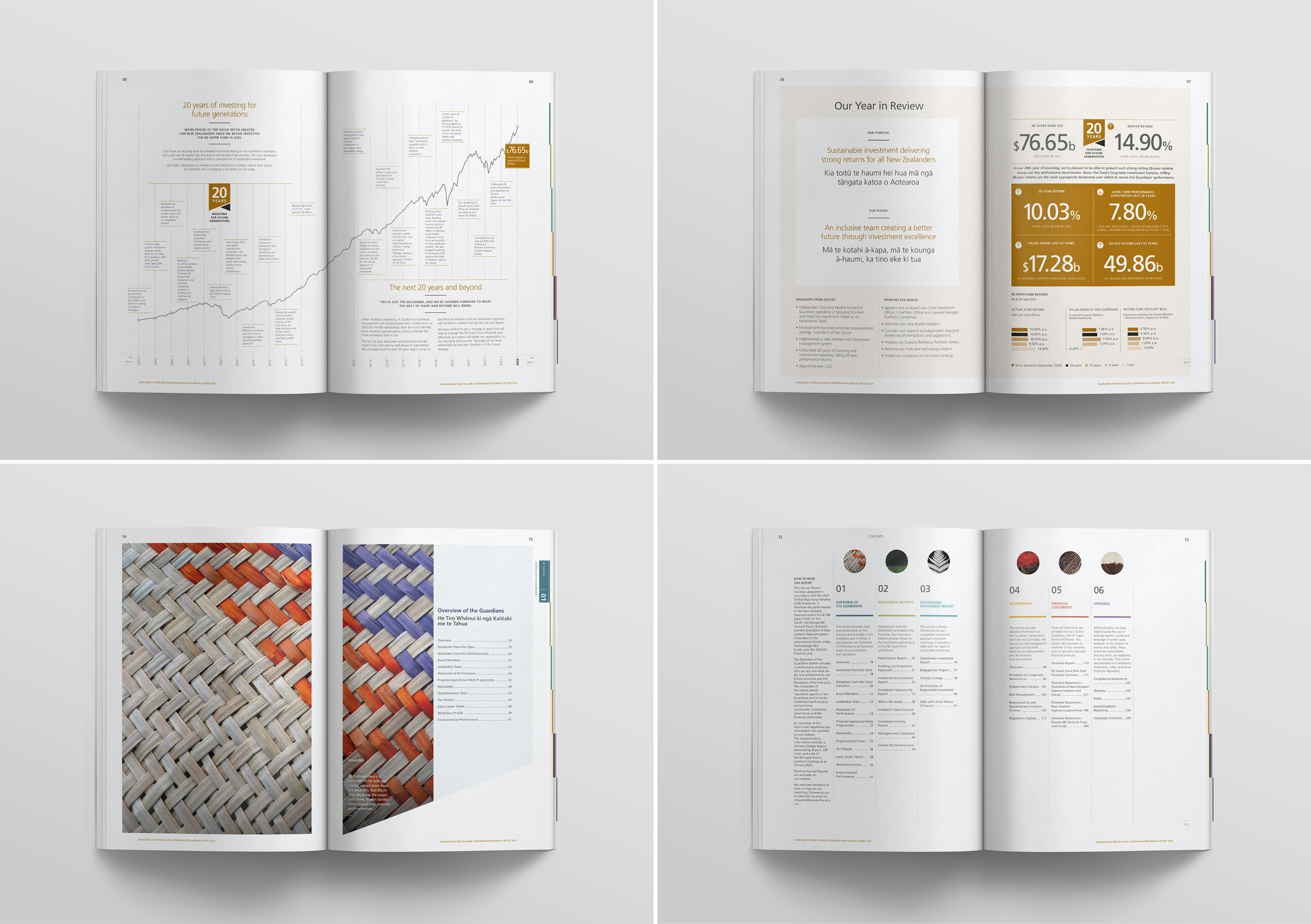
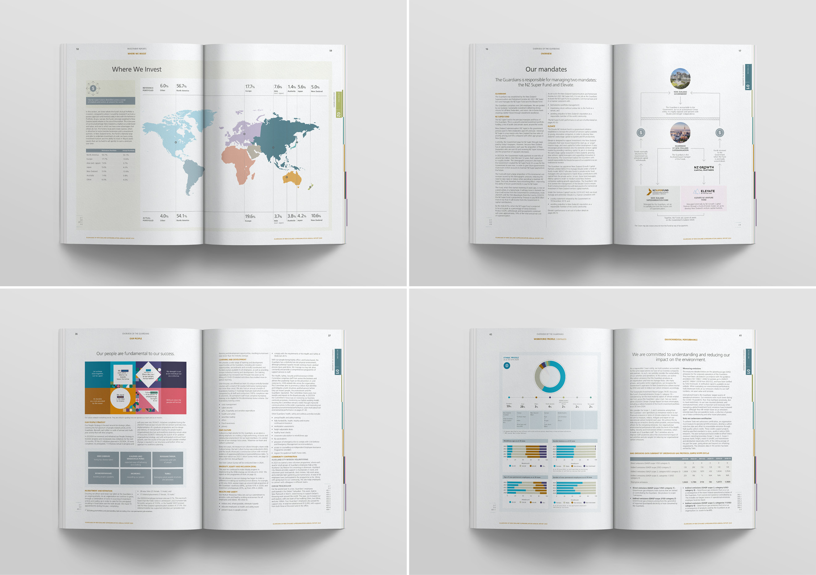
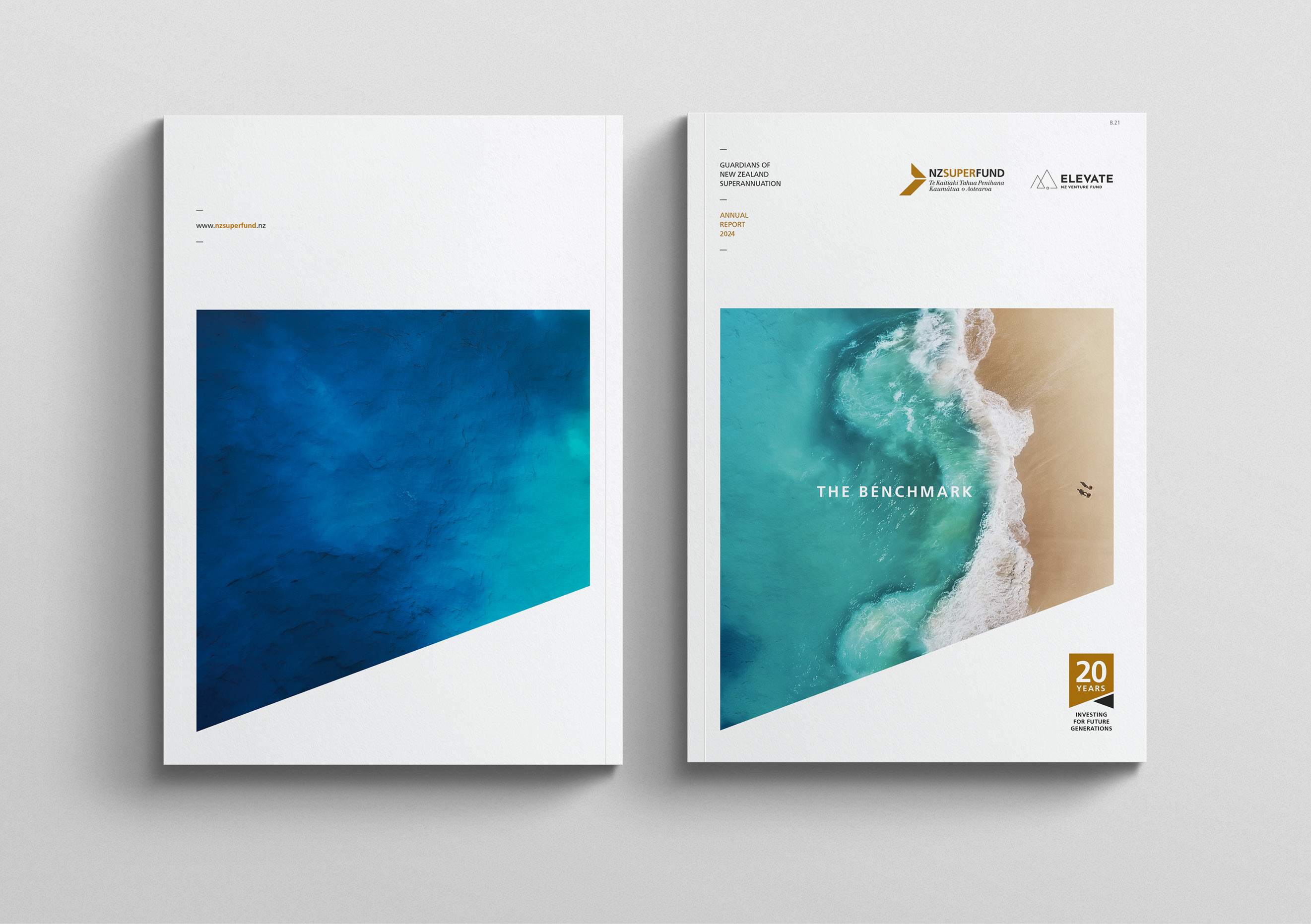
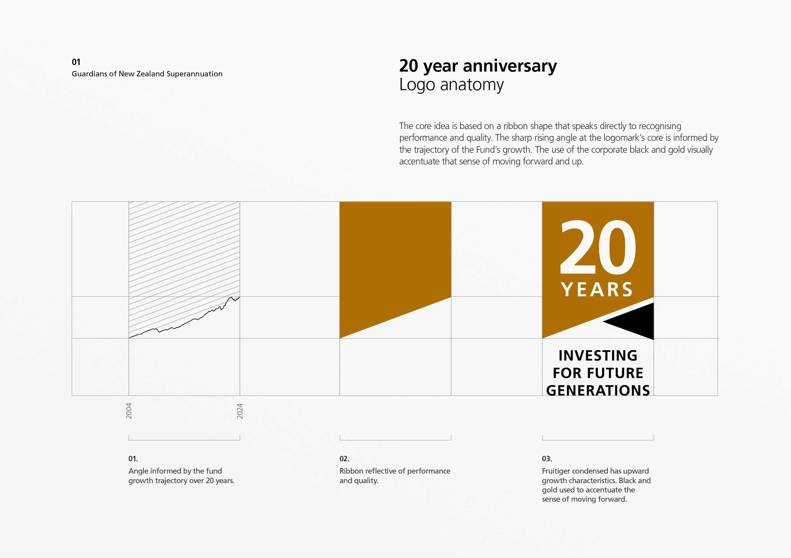
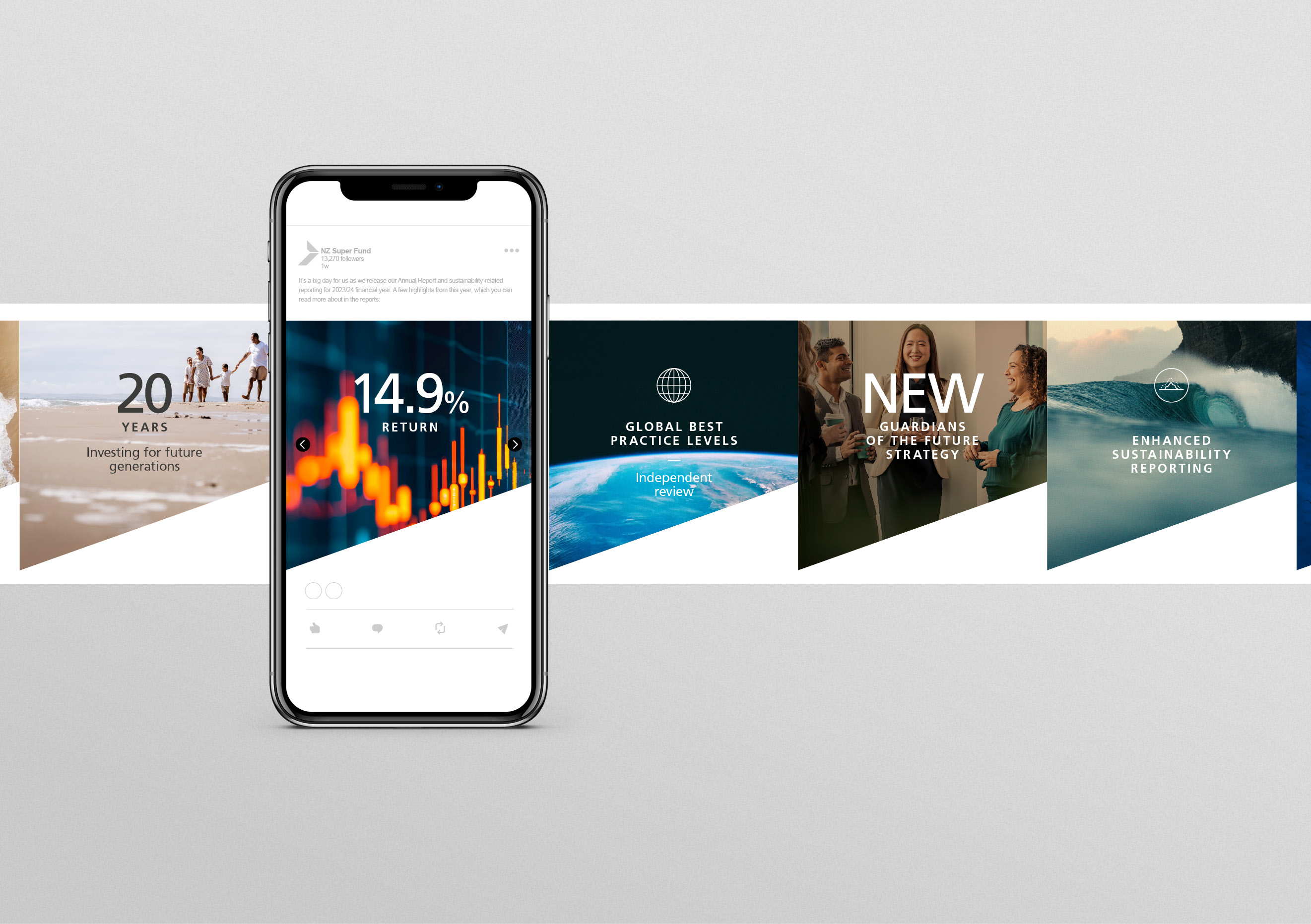
There were two key ideas that informed the creative concept. The first was to create a 20-year anniversary logo to recognise the milestone occasion. The logo’s overall ribbon shape speaks directly to recognising performance and quality, and the sharp rising angle at the core is inspired by the trajectory of the Fund’s growth. The use of the corporate black and gold visually accentuate the sense of moving forward and up. This angle became a core device applied consistently across the document, including to create a repeated background texture pattern behind graphs, charts and large pull-out information.
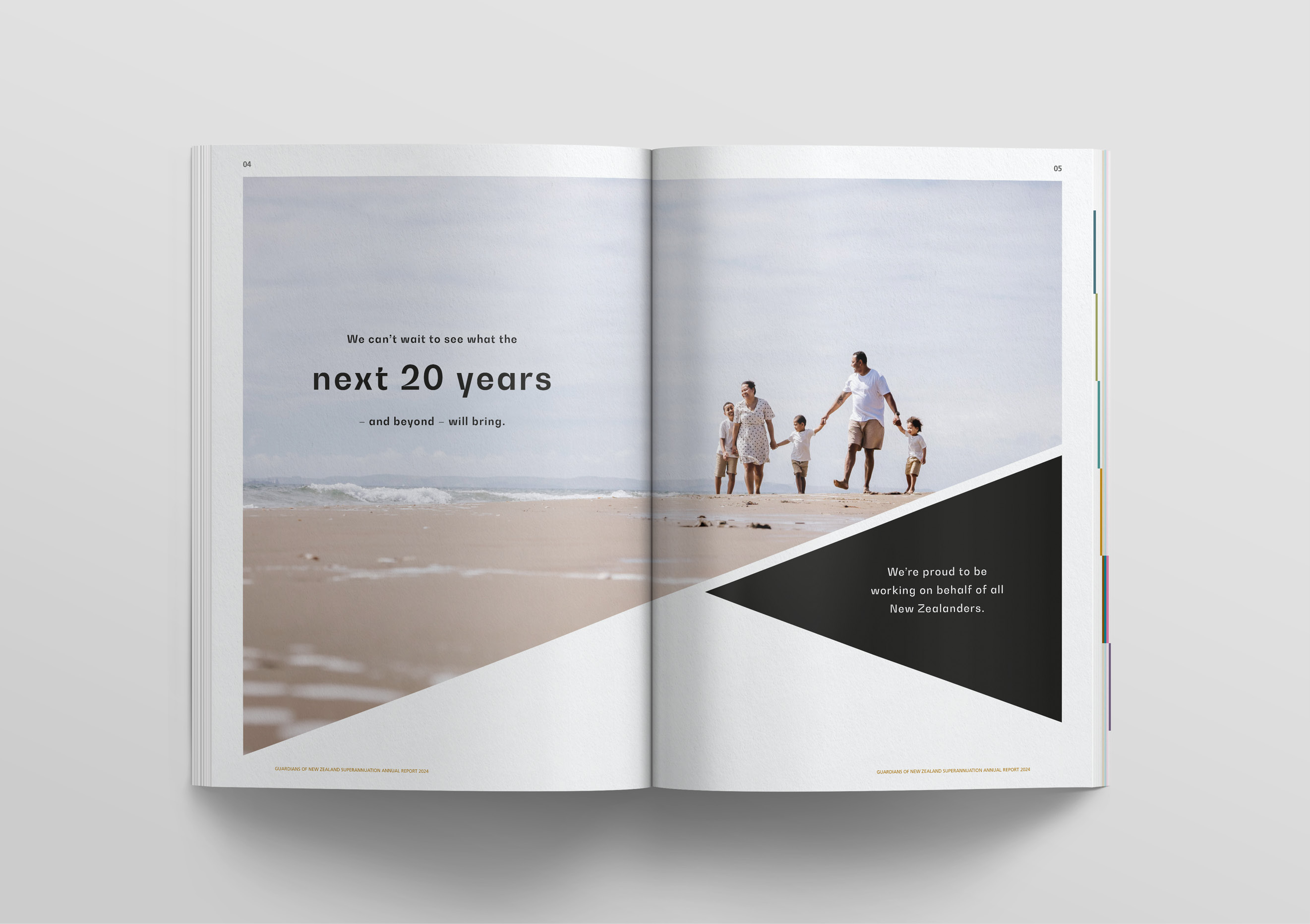
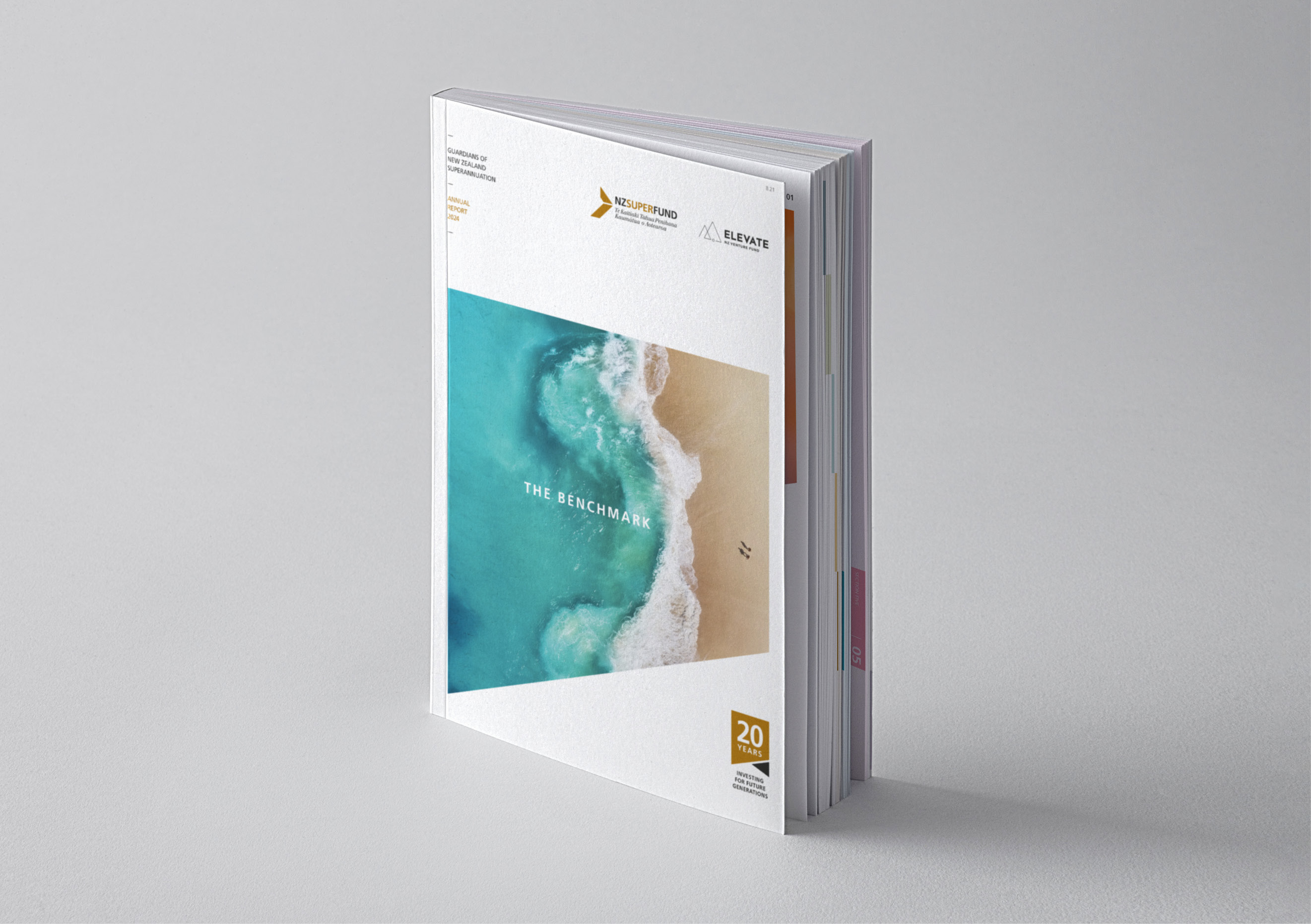
The second idea was the notion of outperforming the benchmark and reaching new heights. This relates to the Fund’s performance and the fact that it’s become the mark of quality that other global funds now look to, and is referenced in the ‘high-tide’ image on the cover. It’s acknowledged again with a multi-generational Kiwi family enjoying life at the waterline, looking forward to the next 20 years.
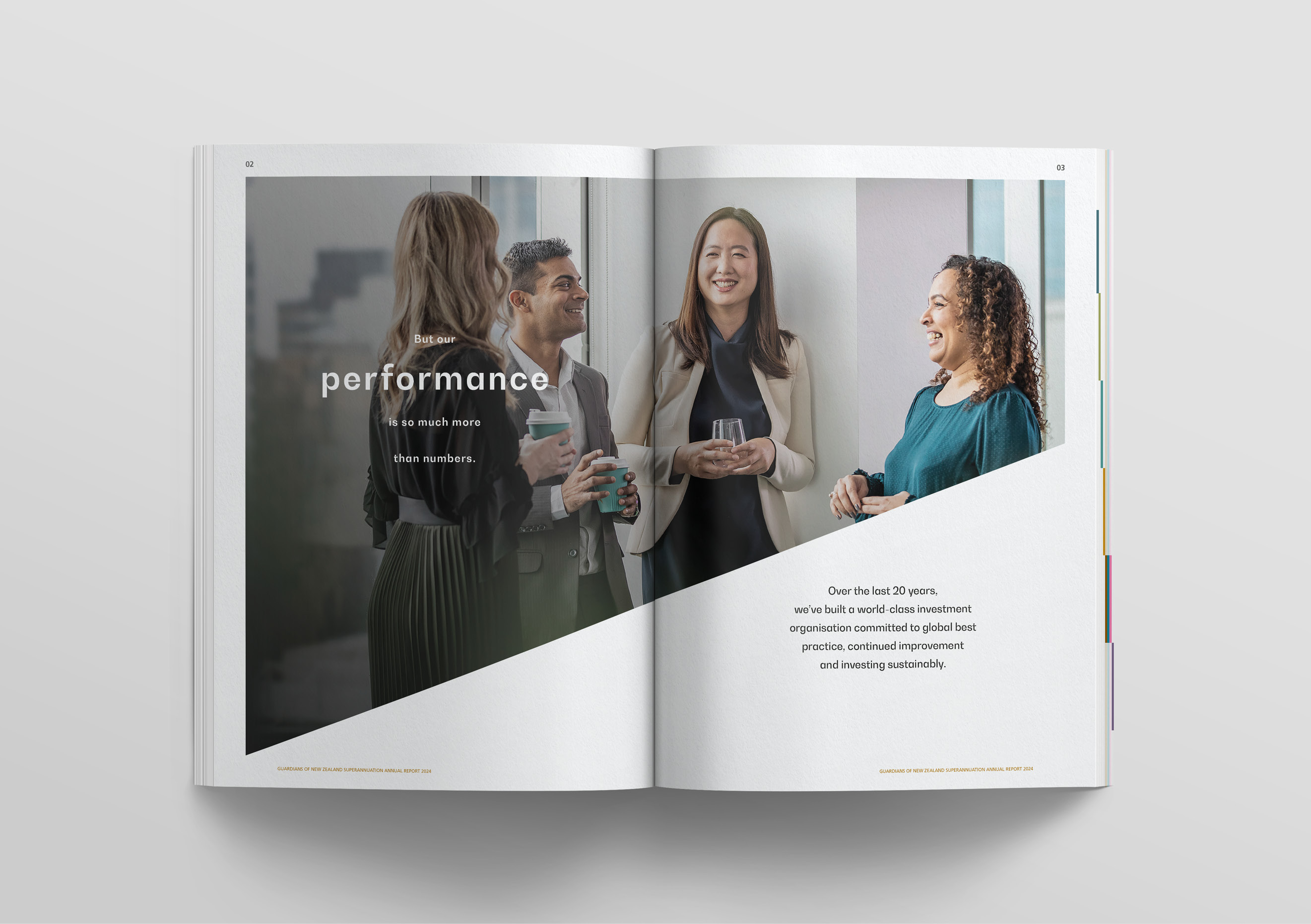
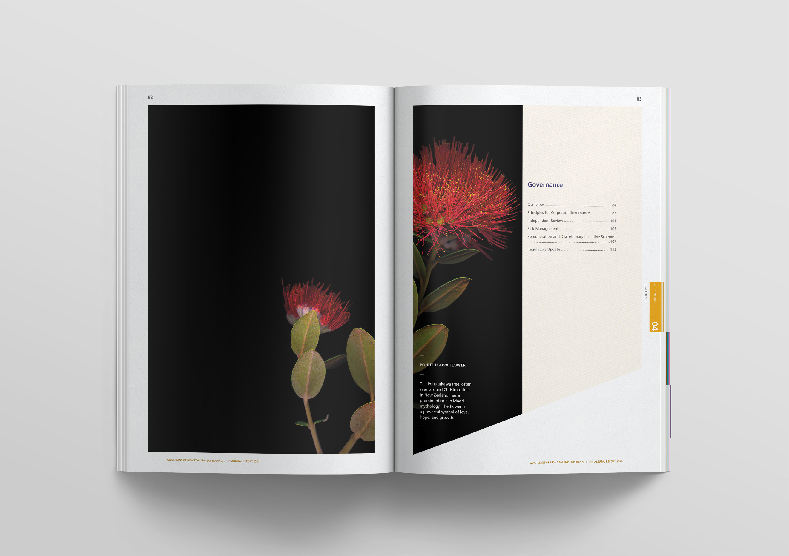
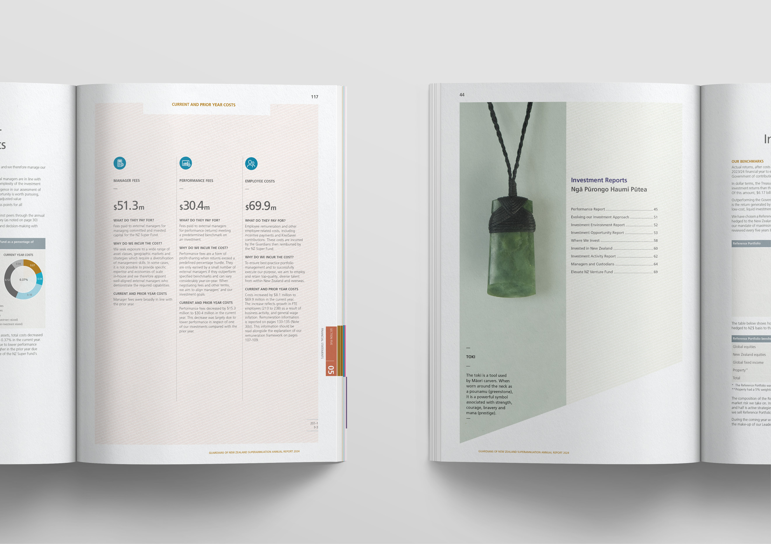
These two ideas came together seamlessly to deliver a measured, factual and high-quality tone, that fits well with the Guardians’ humble approach. The ideas came together most prominently on the divider pages, with New Zealand symbols and artefacts of quality used to represent the skills and qualities of the Guardians themselves. After all, it’s these qualities that have allowed the Guardians to deliver such high levels of performance, and it’s these same qualities that will allow them to keep delivering them in the future.
Aspects of the report’s core design concept were adapted to acknowledge the 20-year milestone via social media and email footers.
The result
The Guardians are a high-performing organisation in everything they do, including producing annual reports. They have built a global reputation for delivering reports which are transparent and well-communicated, and this report was no exception. It was awarded the overall Best Annual Report at the 2025 Australasian Reporting Awards (ARA) – the fourth time in the last five years the Guardians have won this award. The judges noted the effectiveness of the communication in engaging readers, its customer-centric approach, and how the well-designed graphic elements engage and inform the reader.