Matariki moments
Client: Insight Creative
2024 INTERNATIONAL DESIGN AWARDS (IDA) - SILVER

Our celebration of Mataraki delivers a way to make Matariki personal and inclusive for all, connecting with hundreds of passers-by who took a moment to reflect and share.
The Brief
The design challenge was to express the meaning of Matariki (Māori new year) as an accessible holiday all New Zealanders could celebrate. Thinking less about the astrological aspects of the seven stars, Ngā Mata o te Ariki Tāwhirimātea, in the night sky, we wanted to explore a more inclusive and personal meaning that embraced each of us, our friends, our whanau (family), our community and our nation.
The key message was that “Matariki is a time to connect with those you love, to reflect on what life has given us, and to look ahead in hope.”
We wanted an idea that could be applied to billboards and be used to wish all our clients and contacts a happy Matariki.
The Solution
The core creative idea was Matariki Moments: taking a moment to share your reflection with friends and whānau. It’s a self-reflective approach - looking inwards but expressing your feelings outwards.
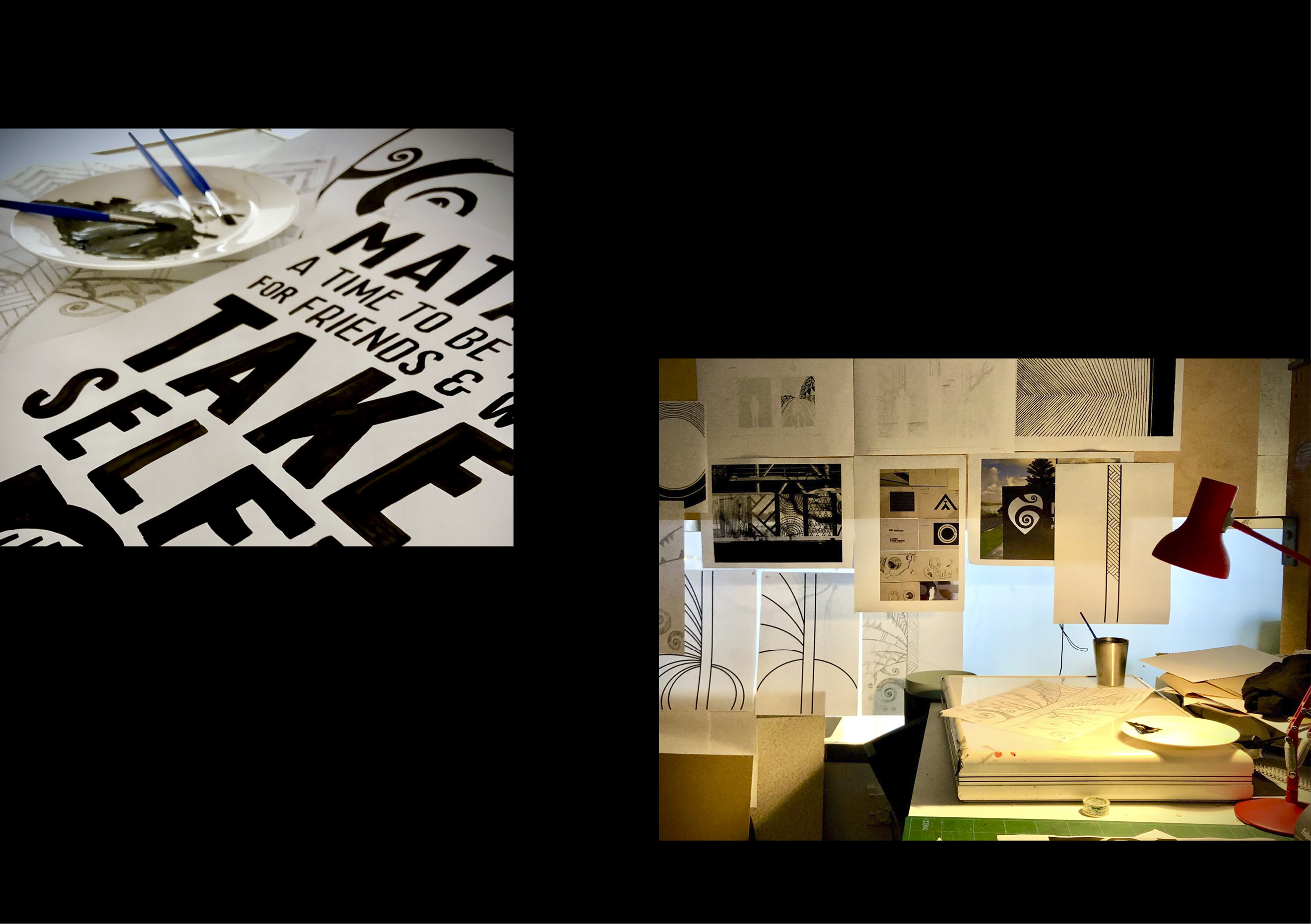
The design process started with our Māori cultural advisor, discussing the history of Matariki, the traditional meaning and its modern interpretations. This led to the sharing of sketches to express aspects of ‘self-reflection’ and the development of the ‘be thankful for the ones you love’ narrative.
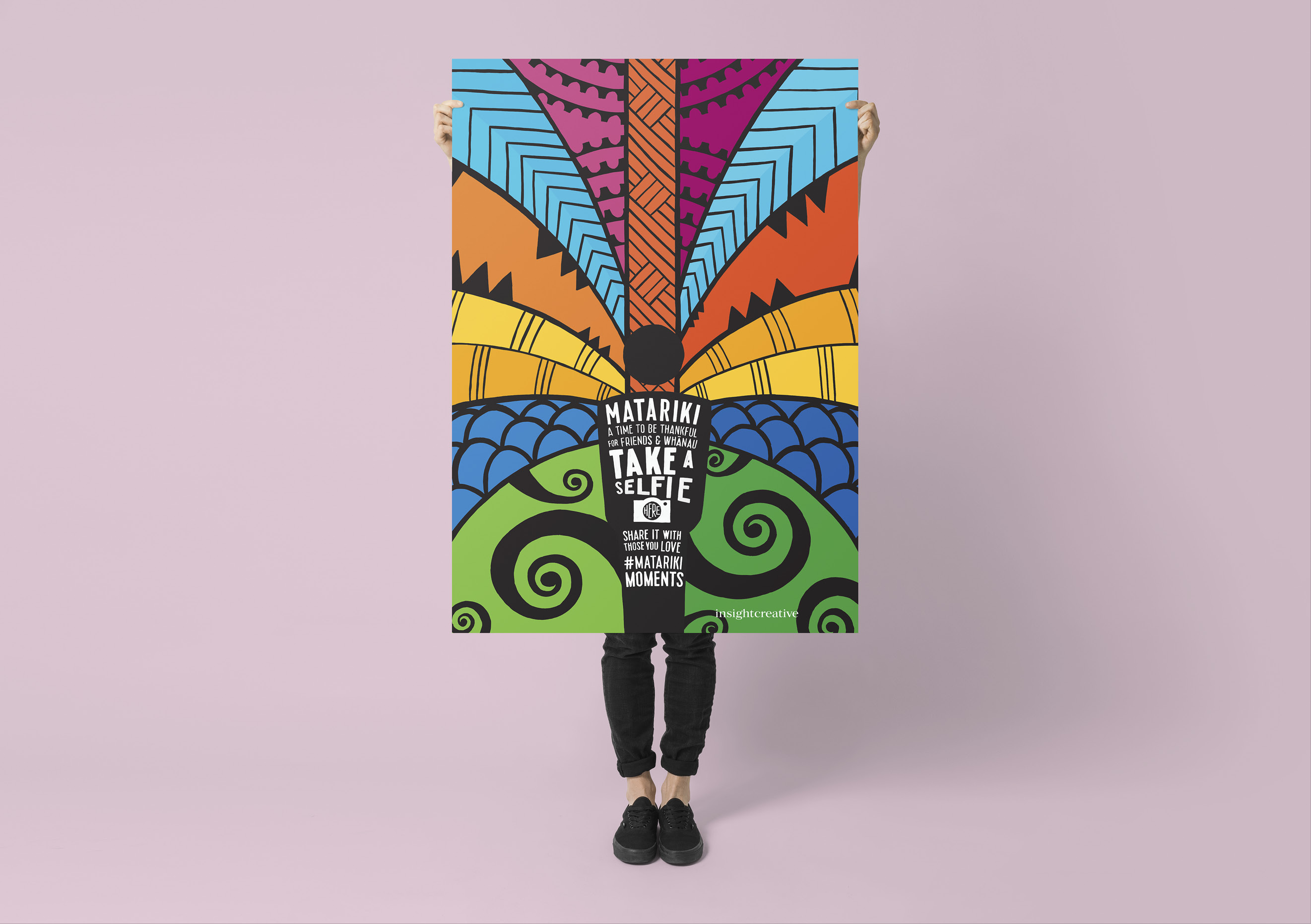
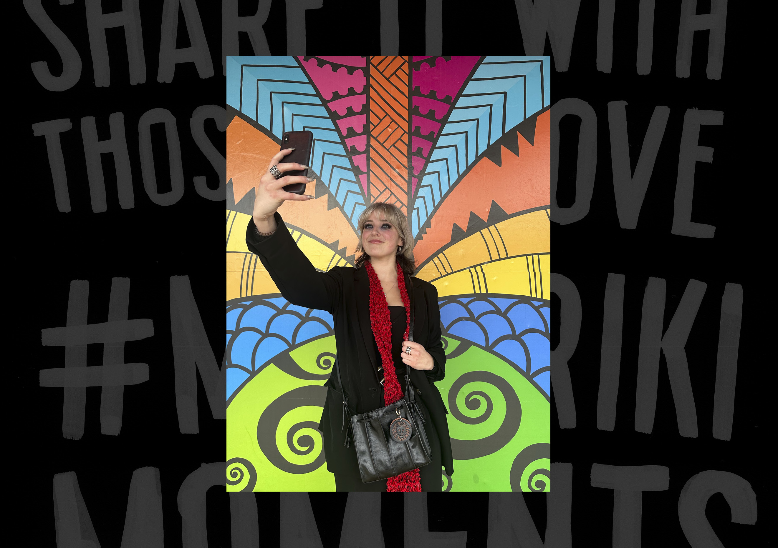
A key design decision was to ‘activate’ the billboard. Using street-level billboards as a call to action, passers-by are encouraged to take a ‘selfie’ self-reflection, placing themselves in the centre of the canvas. The selfie is then shared with loved ones, using #matarikimoments to make a connection and to acknowledge Matariki.
The Māori-design inspired graphics aren’t finely detailed or crafted, giving them a genuine hand-drawn feel. The modern poster design approach delivers street appeal, cut-through and high levels of engagement. The bright primary based colours offer a sense of celebration and were chosen to depict the land, the sky and the stars. The central canvas is divided into 12 sections to symbolise the calendar year. The person in the centre, stands in front of a central pou (pillar) reflecting their strength and the world around them.
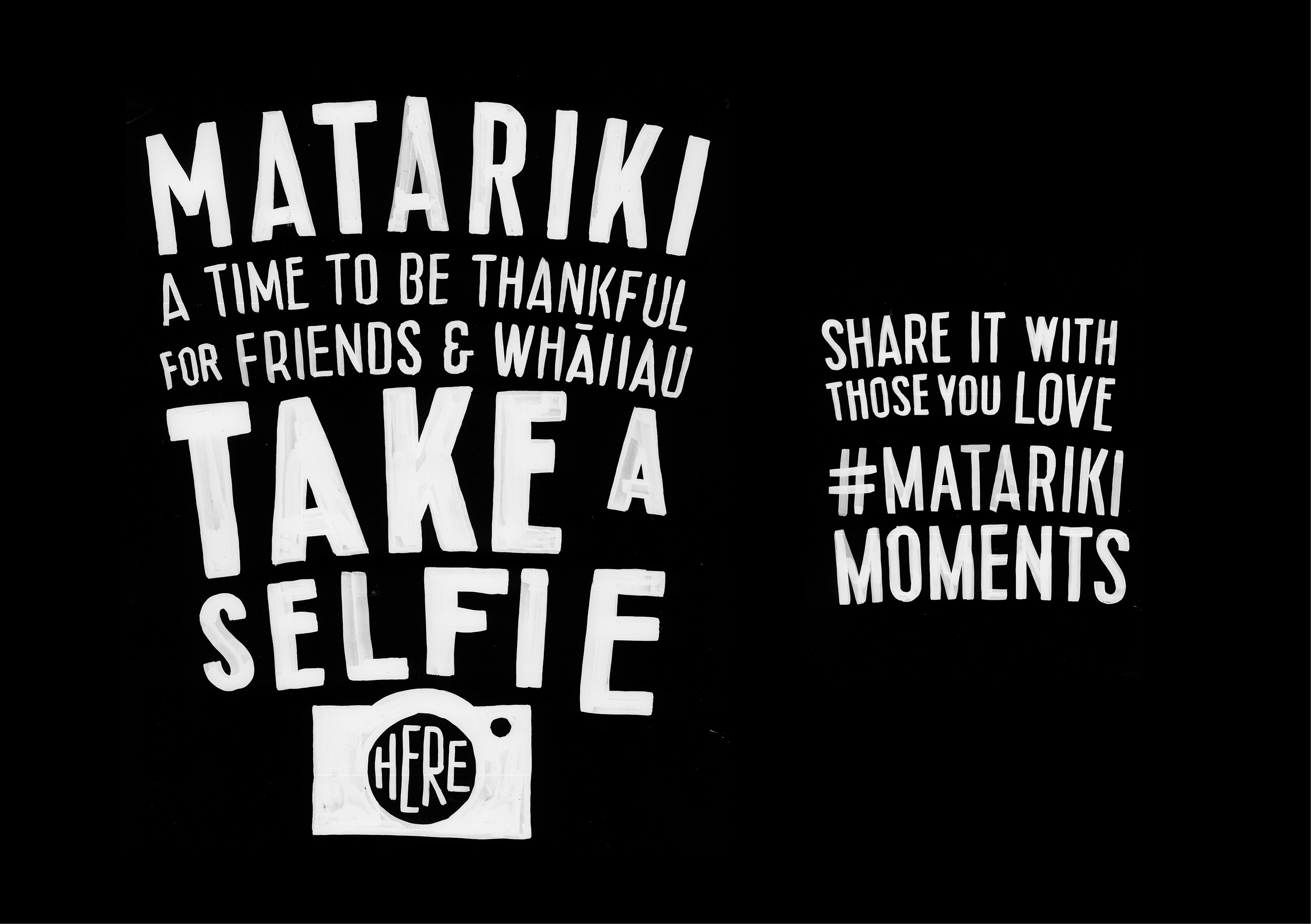
Custom typographic elements were hand painted to align with the overall visual aesthetic and the self-reflection, personal connections message. Typographic areas are designed to be obscured when selfies are taken, allowing the graphic ‘reflections’ to emanate from the person in the centre.
The Results
Our celebration of Mataraki is contemporary, yet informed by tradition, the richness of the past, and a timeless graphic feel. It delivers a way to make Matariki personal and inclusive for all, literally placing our audience in the centre of the world they are thankful for.
#matarikimoments connected with hundreds of passers-by who took a moment to reflect and share. This positive sentiment was further reinforced by our clients and partners who gave us feedback that this idea really resonated with them.


