Mark your territory
Client: University of Auckland

The University of Auckland takes pride of place on the Symonds Street Ridge. But a few years ago, you could drive right through it and not really know it was there.
And if you were a student trying to find your way around it – well, good luck with that.
We suggested to then Vice Chancellor, John Hood, that making the precinct more visible would substantially lift the brand’s profile, and an intelligent signage system would seriously help people find their way around the campus. He agreed.
The Brief
As part of a larger programme to reposition The University of Auckland and increase awareness of the role it plays, the issue of its physical presence melding with the rest of the city and not defining itself was a low burner. Any fix was a significant undertaking – complex and expensive – with three key facets: Branding, Wayfinding and Positioning.
As part of a programme we were engaged in to enhance the University's reputation and profile, we emphasised the importance of tackling this lingering issue with some serious branding signage to mark out its significant presence – and some more to help people find their way around the vast and convoluted campus. The Vice Chancellor looked out his office window at an immense neon sign proclaiming Otago University’s presence. Our advice resonated . . .
Branding
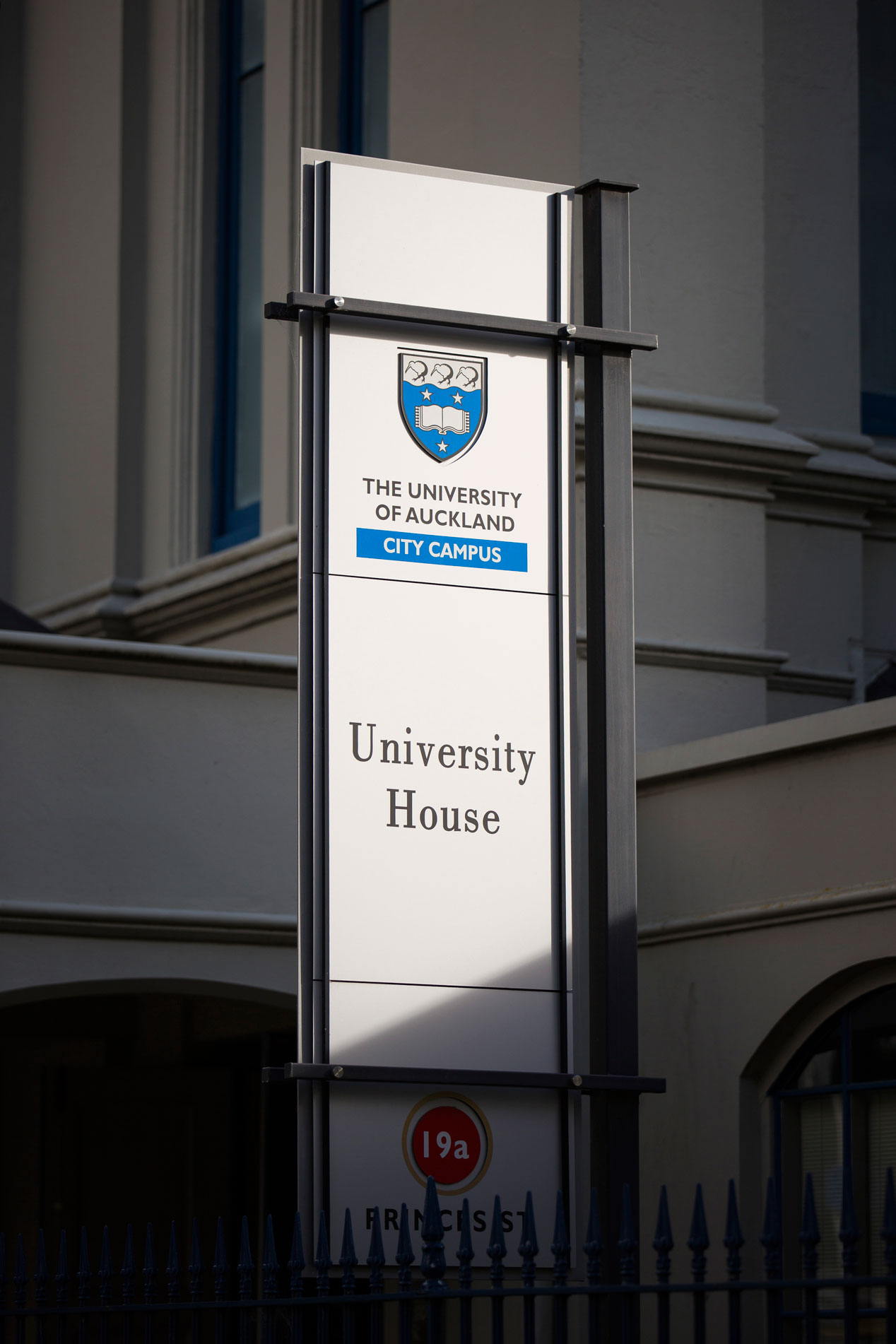
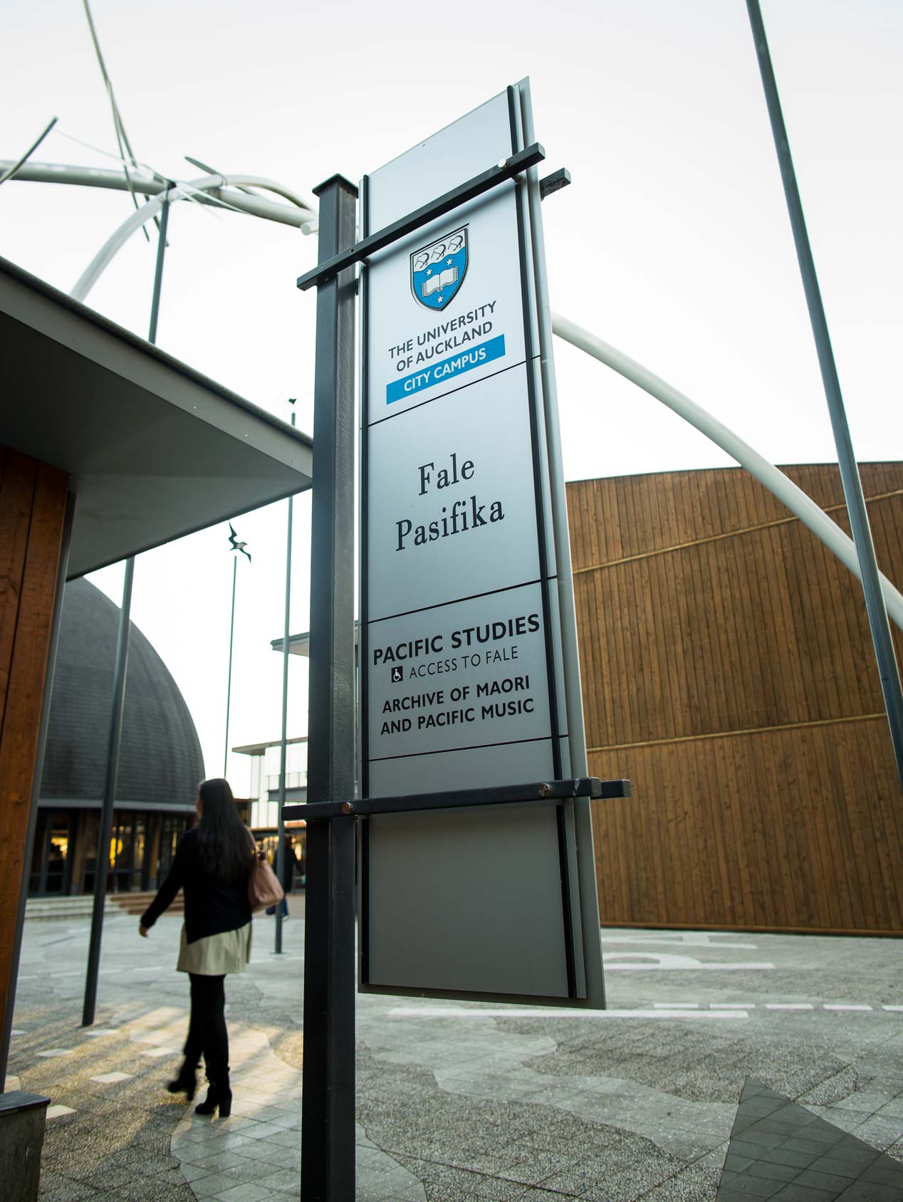
The green light to proceed sparked a clear brand statement for the university, and claimed the territory on three distinct parts of the city: the Symonds Street ridge, the Grafton medical precinct and the outlying Tamaki campus.
Wayfinding
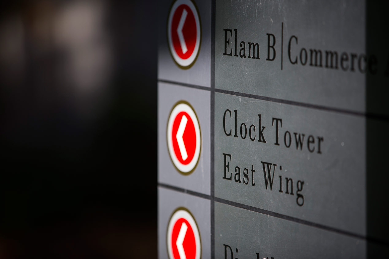
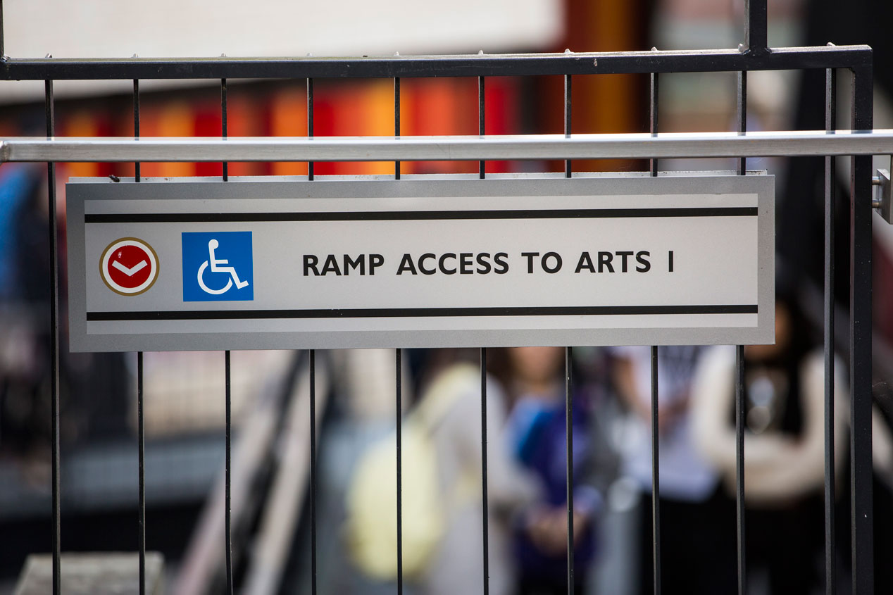
The project also involved clear location signage for every facility, lecture theatre and office throughout the university, and a clear wayfinding system throughout the byzantine meandering campus.
Positioning
The signage programme needed to recognise the university’s architectural heritage, and extend its research-led, elevated academic market position.
The Solution
The programme was broad and deep. The simplest part was claiming the territory – with large logos ‘built’ into the environment at key access points and geographic perimeters.
Much more complex was the location, orientation and wayfinding programme. Mapping the access points and journeys into and around the precinct needed to be considered for first time visitors, on foot or in vehicles, as well as those who knew how to get into the campus but not how to find their way around it. Much research went into establishing how people moved through the campus to then resolve how to aid them, using architectural clues, landscape clues and signage clarity. Where to place signs was as important as what they said and what they looked like.
The design solution was sophisticated and structural in order to sit as a considered part of the fabric of the university and reflect the ‘ivy league’ aspirations of the institution. We recreated traditional forms, suited to the sense of antiquity through much of the campus, in fresh, crisp ways using 21st century materials. Combining traditional materials such as stone with sleek anodised aluminium finishes and matt paint finishes created a sense of longevity. Using finger signs rather than solid sign boards for directional signage created a more see-through and less obstructive object, allowing for greater flexibility of messaging and breaking up long list into visually manageable clusters.
Colour was also considered with great care – the university’s corporate blue and silver assisting with branding and environmental appropriateness, and a deep ruby red being reserved solely for direction components.