The beating heart of engaging education
Client: Heart Foundation
2023 BEST AWARDS - BRONZE
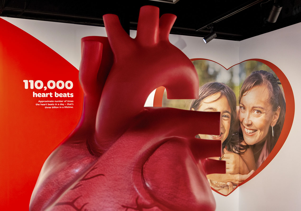
A giant beating heart and an engaging interactive experience educates visitors on how the heart works to drive more informed heart health decisions.
The Brief
The Heart Foundation approached us to create an enhanced visitor experience for their Auckland premises. They wanted an experience to connect with their communities, fostering open and informed conversations about heart health. The experience needed to include a strong educational aspect that demonstrated how the heart works including the cause, and treatment, of common conditions. Our key challenge was to balance the need for medically accurate information, with the simplicity required to allow audiences to understand and engage.
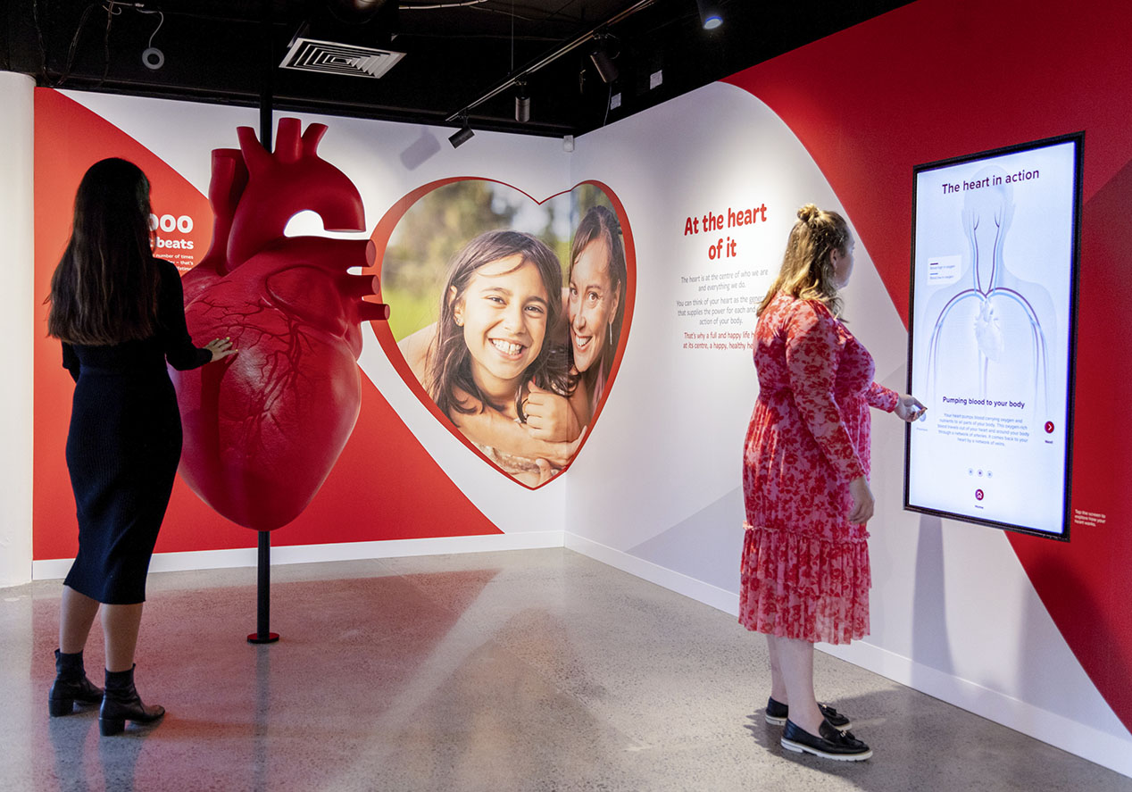
The concept for the overall visitor experience saw the content grouped into three zones: (1) the physical heart; (2) heartfelt conversations; and (3) the Heart Foundation. The first zone is where we focused on using technology to explain the physical heart, in the form of a heart sculpture and a heart-interactive.
The Solution
The giant heart sculpture, near the main entrance, is made of fibreglass and stands at over two-metres tall, compelling visitors to engage with it. 3D projection offers an accurate depiction of a beating heart, complete with pumping veins and arteries. The realism is further enhanced by the addition of a rhythmic heartbeat when in proximity to the sculpture.
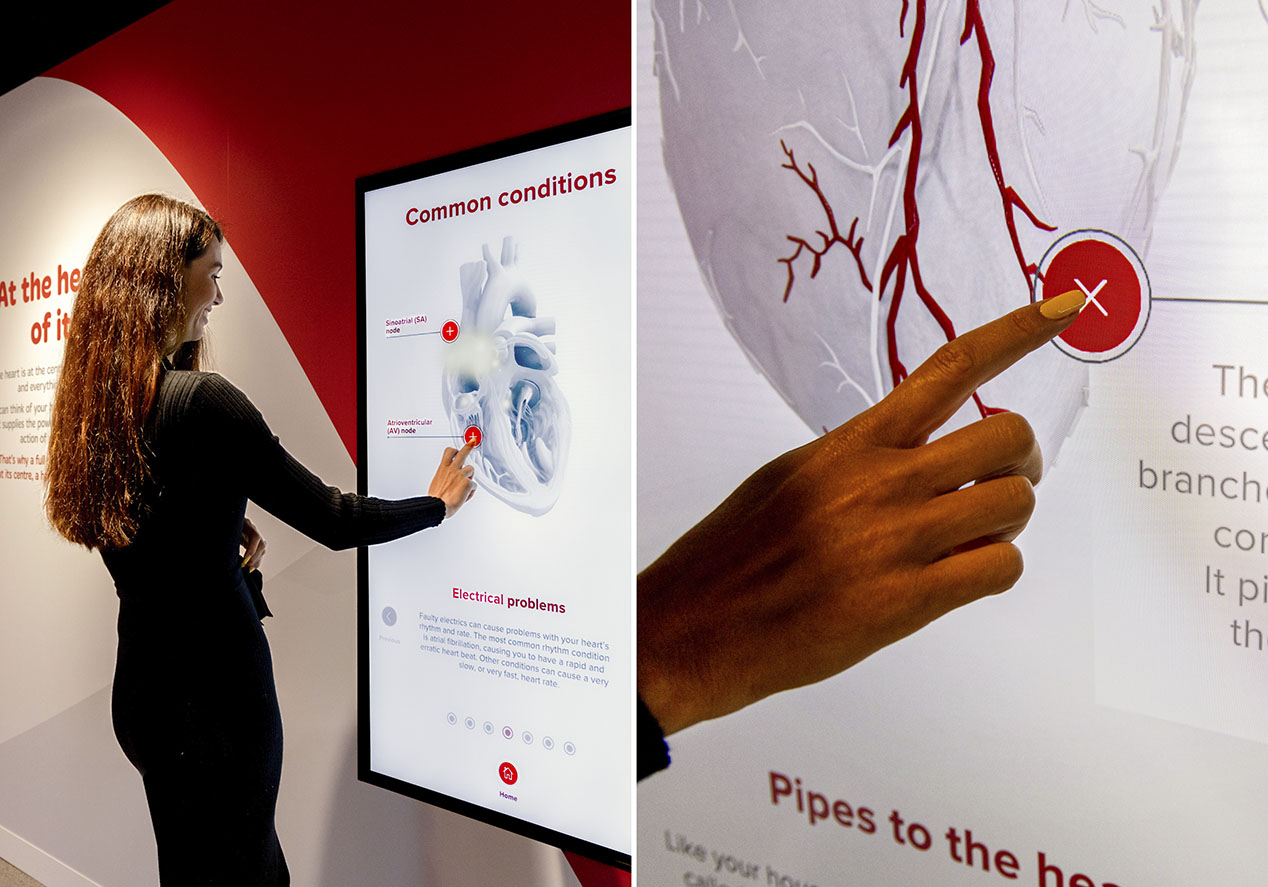
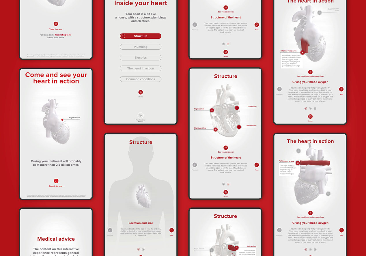
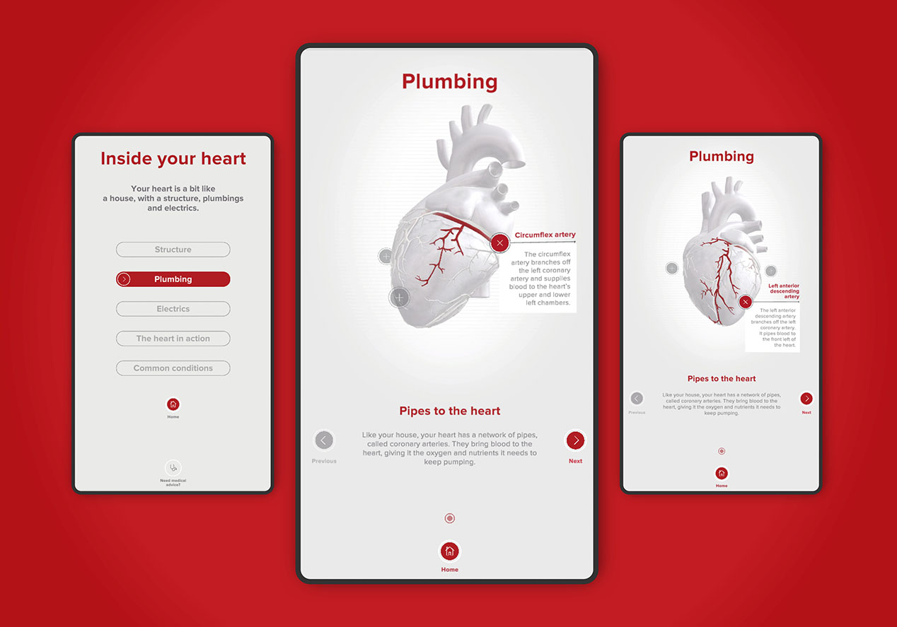
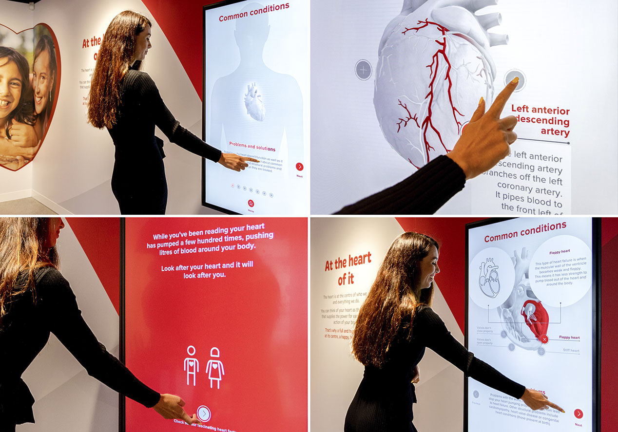
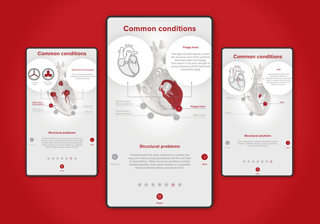
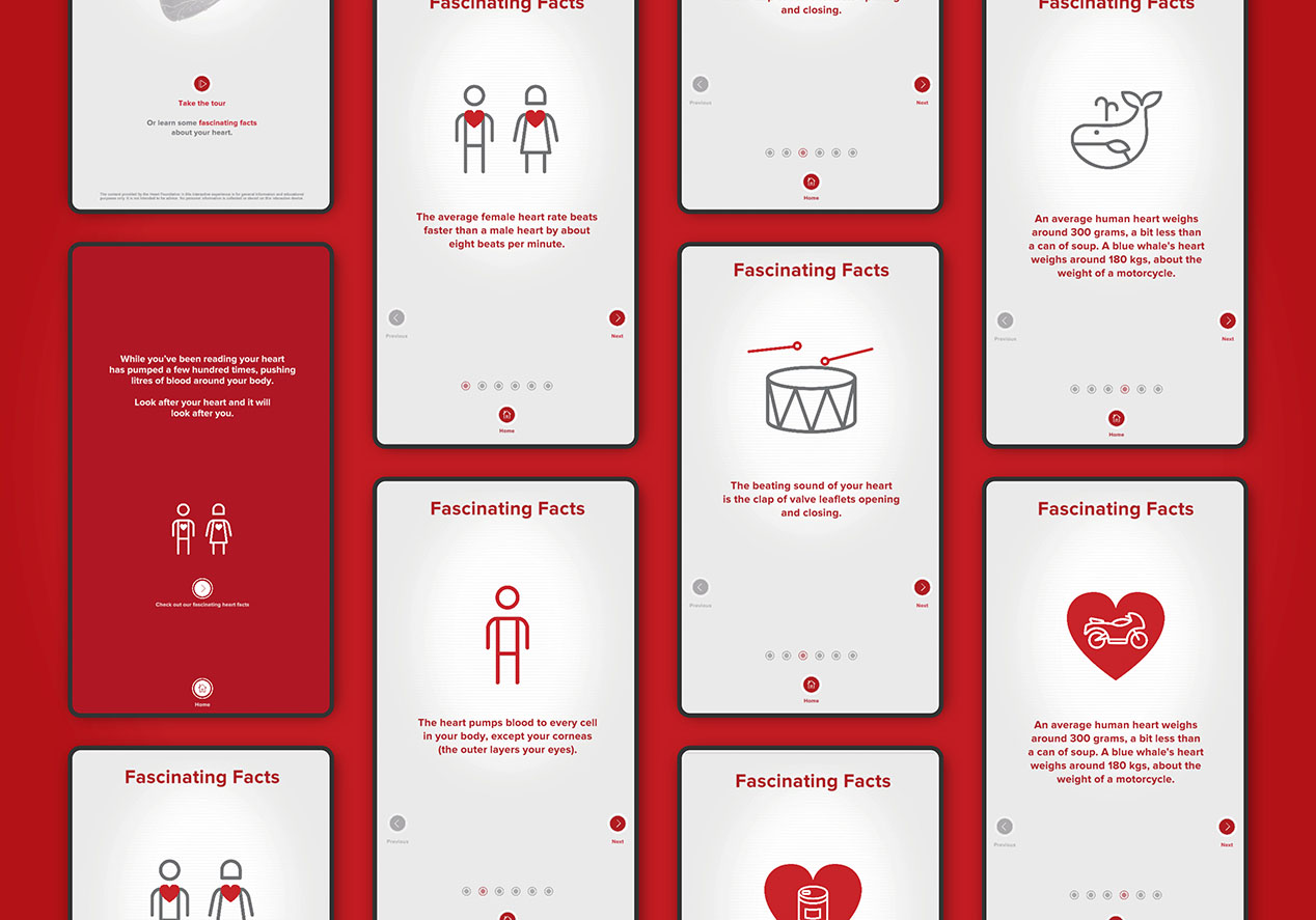
Behind the big heart is a large wall-mounted interactive screen that takes users deep into the mechanics of the heart. We adopted a simple ‘house’ storytelling analogy, complete with descriptions of the heart’s walls, electrics and plumbing, to make it easier for audiences to understand. Each section allows the user to simply click or swipe to explore how the heart works, common conditions and common treatments. The medical information is complemented by a less serious ‘fascinating facts’ section that offer real-world context to heavy medical facts.
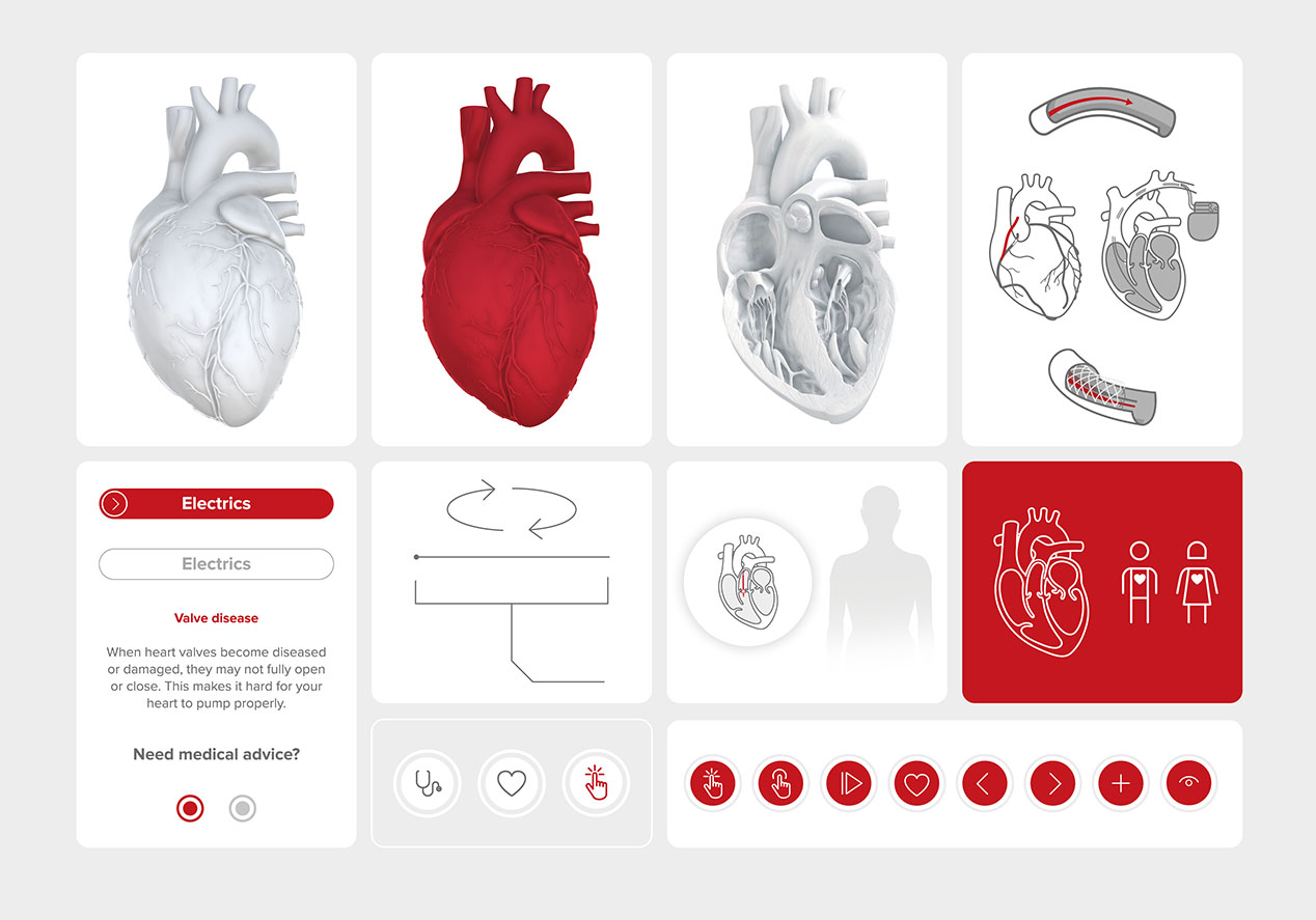
The design of the overall visitor experience was led by The Heart Foundation’s red and a dynamic and flowing Māori and Pacific weave, to represent the community. We carried these elements through to the heart interactive, while also dialling up the use of white. A white on white central heart, allows a clean, uncluttered and easy feel, and lets other colours pop to highlight different aspects we wanted users to focus on.
Given the complex content, the focus was on designing intuitive UX and UI that allowed users to control the direction and pace of their experience. An initial prototype was developed with the support of medical specialists ensuring the experience was medically correct. From there, the focus was on simplifying the visuals and language to make it more accessible for users. Navigation was kept simple, utilising universally understood symbols. A series of prototypes were developed and used for ongoing testing of content, design and UX elements, allowing the best finished product possible.
The Results
The Heart Foundation are delighted with the experience. Feedback from audiences has been extremely positive and discussions are already underway about how to make it accessible to more health professionals and communities throughout New Zealand. Medical Director, Dr Gerry Devlin, commented that “every heart specialist should have access to this resource to explain how the heart works to their patients.”
