A ‘work in progress’ brand
Client: Insight Creative
As we were developing Playful, we briefed the creative team in our parent company, Insight Creative, to develop a strong brand identity that reflected our name, while resonating with studio and playtesters. That identity is now up for a number of global awards. Here’s the story behind it.
The Brief
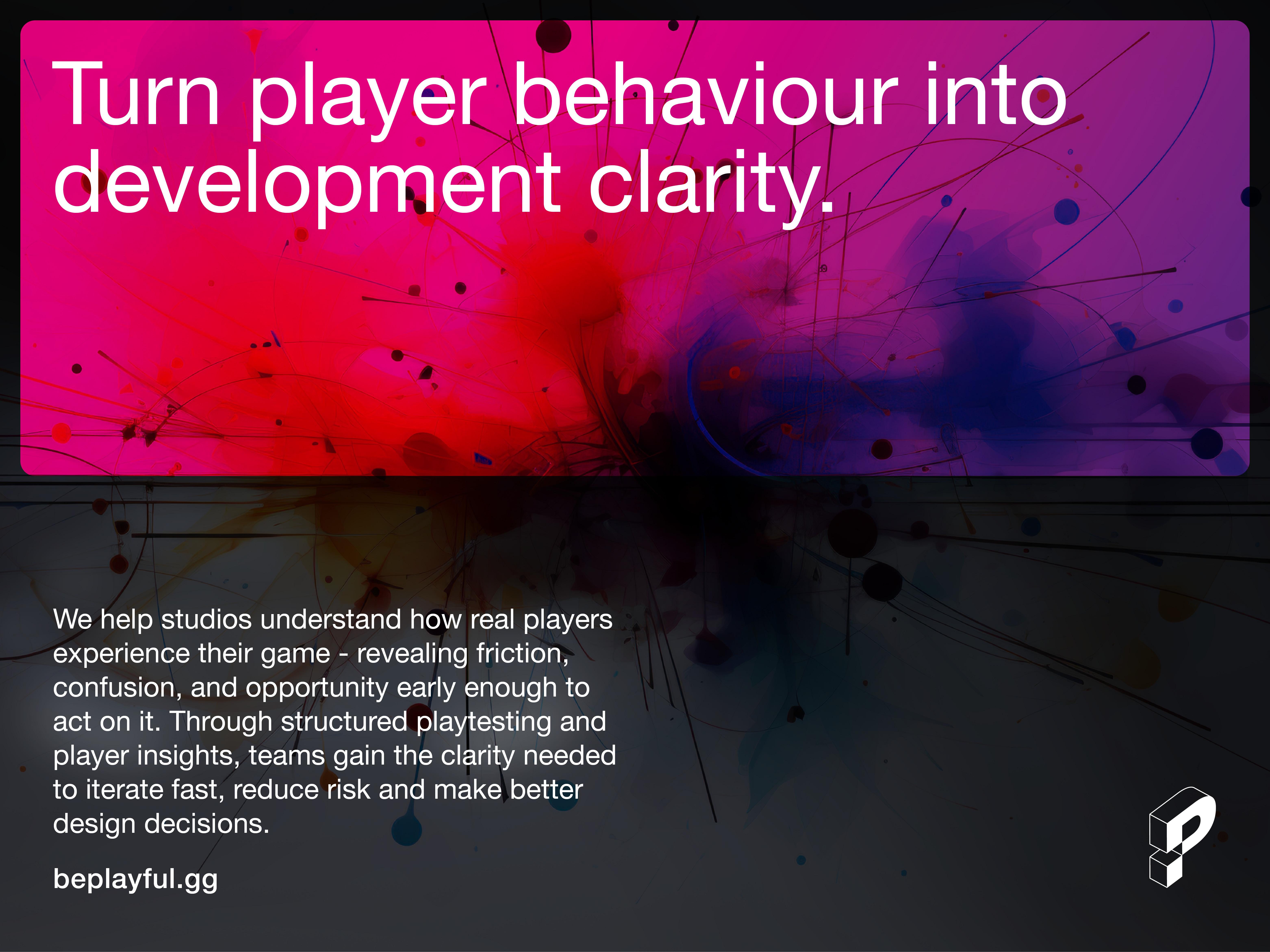
Built by game developers for game developers, Playful is a game playtesting service that connects studios with real players, turning player data into actionable insights that helps build better games.
The challenge was creating a brand that could sit comfortably between two very different audiences. It needed to earn the trust of studios investing time, money and creative energy into their games, while also engaging a diverse global community of playtesters motivated by curiosity, challenge and a love of playing games.
The identity needed to feel credible without becoming corporate. Fun but not childish. Flexible enough to work across multiple game genres, digital platforms and marketing channels. Bold as to enable a new entrant to stand out in a highly competitive global market.
The Solution
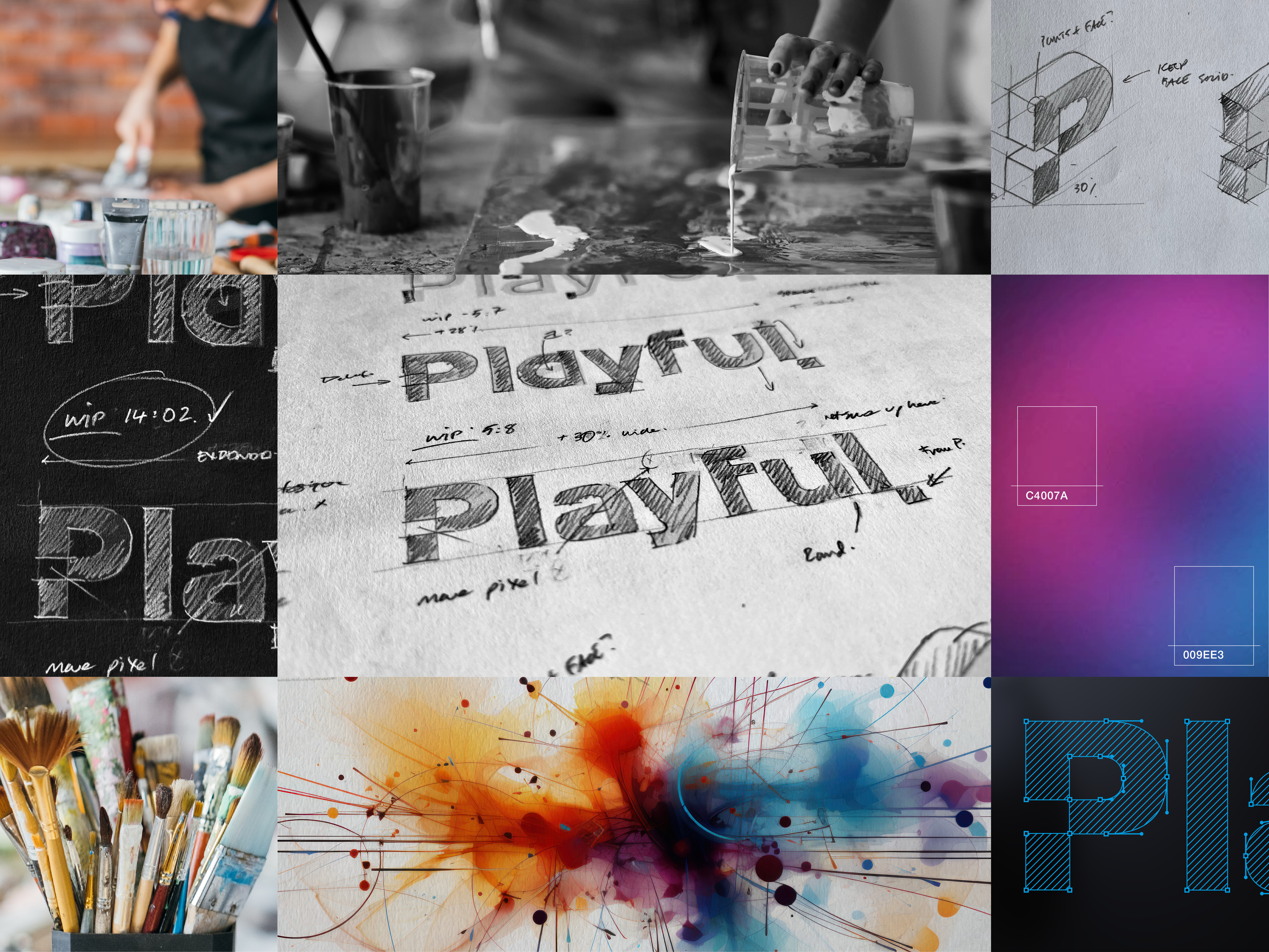
The design breakthrough came from recognising that Playful isn’t actually just about testing games. It’s about helping games evolve. Every game is shaped through countless iterations, with each playtest creating another opportunity to improve. Playful gives studios the evidence to decide what comes next. That insight became the single-minded idea behind the identity: Work in progress.
Rather than creating a finished, polished gaming brand, we deliberately built an identity system that feels like it’s developing.
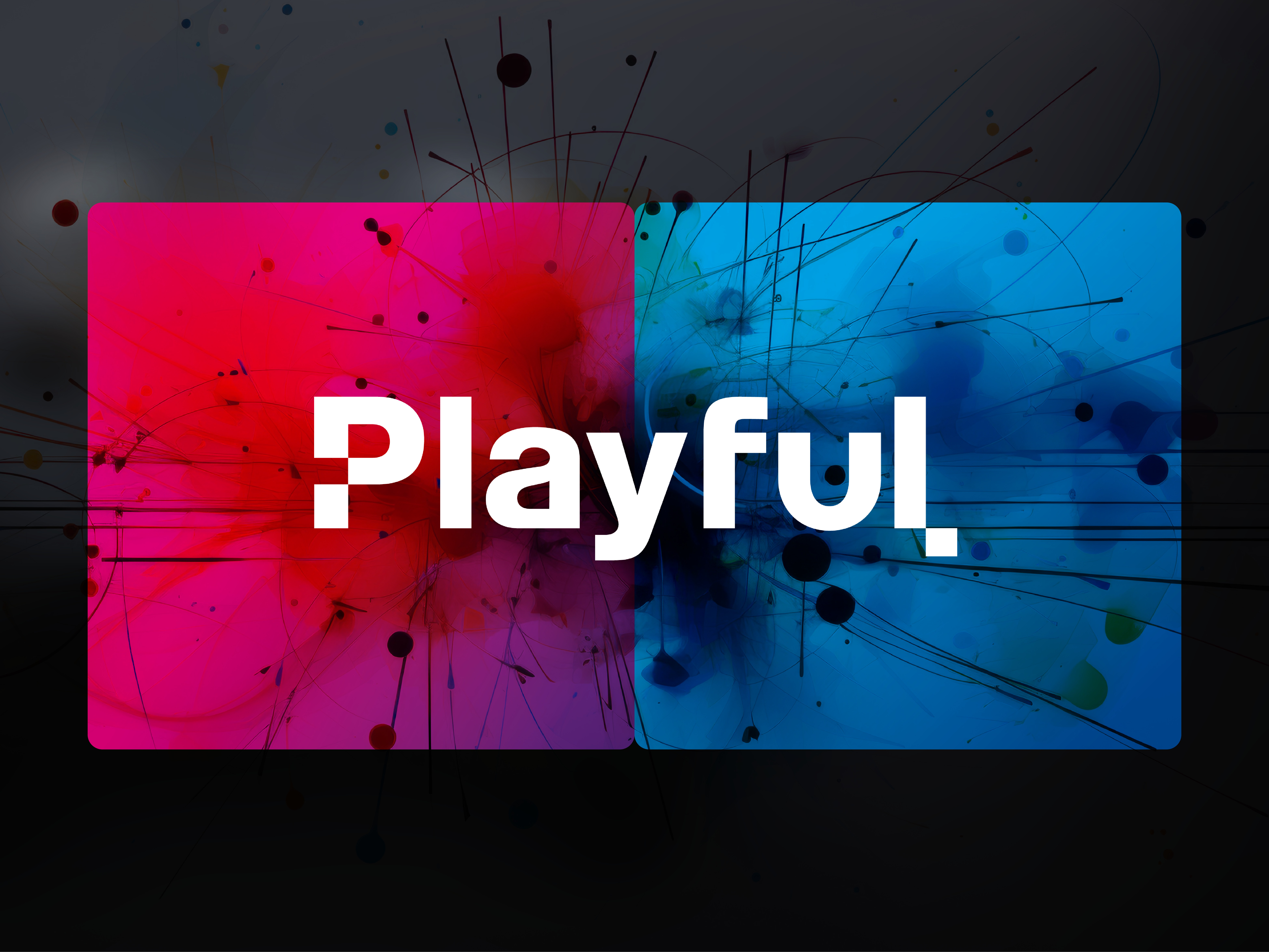
The custom wordmark combines rounded forms with strong screen readability and accessibility. An intentionally irregular pixel moves from the P to the L, creating a subtle visual cue that it is still being refined. It represents both the creative experimentation of indie developers and the role player feedback plays in shaping a better game experience.
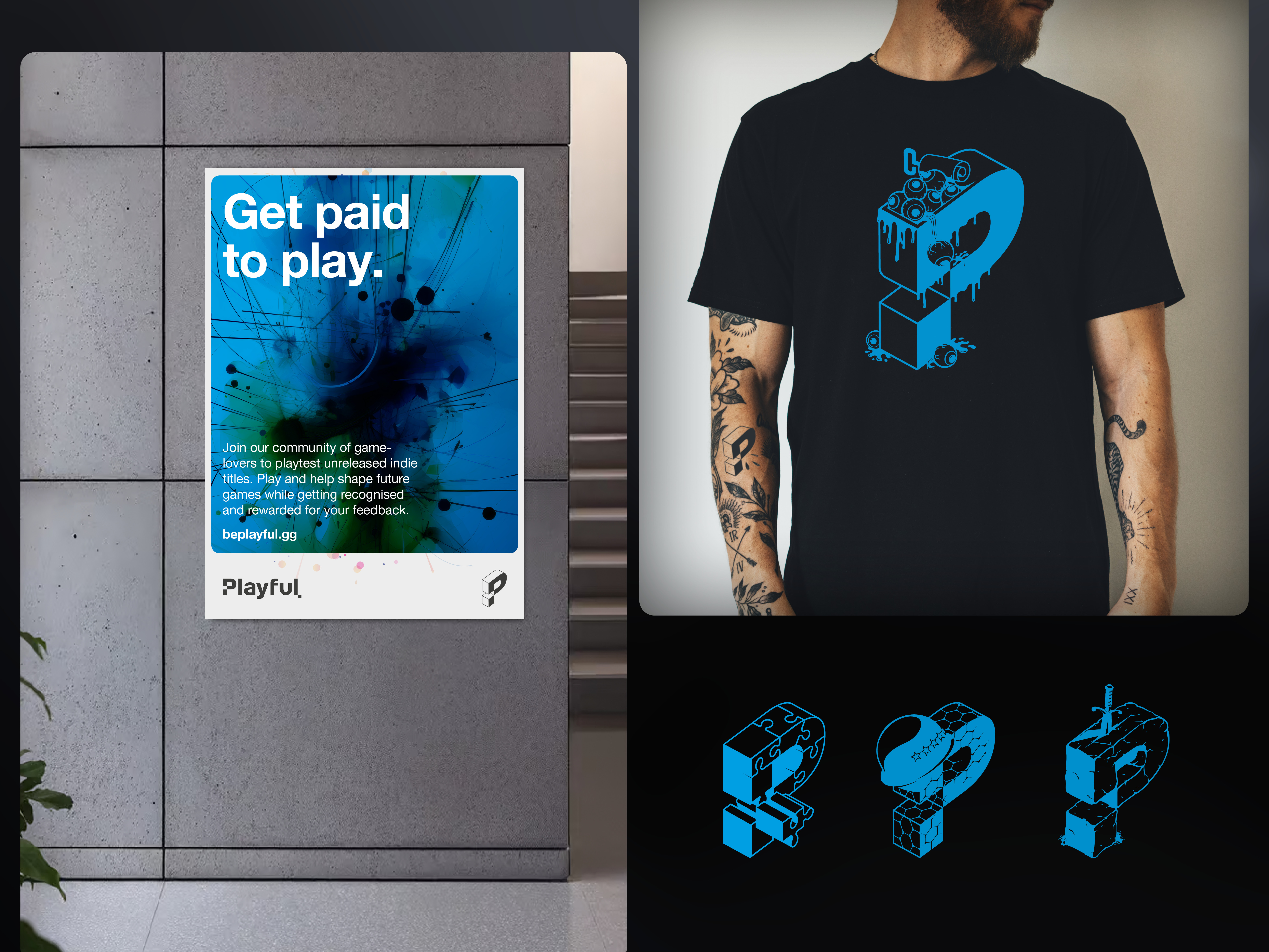
The isometric P icon extends this thinking further. Built from a visible structural framework and partially formed surfaces, it reveals the mechanics behind the finished product. It is a visual metaphor for the work behind the scenes as developers test, learn and improve.
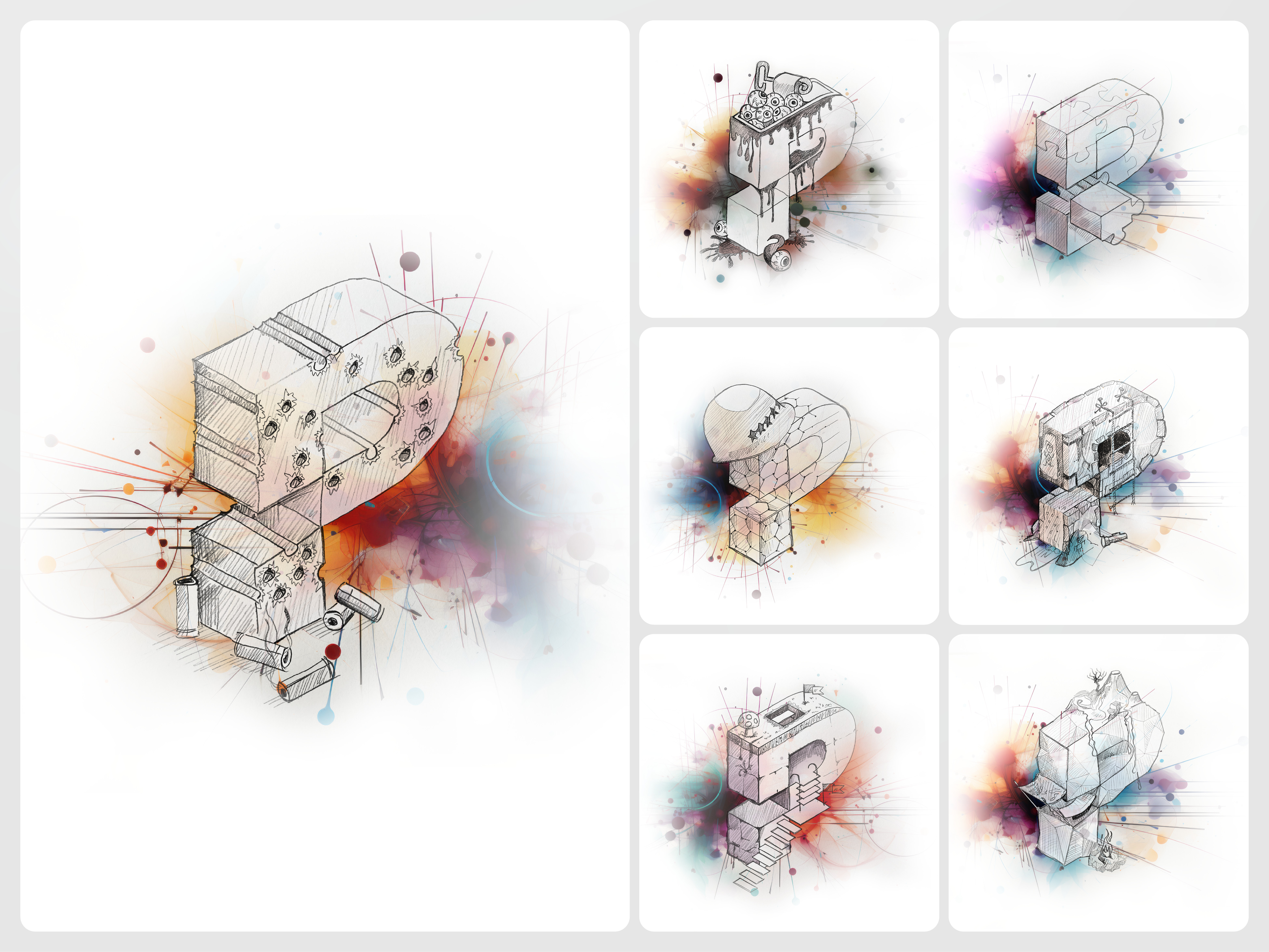
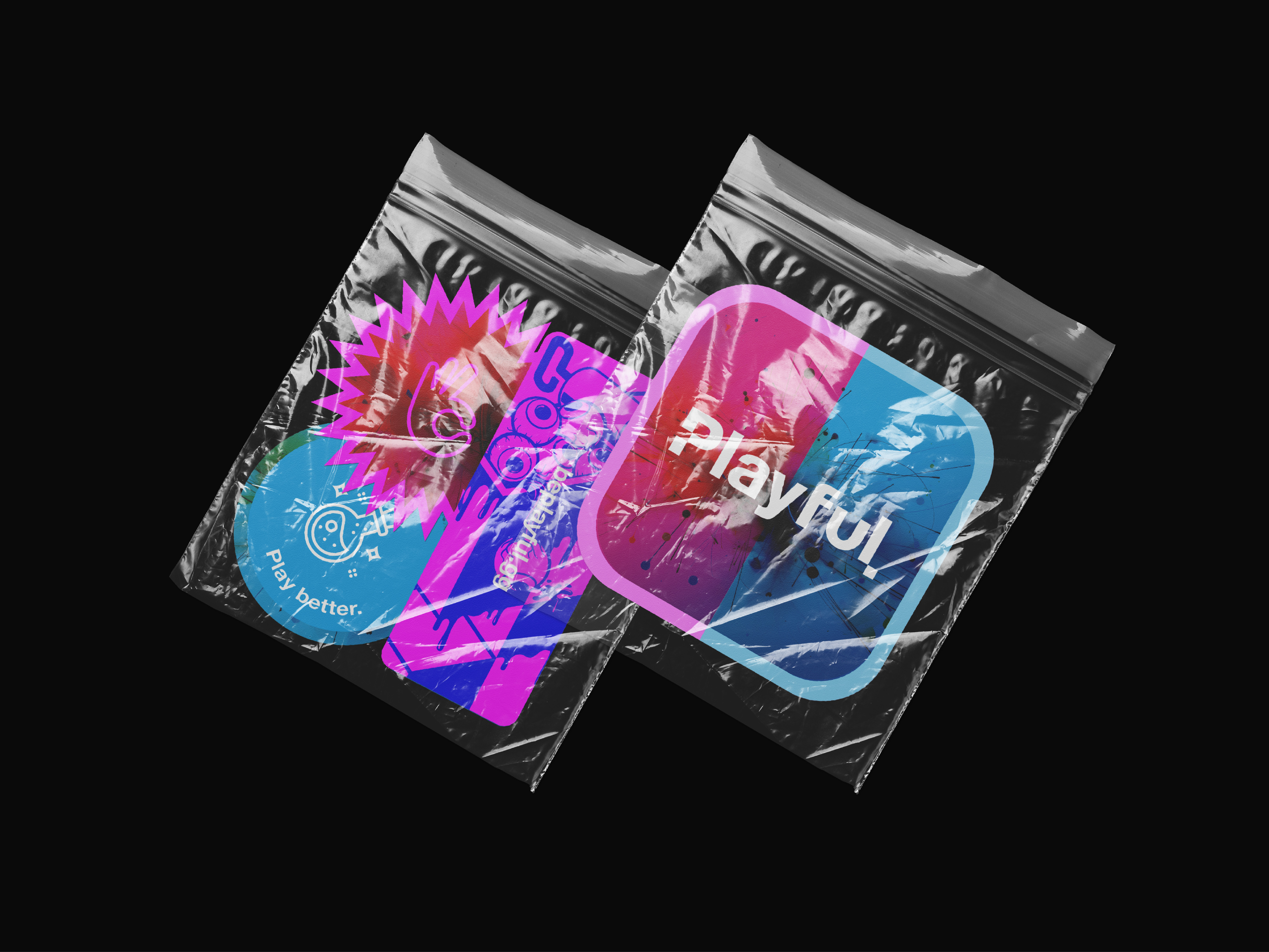
To reinforce both the breadth of Playful’s offering and the playful spirit of our brand, we created twelve hand-drawn genre-specific P illustrations. Their sketch-like style complements the ‘work in progress’ concept while celebrating genres ranging from horror and strategy to simulation and sports.
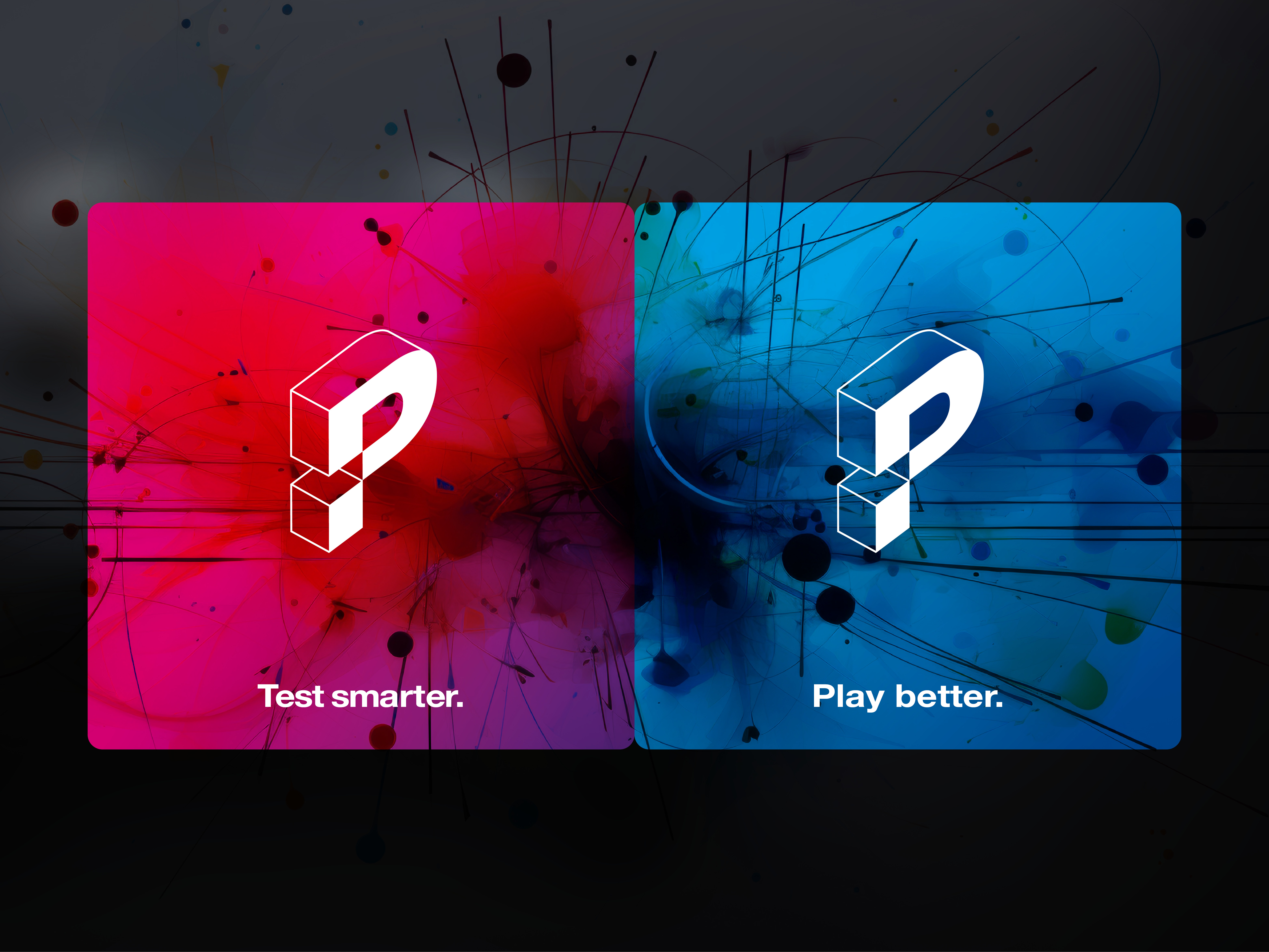
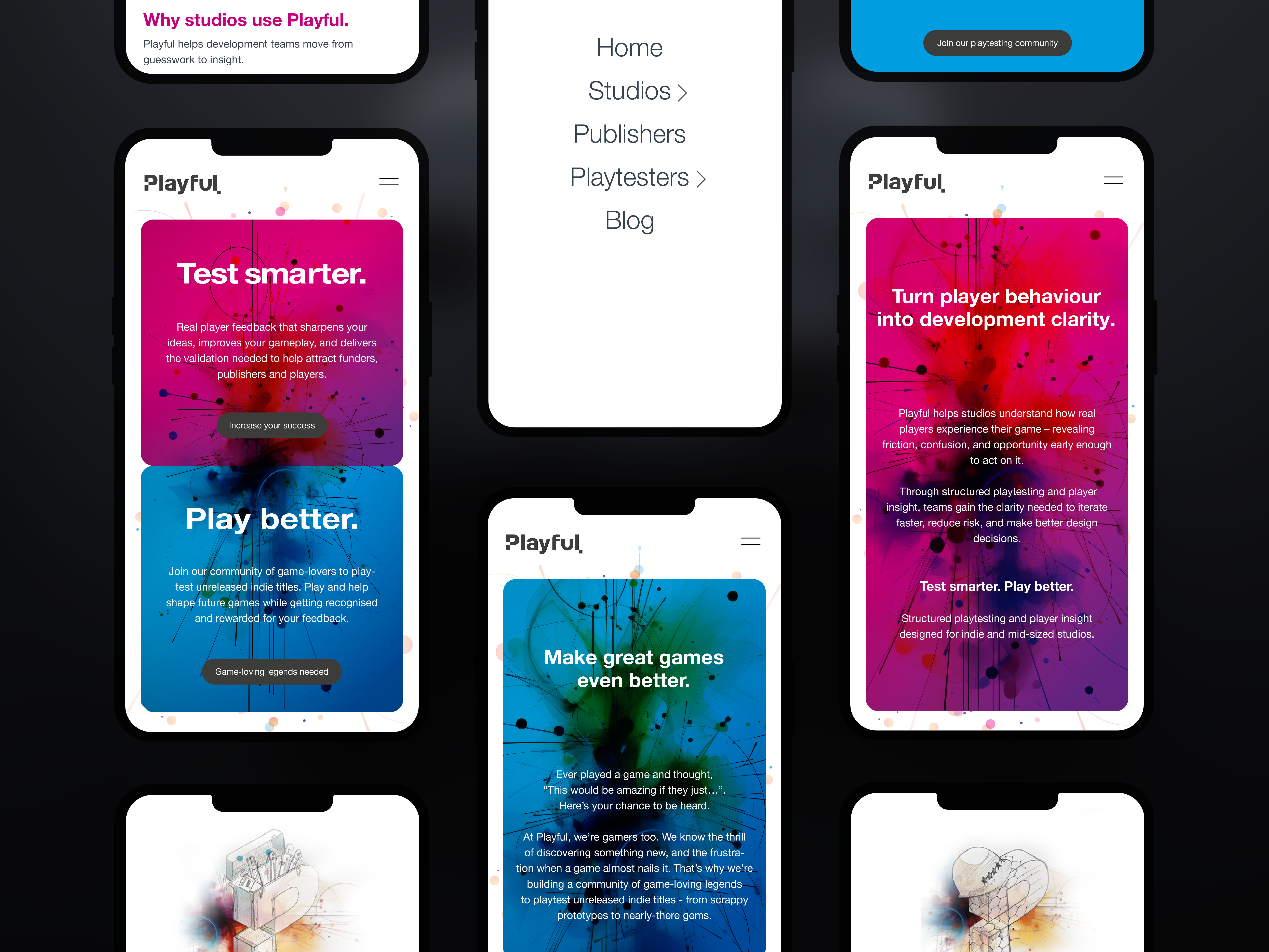
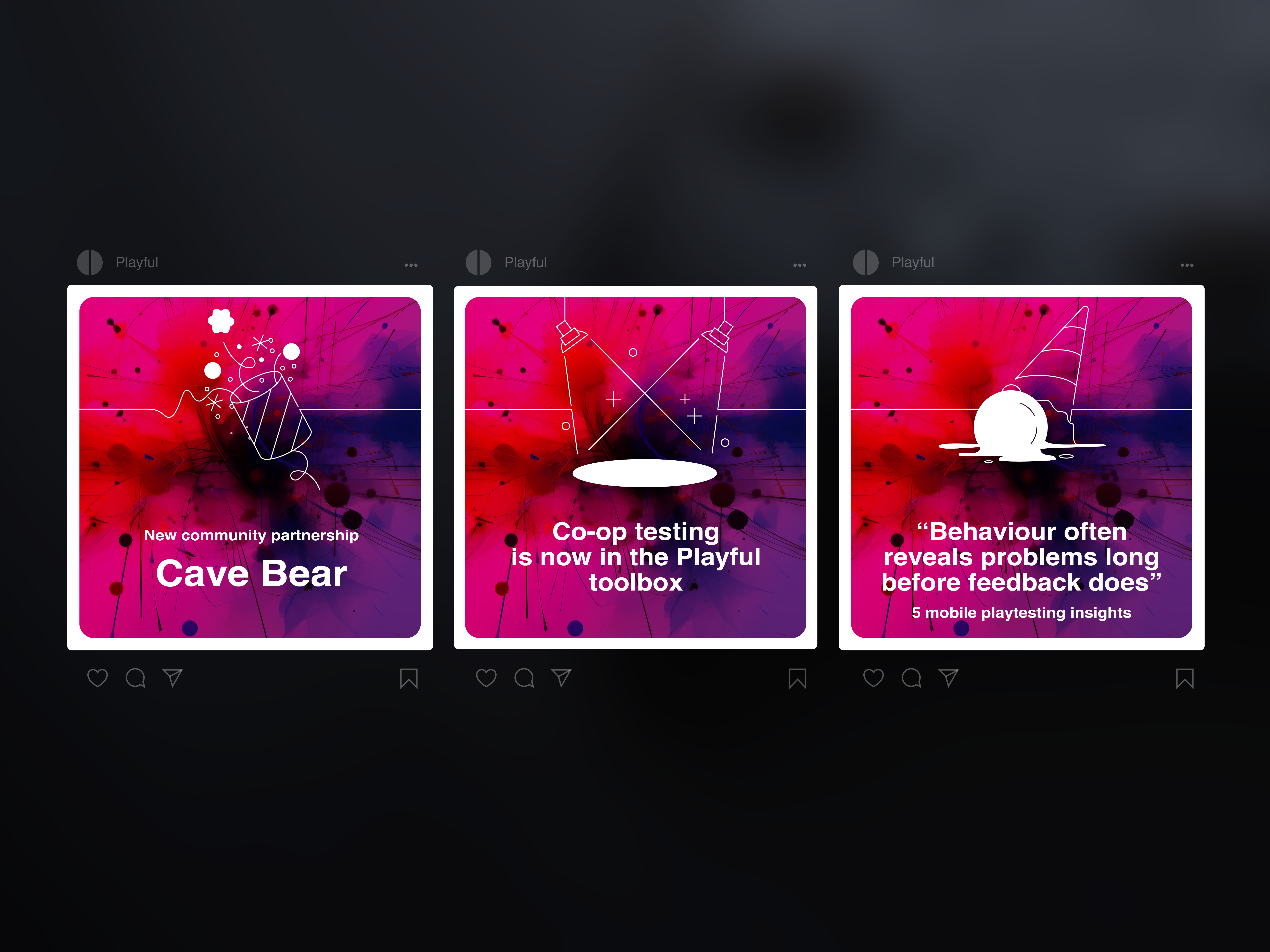
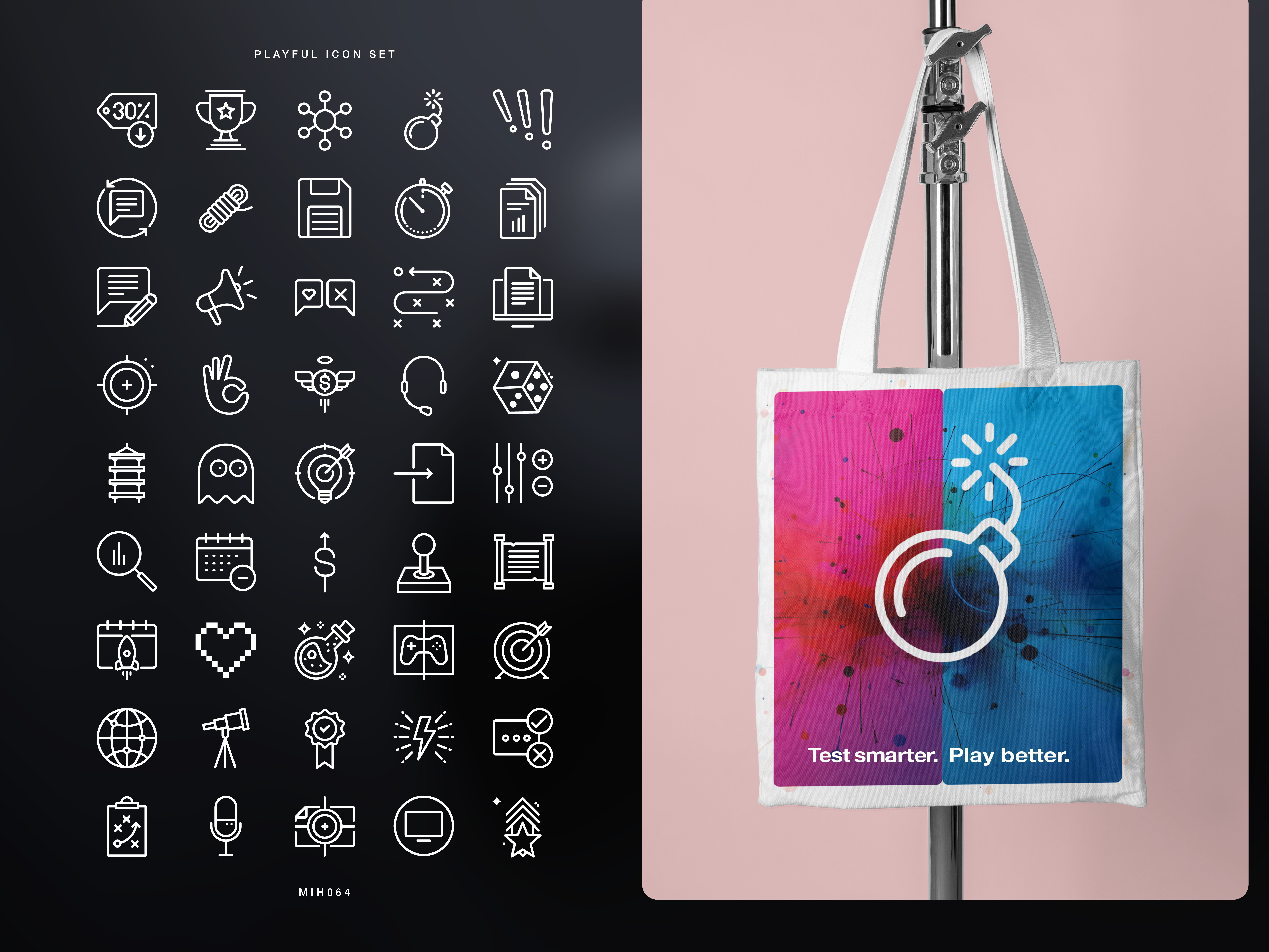
A dual-colour system was developed to create clear distinction between studio and playtester communications. These two worlds are then united through a dynamic energy burst graphic that flows across both palettes, symbolising the dynamic creative process where testing, insight and improvement continually fuel each other.
The Results
The identity has given Playful a distinctive position within the games industry by expressing an idea rather than simply promoting a service. Every visual element reinforces the belief that great games are built through continual testing, learning and refinement. In doing so, the brand transforms work in progress from a development reality into Playful’s defining promise.