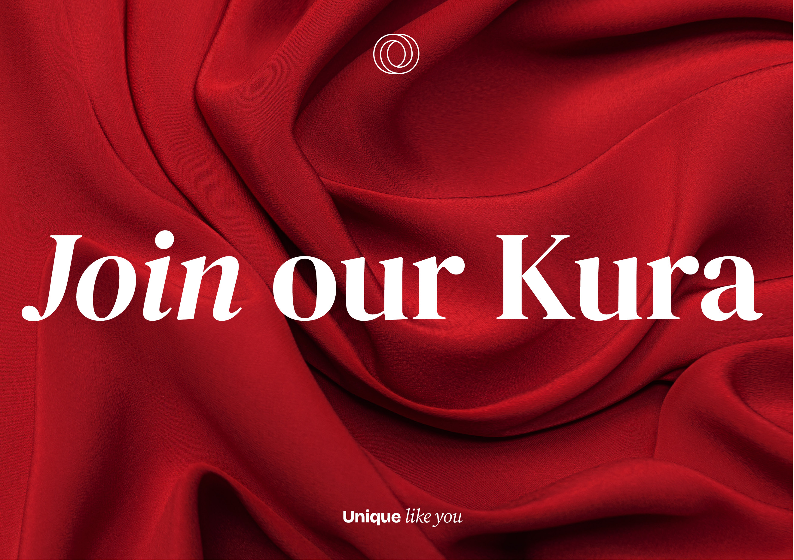
Unique, like you
Client: Toi Whakaari: New Zealand Drama School
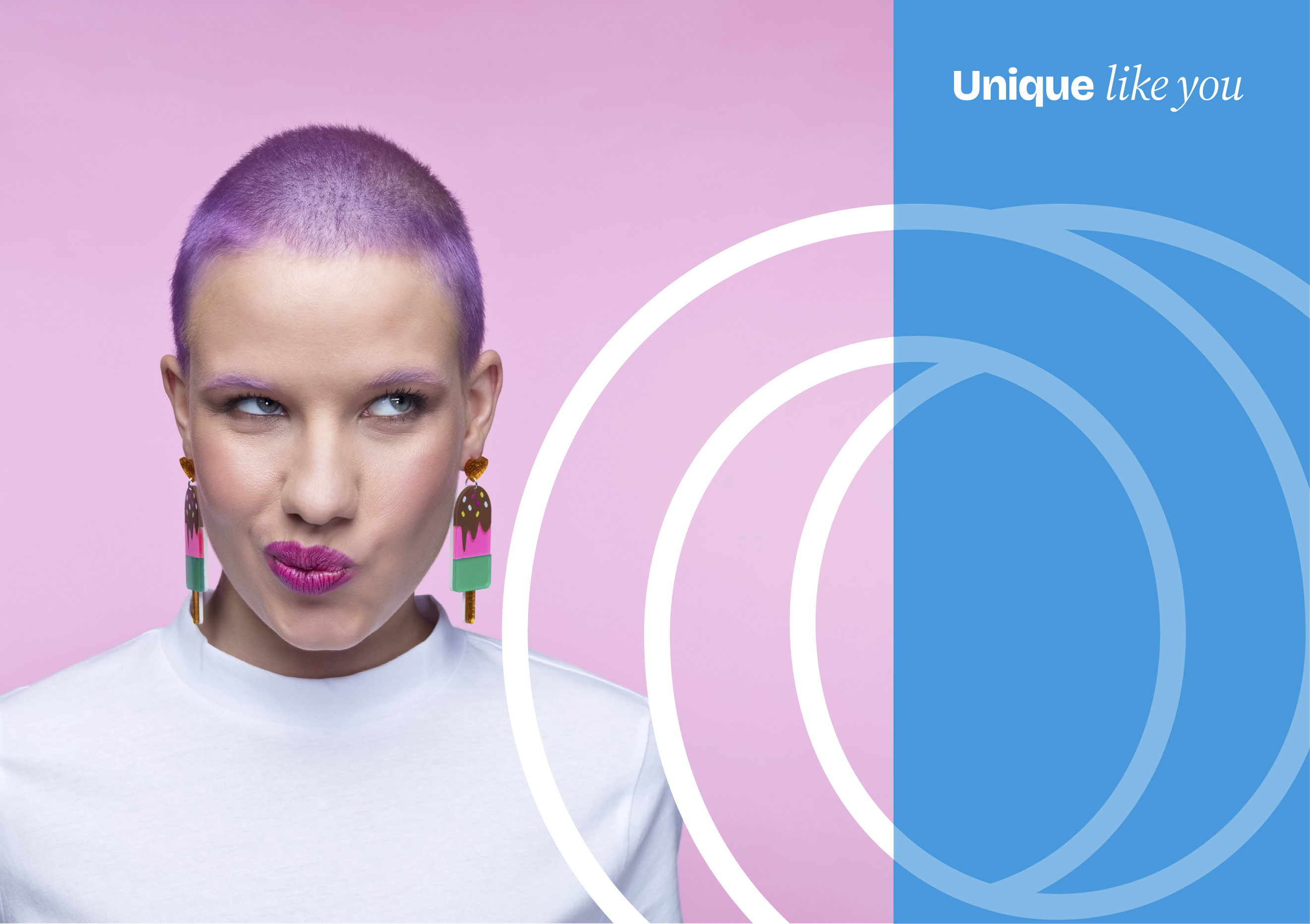
Capturing the creativity, individuality and passion of students and the unique te ao Māori-world view Toi Whakaari: New Zealand Drama School take to learning and engagement.
The Brief
Toi Whakaari is New Zealand’s premier performing arts school. Following a strategic review of their proposition, we were bought in to drive growth through greater awareness and understanding of who they are and the difference they make for students, the performing arts industry and Aotearoa. Effectively, our role was to help them tell an effective and consistent story that inspires their audiences to engage with them. We agreed a structured process that kicked off with an immersive Discovery workshop involving their senior leadership team.
The Solution
The initial stage focused on the story that defined Toi Whakaari. We developed 5 positioning directions, each with an expressive short story and a mood board. Co-designing with the client we narrowed it down to two clear directions which we developed further. The client then engaged their Board, students, industry and other stakeholders to get a sense of what resonated the most.
‘Unique like You’ was chosen as the preferred direction, capturing the creativity, individuality, and passion of students and the unique te ao Māori-world view TOI take to learning and engagement. We developed an engaging brand story and extended it into a series of key messages tailored to students and their families; alumni; industry; donors and supporters; and the wider community. The final strategic element was to develop a plan to engage each audience in the most effective way.
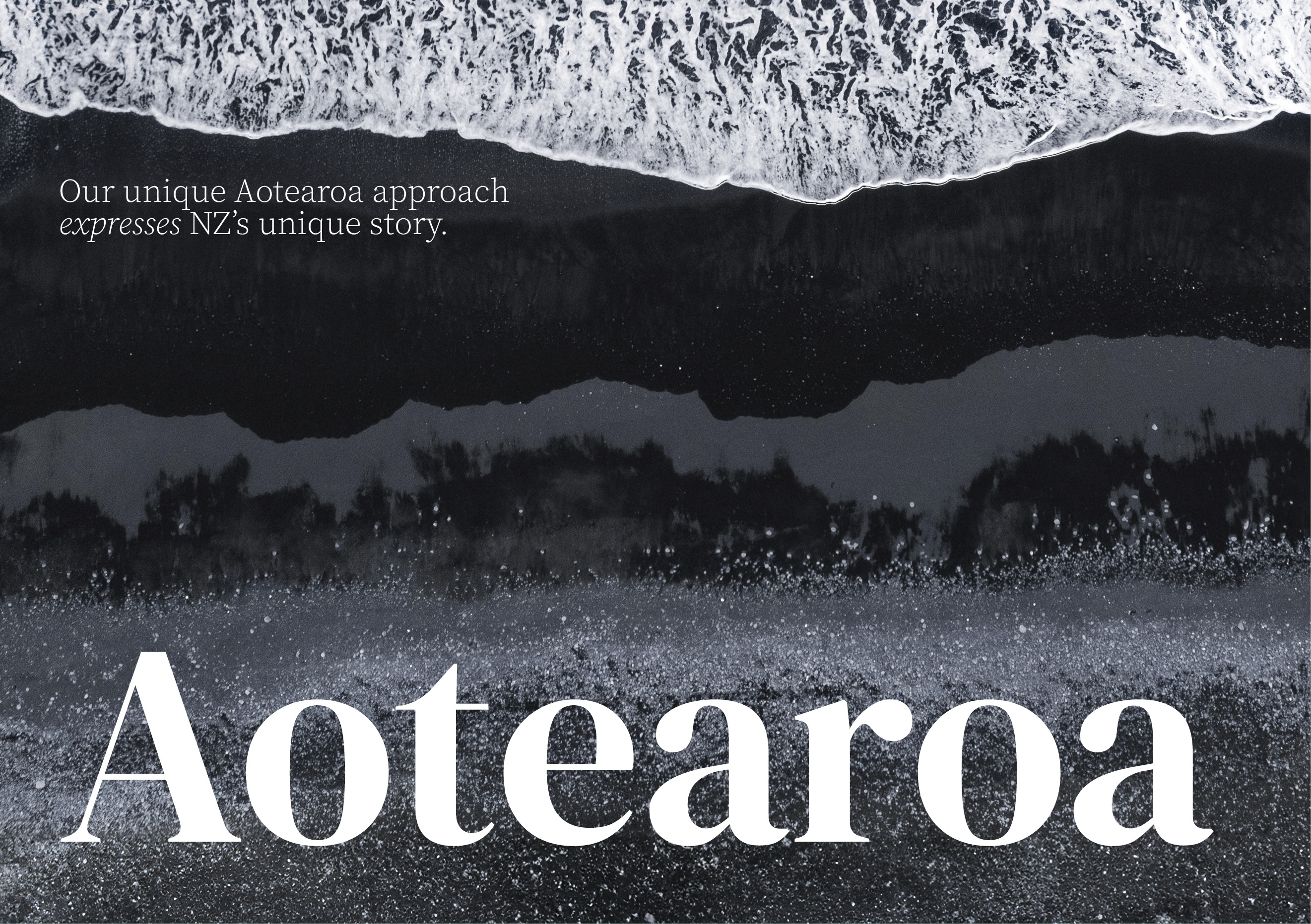
Next we advanced their visual identity to tell the Unique story in a strong, collective and authentic way that exuded quality and Aotearoa New Zealand.
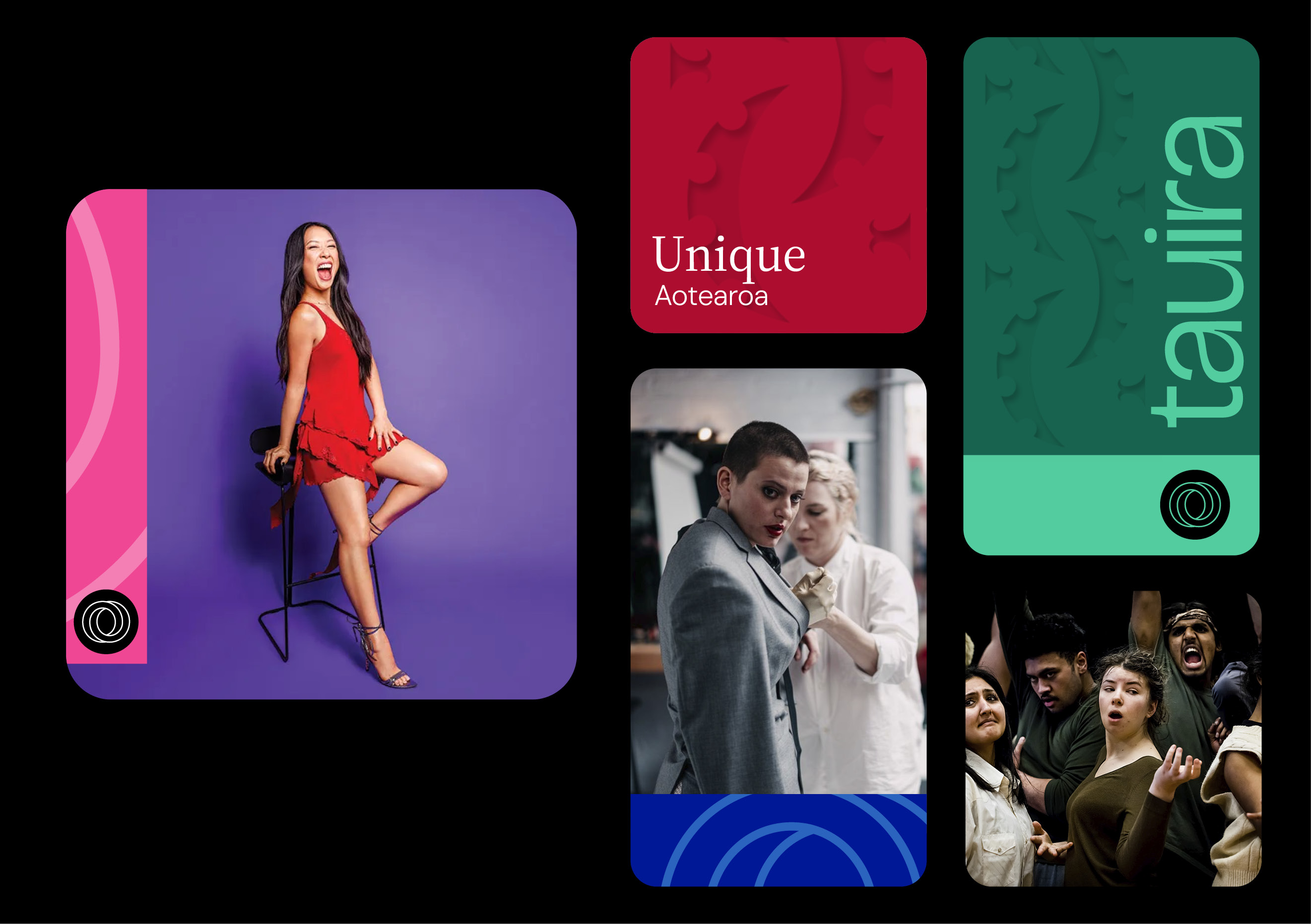
Our first recommendation was to activate the logo, making it an active player integrated in all our communications. The O of TOI became a meaningful device, incorporated either prominently or subtly, into graphic layouts and also used as a quality mark.
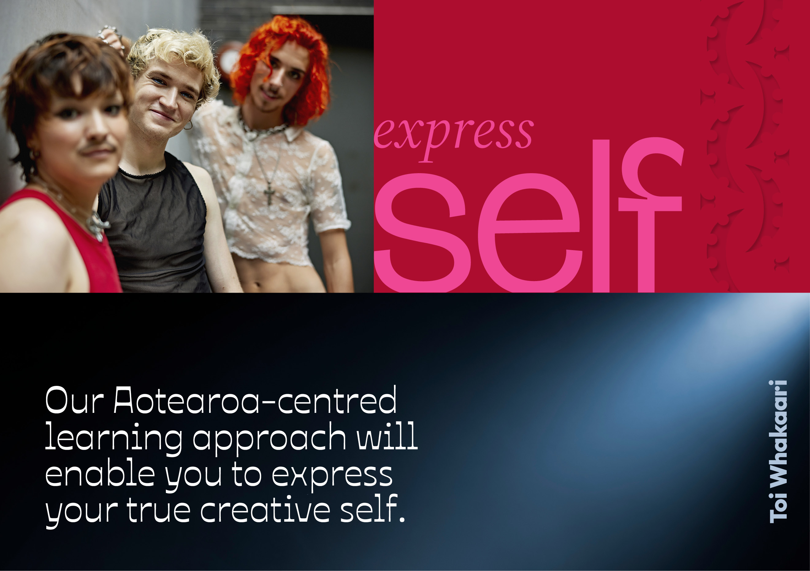
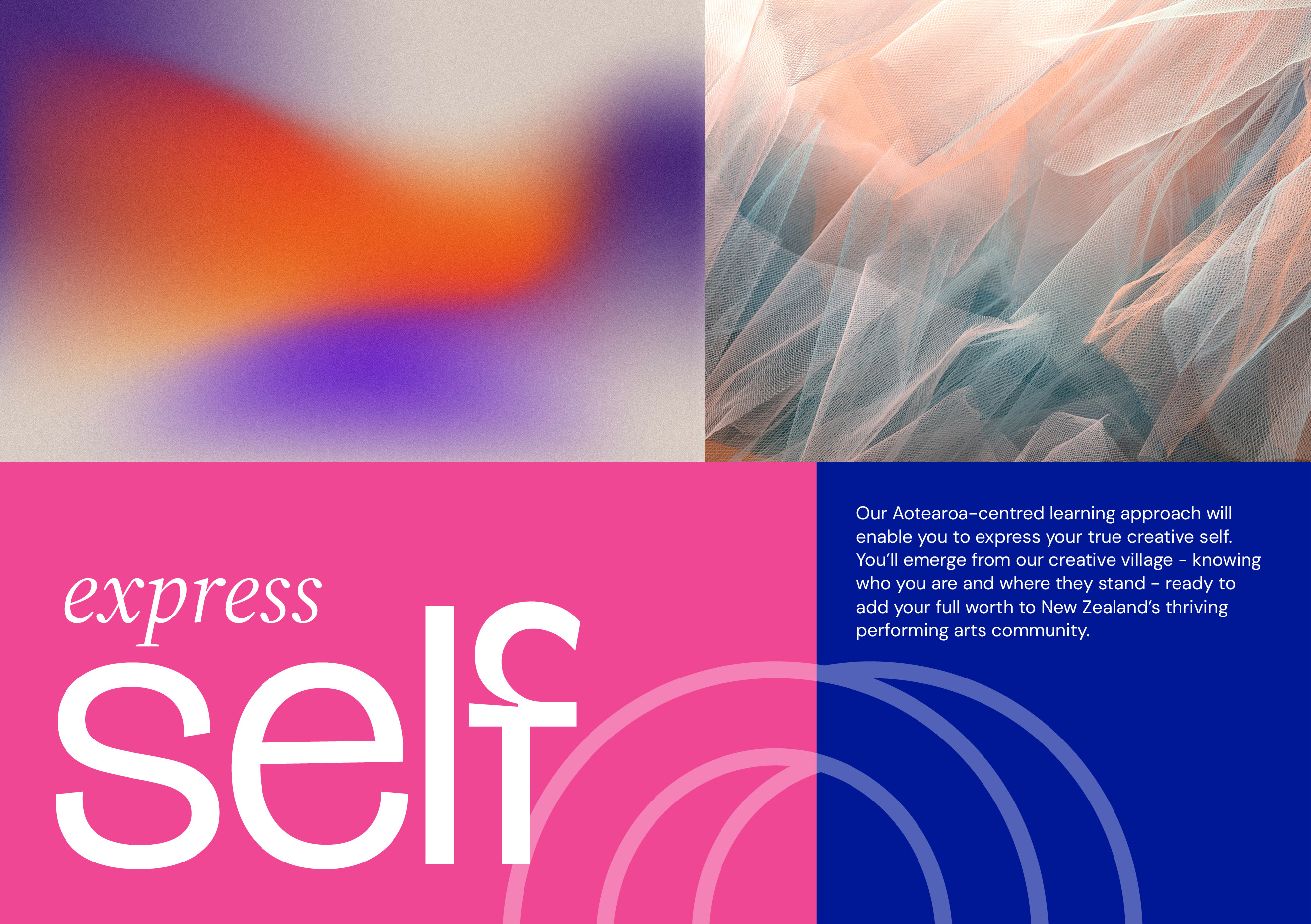
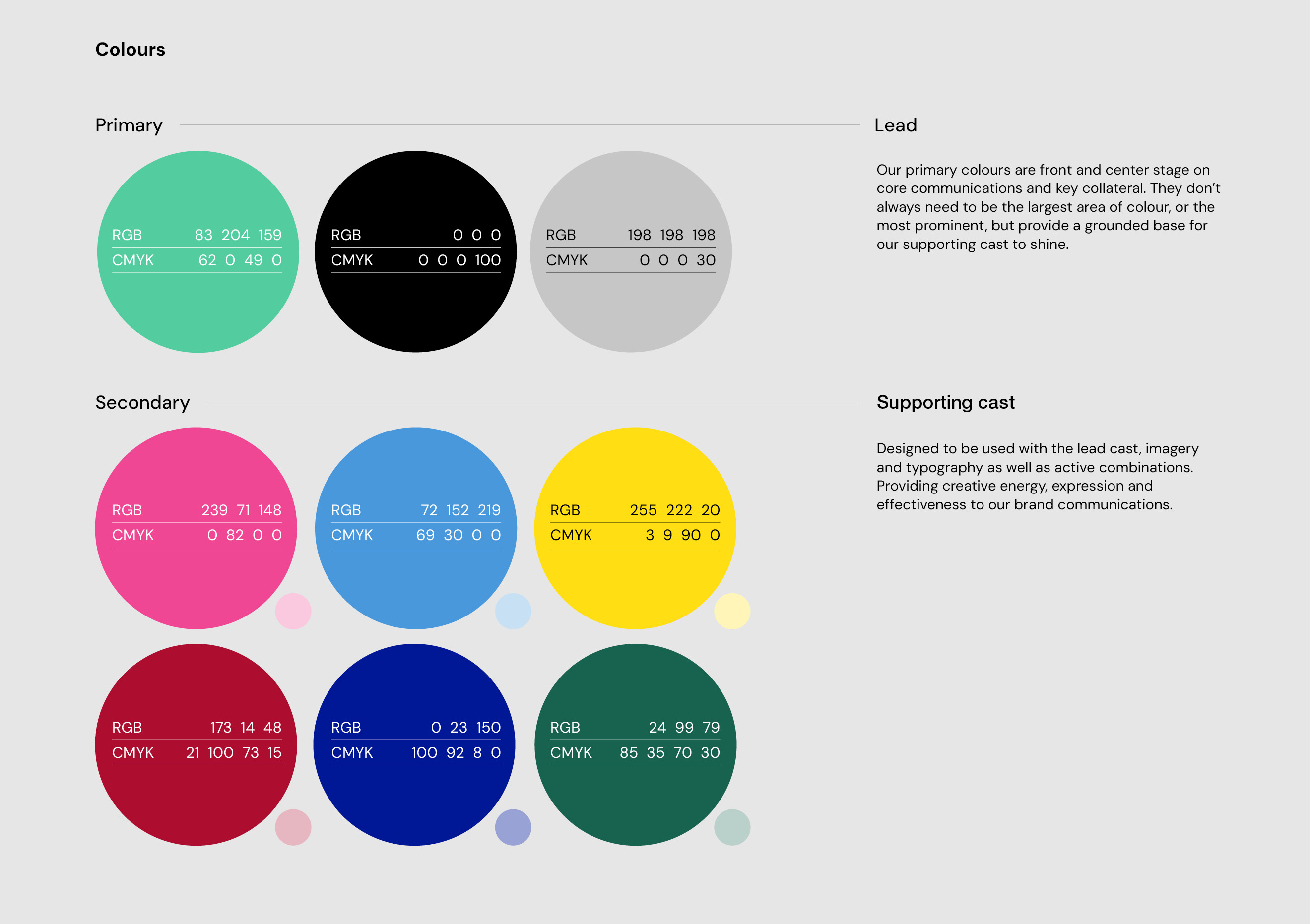
A diverse and bold colour palette supports the overarching Unique message and adds energy to communications. Imagery was also extended to be more diverse, active and creative. Textures were added as a new element to help with storytelling, to express a more sophisticated tone, and to dial up the Aotearoa feel.
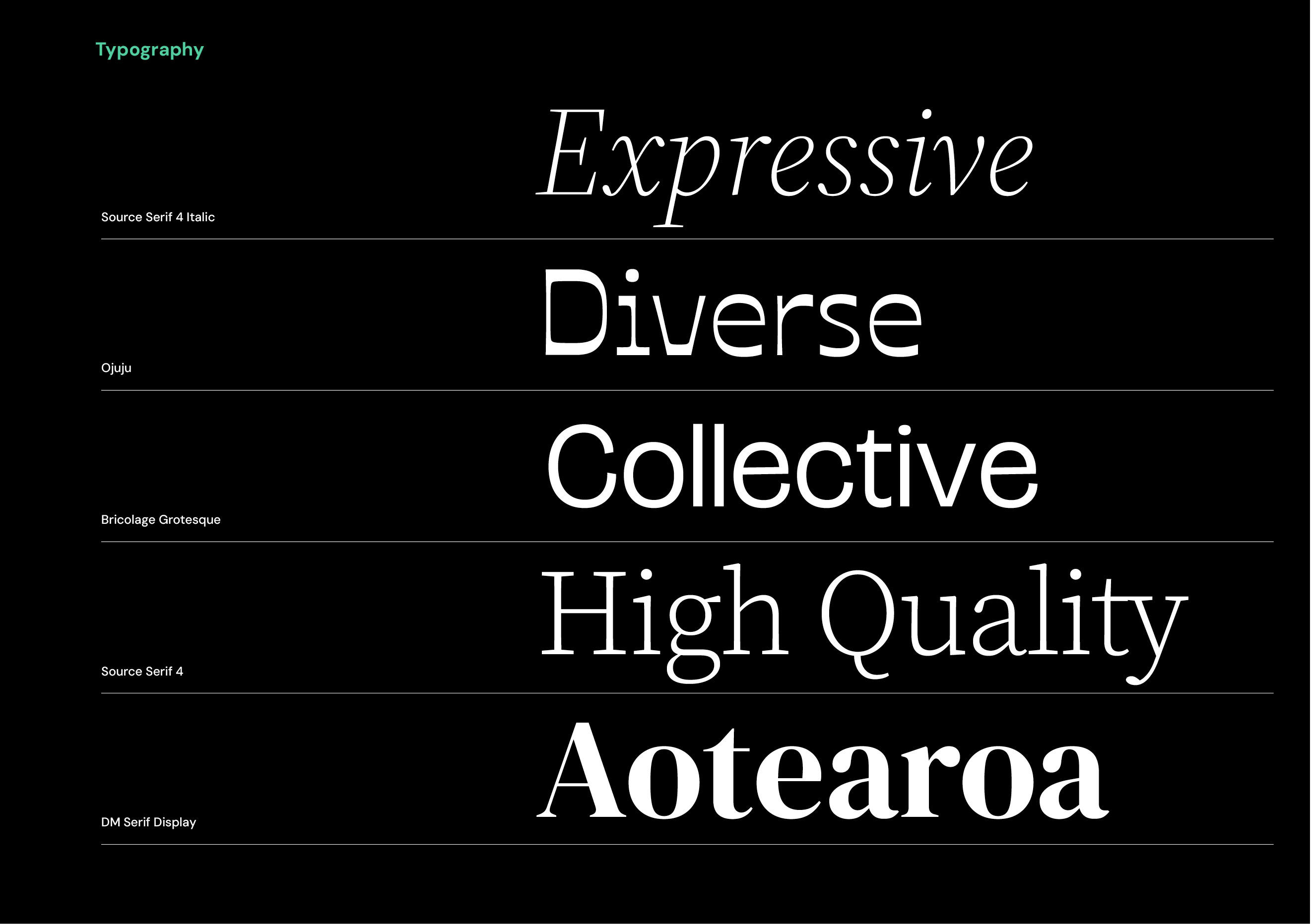
Clean, functional typography was retained but amplified with a range of open source headline fonts that give each communication a more personalised and considered feel. TOI had already commissioned a bespoke Māori graphic, which we integrated into the identity, elevating it from a decorative to a story-telling role.
The final new element was a more expressive voice which spoke directly to the needs of the audience being communicated to.
The Results
We delivered the final work in a presentation to the Board, who responded with overwhelming positivity. The CEO of Toi Whakaari, Tanea Heke said: “You put our students’ voices, views, personalities and perspectives first, and that has made the ‘Unique like you’ whakaaro so engaging for all our stakeholders. Thank you for your amazing mahi. It has already made a big difference to how we see, and talk, about ourselves. I can’t wait to share it with all our audiences.”
We subsequently developed a series of initial executions and guidelines to help the TOI team implement this new identity in the most cohesive and consistent way while staying to true to the brand’s unique ethos.
