A drugs journey
Client: NZ Drug Foundation
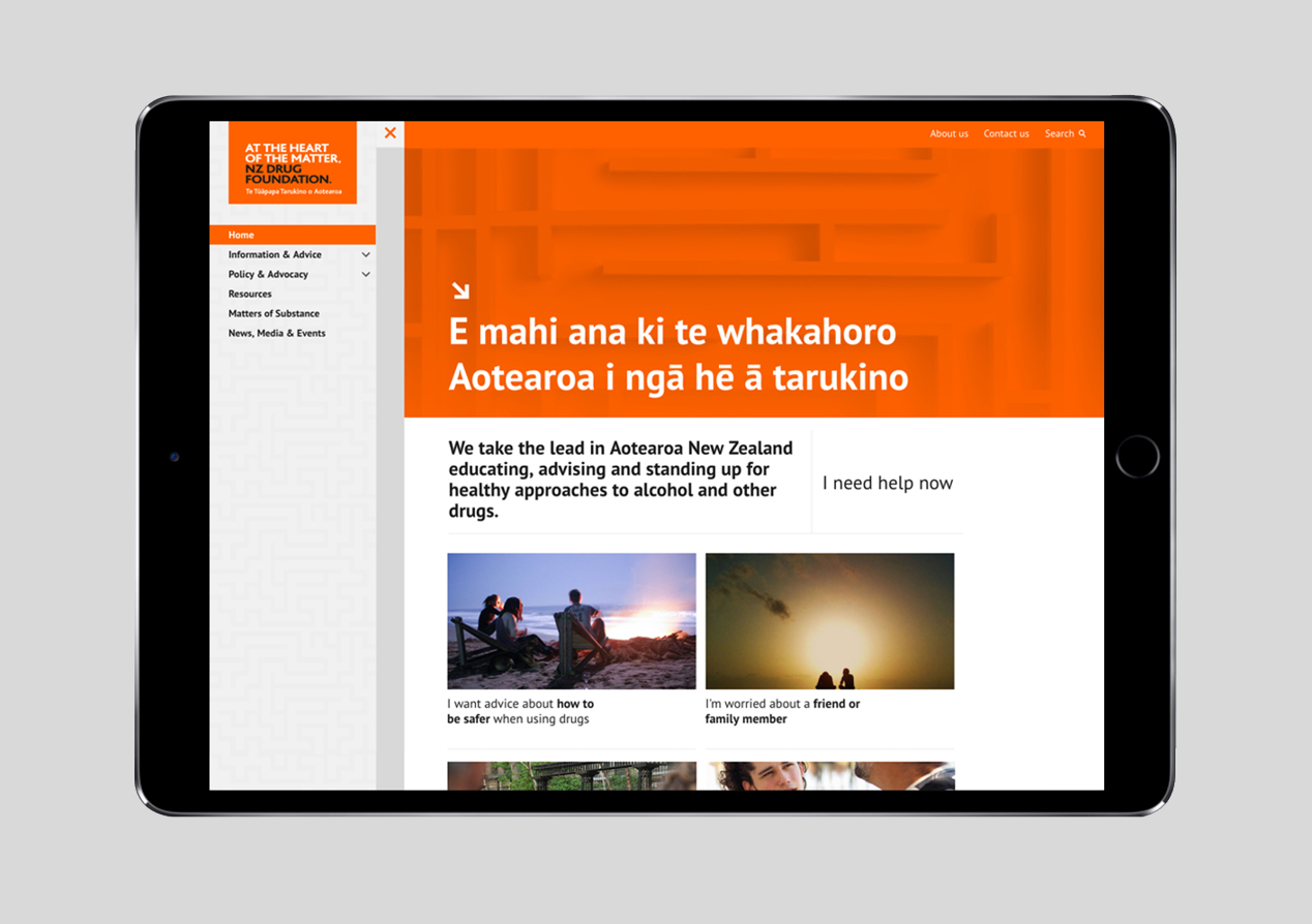
Leading the drug debate in New Zealand means the NZ Drug Foundation’s website has a myriad of facts, opinion, resources and discussion.
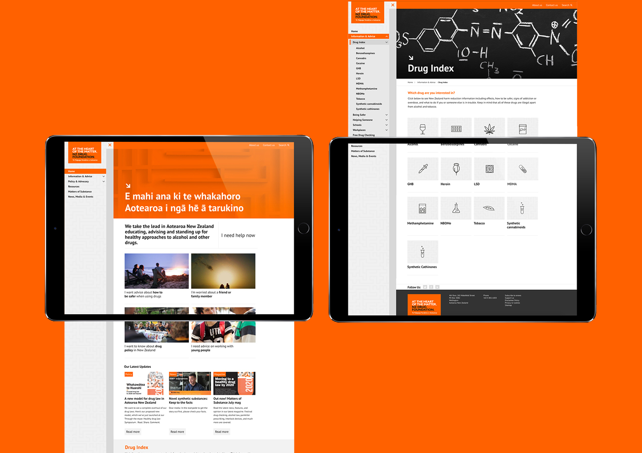
Critical to the strategy behind the new site was the creation of very clear user journeys that made the site feel very tailored to the needs of specific audiences.
Through a series of discussions and workshops, and the development of personas, we created (and tested) five very clear user journeys aligned with audience needs. The idea was to make each journey unique in content, in tone and in feel. For example, a journey for parents, family-members and friends had a strong supportive tone, providing facts and resources as well as plenty of reassurance. The journey for commentators, advocates and other interested parties was much more factual and debate based.
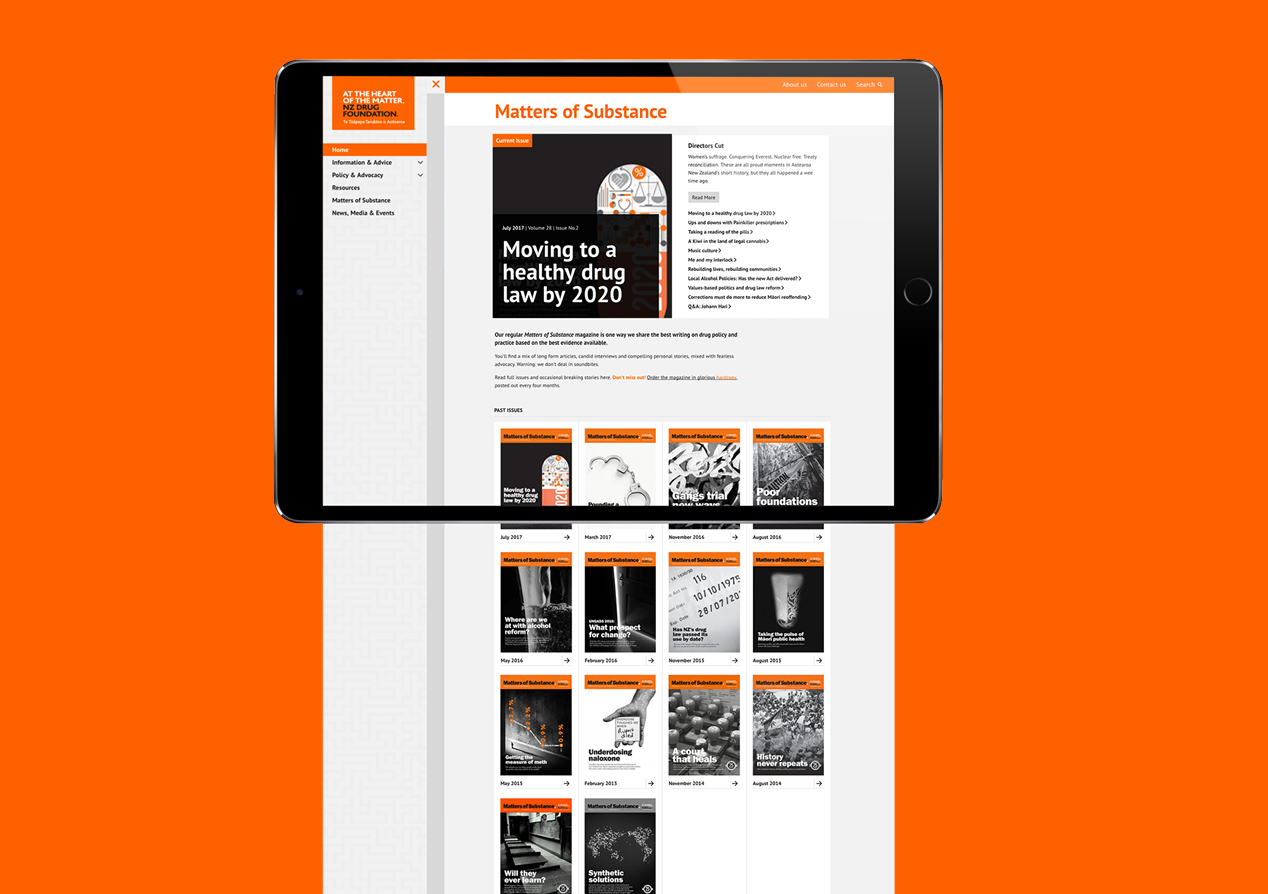
A platform of common information, such as the A-Z of drugs, ensured all journeys are underpinned by facts and not just sentiment. The back-catalogue of Matters of Substance magazines became a rich library of individual articles to support ongoing exploration.
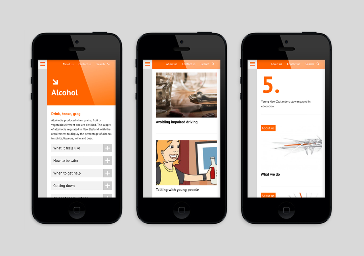
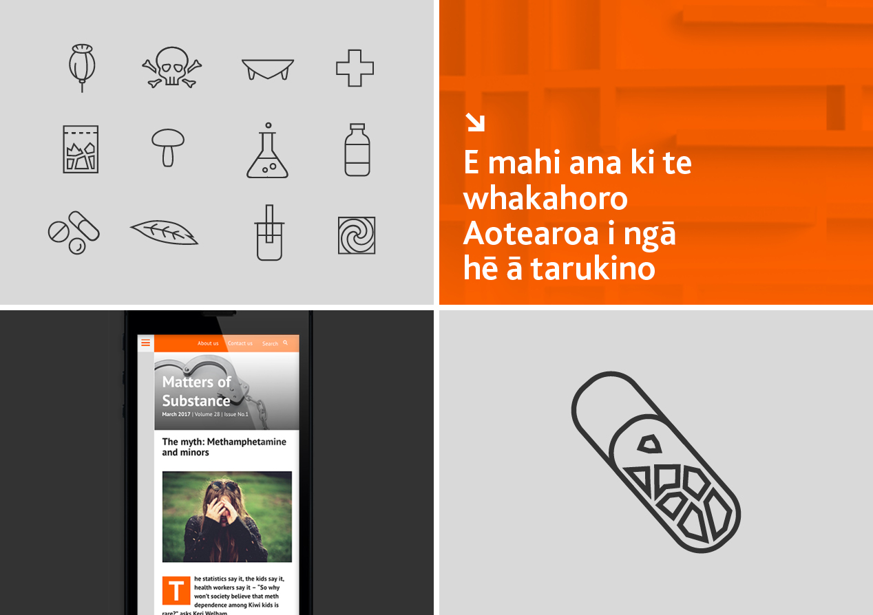
The design is clean and uncluttered to counter the weight of content and to add a sense of ease of use. Images, icons and graphic elements are used to change the tone based on selected journeys.
Working closely with the client, we’ve implemented a post-live programme of site optimisation, using analytics to drive on-going refinements to each journey based on how users actually interact.
