Annual Report made wonderful
Client: Mercury
GRAND WINNER: BEST INTERNATIONAL ANNUAL REPORT, 2017 INTERNATIONAL ARC AWARDS
GOLD: 2017 INTERNATIONAL ARC AWARDS
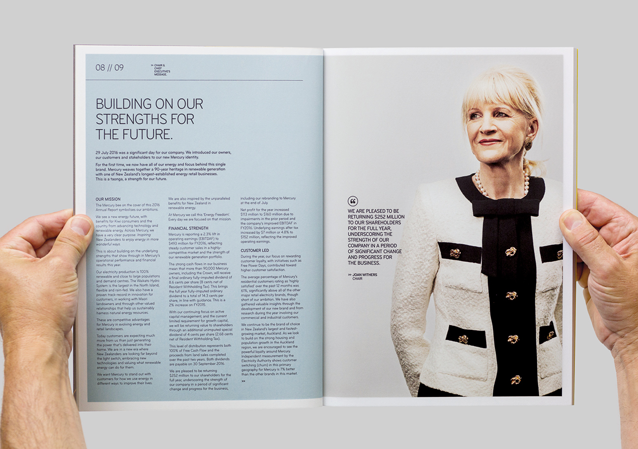
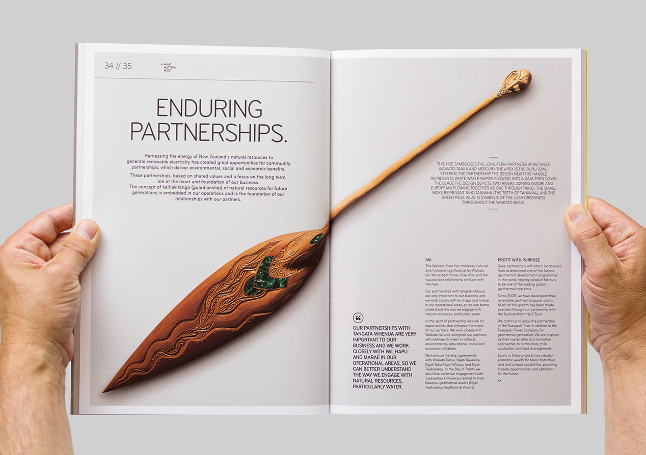
The 2016 Mercury annual report was the first major publication following their rebrand, expressing everything the new brand stands for.
Our challenge was to not spook investors but to clearly show continuity while boldly illustrating everything had changed under the new brand. No easy ask.
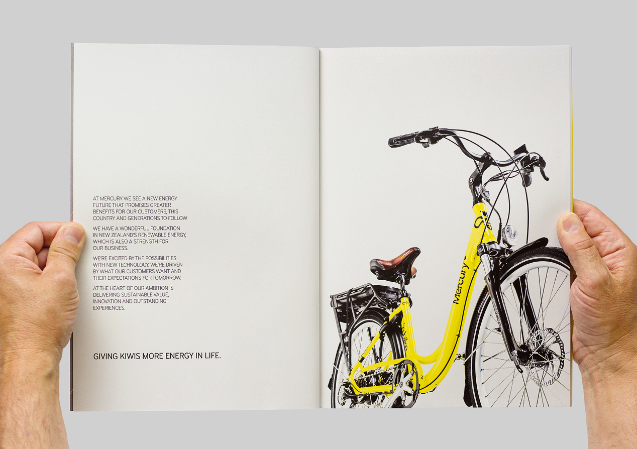
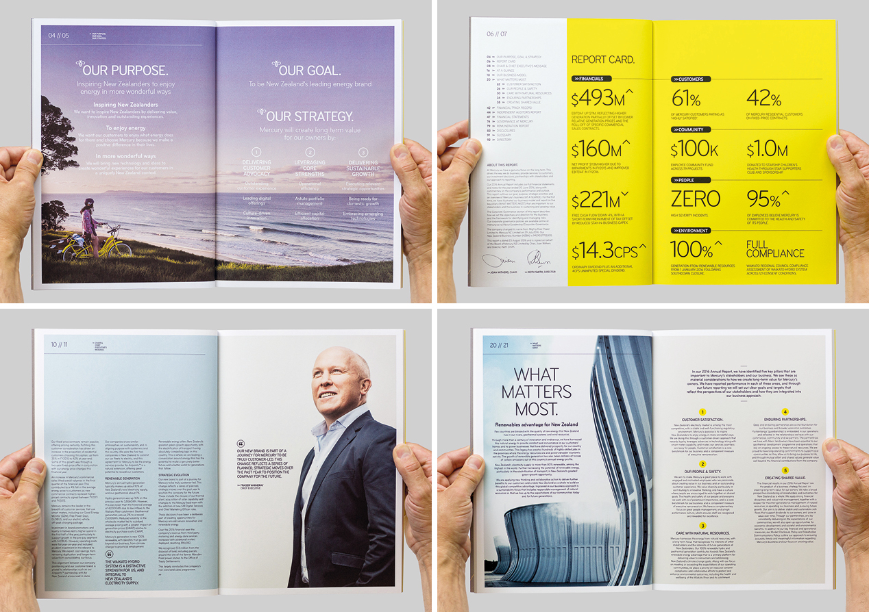
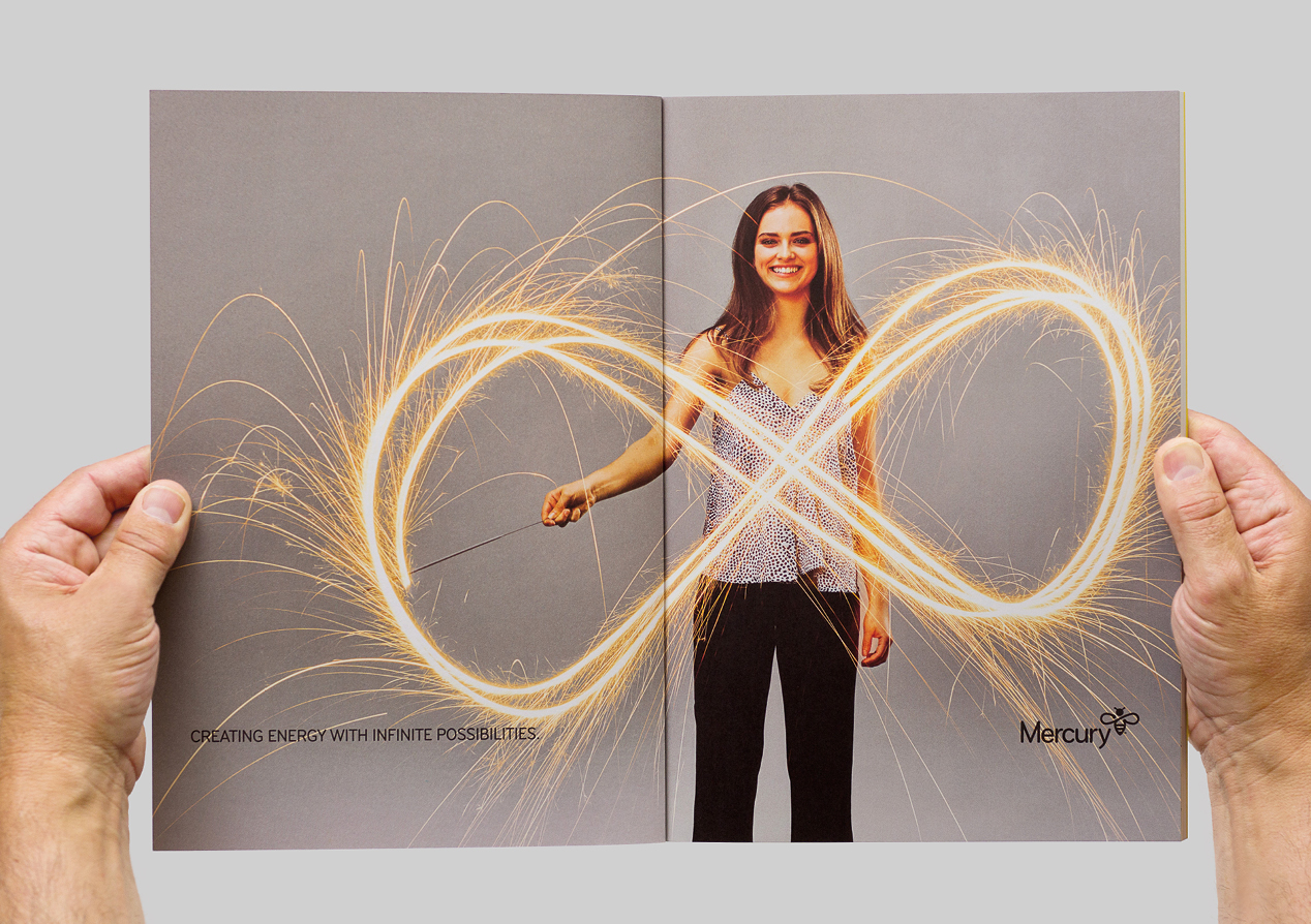
We made the new brand the hero, unfolding the brand story over the opening three spreads. Showcasing the visual identity and positioning the brand as a new expression of their ongoing customer-led business strategy was key.
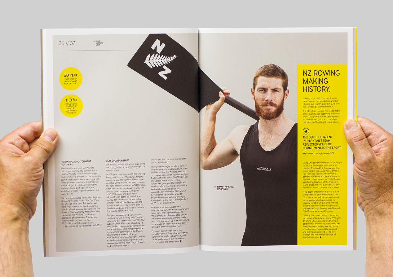
A new strategy spread and business model diagram were introduced to tell the continuing investor story in a fresh way, more aligned with a more dynamic retail-led brand. Magazine style case studies were used to showcase the brand story in action, highlighting how the core aspects of the brand manifest themselves everyday in 'what matter most.'
Mercury received great feedback from investors and other stakeholders and it's become the internal touchpoint staff refer to on how to express their new brand. And we've had a number of clients point to this report as the benchmark they aspire to for their next report.
