Diversity, scale and volume made clear and simple
Client: Fletcher Building
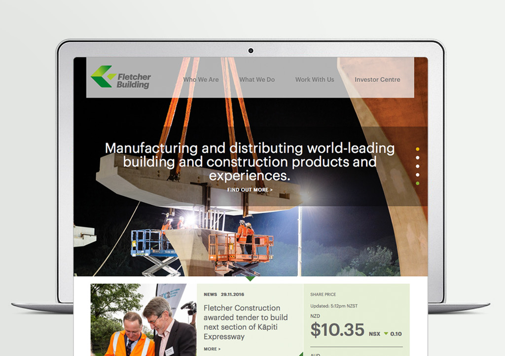
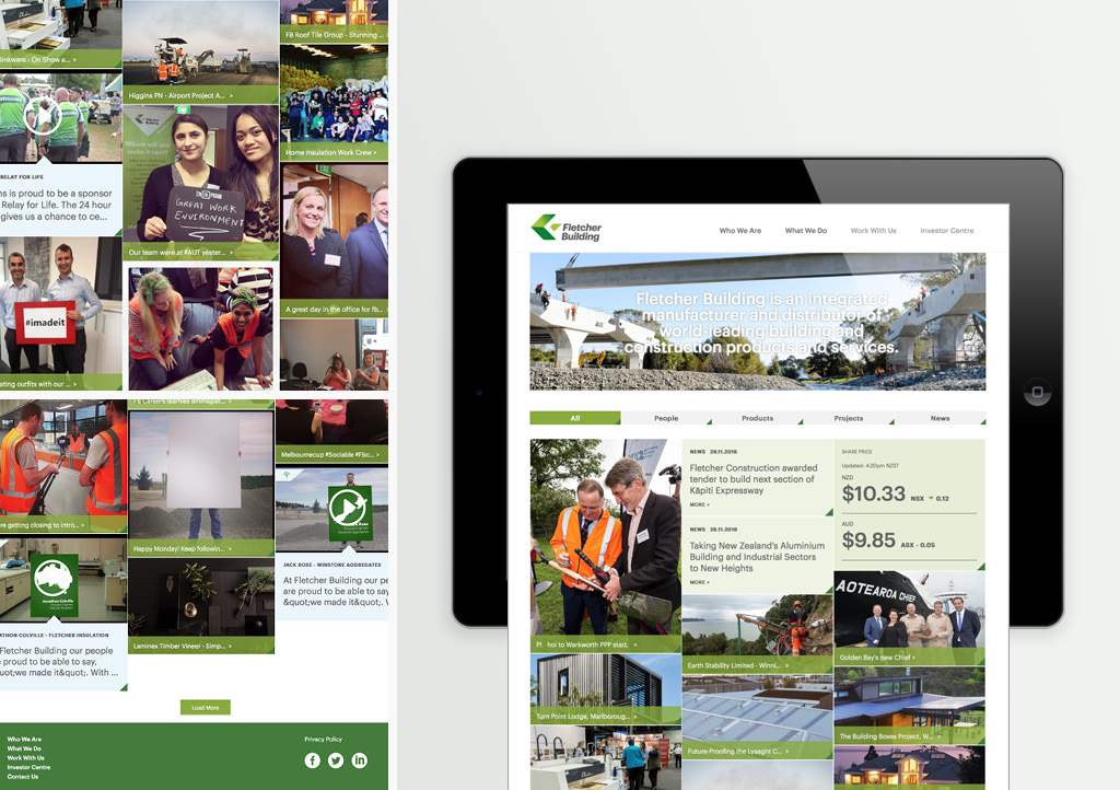
Fletcher Building’s corporate website required an integrated story that connects its many businesses, countries, brand products and projects.
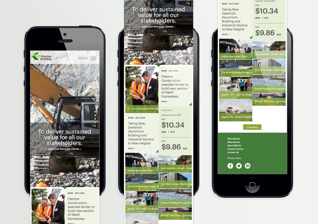
One of many challenges was to keep the site shallow and simple while doing justice to the richness and depth of the business.
The Brief
When you are as big and diverse as the Fletcher Building (FB) Group, the challenge is to present an integrated story that connects the many businesses, countries, brands, products and projects. Our website brief was to showcase the huge difference FB is making to the communities it works in, its people and their careers and for its shareholders.
The Solution
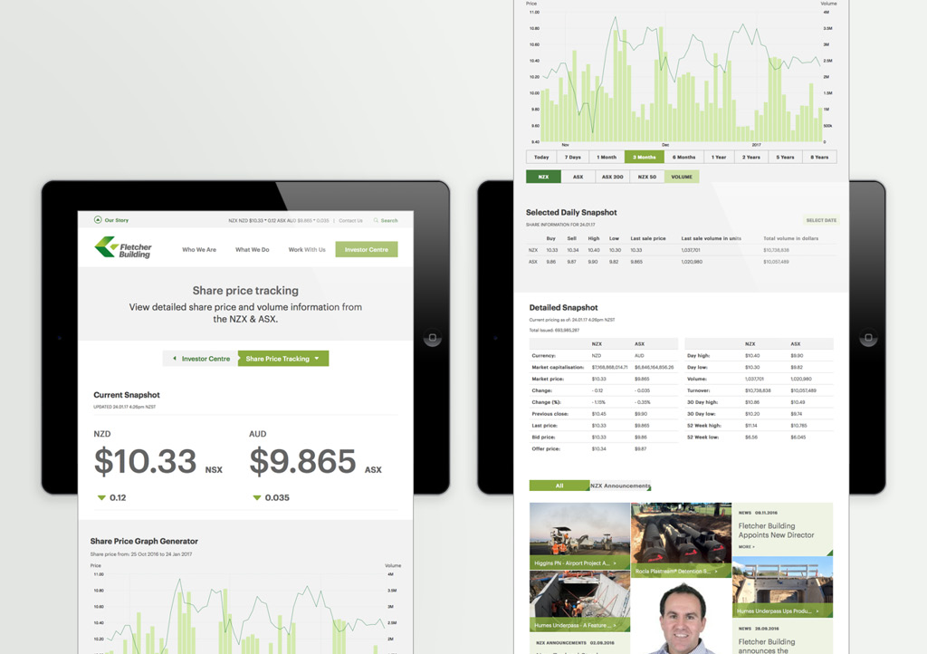
We started by developing personas, giving us total clarity on our audiences and defining specific user journeys for each. An audience-needs driven information architecture was developed to keep the site shallow, allowing most content to be within two clicks of home.
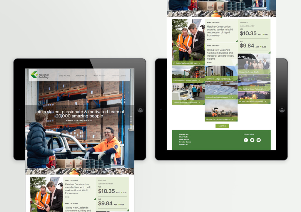
Storytelling starts on the home page, offering a cross-business perspective before driving audiences into business line, and/or specific business discipline stories. An extensive tagging exercise allows associate content to be presented, helping audiences make connections across the business, projects and communities.
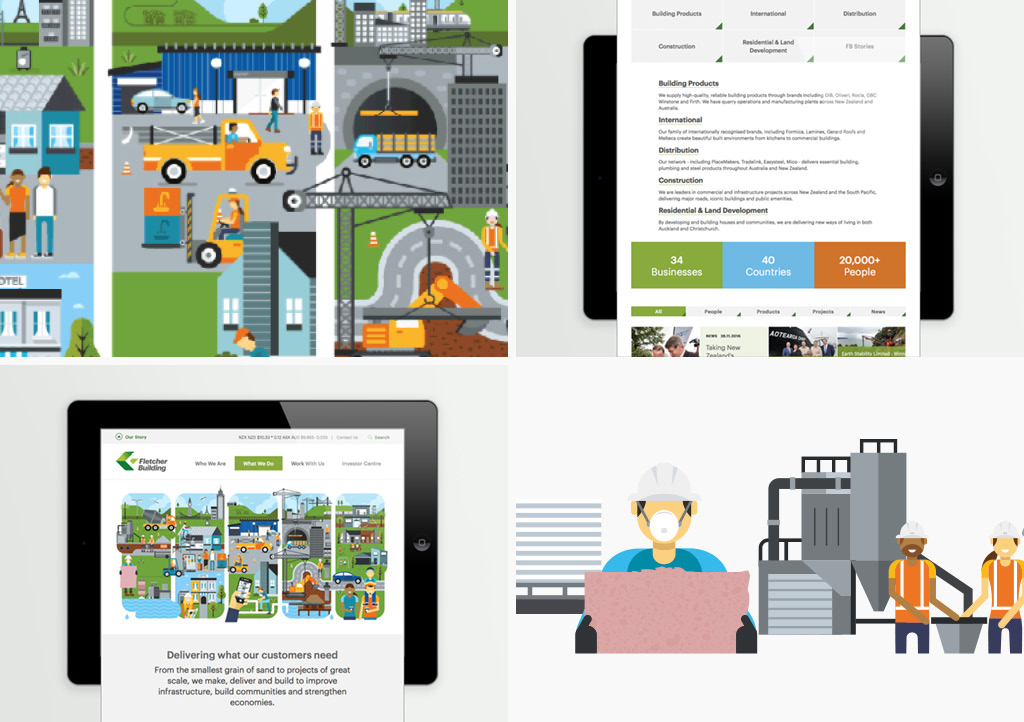
The design reinforces the brand story, using a variety of colour, language, photography, animation and infographic approaches to engage audiences.
The results
The site has only been live for a short time but already it has become the source for everything happening at FB. Dynamic content is encouraging audiences to stay longer, engage with more pages and come back more often than the previous FB site.
