A new era of commercial confidence
Client: Watercare
Watercare’s financial independence brought new expectations of commercial discipline, infrastructure delivery and accountability.
The brief
The annual report needed to reflect that change, moving away from a government-report feel towards the confidence of a major infrastructure business. A new client team wanted a leaner process and a stronger outcome. We needed to advance the story and modernise the design, while still working within the existing brand guidelines.
The solution
The opportunity was to connect commercial capability with public purpose. For debt investors and regulators, Watercare needed to demonstrate its readiness to fund and deliver at scale. For Aucklanders, that capability mattered because it supported reliable, affordable services and a healthier environment. The report needed to make both sides of that story clear.
We explored three messaging and design directions, giving the new team a clear view of how far the identity could evolve. The selected messaging informed the final story, “A new era, delivering smarter together” with design elements drawn from across the concepts. This connected organisational change with the discipline and collective effort needed to turn stronger foundations into better outcomes.
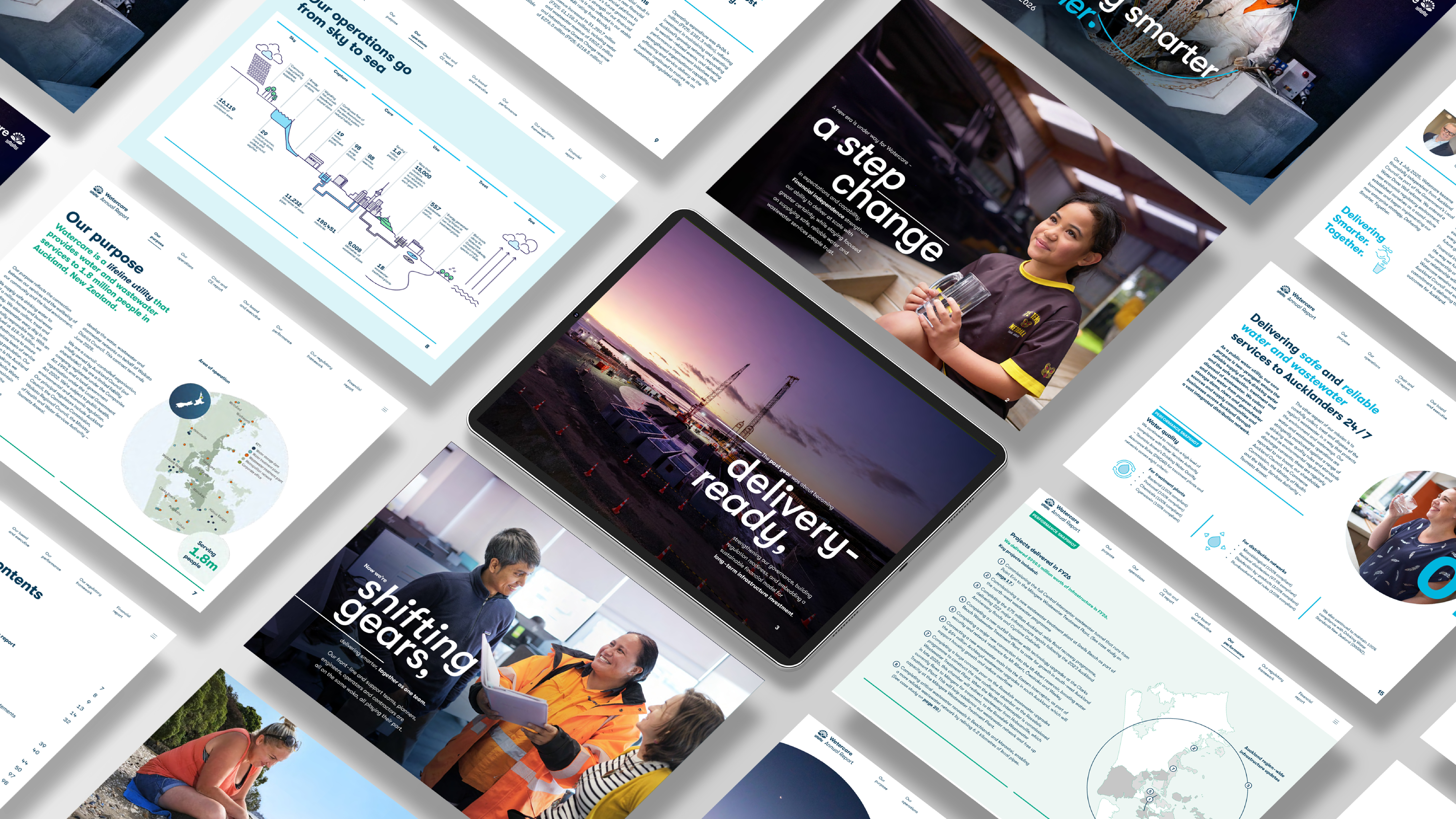
We applied Watercare’s existing brand assets in fresh ways. The familiar droplet became a flexible device for framing photography, highlighting information and connecting pages. A single-colour logo treatment created a differentiated, corporate presence, while confident use of the colour palette brought energy and helped distinguish performance themes.
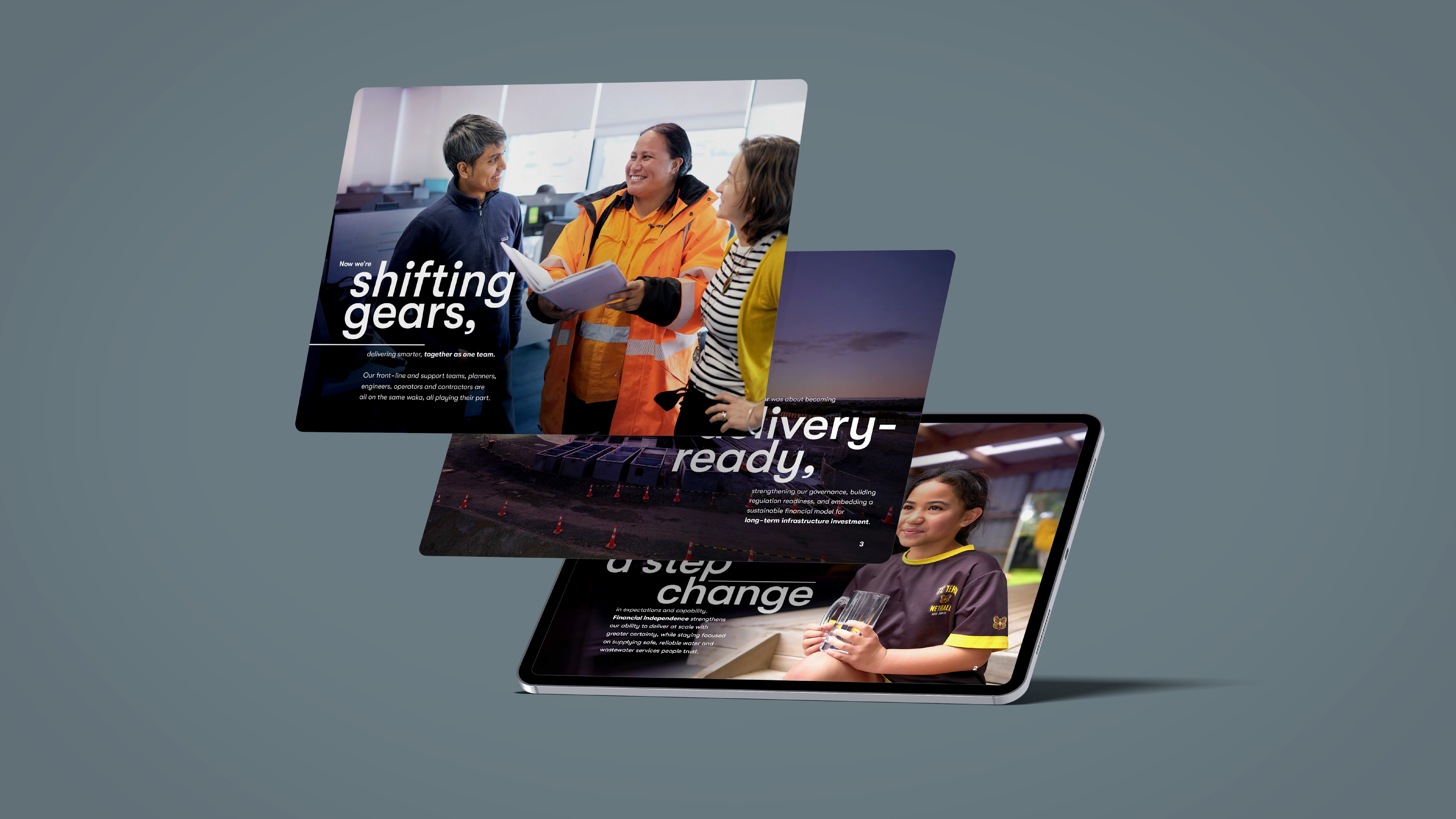
Large-scale typography and selective italics gave the opening narrative emphasis and momentum. Full-page cinematic photography balanced infrastructure scale with the people delivering the work and the communities benefiting from it. This made the commercial story tangible without losing Watercare’s human purpose.
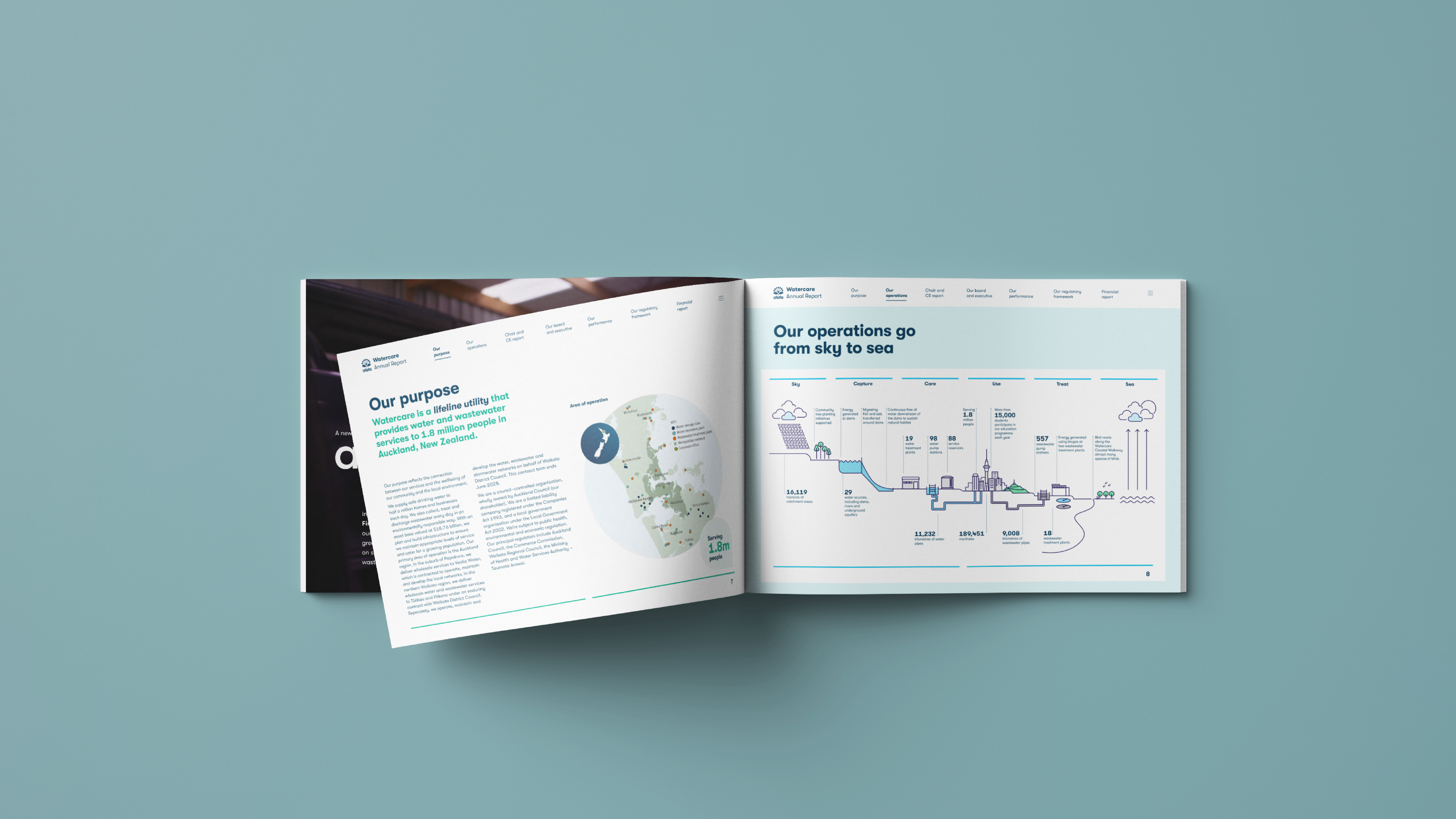
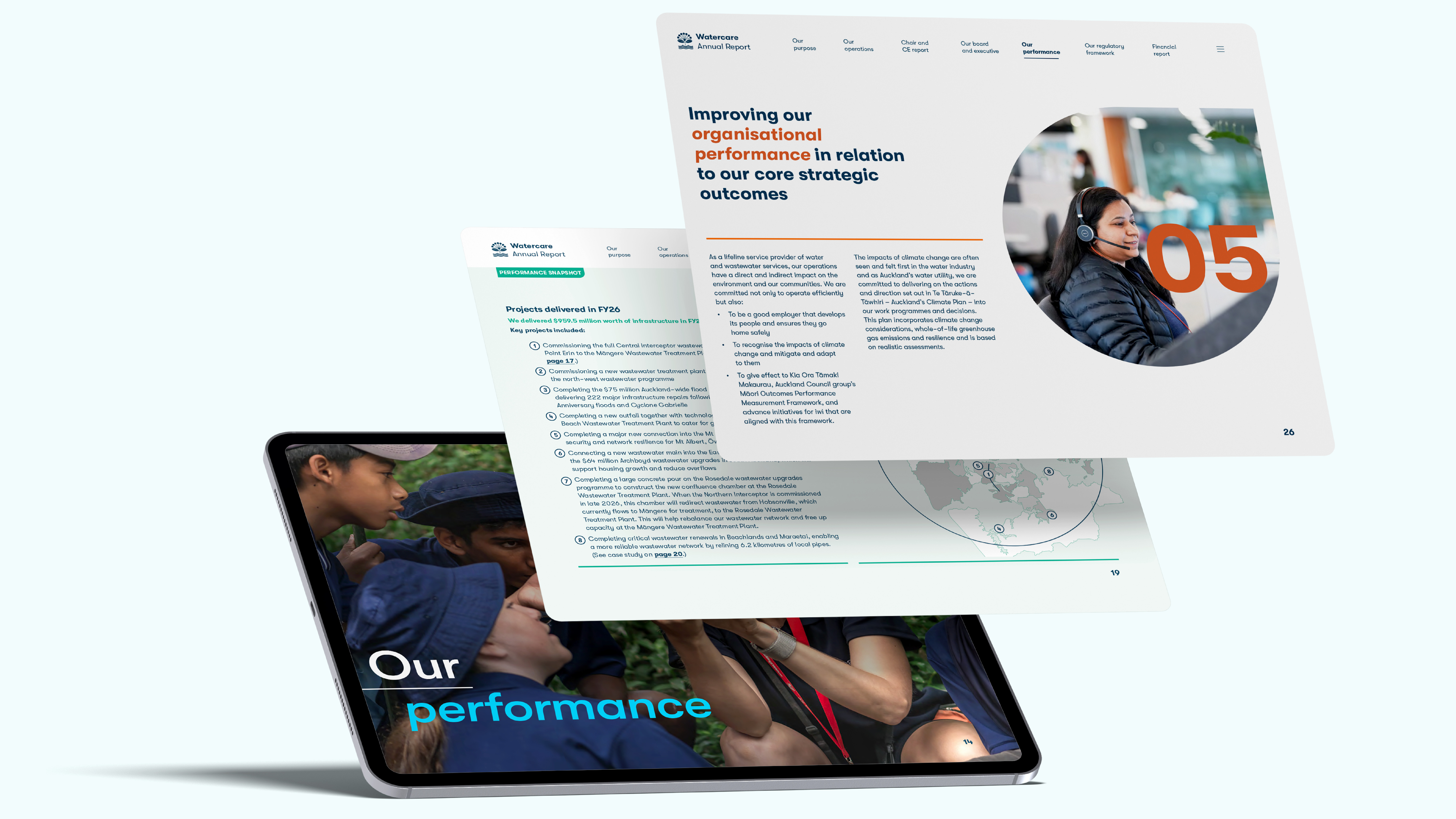
Across the report, clearer headings, more open layouts and consistent navigation helped readers find their way through complex information. Performance snapshots and prominent figures brought evidence forward, while a refreshed “sky to sea” illustration explained the connected system behind everyday services. Case studies linked investment and operational decisions to practical benefits.
The same design approach carried through governance, financial statements and service performance reporting. This gave the whole document a consistent, contemporary character, with the clarity and substance needed to support commercial credibility.
The results
We delivered the leaner process and stronger, commercially confident report the new team was looking for. The client is “over the moon” with the outcome and has received strong feedback from their internal and external stakeholders.
The report’s impact has extended beyond annual reporting. Watercare subsequently commissioned us to incorporate the new brand applications into its guidelines, allowing them to cost-effectively refresh the wider brand to reflect what the organisation has become. What began as a reporting project demonstrated how much more the existing identity could do, establishing a practical direction for Watercare to communicate with more confidence and consistency.