Positioning to differentiate
Client: The Law Association
How a considered rebrand and name change helped the Auckland District Law Society set the stage for their nationwide growth aspirations.
The Brief
ADLS (Auckland District Law Society) approached us to help them grow their nationwide footprint by telling a stronger story about the value they deliver for New Zealand lawyers. They also wanted to appeal to a younger, and more diverse, demographic of lawyers.
Through our discovery phase, we discovered an extensive range of existing membership benefits ranging from training, networking, advocacy, news, and forms. And through a workshop with their senior leaders, and external qualitative research with members, we developed a clear understanding of how they wanted to position themselves and the barriers that were holding them back from growing.
The Solution
Our initial strategic recommendation proposed four possible brand directions, based on a matrix focused on the individual lawyer vs the legal profession. We developed a mood board for each direction to illustrate how the tone and feel of each positioning was different. We also proposed that a name change may be needed to help overcome current perceptions that they looked after the interests of Auckland lawyers only.
This initial strategic work became the basis for an extensive programme of research with existing and potential members right around the country. The two-leading directions from the research became the starting point for defining the direction the brand needed to take. Enabling Excellence became the brand essence, reflecting a modern brand that provides the support and tools that allow lawyers, and the legal profession, to achieve more. The research also reinforced that a new name would help shift how they were perceived. As a result, the client made the big decision, via a membership vote, to adopt The Law Association – a short, clear, and descriptive name – as the new name for ADLS.
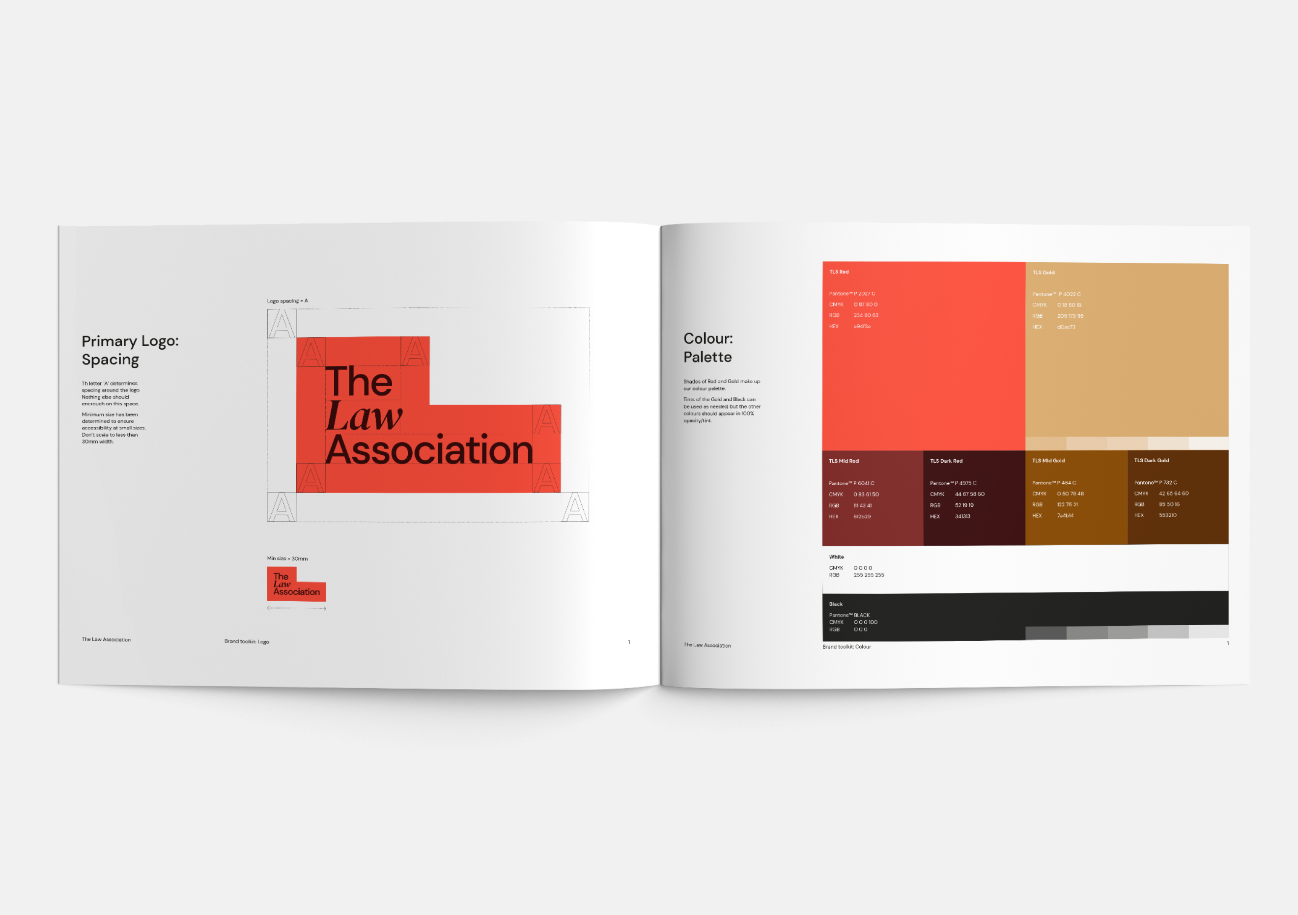
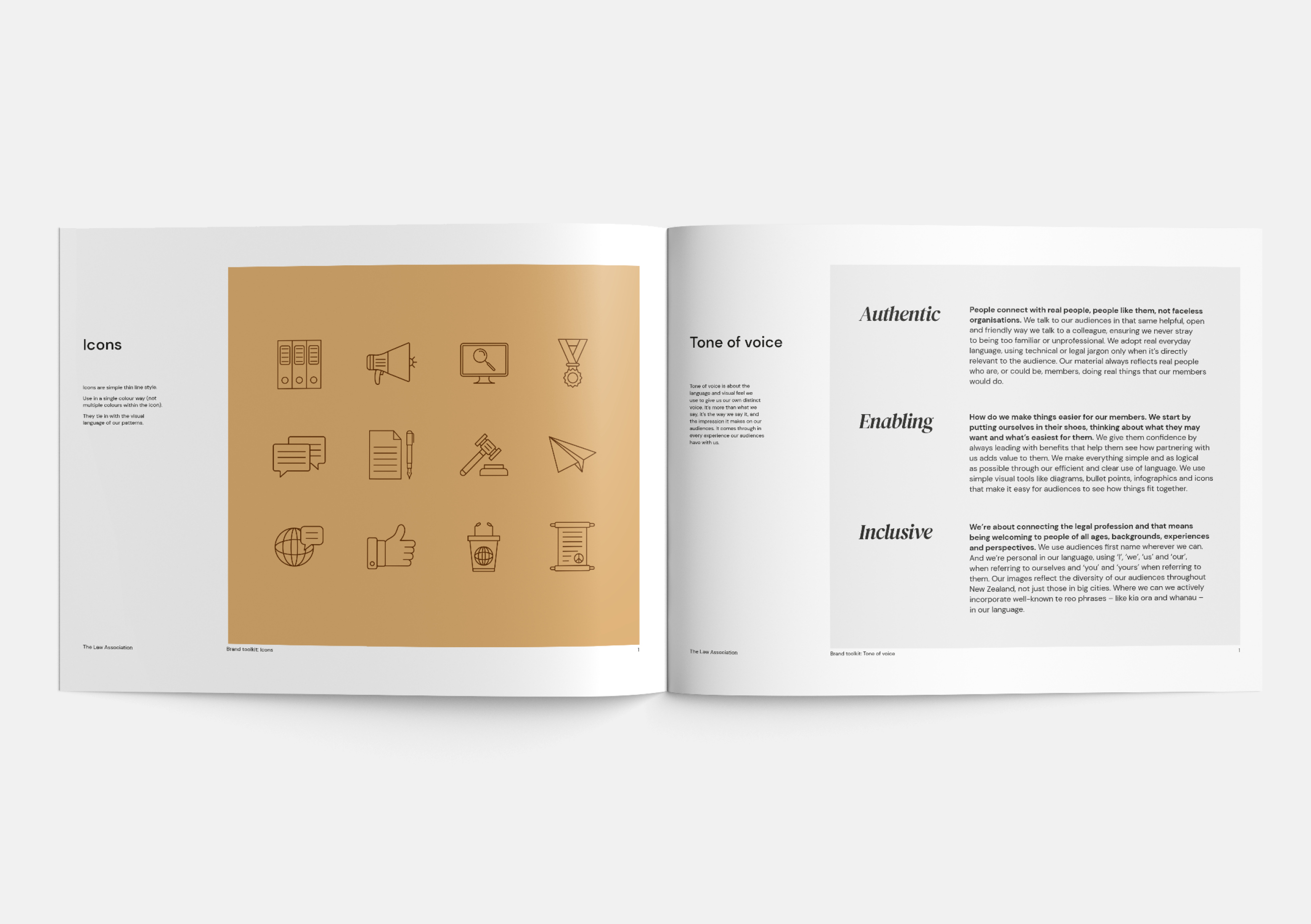
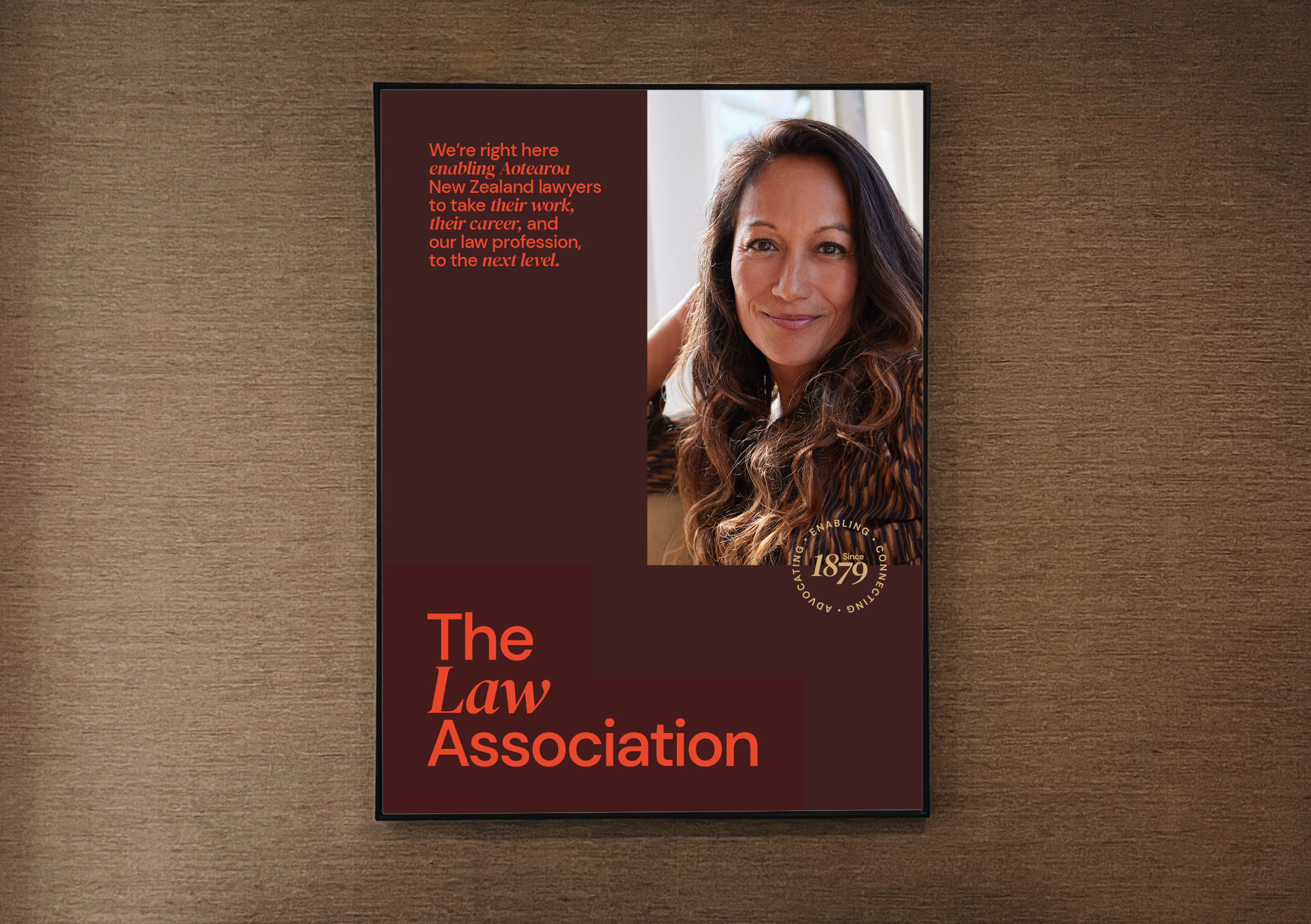
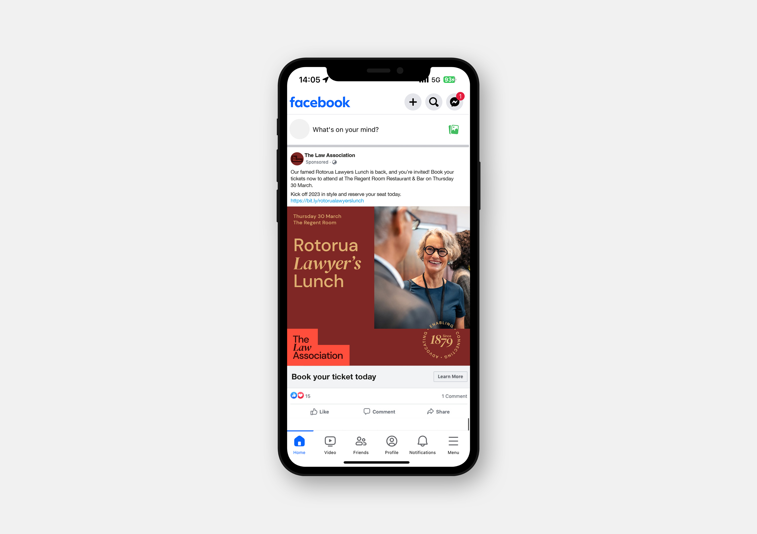
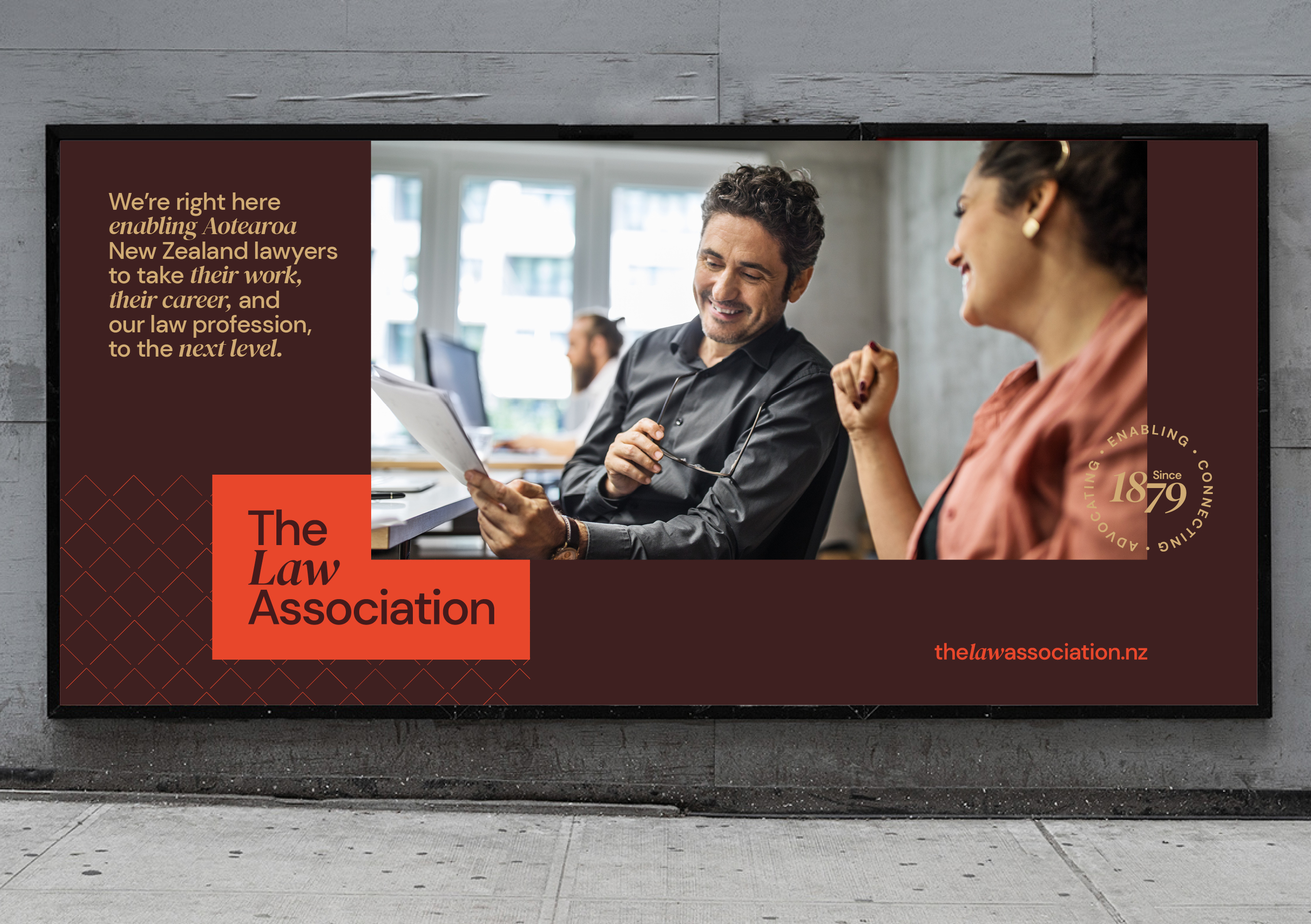
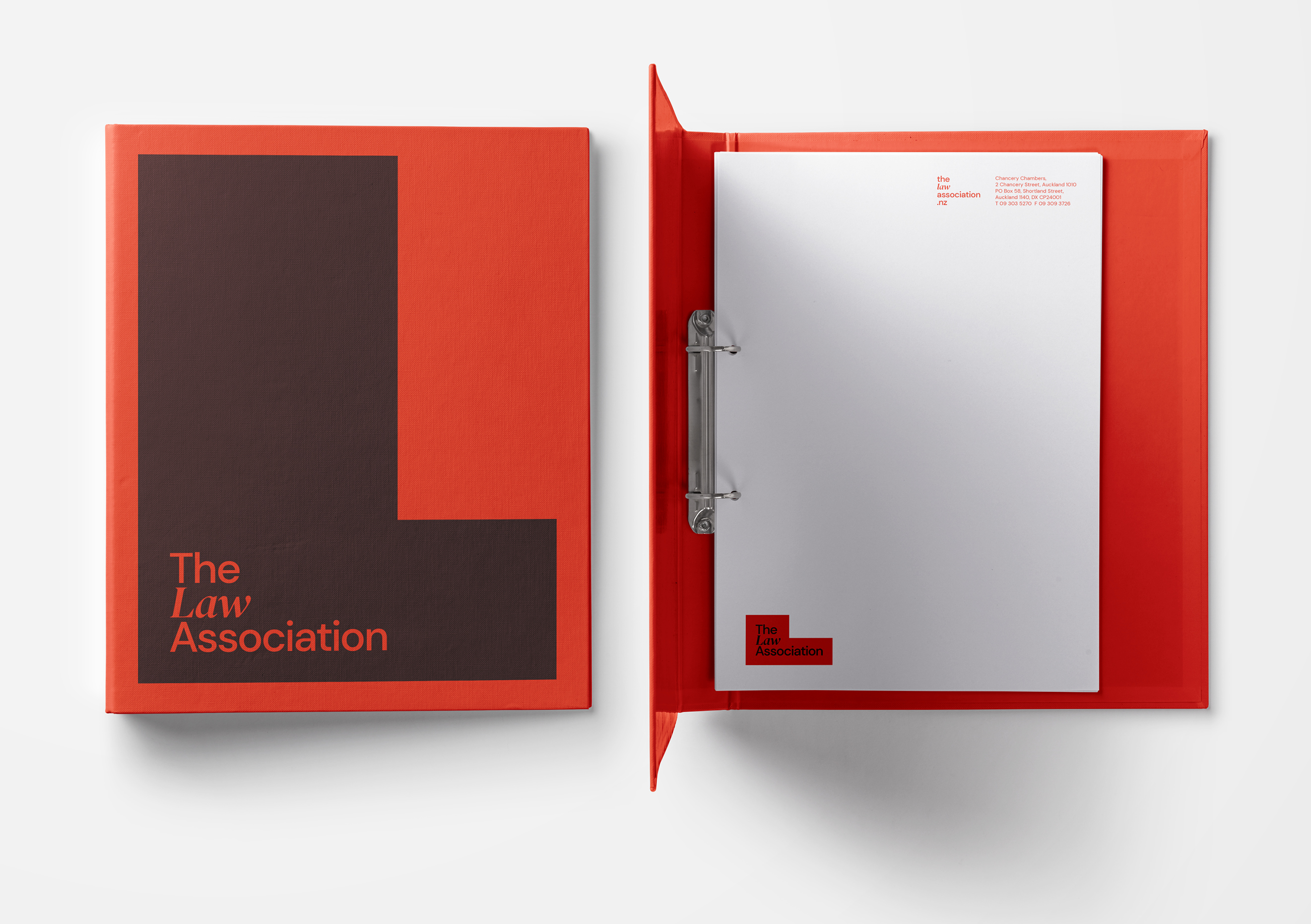
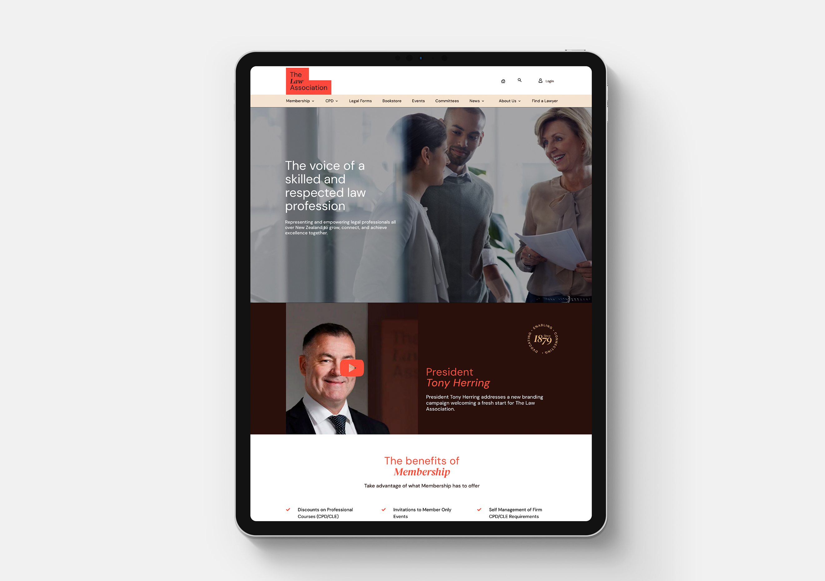
The new visual identity builds on the equity and legacy in the ADLS brand, adding bolder and more accessible colours while maintaining that sense of quality. This is further reinforced by more sophisticated typography and a subtle background texture. A new, real, and engaged, approach to photography was designed to reflect the face of the legal profession and the value The Law Association offers them.
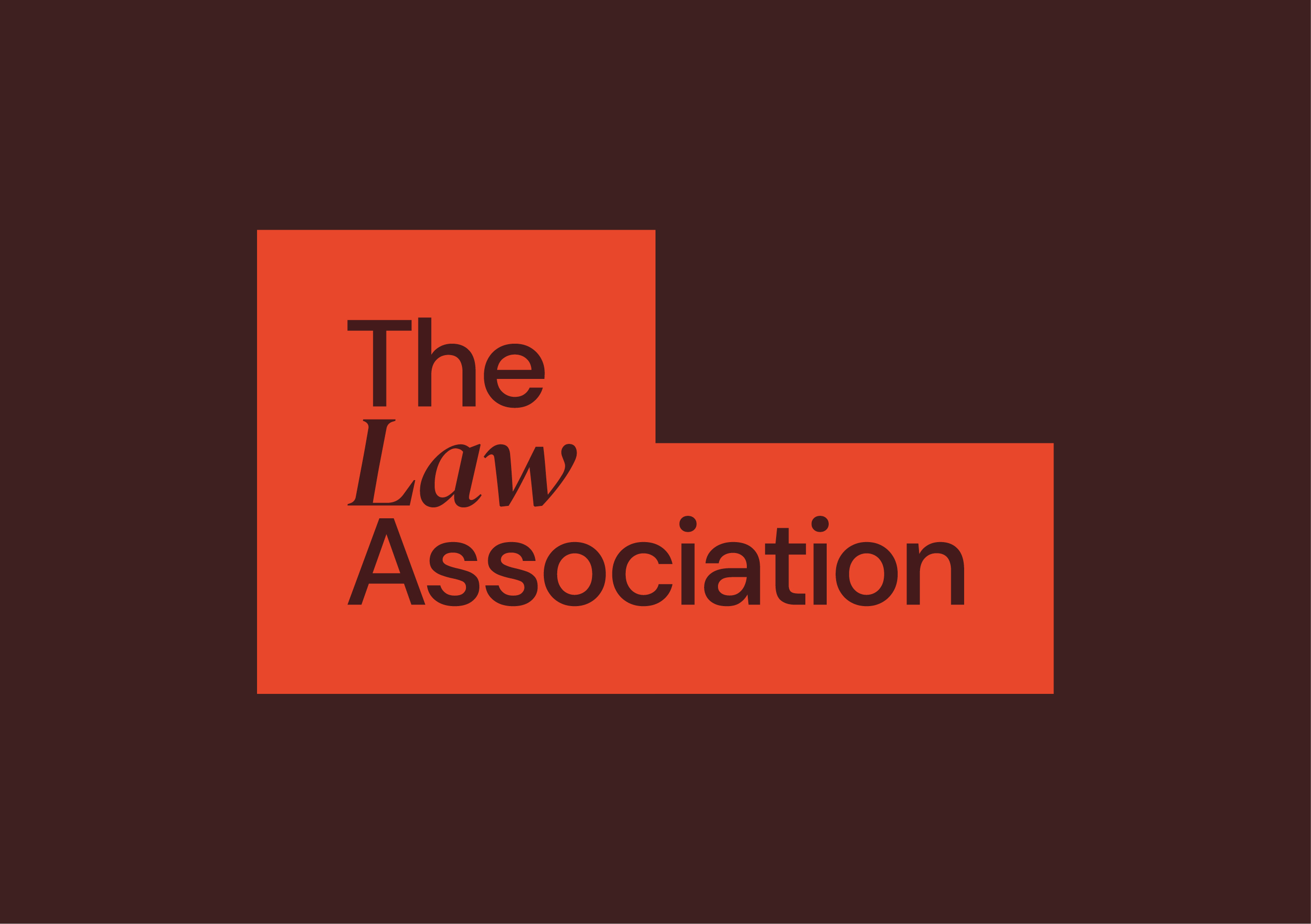
The L shape of the logo became the basis of a flexible design system providing a way for the logo to be reinforced in all communications. The modern logo, that speaks to their future aspirations, is nicely offset by a classic monogram, reflecting their heritage.
The new brand story and visual identity came to life on a new website, new marketing materials, a launch video, banners, merchandising, stationery, and a whole range of branded collateral.
The Result
The feedback has been positive from existing members. With barriers to growth addressed, a strong customer-value story created, and a cohesive and appealing visual identity designed, The Law Association are geared-up to achieve their nationwide growth aspirations.