Transforming Te Papa’s learning space
Client: Te Papa Tongarewa
Te Papa has transformed its learning programmes and space, creating Hīnātore.
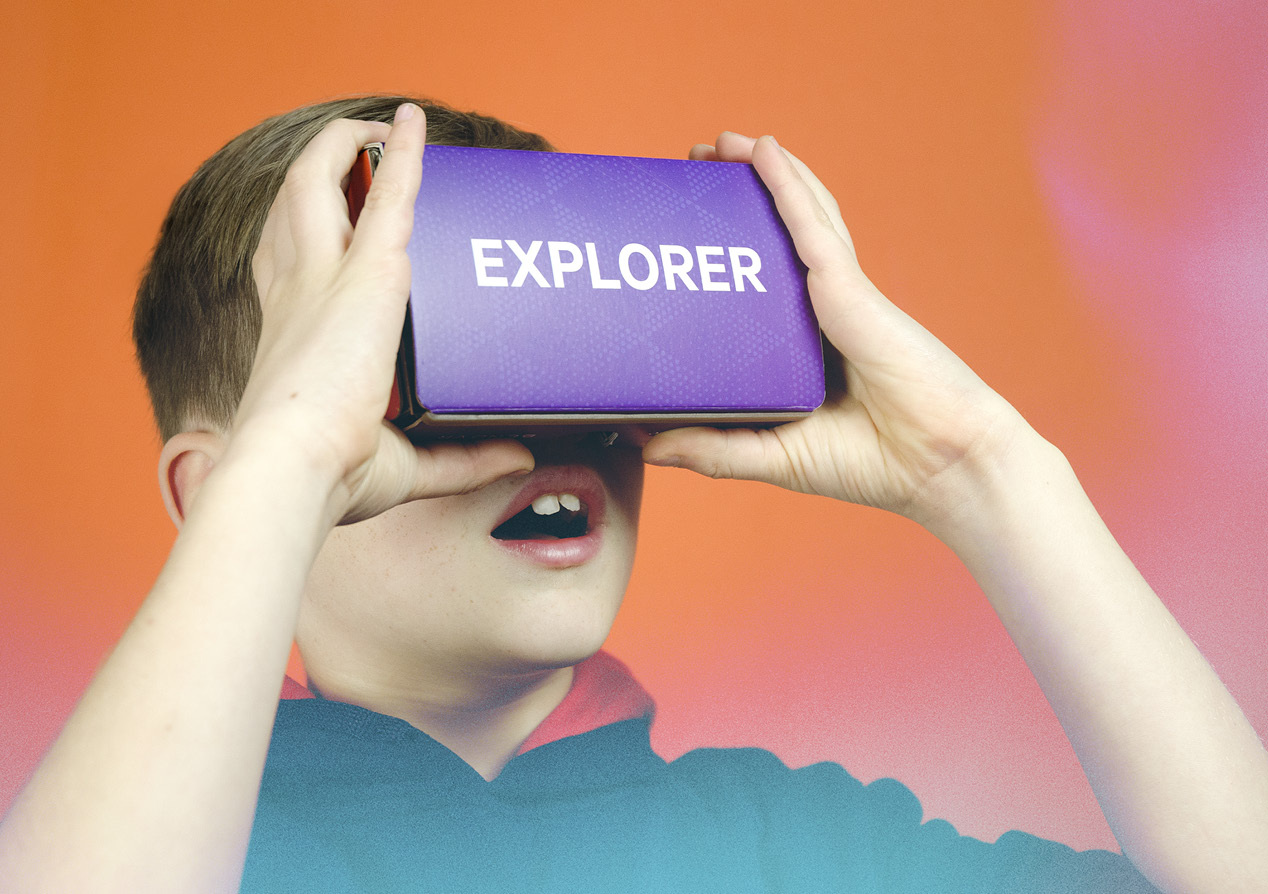
Hīnātore is a disruptive new learning lab stacked with cutting-edge tech gizmos that consign clunky projector slideshows and VHS videos to the museum’s basement archives. And it needed eye-catching, dynamic branding to communicate the evolving and experimental nature of the programme.
The Brief
Hīnātore at Te Papa signalled a complete rethink of Te Papa’s learning offer. It’s a flexible learning space that provides learner-centric, collaborative and highly innovative experiences, in an experimental space where learners create, fail, question and learn together, pairing cutting-edge learning technologies with Te Papa’s extensive collections and taonga. It’s a space for learners to connect and be inspired and for Te Papa to experiment with new ways of learning and engaging.
Our brief was to create a visual identity for the Learning Lab that supports an exciting, inspiring and fun space to learn and explore. An identity that spoke equally well to teachers, parents, students and learners of all ages, while reinforcing Te Papa’s overall vision and positioning.
The Solution
After testing four different directions we settled on ‘transform’ as the big idea behind the Hīnātore identity. Transform. Don’t settle for status quo. Innovate. Take inspiration from everywhere and anywhere. Break the mould, raise expectations and change what we all know and believe. Feel the intoxicating rush of reshaping ideas, experiences and lives. The more you learn, the more you want to keep experimenting. Always moving. Always reinventing. Always growing.
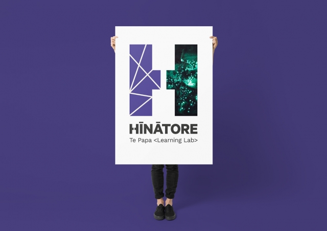
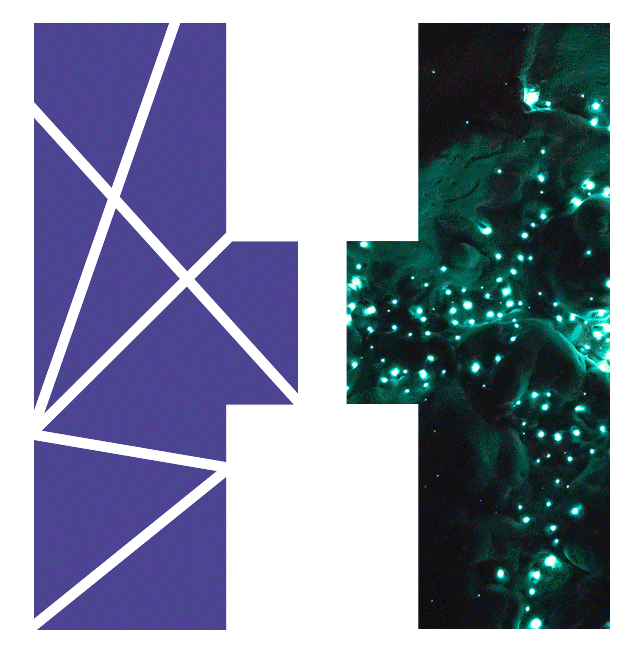
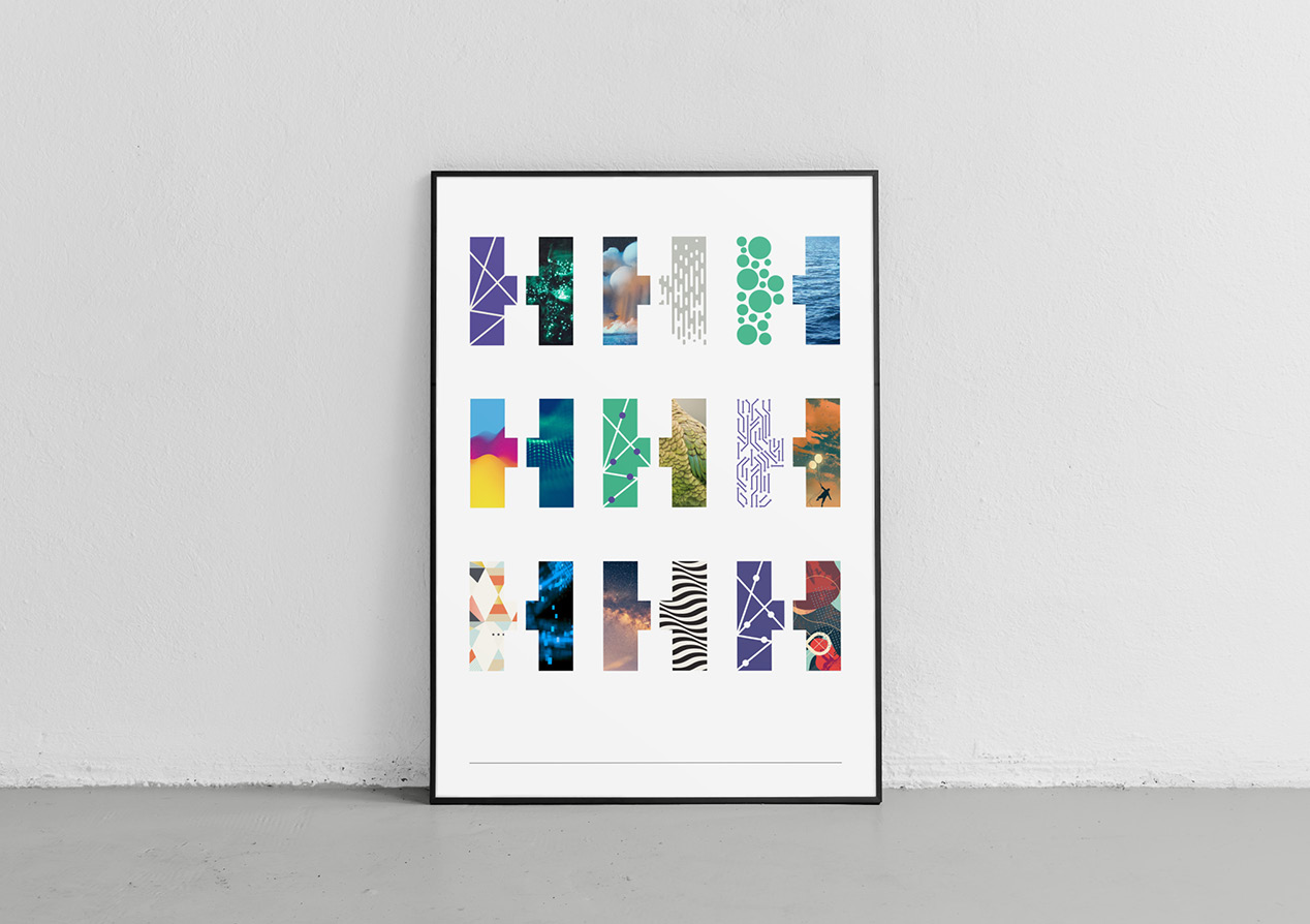
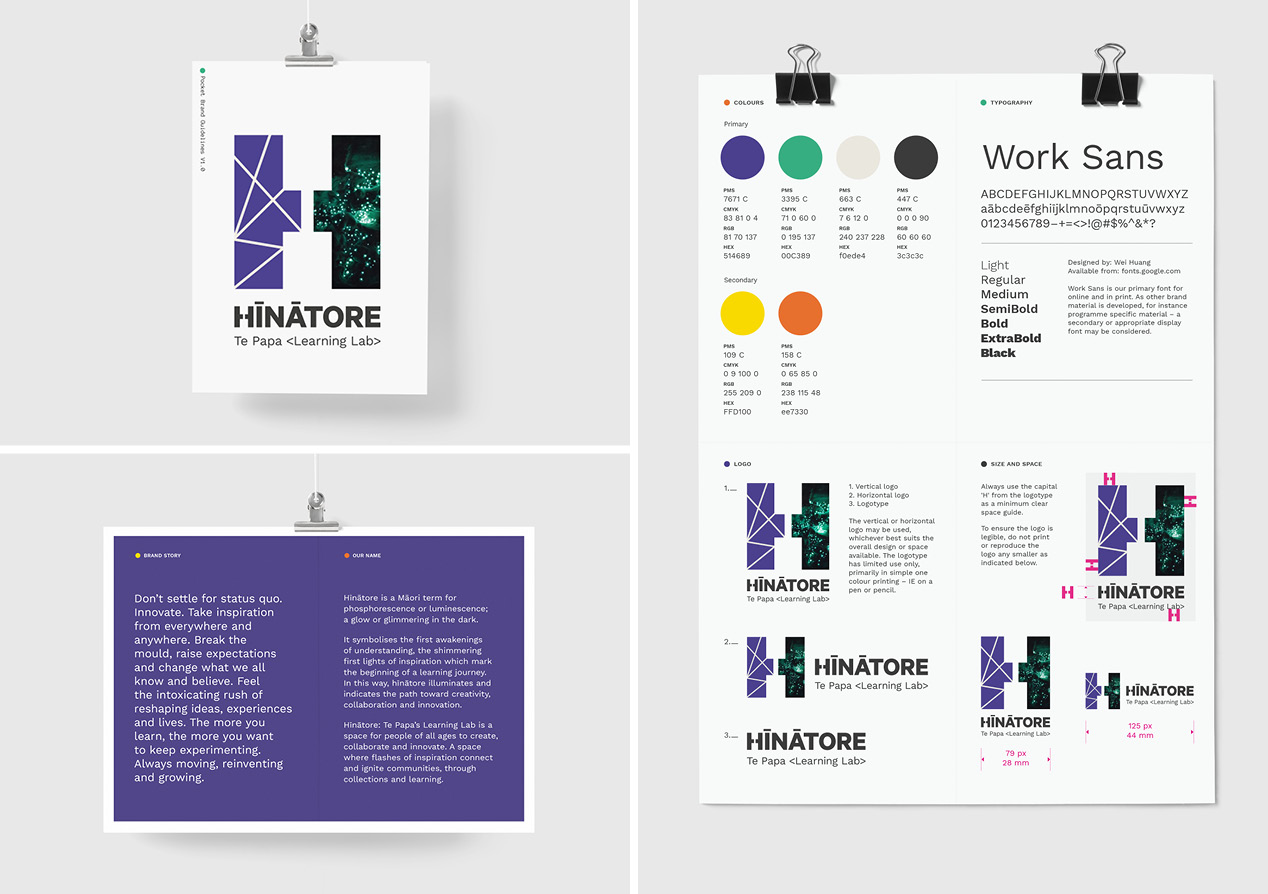
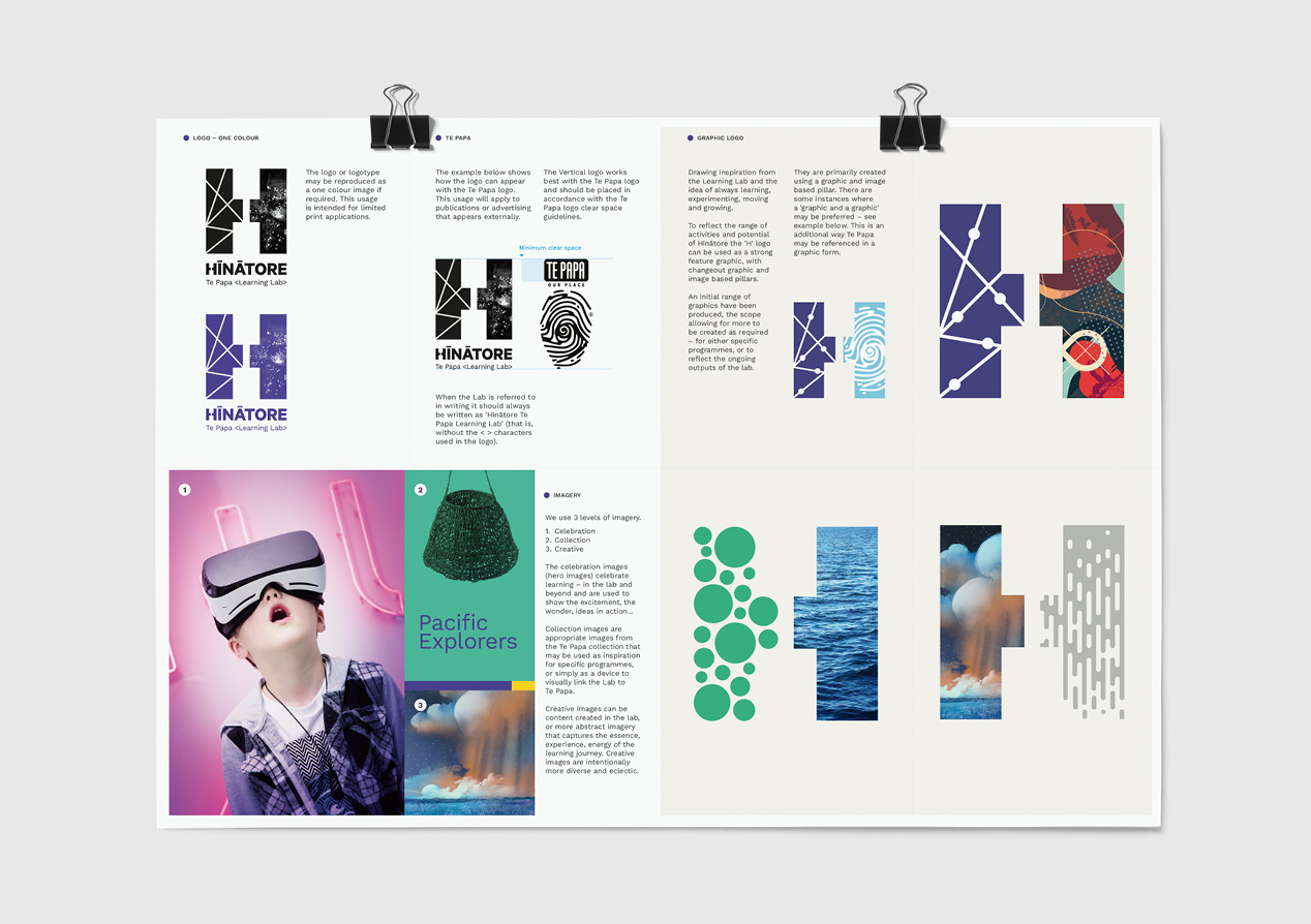
The idea manifests itself as a dynamic, constantly morphing, logo that represents coming together, reinventing and transforming. Ideas and people. Past and present. Technology and application. Knowledge and experimentation. The logo’s design has a sense of creating and interpreting, directly reflecting the hands-on learning principles that underpin the Learning Lab. It also has a distinctive luminous quality, reflecting that Hīnātore is Māori for phosphorescence. It symbolises the awakenings of understanding, that shimmering first light of inspiration that kicks off a learning journey.
The ideas of transformation and illumination also underpin the selection of colours, fonts, graphics and other visual identity elements. Photography was chosen to directly represent the offering and to capture the wonder of the Learning Lab experience.
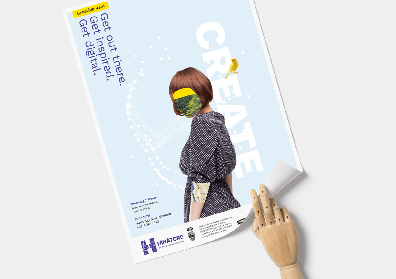
Applying the visual identity, we created a series of launch applications including invitations, brochure-ware and a Google cardboard VR box. To support specific learning initiatives, such as the schools programme, we produced adverts, posters, t-shirts, presentation templates and animated graphics. And the transforming logo now features prominently on screens at the Learning Lab, throughout the museum and on videos.
The Results
We knew we were on to a winner when our client presented the design concept to their Board and Executive team and received a round of applause. Feedback from all audiences has been extremely positive, with the animated logo being singled out for specific mention. Since opening earlier this year, Hīnātore has attracted a large following, both local and international, allowing it to extend its programmes and learning offerings.
Te Papa’s Head of Learning Innovation, Miri Young: “We love the brand identity Insight created for us. It communicates the evolving and experimental nature of Hīnātore, in dynamic and flexible ways and helps us to speak to our many audiences. Like the Learning Lab, it’s fun, colourful and connected to our cultural heritage.”