Branding a regeneration
Client: Tamaki Regeneration Company
FINALIST: 2017 BEST AWARDS
Regenerating a significant swathe of Auckland comprising three suburbs requires careful and sensitive approach.
With multiple audiences, ranging from government, through corporate partners and, most importantly, the existing local community, the brand needed broad appeal and stretch.
The Brief
In 2012 we helped the Tāmaki Regeneration Company (TRC) with a series of stakeholder engagement pieces to build support for the regeneration of the Tāmaki region. In the process, we built the foundations of a compelling brand identity, speaking largely to the community and government. Three years on, the regeneration programme is a reality and TRC asked us to extend these foundations into a complete brand identity that also attracts developers, investors, businesses and new Tamaki residents.
The Solution
TRC needs to speak to many audiences, reaching out in ways audiences can understand, relate to and see their own needs in. We started by defining those audience needs and developing a brand story and architecture to engage the hearts and minds of each. We needed an approach to the identity that would remain true even when stretched across formal government communications, technical specifications, sales-orientated material and informal community engagement.
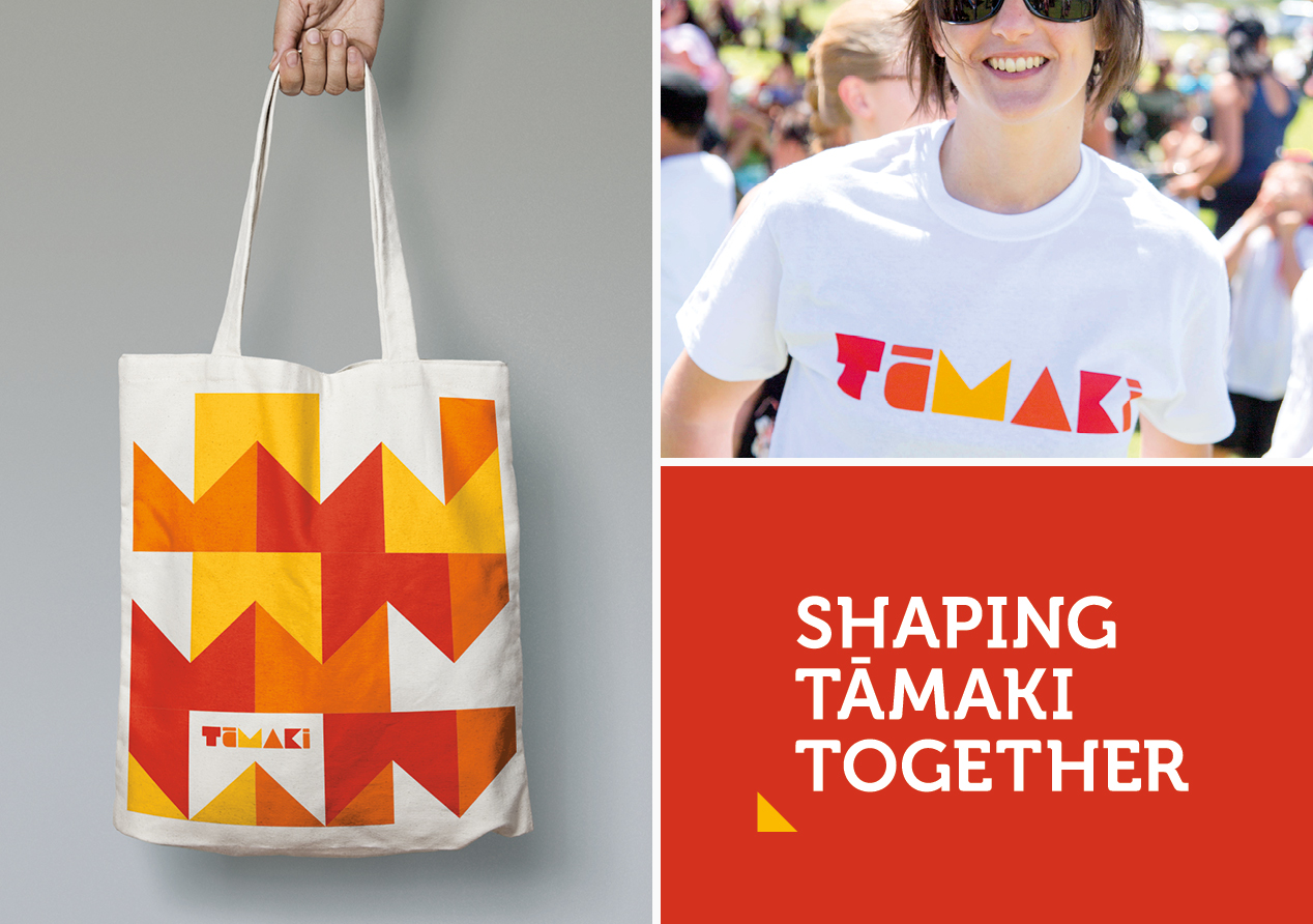
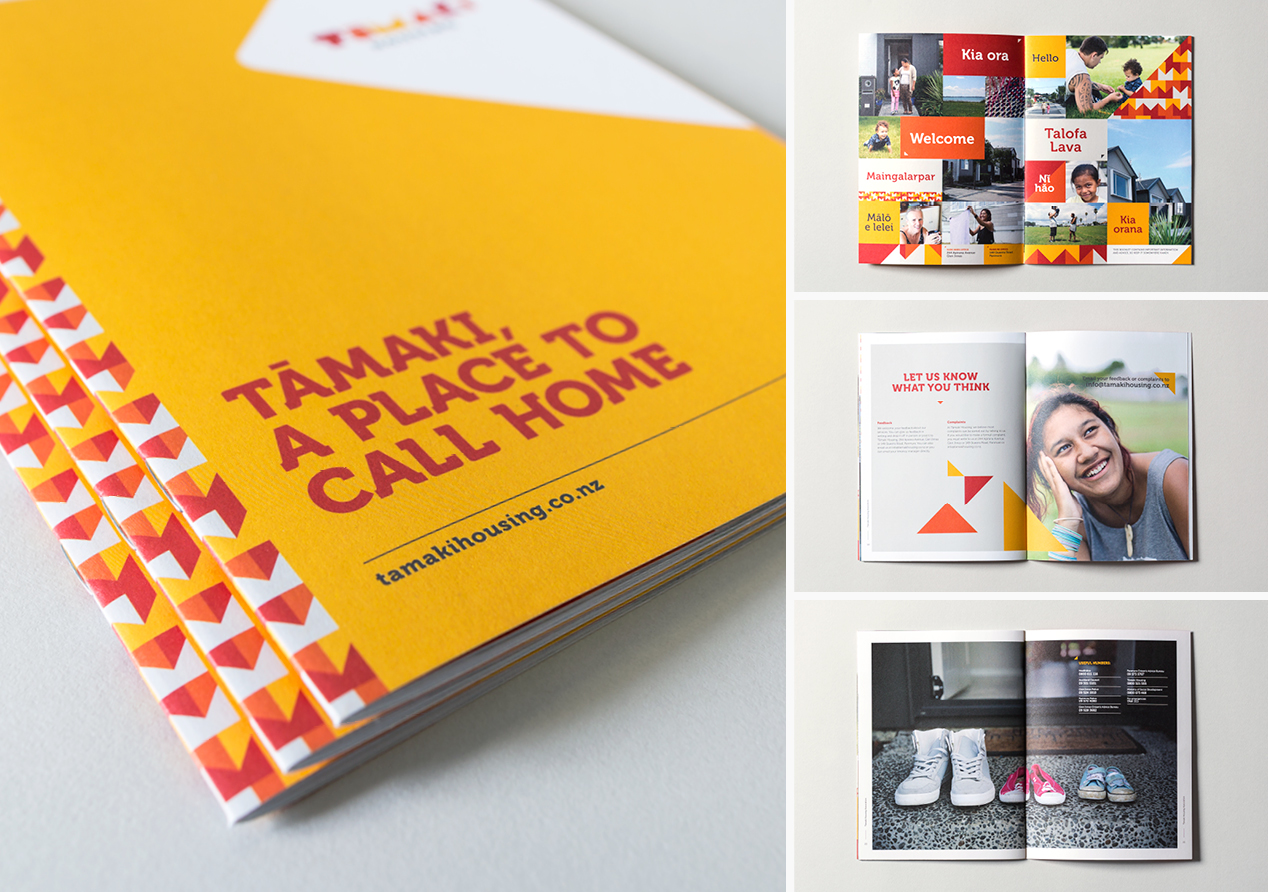
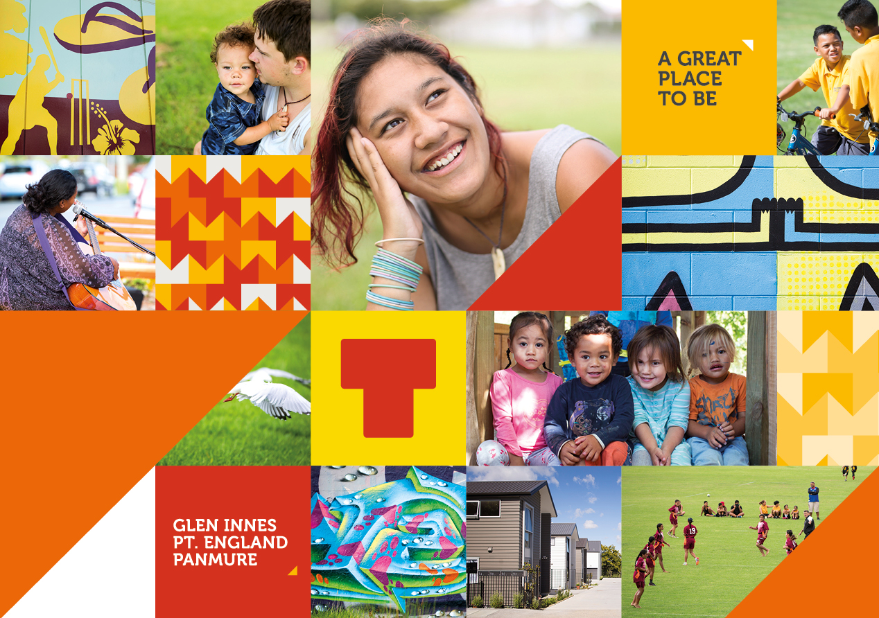
The overall brand is colourful and energetic with a pacific–inspired patchwork aesthetic that celebrates the diversity and colour of the area. It’s bold and optimistic, reflecting the enormity of the programme and the positive outcomes it will deliver. A series of tag-lines, a wide colour palette and a breadth in photographic content approaches give the brand an authentic and engaging tone that can be dialed up or down for different audiences.
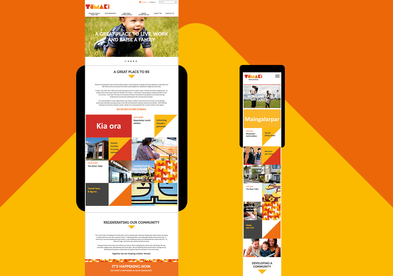
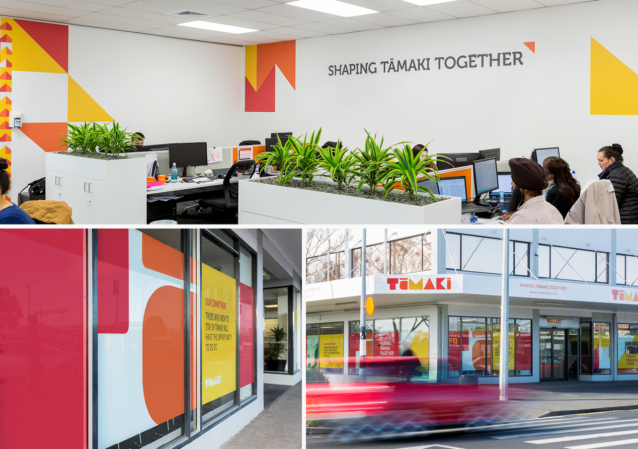
The new identity manifests itself in many forms. First, in a new website which is actually two sites, built as one, allowing a unique user journey to be carved out. We saw having a physical ‘on the ground’ presence as crucial and this resulted in bold exterior graphics in their Panmure and Glen Innes offices. And a bold and proud hoardings system will give the brand even more mana in and around the developments as they roll out. Numerous other executions included merchandising, banners, posters and brochures.
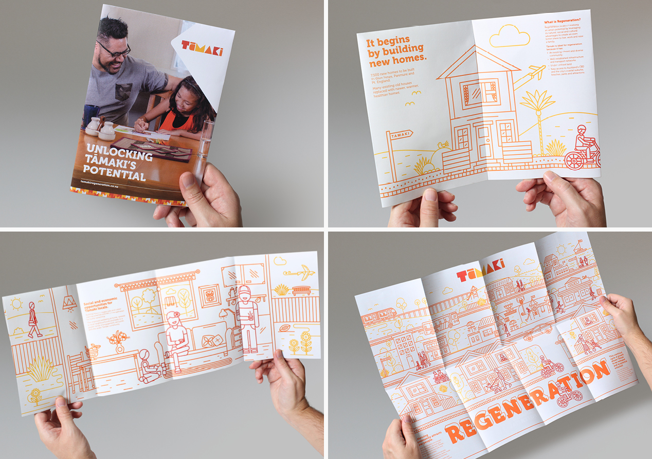
A video and accompanying leaflet tell the story of urban regeneration - a difficult concept to explain, especially given the breadth of audiences. So we chose a simple ‘child-like drawing’ illustration style, in Tamaki colours, to make it feel more accessible.
The Results
TRC wanted impact and cohesion. We delivered both. Engagement is high and this is quickly turning into results as developers and investors sign-on. And as the brand rolls out, the cohesion and flexibility built into the thinking becomes more and more evident.