Sign of commitment
Client: Stand Children's Services

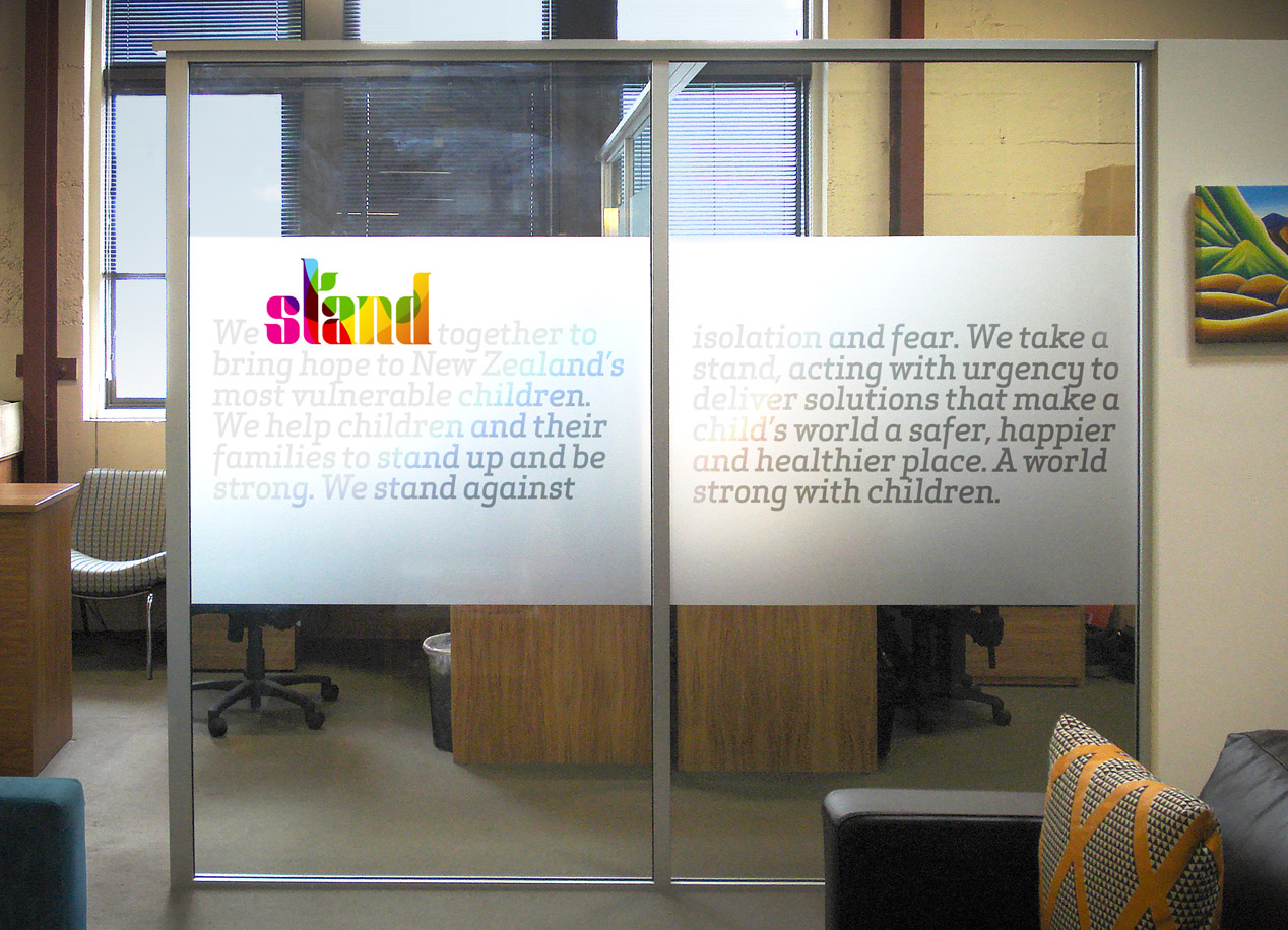
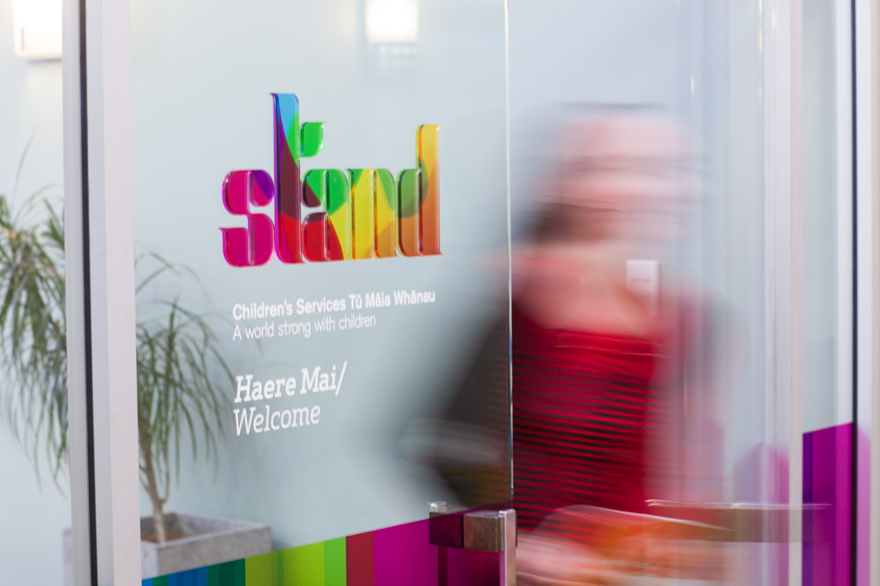
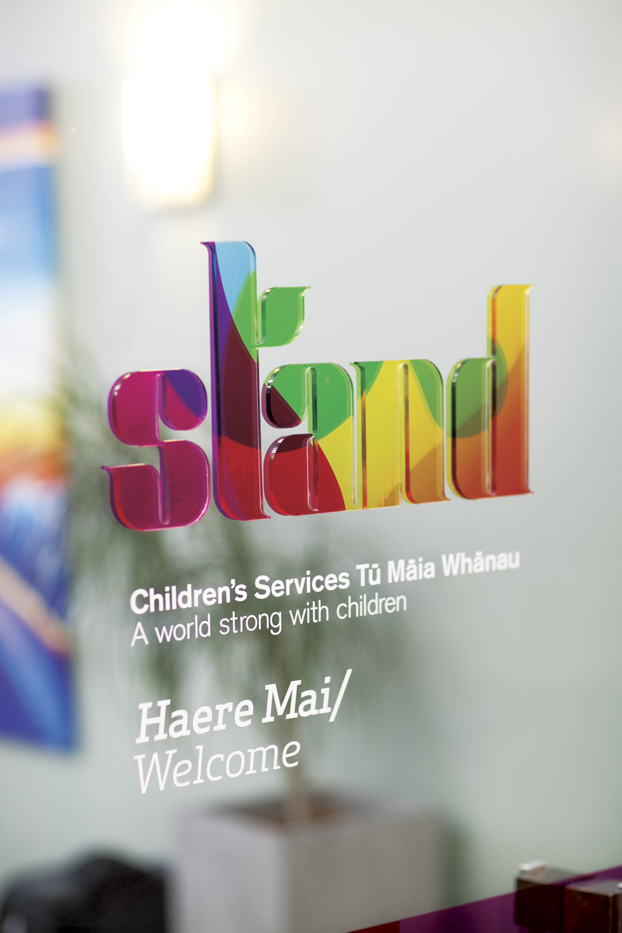
As part of Stand’s new visual identity system, our corporate office signage system focused on bringing the essence of their identity to life.
With high impact and the required gravitas of a corporate office, our aim was to still reflect the joy in the organisation’s commitment to making children’s lives brighter.
We focused on utilising the available environment and natural lighting, applying bold colour graphic panels to create a uniquely uplifting entranceway. The Stand logo was given a strong physical presence by attaching thick clear acrylic, with colour graphics applied to the reverse, onto glass door panels. Once inside the office we took a story-telling approach, applying emotive positioning text onto frosted glass within the reception area. The effect has resulted in a very positive corporate environment that speaks clearly to a reinvigorated organisation that has clear focus and direction.


