Rebranding for clarity & repositioning
Client: Blake
The Sir Peter Blake Trust had a new strategy and a confused market with regard to what they did and stood for.
They needed to tell their story a lot more clearly in order to continue to be successful in their reach and goals achievement.
The Brief
The legacy of Sir Peter Blake is well known to older New Zealanders, but the Trust's new strategic plan ensures that all programmes align with Sir Peter’s environmental goals, with a narrower focus on our country’s young people. Not surprising that there was some confusion.
The Trust felt it a timely opportunity to also review the brand strategy and visual identity to support the new direction.
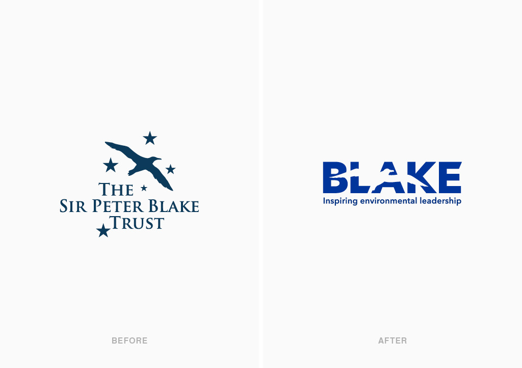
Even the name had its limitations. While it was a fitting legacy to Sir Peter, it didn’t help communicate dynamically to the newly defined audience. And it was commonly shortened to either ‘SPBT’ or ‘The Trust’ without reference to the Blake name, thus lacking a defined personality.
In summary, a complete brand perception shift was required. Future-focused, clear, young and inspirational.
The Solution
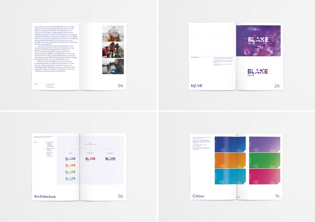
Immediately, we saw the need to develop a brand architecture framework that included a new Masterbrand and a system of closely aligned sub-brands, as there were a number of existing sub-brands and programmes that had little or no obvious connection to the parent organisation.
From our in-depth brand workshop and problem/opportunity assessment, it became clear that courageous naming changes were also required across the brand portfolio. And co-patron, Pippa, Lady Blake, had already intimated that she and the family were open to that possibility.
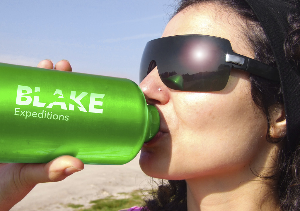
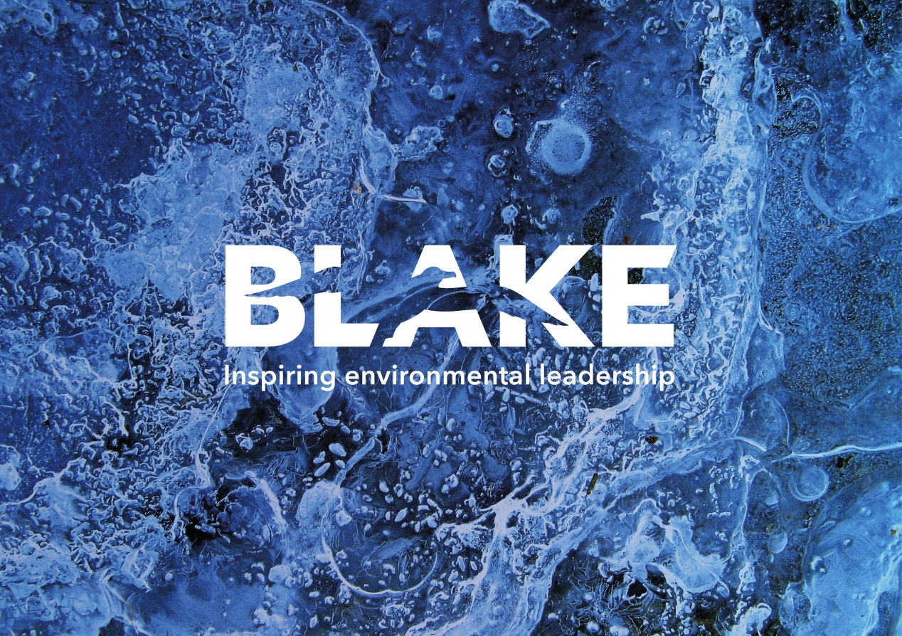
And so we started with brand architecture, and after considering a number of name + descriptor options, our bold Masterbrand recommendation was the one word: BLAKE.
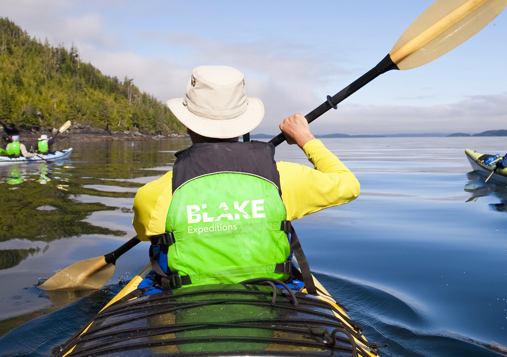
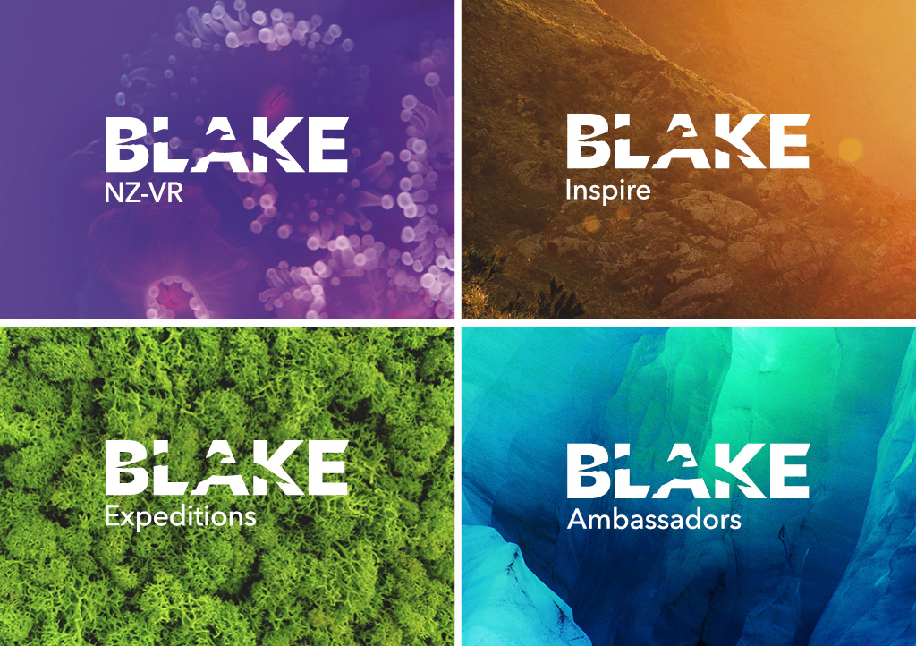
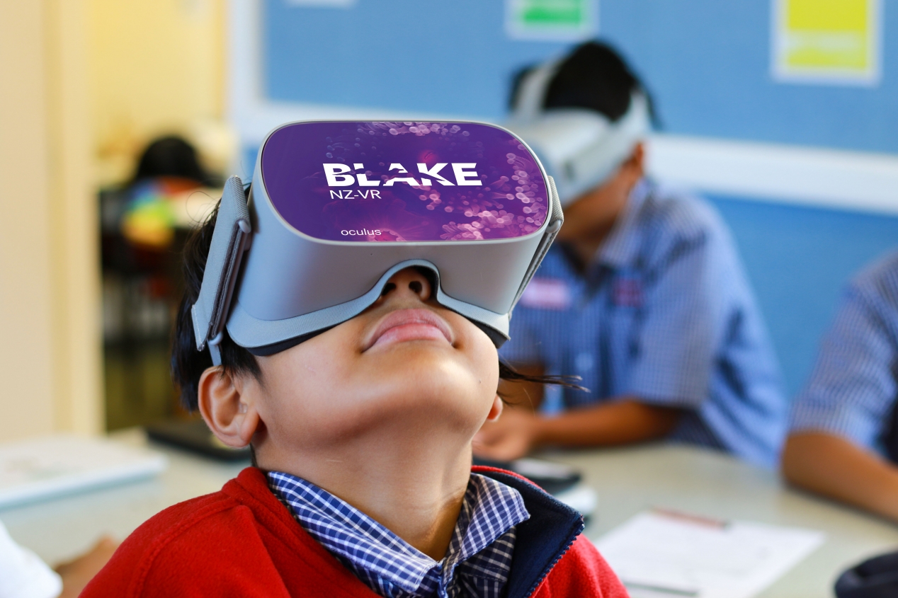
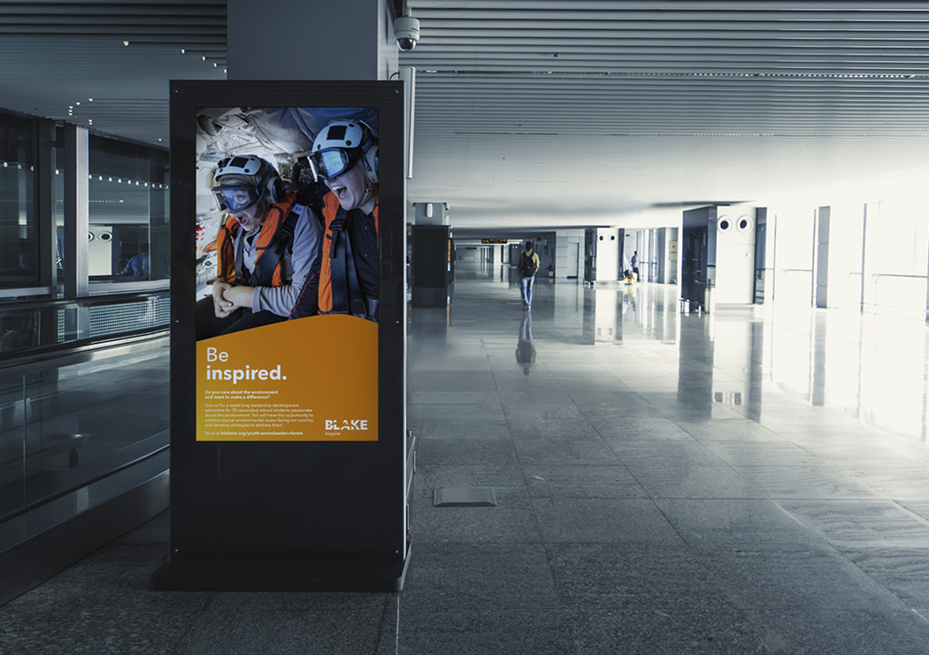
It was crisp, punchy, active, clear – and versatile, because it worked simply with the sub-brands (many of which we also renamed for directness and clarity, such as BLAKE Inspire, BLAKE Expeditions, BLAKE Awards, BLAKE Ambassadors, etc). We wrote a concise brand story and presented the naming architecture and story to the Trust leadership before we proceeded towards anything visual. They followed our logic and gave us the green light to proceed.
Visually, the brief was very open, with only a polite request that we consider retaining the albatross from the existing visual identity. The massive bird was iconic for Sir Peter, seeing so many in his multiple crossings of the Southern Ocean, and observing their numbers dwindling. It embodied the direction and aims of his future life’s work.
With such a short name, adding real strength and power visually became crucial for brand presence.
You can see the results in the accompanying images. Simplicity and strength. Visually dynamic and exciting. Colourful and uplifting.
The new Masterbrand and system of sub-brands each have their own suite of colours and textured backgrounds that elegantly fit together and reflect all that BLAKE have to offer.
A new photography style was also defined in order to start a library of cohesive imagery for ongoing marketing collateral.
The Results
The new brand was launched in early April. The immediate feedback from supporters, the Blake family, Blake Leaders and Ambassadors etc was absolutely glowing with a strong stream of enthusiastic congratulations hitting the CEO’s desk.
The first event to carry the new brand was the BLAKE Inspire youth leadership residential week (previously the Youth EnviroLeaders Forum – YELF) in late April. CEO, James Gibson, was there for the week and reports back as follows: “In the past week we’ve held the first BLAKE Inspire event, and it was fantastic to see the branding come together over the course of the week. Having a clear, consistent and compelling visual identity added much to the week. Seeing the cars, T-shirts, PowerPoint slides, event manual, lanyards and signage all in the new branding was really powerful.”
Note: Emily Wilson at Angel Creative applied our design principles to the car fleet