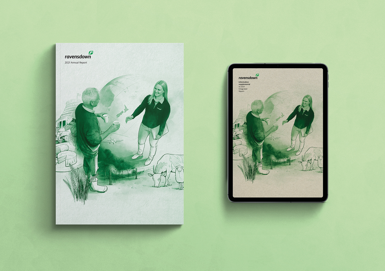
A digital-first annual report
Client: Ravensdown
2022 INTERNATIONAL ARC AWARDS - BRONZE
A screen-oriented, concise-driven, suite-approach to this year’s Ravendown reporting continues their constant drive for evolution, innovation and edginess in stakeholder communication.
The Brief
Many of Ravensdown’s farming stakeholders feel under-valued and uncertain about the future of farming and how regulations, and many other external factors, will impact their abilities to farm. Farming communities directly affected are frustrated by unbalanced public perceptions while other audiences are confused about the trade-offs between economic necessity, stable food supply and environmental sustainability.
In this uncertain and, at times, volatile environment, we were invited to reinvent Ravensdown’s integrated report into a clear communication vehicle that directly addresses perceptions and misinformation.
The Solution
Our aim was to position Ravensdown as a forward-thinking organisation positively partnering stakeholders in this changing landscape.
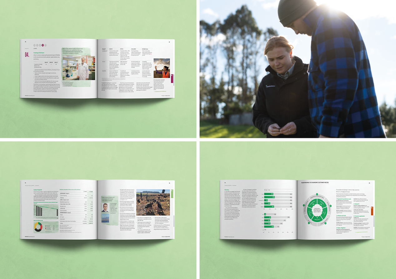
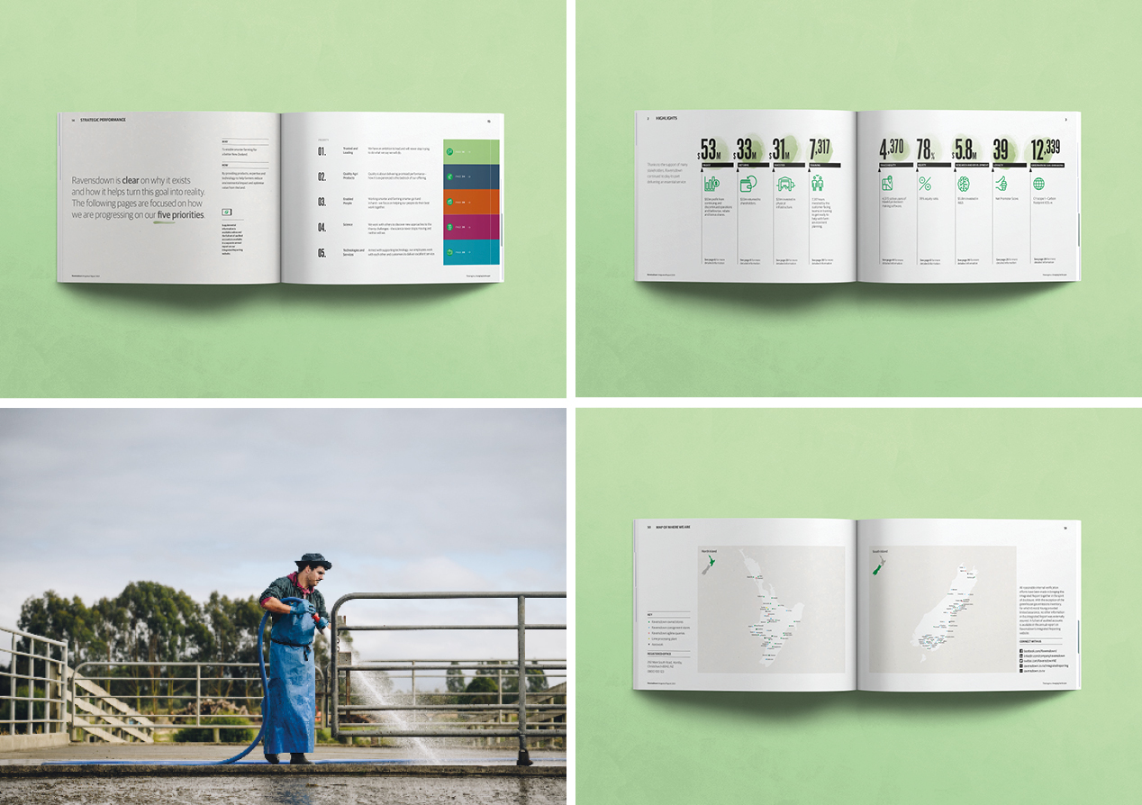
A decision made early was to change the format of the document, with a landscape orientation chosen to reflect the changing landscape. This decision also acknowledges the changing audiences for the report, who are more likely to be reading it online. The new format – complete with larger point size – is designed to work equally well online as it does in print. The other significant format change was the move to three separate documents, allowing the storytelling to be more concise and impactful. Financial and statutory information were moved to two complementary looking documents.
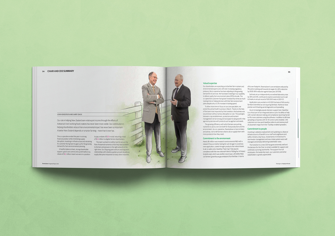
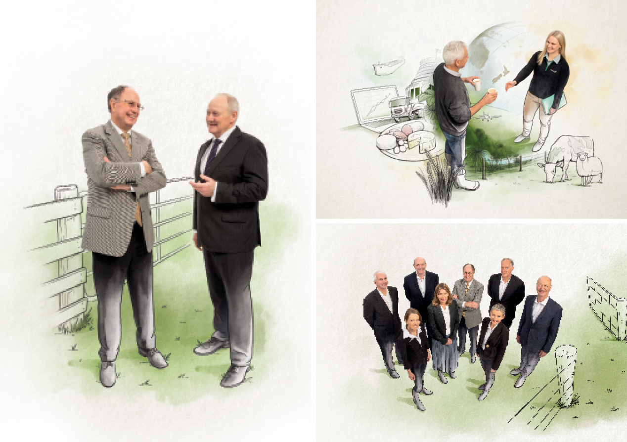
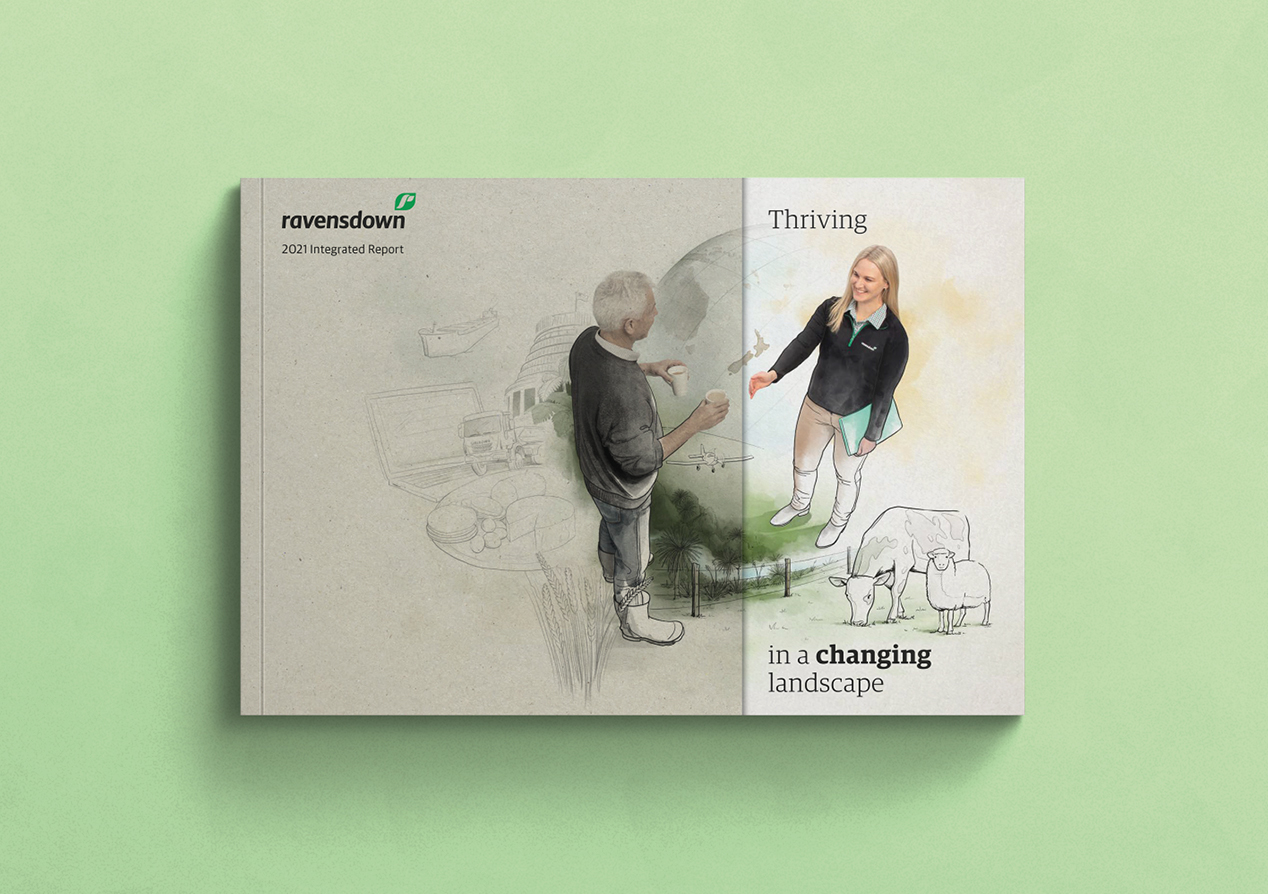
The overall design approach features an artful combination of illustration and photography, coming together to capture the complexities, shifts and relationships of change. This mixed media approach is effectively a metaphor for a dynamic farming environment, made up of different perspectives. The use of illustrations reinforces the core notion that Ravensdown is bringing colour to a somewhat ‘sketchy’ debate.
We brought our illustrator and client together to ensure all the details were factually accurate and to ensure the emotive qualities were correctly balanced for a farming community that prefers a ‘no nonsense’ approach. A carefully choreographed studio shoot ensured image and illustration worked in harmony.
This mixed image and illustration approach is carried throughout the document with greatest impact in the CEO, Chair, board and leadership team sections while also adding impact to feature quotes, highlight facts and core details.
A double cover was used to reinforce the key themes and to bring the key messages to the forefront. The plainer outer cover depicts a positive farming relationship, with a multitude of outside forces casting a shadow over it. Under the flap, these forces are coloured in, bringing them out of the shadows for the audience to see. It also depicts the value of partnering with Ravensdown in these changing times. This partnership positioning is then literally spelt out on the cover, avoiding any confusion.
The Results
The feedback from a wide range of Ravensdown’s stakeholders, including staff and the farming community, has been extremely positive. Comments range from describing the work as having ‘high visual impact’ and being ‘clear and concise’ through to the positioning of Ravensdown as genuine, transparent, respectful and collaborative.
