Redefine yourself through change
Client: Ports of Auckland
Ports of Auckland wanted to lift the focus on their customers and community by presenting a compelling brand story about the difference they make to all New Zealander’s lives.
We were asked to refresh their visual identity:
- to reflect the changes the company has been through in recent years;
- to better connect with the community; and
- to present a more modern, relevant face to its customers and stakeholders.
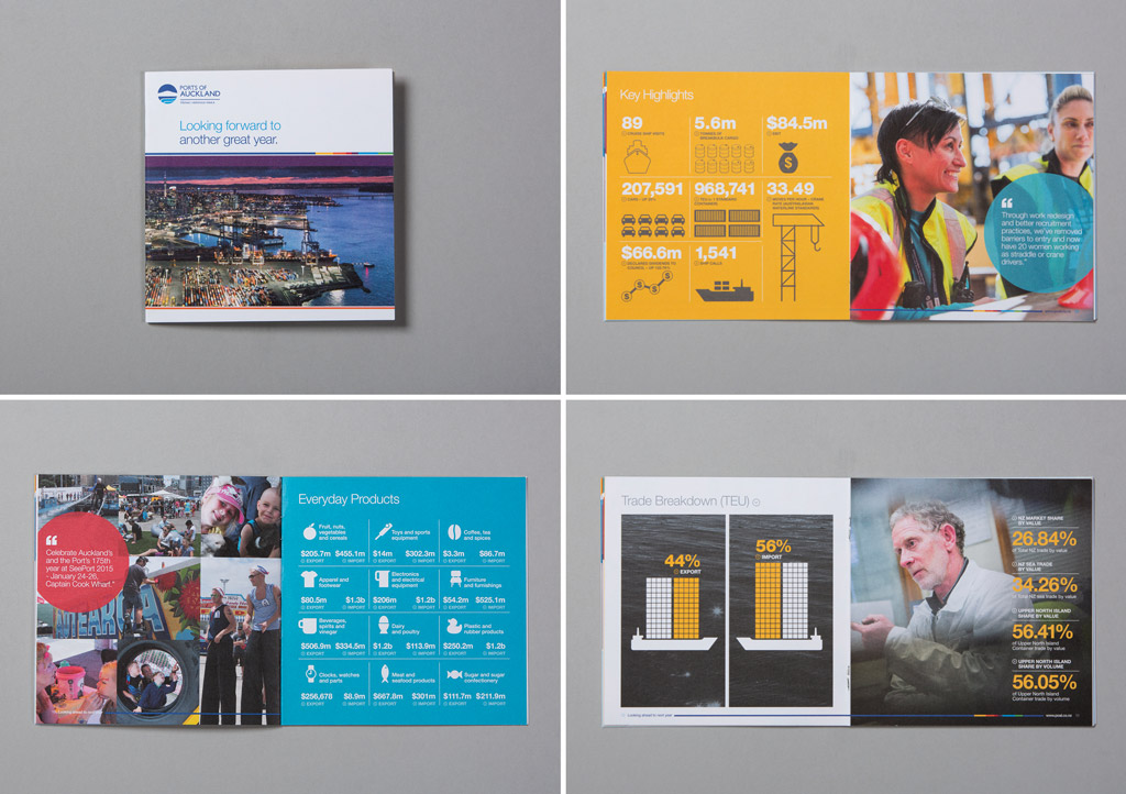
Following a workshop with key internal stakeholders, we identified two unique points that elevate Ports of Auckland above its competitors - location and productivity. These two aspects became the cornerstones for the brand positioning and personality and were also the basis for the visual identity refresh.
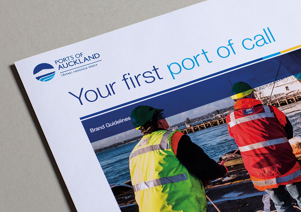
We reviewed each of the elements of the existing visual identity against the desired positioning and recommended changes in a number of key areas including the logo, fonts, colours, photography and tone of voice.
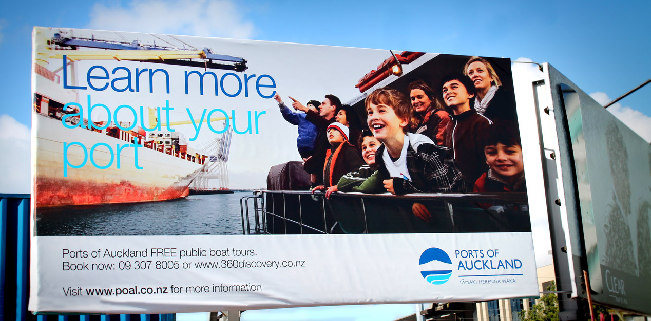
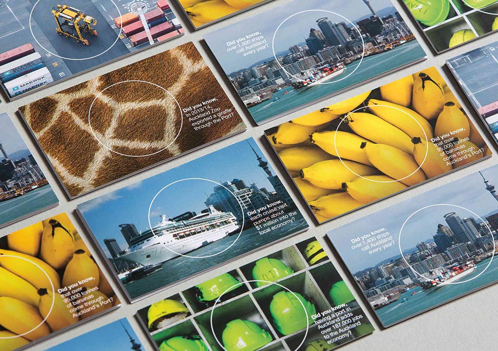
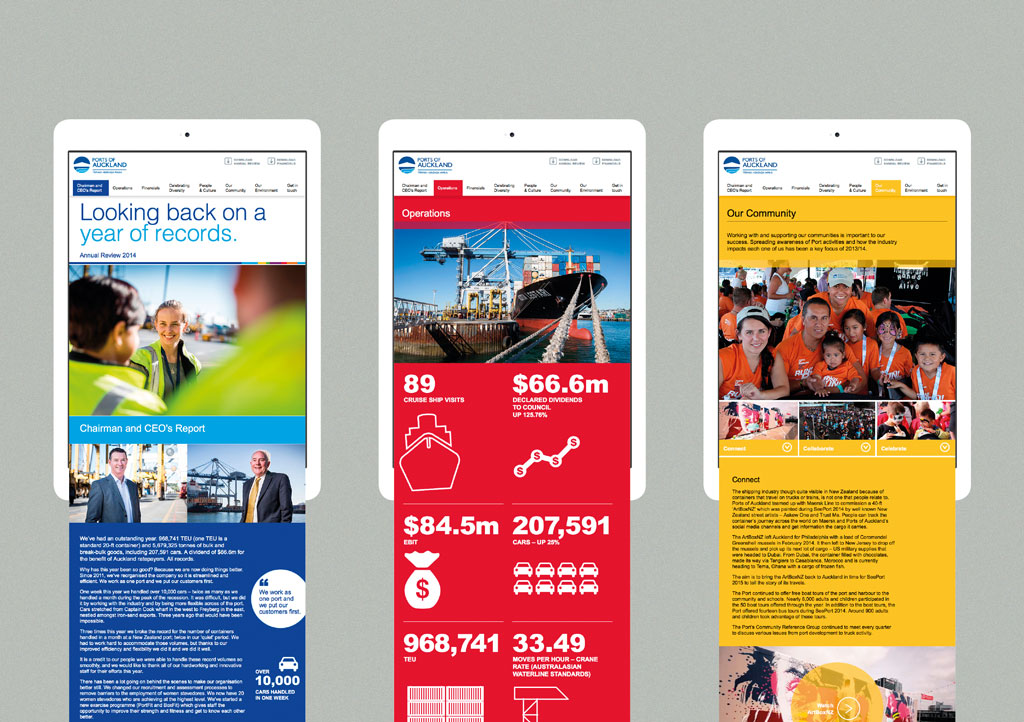
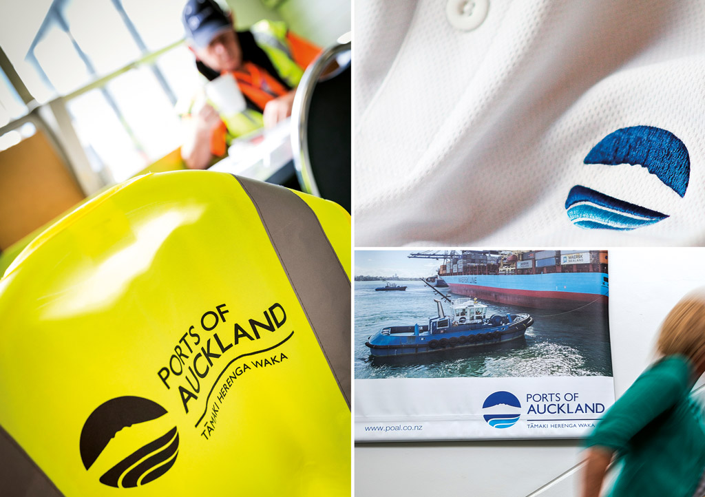
The re-think of the logo saw it move beyond its traditional endorser role, to being a graphic treatment that allows their personality to be stamped on any communication. The new colours are more modern and vibrant, mirroring Auckland and its inner city communities. The new photography style is more human and personal, allowing a more caring and community aspect to be represented. The new voice is approachable, inclusive and benefit-led.
All these elements combine to deliver a relevant identity that redefines them as a warmer, energetic and community focused organisation with a strong sense of quality and efficiency.