Reflect a new status
Client: Property for Industry
PFI had merged with a private property entity in the same market space and in doing so became the country’s fifth largest listed property company. We were asked to present a more prominent face and voice in the market befitting their new position.
An incisive brand workshop with the senior leadership of this tight team identified the real personality of the company, and also the gap between who they authentically were and how they had been presenting themselves.
The Brief
This was much more than a cosmetic makeover. Our task was to re-define who PFI are, create a very clear brand story as a backbone for all future communications, and build a visual identity and communication collateral on those foundations.
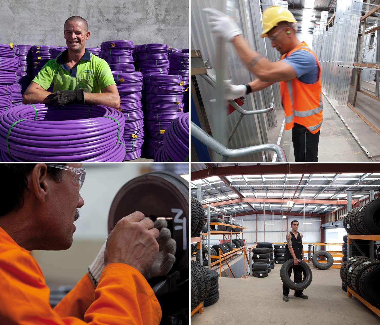
PFI specialise in Property for Industry, as their name suggests. And genuine specialists in this field is what they are. None of the flash CBD glass buildings where paper is shuffled, these guys operate out the back where the real work gets done. And they do it with a style that is straight up, common sense and directly approachable. And that’s what we settled on reflecting.
The Solution
While the original brief was to ‘evolve’ the existing logo, by the time we had completed the required ‘shift analysis’ of how we needed to change perceptions to ensure they were seen as they really are, it became clear that a simple modernisation of their logo wasn’t going to bridge the gap. And so we found ourselves needing to stare at a blank piece of paper, and conceiving the look of their brand from the ground up.
By having our design team work in close collaboration with our ‘corporate storyteller’, we created a vivid brand story and strong, powerful identity in perfect harmony.
The Result
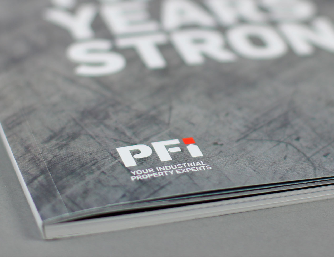
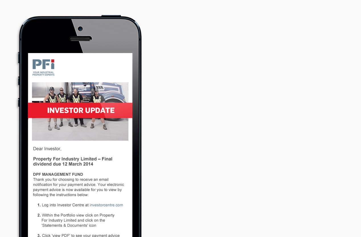
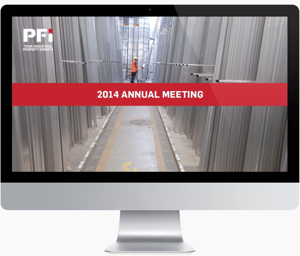
The new identity was launched with the 2013 PFI Annual Report which coincided with their 20th year of operation. All audiences, including their competitors, have expressed their admiration for the clarity and strength of the new solution. Only the corporate/investor part of the full brand toolkit has been exposed at this point. An expanded vocabulary and graphic style is set for launch later this year, particularly tuned to their tenant audience.