Expressing our story
Client: NZX

A unifying story, a reinvigorated visual identity toolbox and a defined brand architecture has helped NZX tell a strong story about enabling Kiwis to succeed, with confidence, consistency and impact.
The Brief
Over recent years NZX have experienced significant growth by innovating their products and services and diversifying into a number of related investment market activities. Over 2020 and 2021, we helped them define what they stood for and to align their visual identity and brand architecture with their story.
The Solution
Over a series of zoom discussions we discovered that NZX was so much more than a regulator and capital markets operator. We found an organisation with purpose and a real passion for New Zealand’s growth. First, for helping businesses access the capital they need to expand, creating jobs and delivering more opportunities for Kiwi communities. Second, for ensuring investors have more options that allow them to protect and grow their hard-earned savings. And finally, a passion for the local intermediatory community, recognising that supporting them enables businesses and investors to find each other.
This passion became the basis for an aspirational brand story entitled Enabling Kiwi Success. It’s a warm and human story that drives emotional pride for both internal and external audiences.
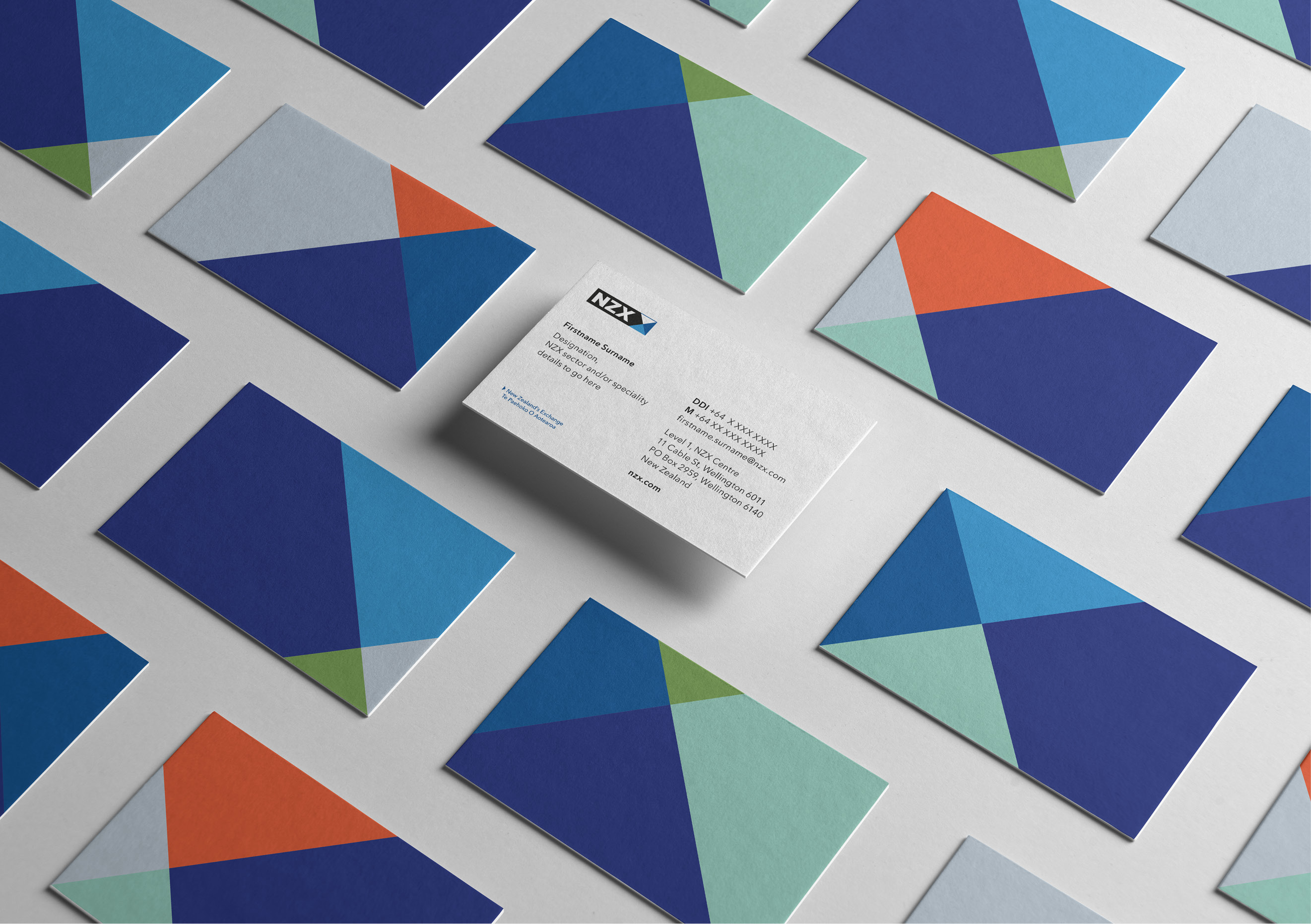
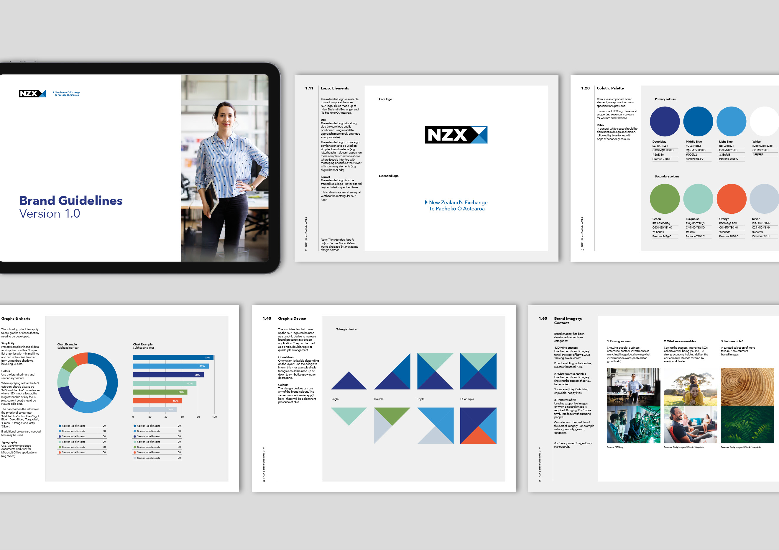
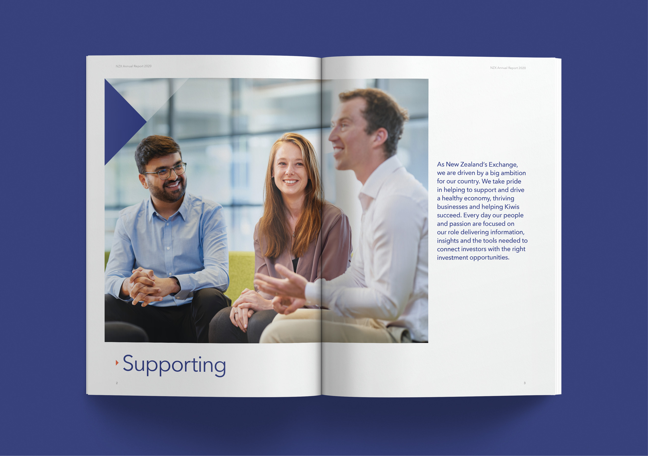
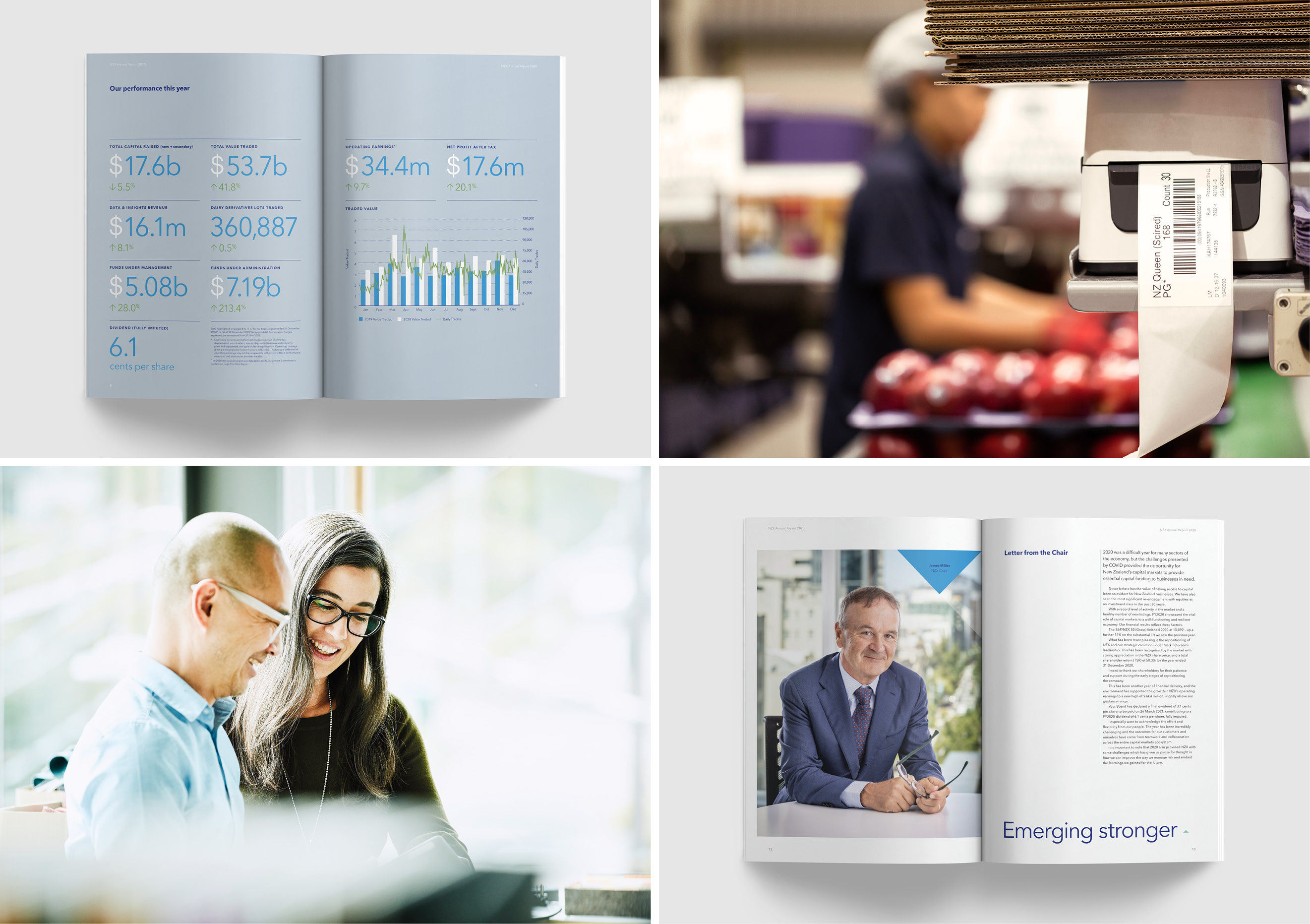
The story became the backbone for a refreshed visual identity that included a wider, New Zealand-inspired colour palette; photography that reflects enabled local audiences; and icons and graphics that are more human and accessible. The logo was refined and its core triangular shape turned into a hard working device that could be used, in isolation or in repeated patterns, to tell compelling brand stories.
The next step was revisiting the architecture ensuring the NZX brand was used consistently across the various market entities. While a masterbrand approach leads the way, the need for levels of independent branding was recognised and formalised.
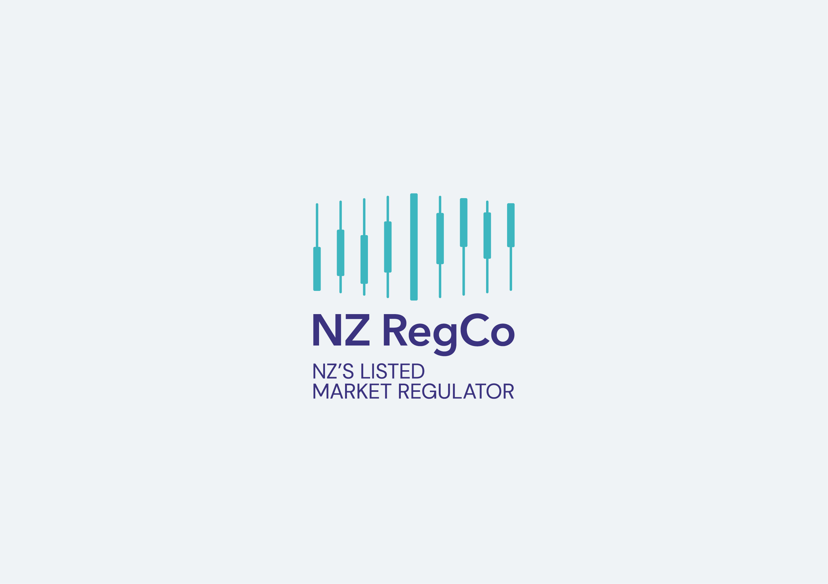
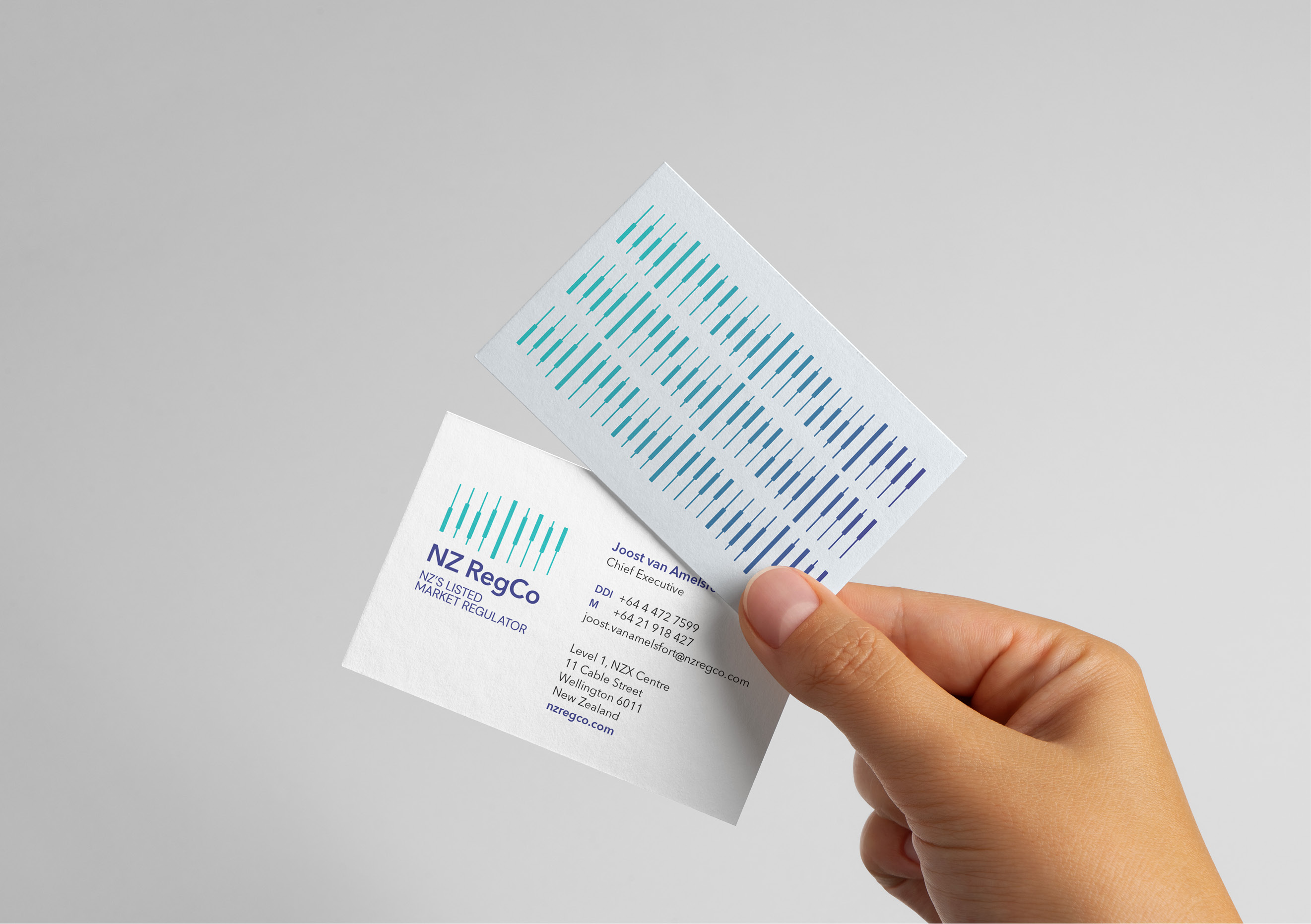
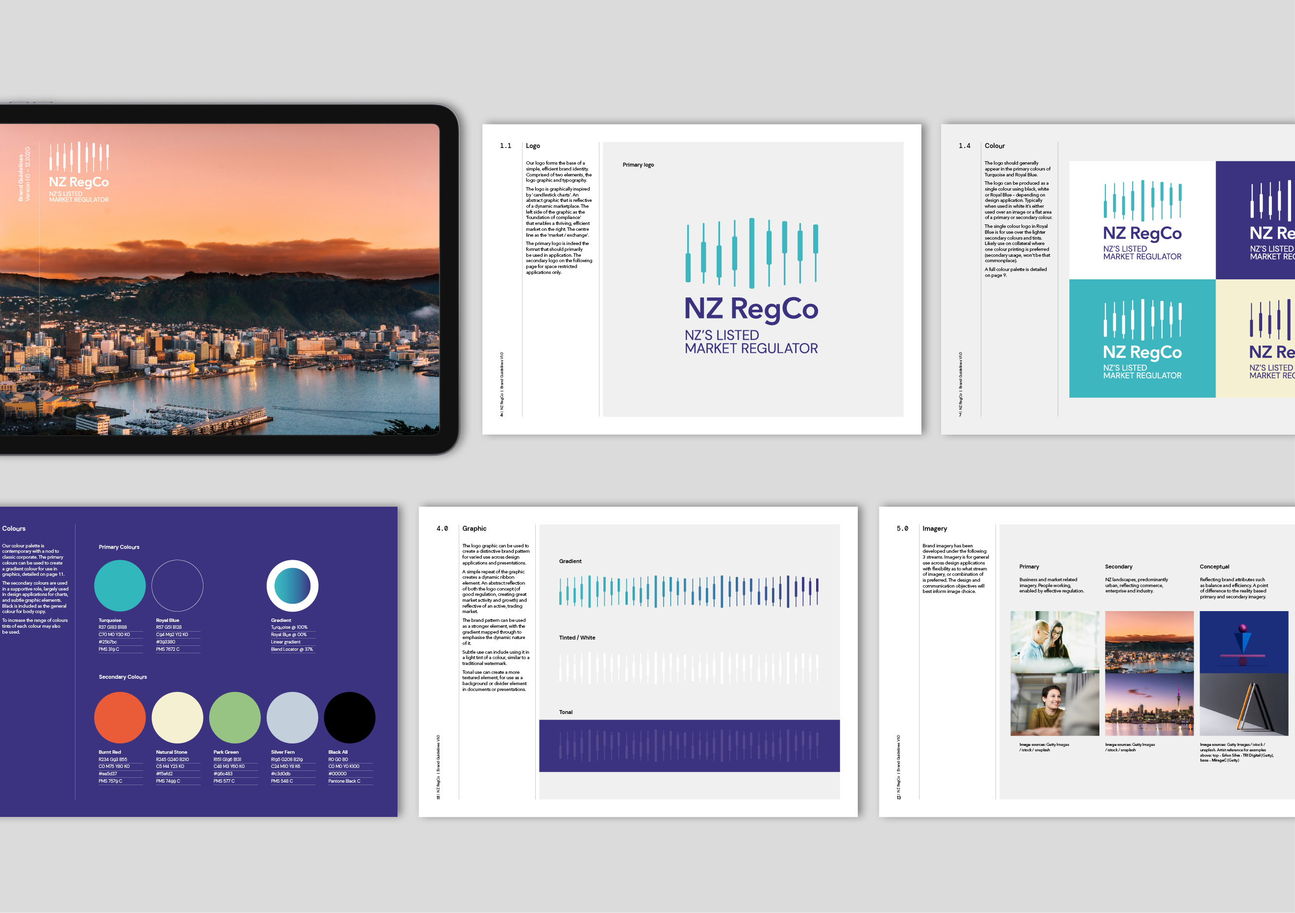
The development of NZ RegCo was driven by a market need to have clear distinction between NZX’s commercial and regulatory functions. While independent, RegCo is an ‘NZX cousin brand’ using a number of common elements. It’s a brand strong on engagement, positioning RegCo as both a regulator and an enabler of good industry practice.
The Results
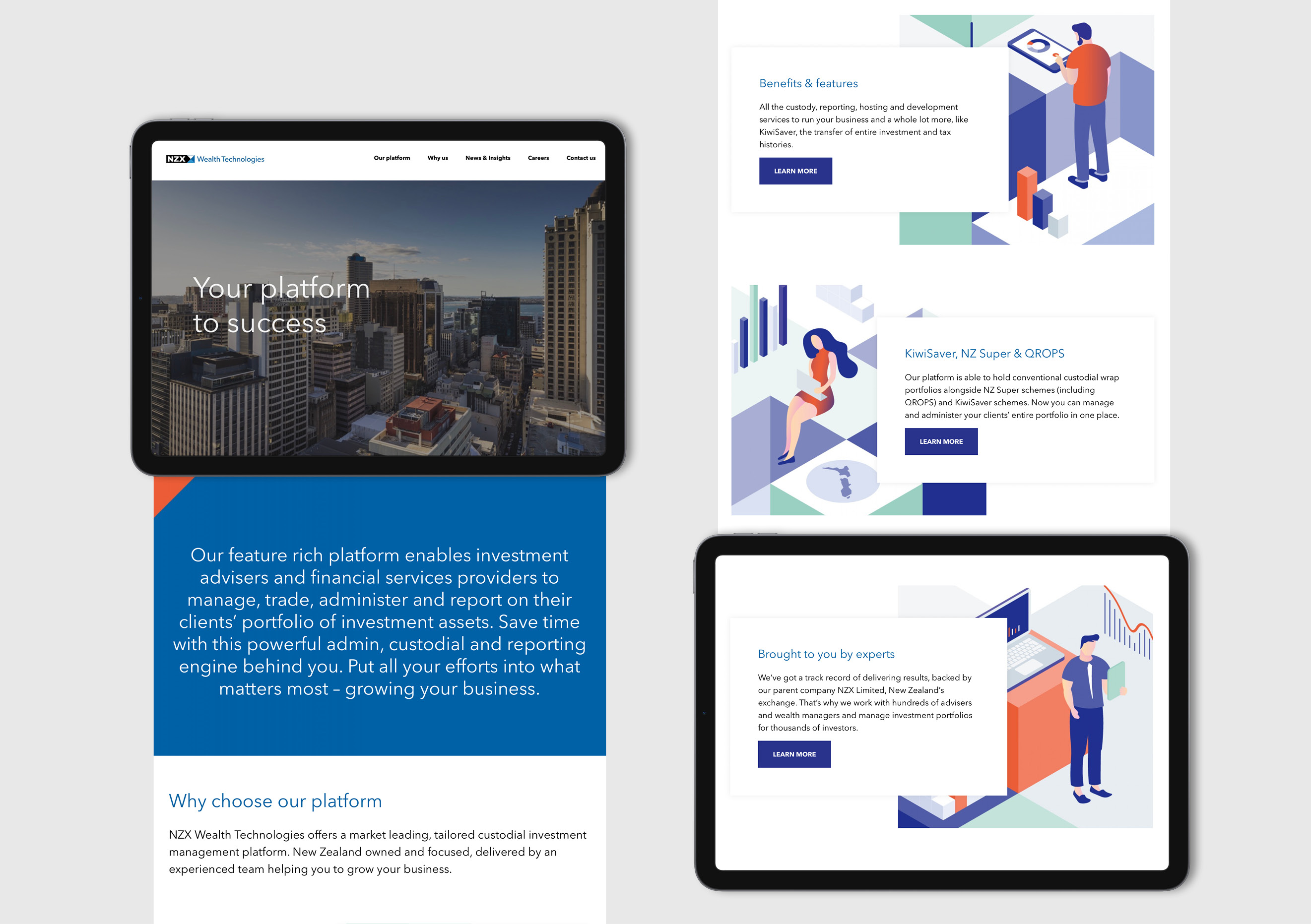
A clear brand story, a fresh and versatile visual identity toolbox and better-defined brand architecture has manifested itself in a string of storytelling executions from sales materials, investor presentations, web applications, an engaging office fitout and a new website for NZX Wealth Technologies. NZX’s Head of Marketing, Farnaz Zemke says “The feedback has been overwhelmingly positive, helping us express a stronger story and connect with a wider audience.”