From corporate to boutique
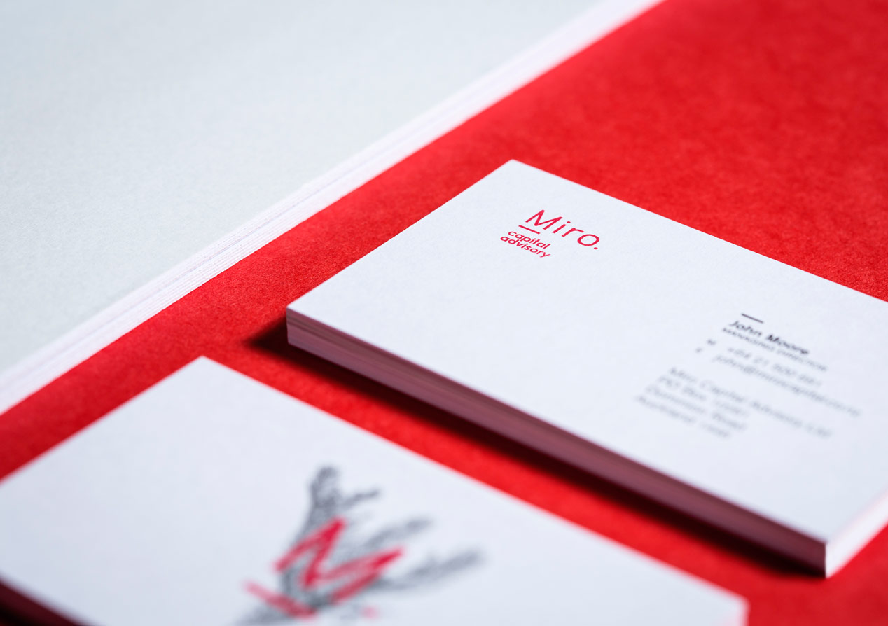
Client: Miro Capital Advisory
FINALIST: 2014 BEST AWARDS

When the Head of Equity Capital Markets left his role at a large global investment bank to set up his own boutique, and uniquely New Zealand, consultancy he chose the name Miro Capital Advisory in honour of our native conifer tree.
Our task was to interpret the name into a cohesive visual identity that projected the personal, professional, solid and New Zealand service the company offered medium to large businesses.
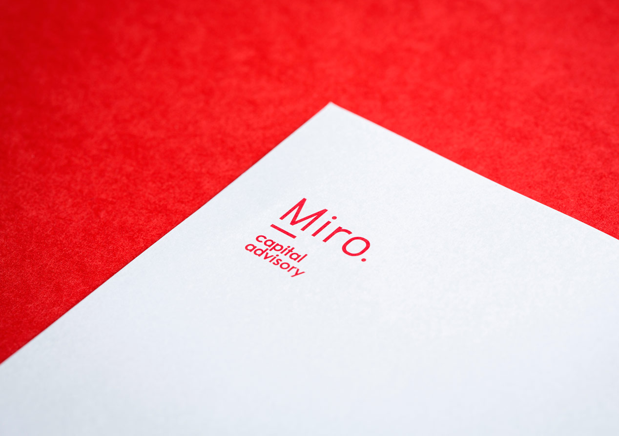
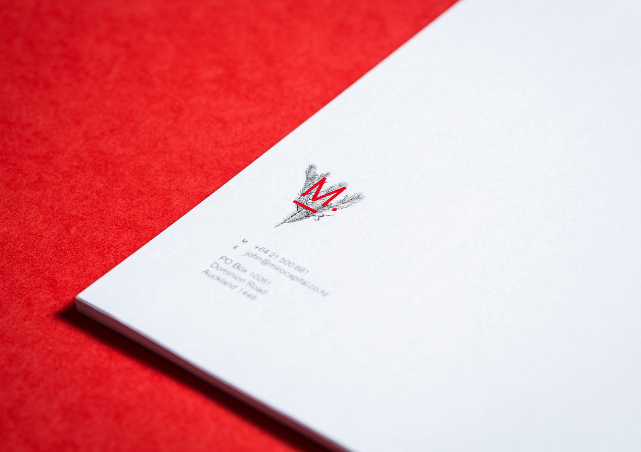
Having explored the full miro tree form and photography options, the optimum design route was found in a sprig of the plant. The sprig is a metaphor for our client’s new beginning and also symbolic of the solid platform for growth Miro delivers to its clients. A botanical line drawing treatment was selected to reference the hand-crafted, personal approach to advice Miro offered. The Miro presents bright red berries so this became a natural choose for the corporate colour.
In blending all these elements into a graphic solution, our work combined elemental purity with dignified professionalism to best represent the gravitas, yet personalisation, of the business.