Branding innovation
Client: Insight Creative
2022 INTERNATIONAL DESIGN AWARDS (IDA) - SILVER
Insight’s new innovation lab is where we dare to imagine the impossible. And it needed a suitable name and brand identity.
The Brief
In 2021 we launched our new Innovation Lab, fuelled by a desire to do good, to be curious, and to experiment. The Lab is about taking great ideas and turning them into solutions that make thing better for us, our clients and the world. It’s a place where we dare to imagine the impossible, push boundaries, create new rules and keep learning until great things happen.
We asked our creative team to develop an identity that captures our vision for the Lab, connects it to our core brand but at the same time differentiates it from business as usual. The desired brand needed to speak to imagination, a future-focus, innovation and pushing boundaries. As if the brief wasn’t complex enough, we also wanted it to be a system that could be applied to communicate a broad mix of innovation projects to an equally diverse range of audiences.
The Solution
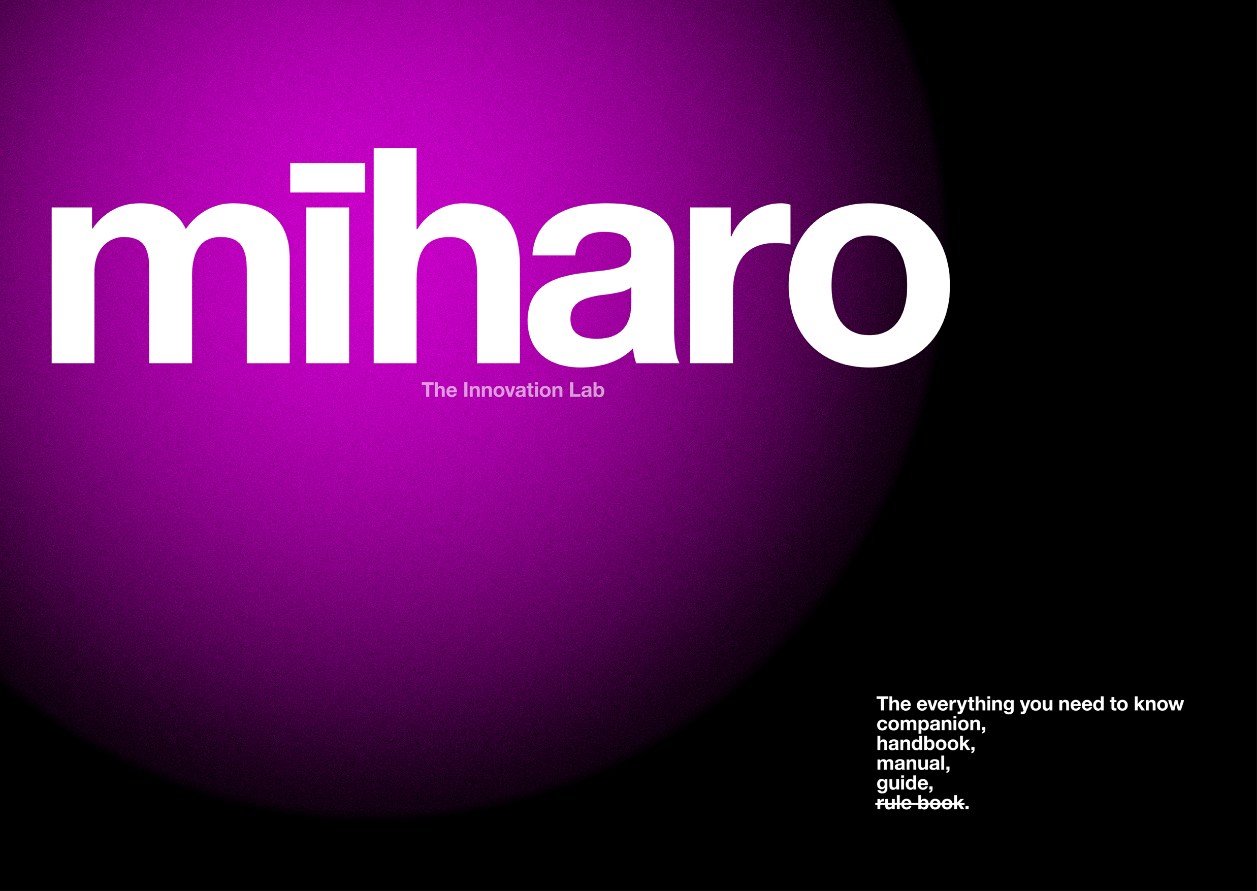
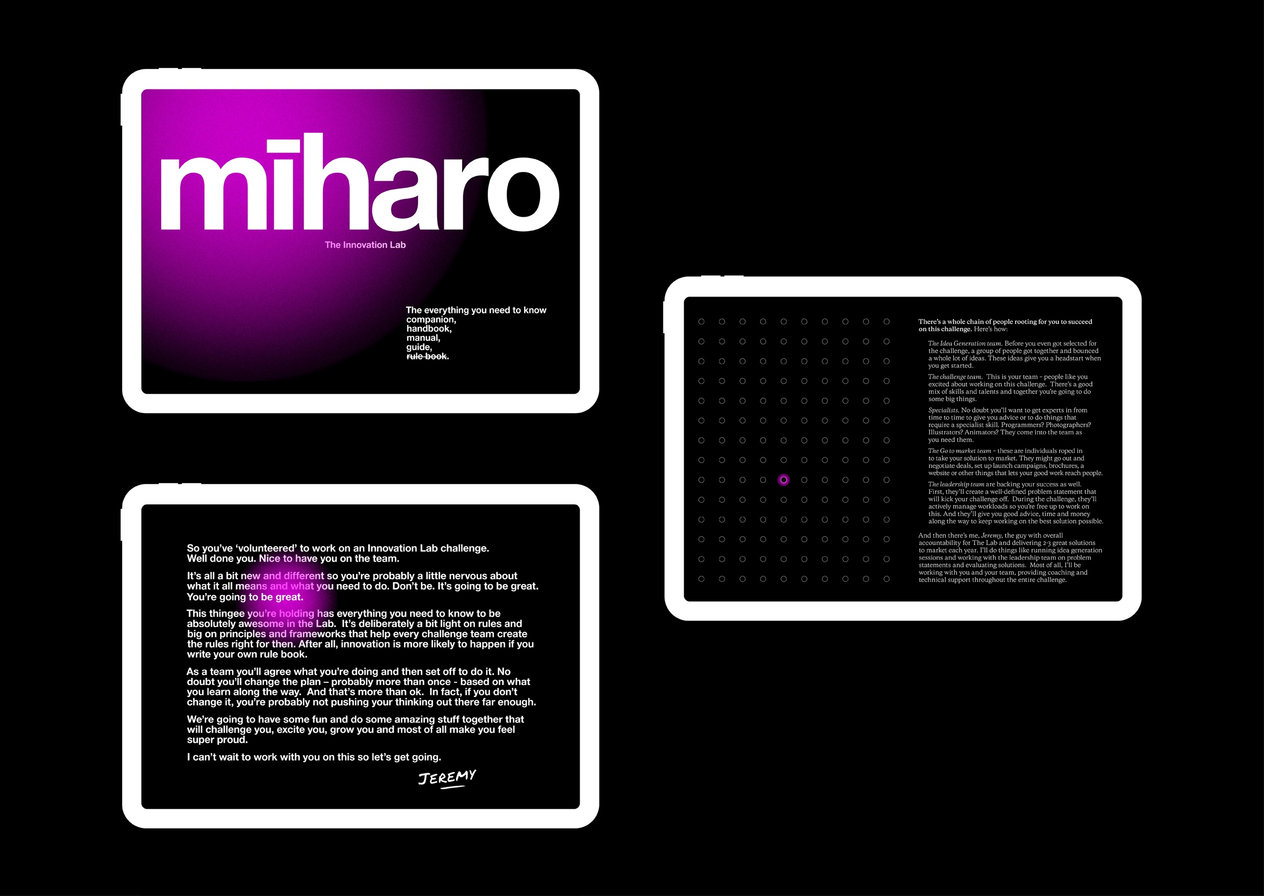
The first step was naming and after considering a variety of options the name chosen was Mīharo. Mīharo is the Te Reo word for ‘wonder’ as in ‘wonderful.’ We extended the notion further to speak to curiosity – “I wonder what would happen if we…?” With this double meaning, Mīharo is about looking at challenges in different ways and finding new solutions that make things more wonderful.
The first step in the design process was considering a logo mark. The decision was made to go with a bold, clean and simple wordmark that has the flexibility to work on its own, with a descriptor tag-line, alongside our core logo or endorsed by the core logo.
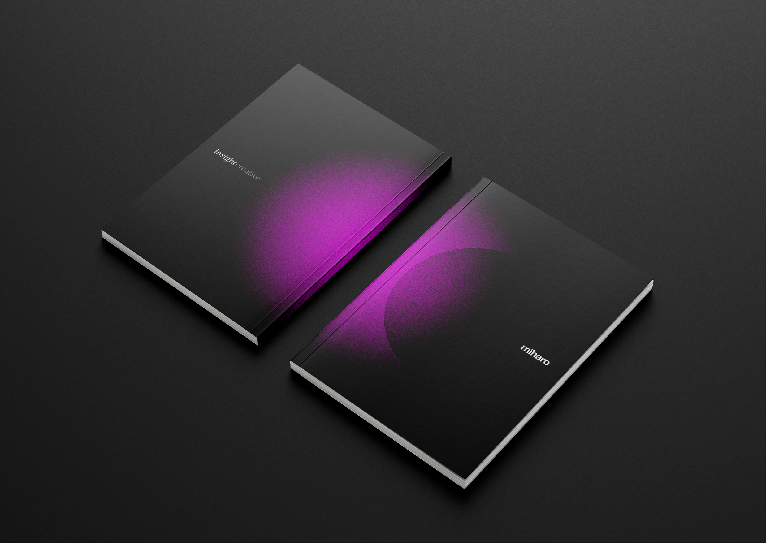
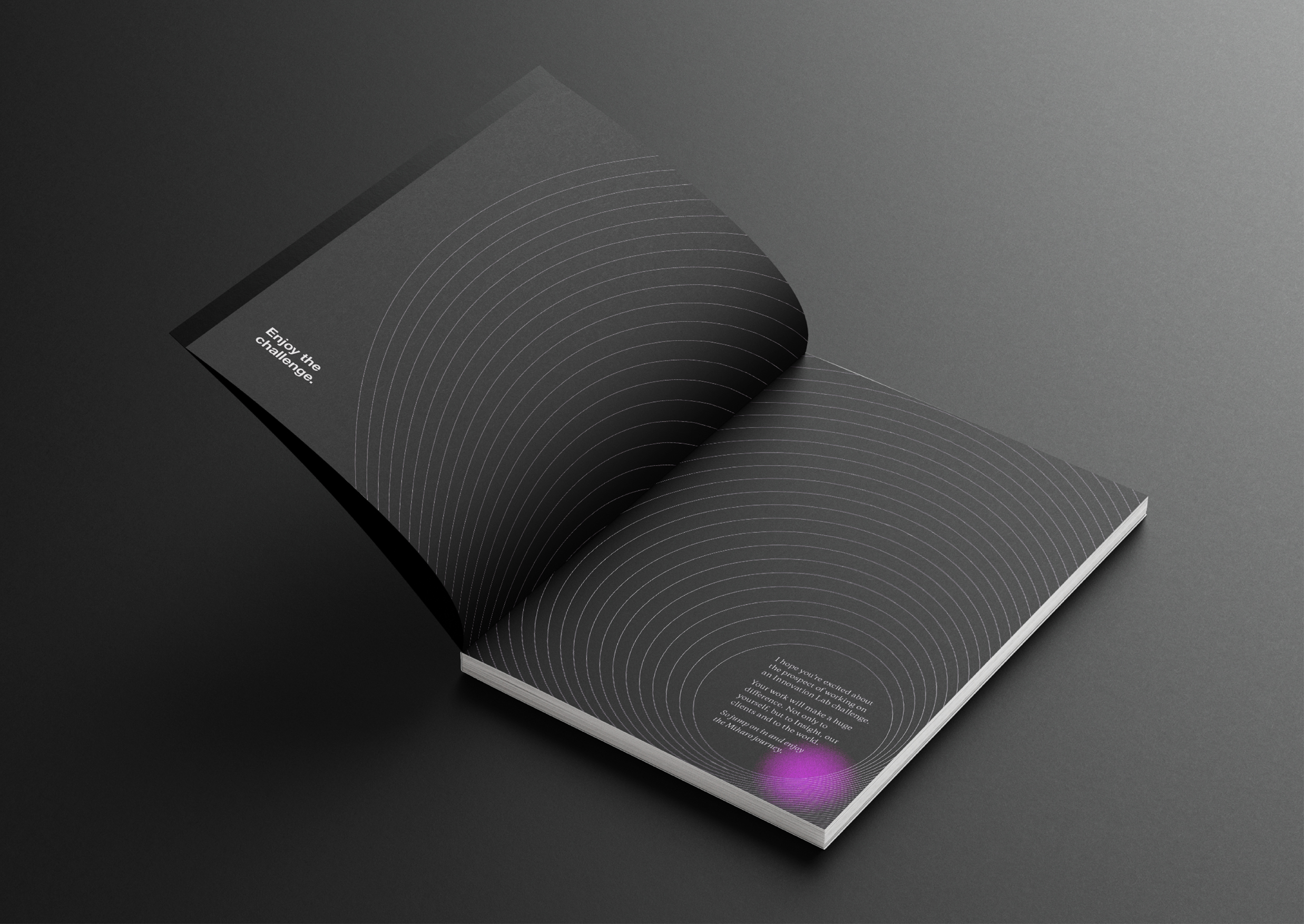
Starting with our brand colours of magenta, black and white, the first decision was to dial up the black, instantly giving the identity a more sophisticated futuristic feel. Magenta became a strong accent colour designed to highlight the wonder and to give life to branded communications.
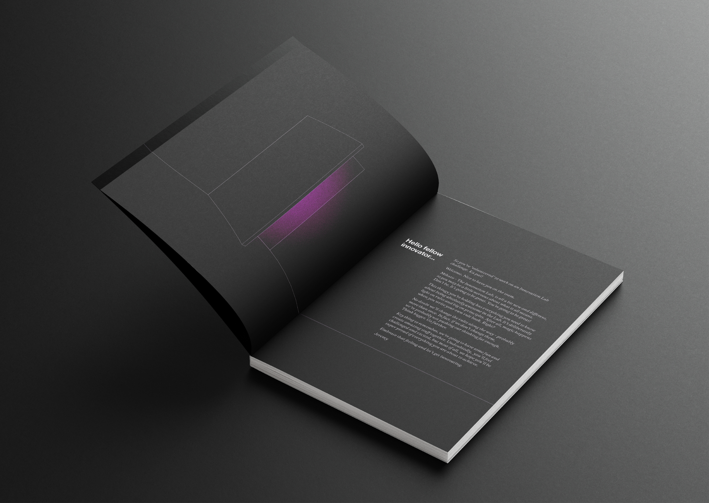
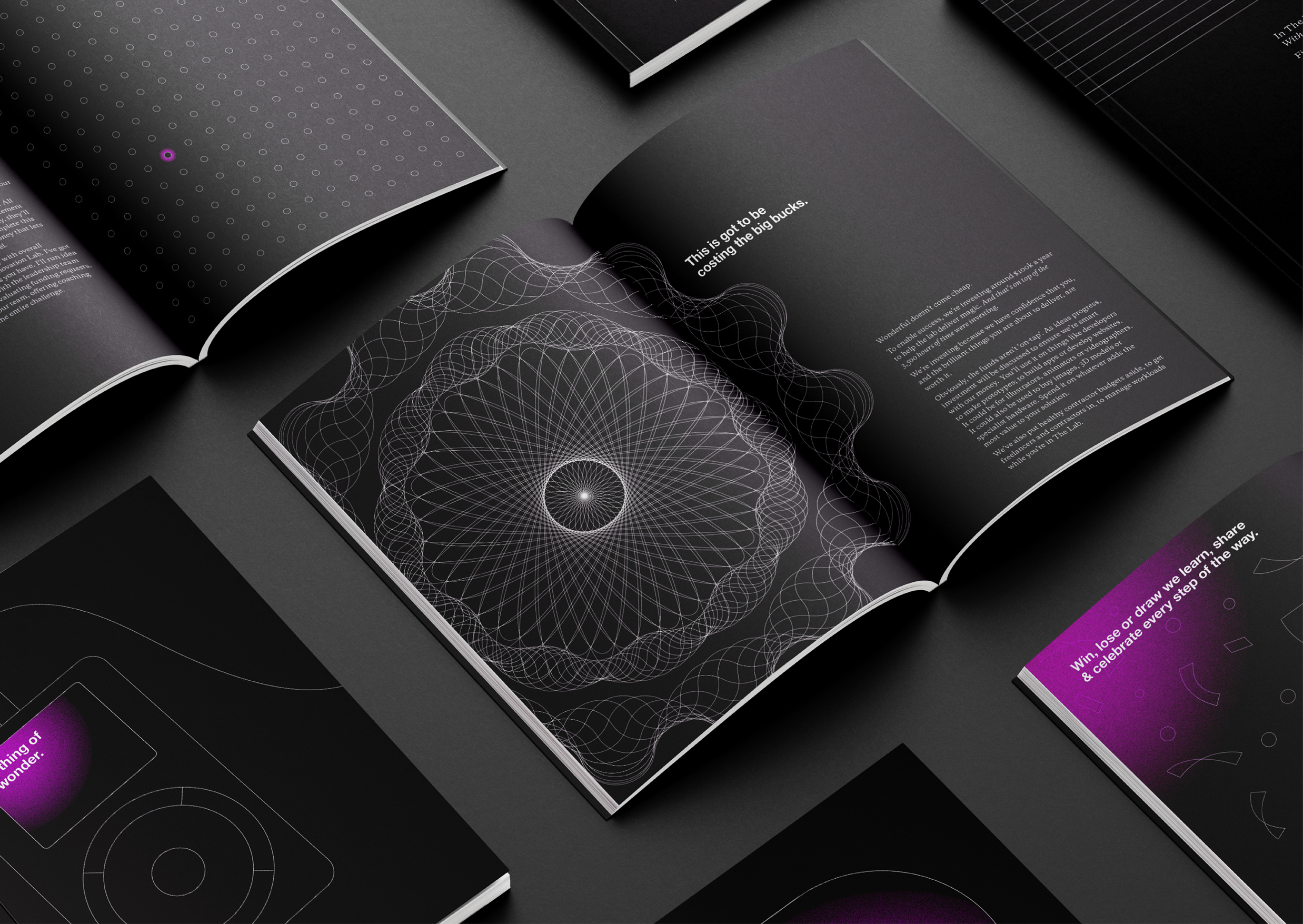
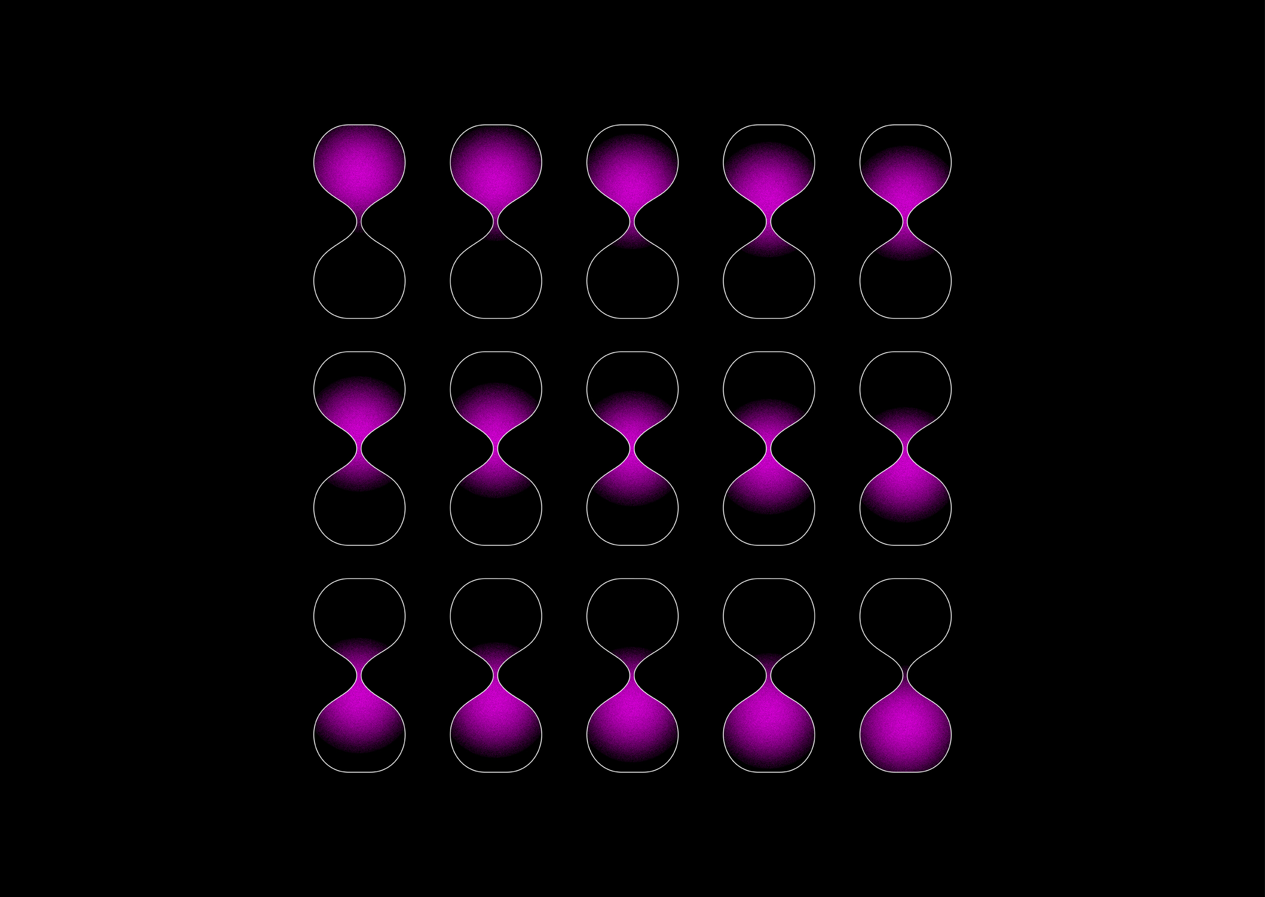
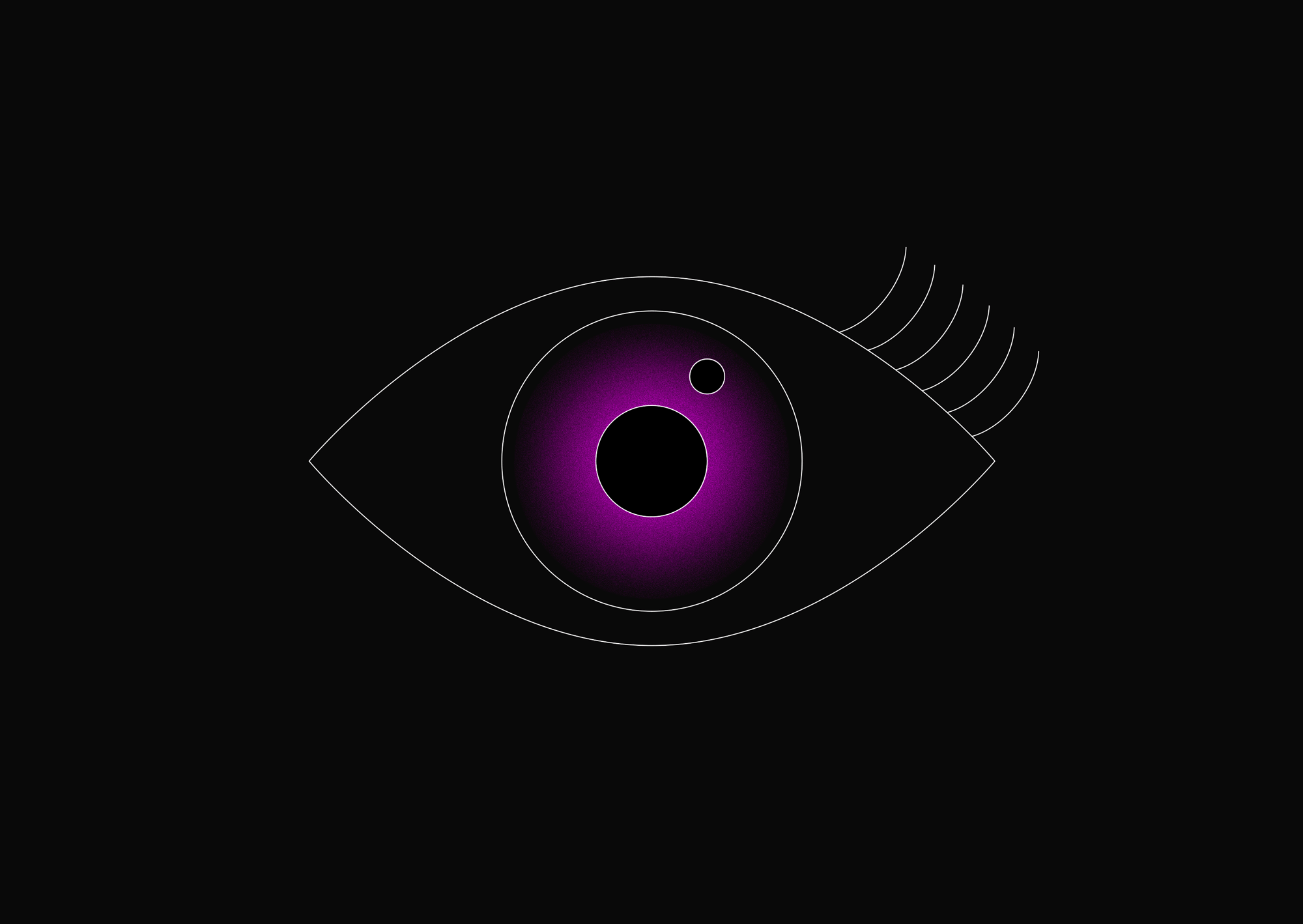
The key design element is the graphic approach, using a simple line drawing to illustrate objects, scenarios and activities. This technique, coupled with the pops of magenta, gives the appearance that illustrations have movement and energy. This approach works to tell stories at multiple levels: at a conceptual level (innovation, pushing boundaries, thinking big) at a process level (charts, diagrams) and at a project-specific level (challenges or outcomes).
A series of initial graphic story devices were developed including the sun, an eye, confetti, an opening door and a superhero cape, as well as a variety of line and circular graphic textures. These graphic stories, coupled with boundary-pushing language, helped give the brand a slightly irreverent tone, further supporting the key message that Mīharo is the place to break the rules.
To bring the brand to market a number of elements were designed including presentation materials, web banners, social media tiles, a promotional booklet and a user notebook. Each one is unique but clearly united by a common innovative feel.