Reflect the outside in
Client: Mighty River Power
To develop a feeling of ownership in Mighty River Power by all employees, regardless of where they work or which retail brand they represent, we developed a united internal brand that clearly reflected the brand attributes and personality of the external brand.
This internal brand helped unite all employees as ‘one team’ with a common voice and clear understanding of the company’s external brand story.
The Brief
Most people know Mighty River Power through one of their retail brands – Mercury, Bosco, Tiny Mighty Power, Glo-Bug or Metrix. With a diverse and geographically dispersed workforce, many employees felt equally disconnected from the parent Mighty River Power brand, in part due to the inconsistent internal messaging, branding and application.
Our brief was to develop a framework and visual identity that allowed internal communications to be delivered with a consistent corporate voice in order to “build a feeling of ownership in Mighty River Power by all employees regardless of the location, division or brand they work within.”
The Solution
Our strategic recommendation was for all internal communications to be in a consistent Mighty River Power branded written and visual language to create a united ‘one team’ identity across all teams. We expressed this as “Retail brand on the outside, Mighty River Power on the inside.”
Working with the Internal Communications team, we defined the tone of voice and personality and agreed on a framework for managing different types of communications to different audiences. This resulted in a navigation tab system that identified the source and nature of every communication.
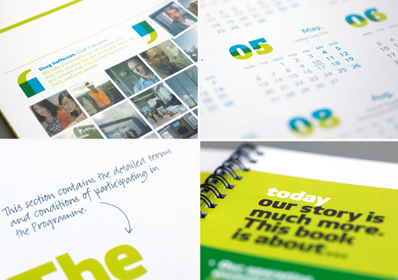
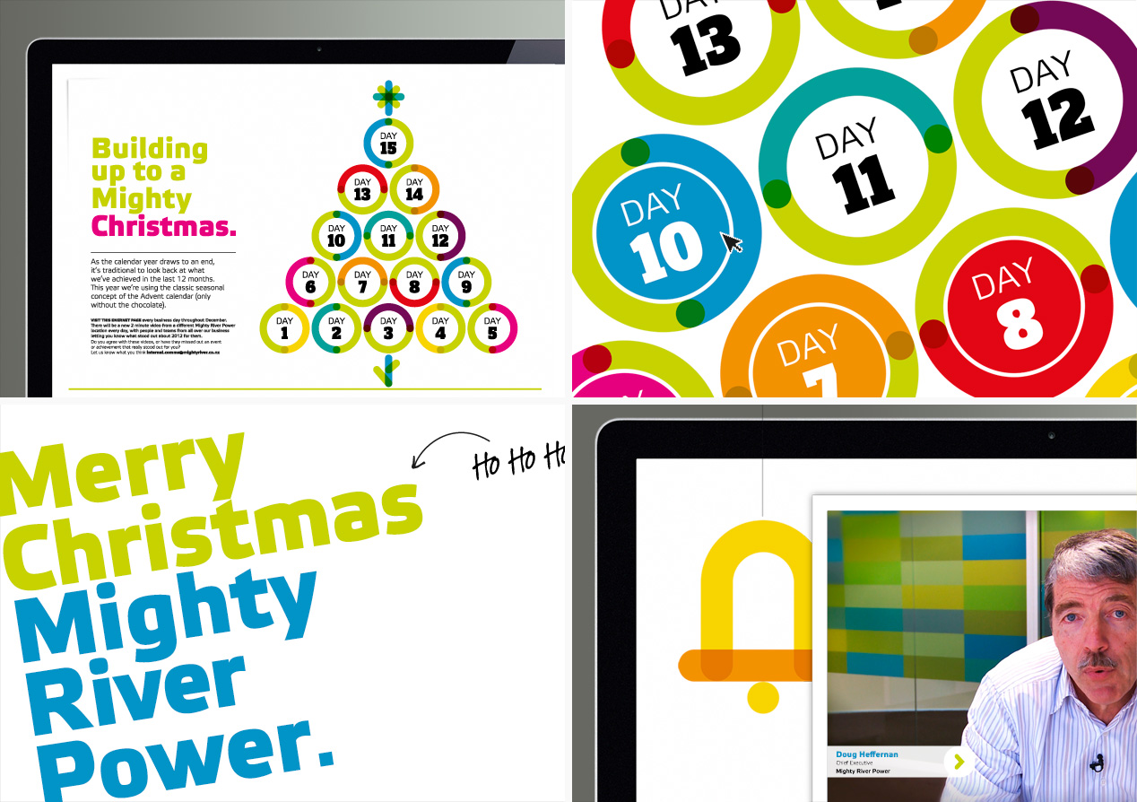
Visually we wanted a clear line of sight to the external Mighty River Power brand, ensuring brand alignment, but with the internal brand feeling more personal, friendly and approachable. We achieved this through the strong use of Mighty River Power green as the hero colour supported by a palette of bold secondary colours. This is reinforced by an informal layout and ‘scrapbook’ photography style. Overlapping illustrative graphic devices, often laid over clear-cut objects, were designed to express the key themes of unity and collaboration within the company. A library of graphics has been developed and more are being added as required by specific communications.
The Result
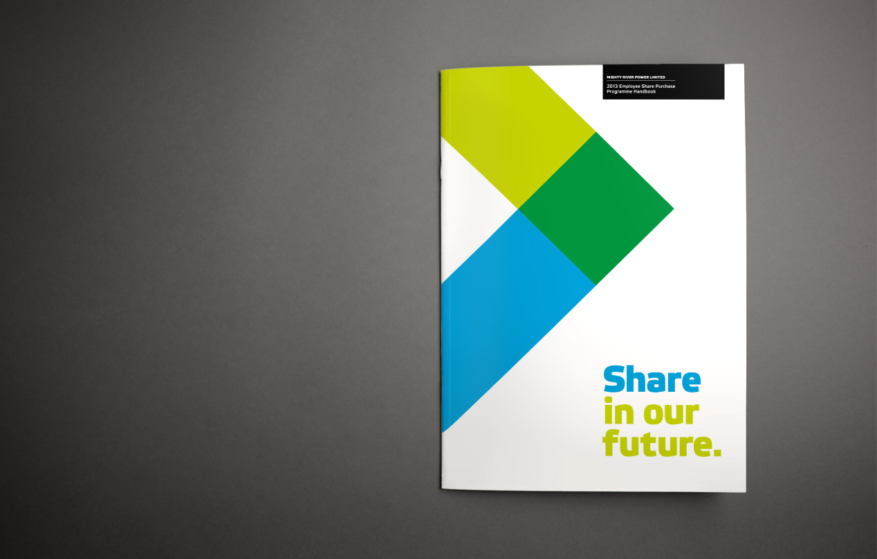
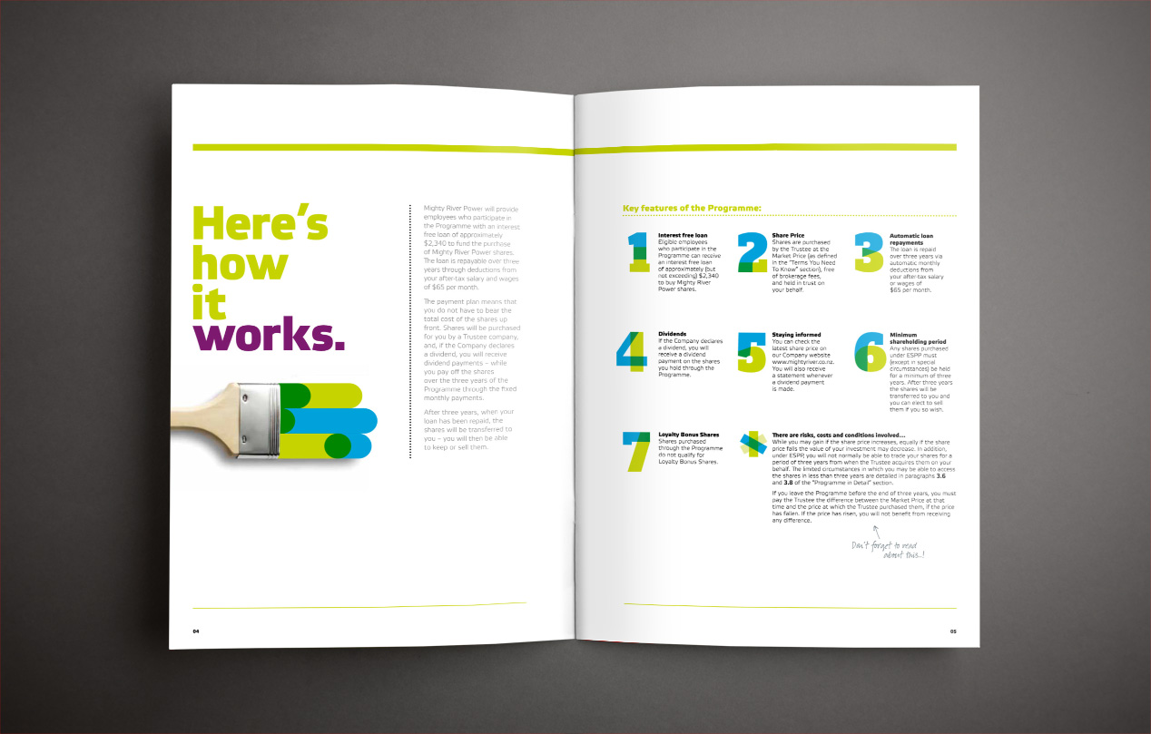
The Mighty River Power internal brand has been applied to deliver a multitude of executions in the last 12 months including videos, internal policy documents, an interactive advent calendar, e-newsletters, training materials, intranet campaigns, the Operation’s business plan as well as a series of internal initiatives associated with listing.
We’ve received positive feedback from staff across all parts of the business including a strong endorsement from the CEO. Another positive indicator is visitor numbers to the Mighty River Power intranet, where the number of clicks have been climbing. The HR team tells us that they have seen a noticeable change in company culture including staff identifying much more closely with Mighty River Power.