A living, breathing Employee Value Proposition
Client: NZ Super Fund
2025 INTERNATIONAL DESIGN AWARDS (IDA) - SILVER
Launched six years ago, the Guardians’ EVP hasn’t just lasted — it’s evolved, keeping communications fresh and on-brand.
The Brief
In 2019, the Guardians of New Zealand Super Fund (The Guardians) asked us to help define and deliver an Employee Value Proposition (EVP) that would connect their people to a clear sense of purpose and culture. Our brief was to develop a compelling visual storytelling system that captured why someone would choose to work at the Guardians, and that could be applied across recruitment, onboarding, culture, internal communications, and more.
The Solution
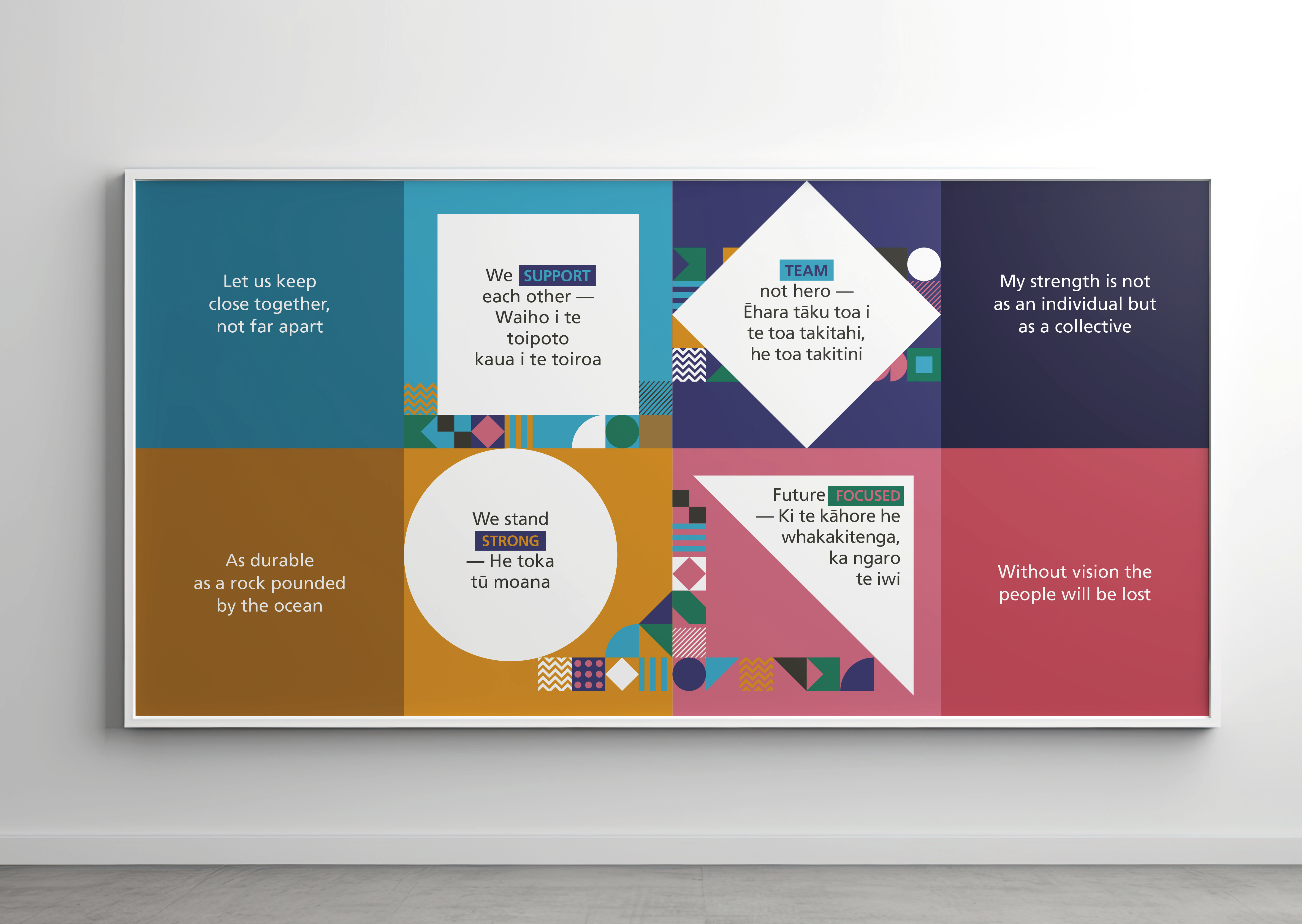
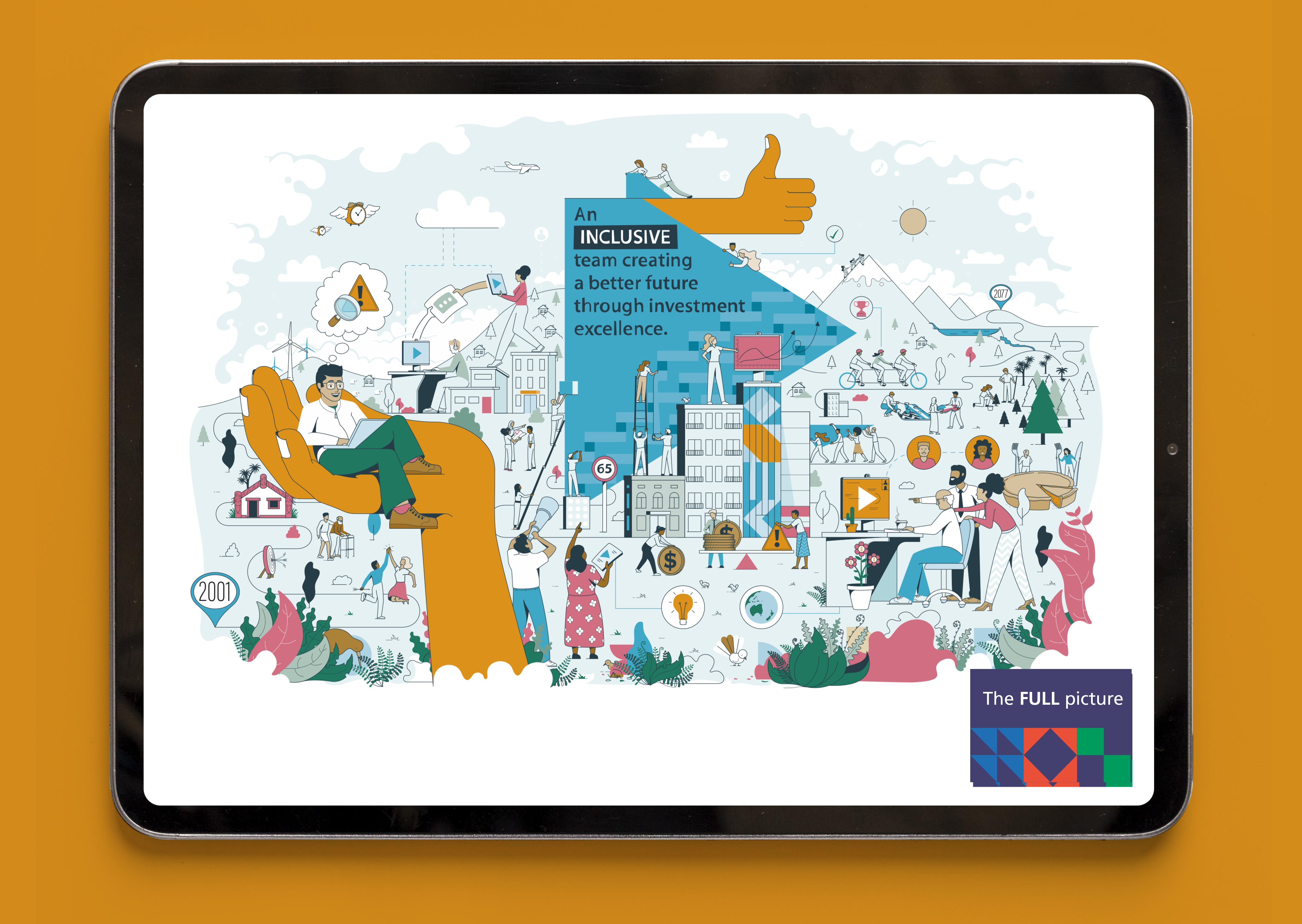
We began by defining a clear, purpose-led EVP promise: Guardians of our future. This simple idea gave us a unifying narrative thread that could work with a variety of ‘people’ messages.
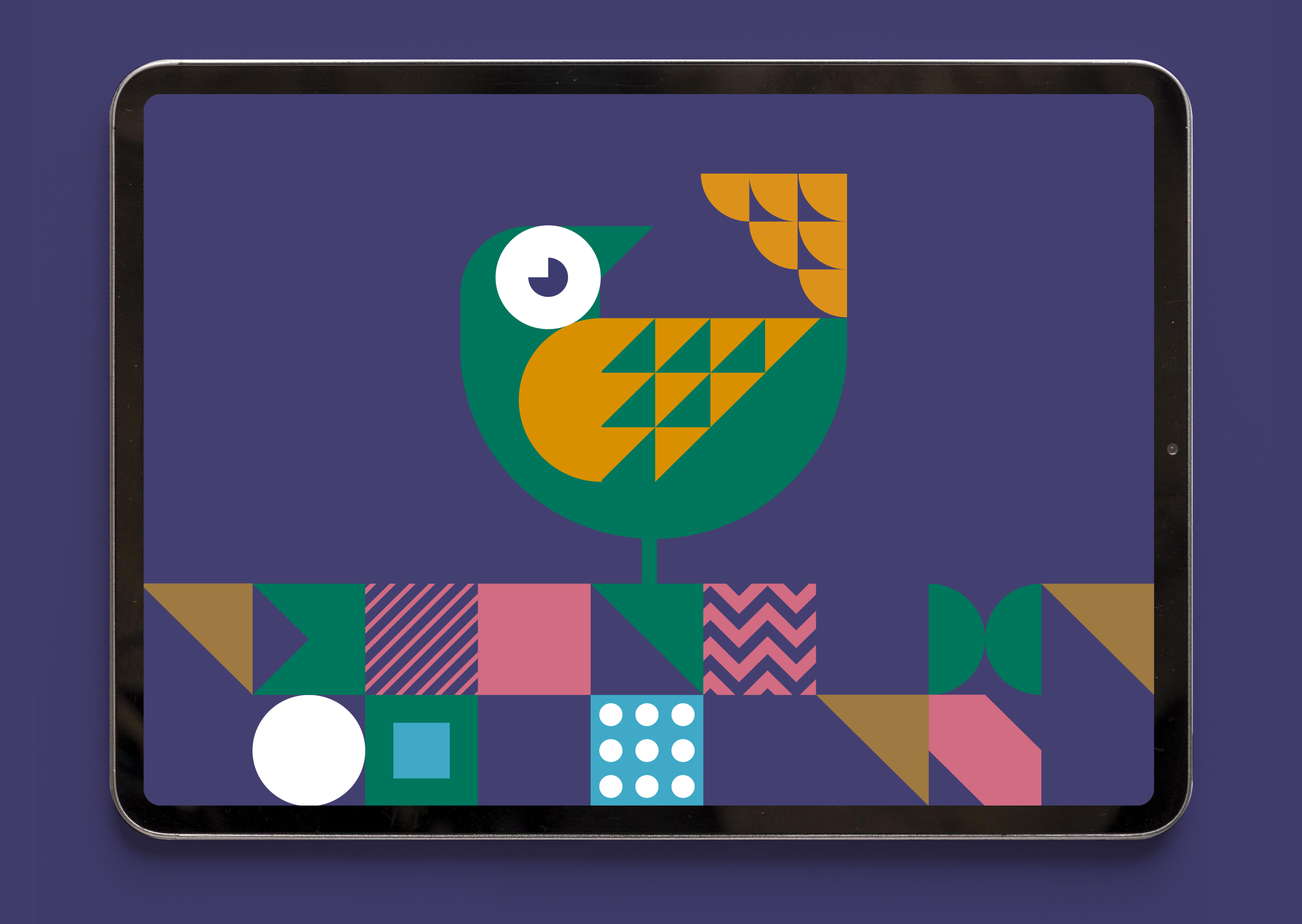
From this central promise, we identified five key reasons to join the Guardians team and translated these into five geometric shapes: triangle, oval, oblong, circle, and square. These shapes were chosen for their design potential and their diversity, inclusiveness and belonging symbolism: “no matter what shape you are, you are welcome here.”
We also wanted the system to feel authentic to Aotearoa. The chosen shapes are prominent in Māori and Pacific art forms, Asian and European calligraphy, and modern design traditions. This gave the system cultural breadth and made it accessible and familiar to people from all backgrounds.
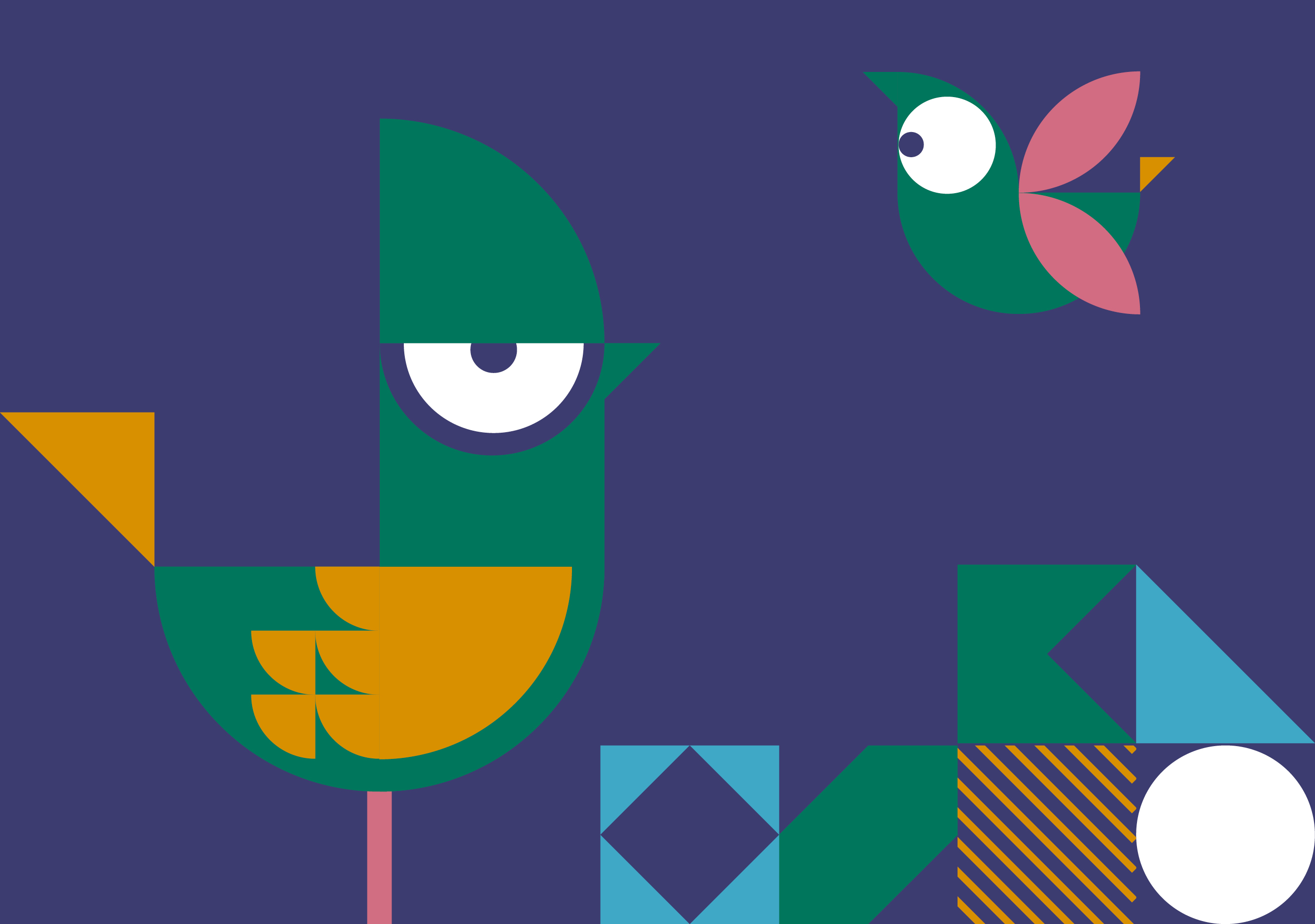
The next challenge was to create a graphic system that could be both highly distinctive and endlessly flexible. We designed a bespoke typeface and visual toolkit built from the five shapes, using their geometric purity as a foundation for creative storytelling. Straight lines and rounded forms worked with a dynamic colour palette to signal energy, innovation, and a sense of expression - qualities the Guardians wanted to express in their culture.
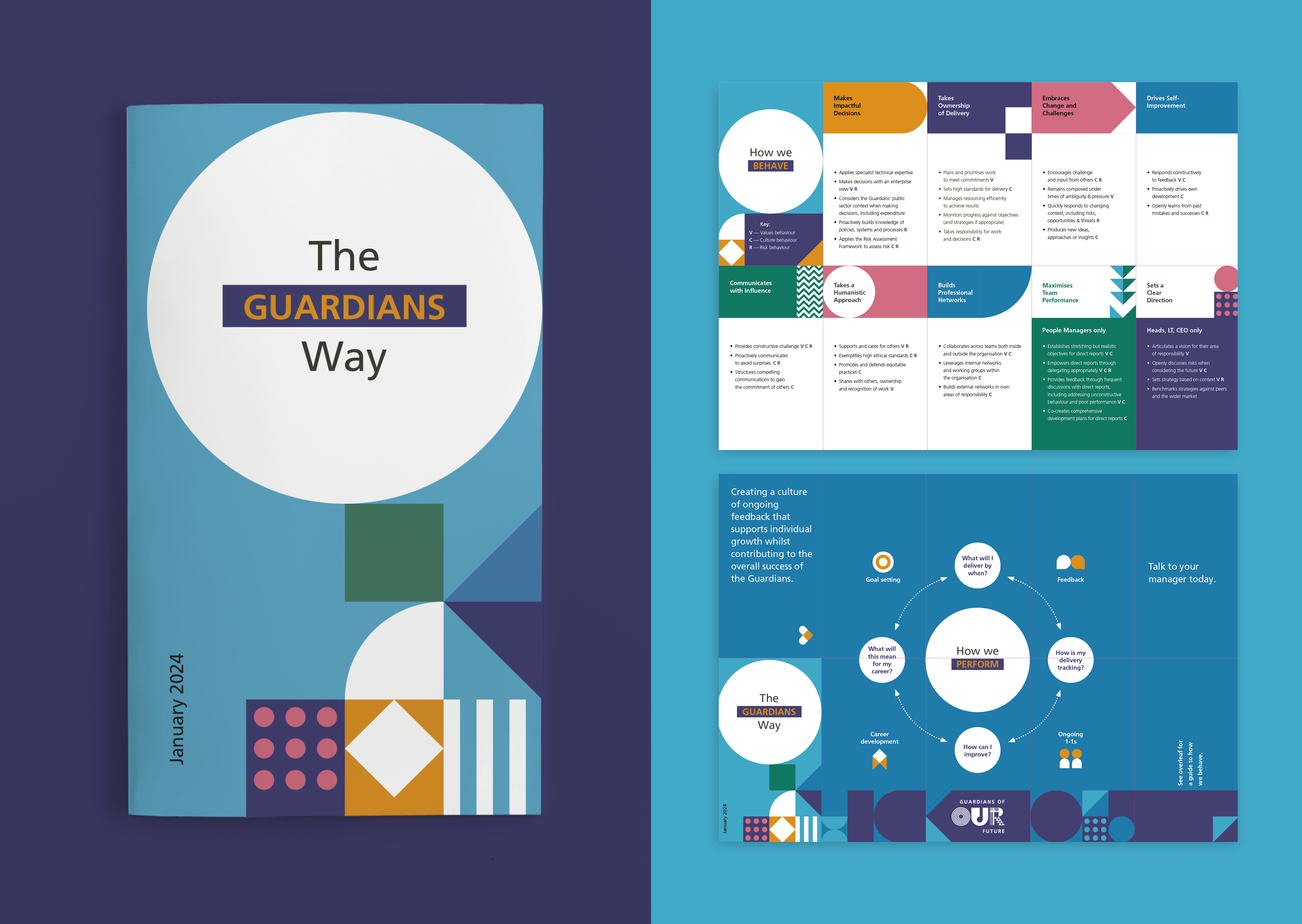
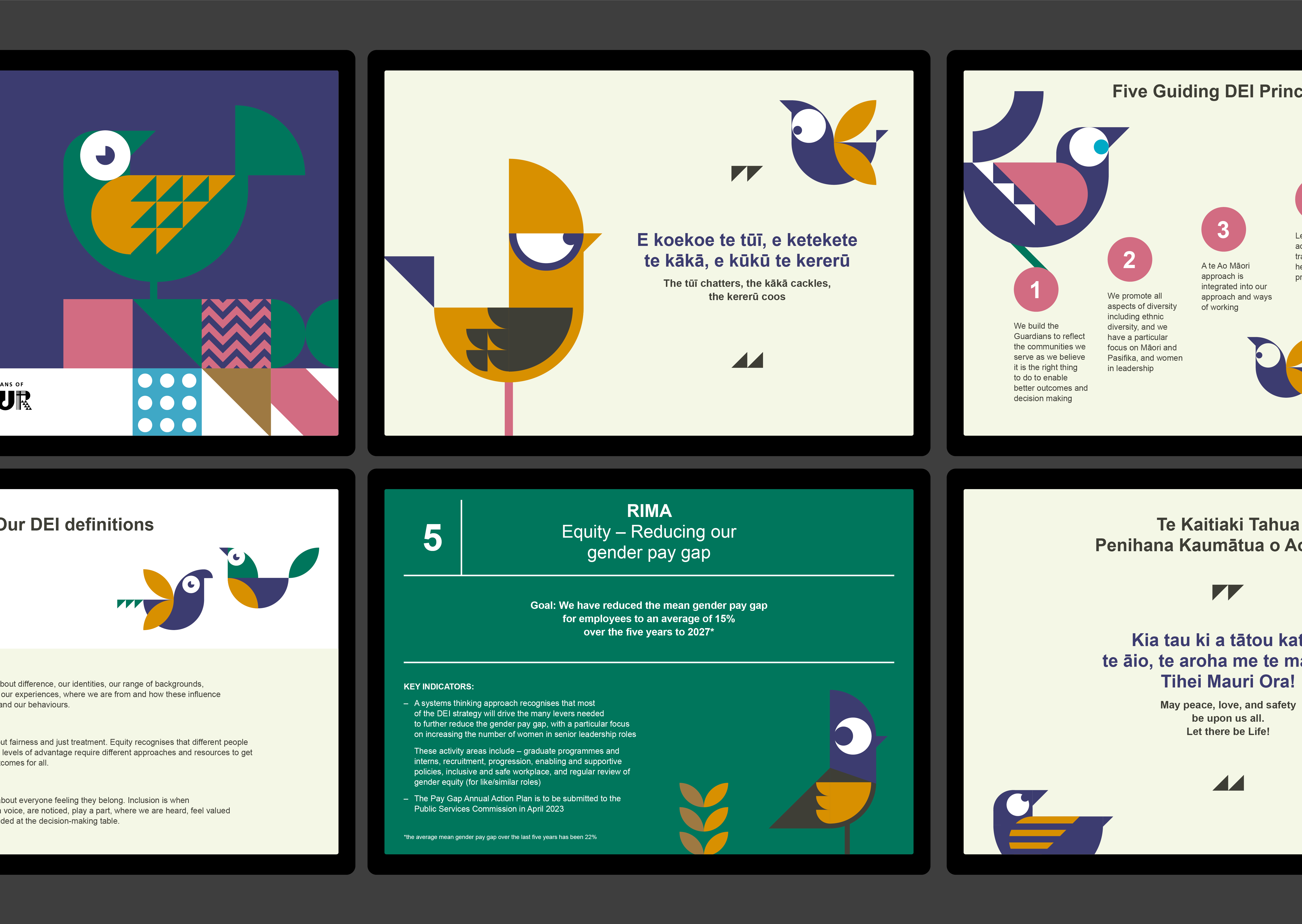
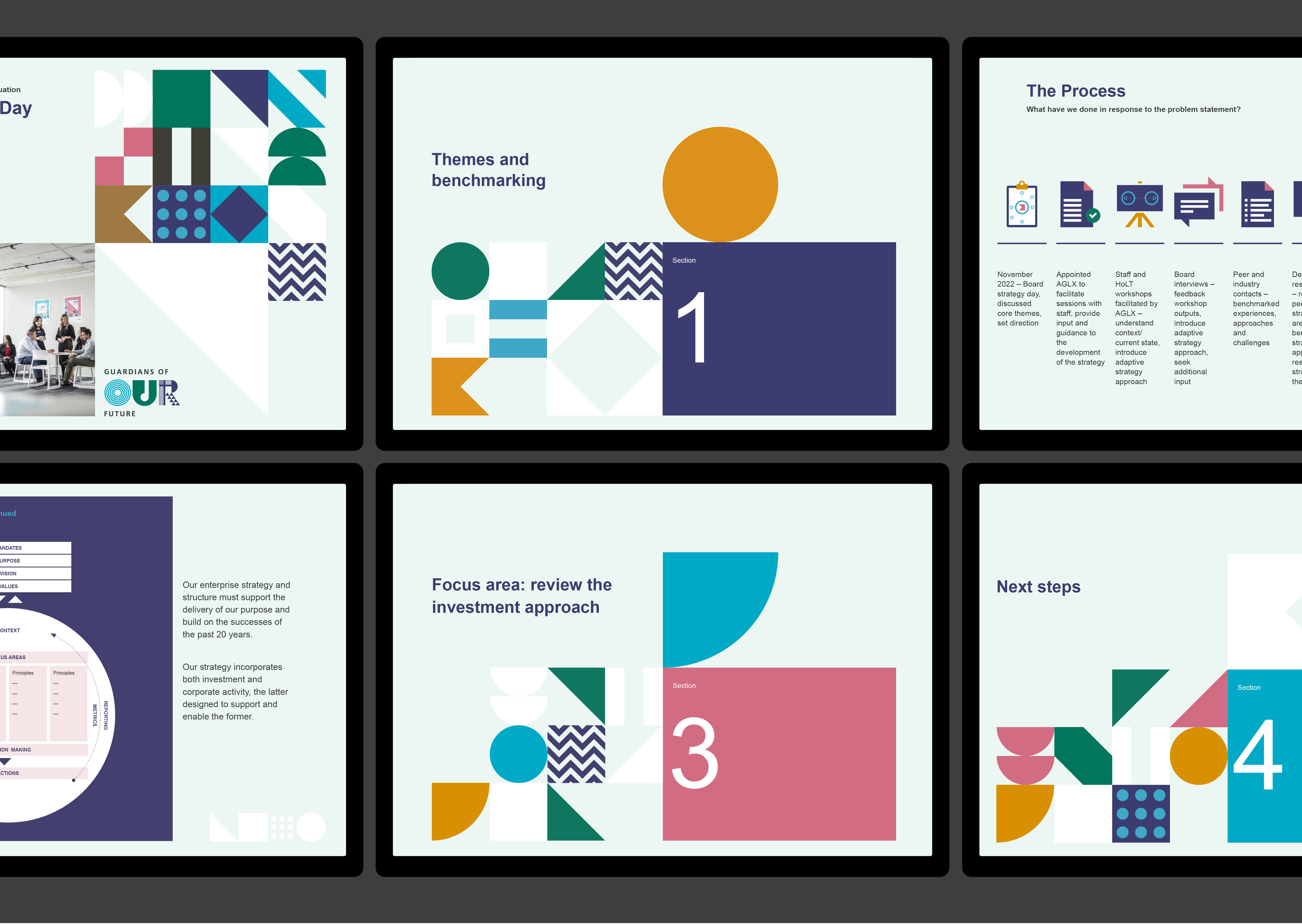
Over time, this design system evolved in line with the Guardians’ needs. Early executions used the shapes in their simplest forms to introduce the idea clearly and consistently. As internal storytelling matured, the system grew more expressive, incorporating pictograms, repeated patterns, and character-based executions that offered richer and animated ways to communicate ideas. The colour palette remained consistent for brand cohesion, but was adapted and refined to meet evolving requirements.
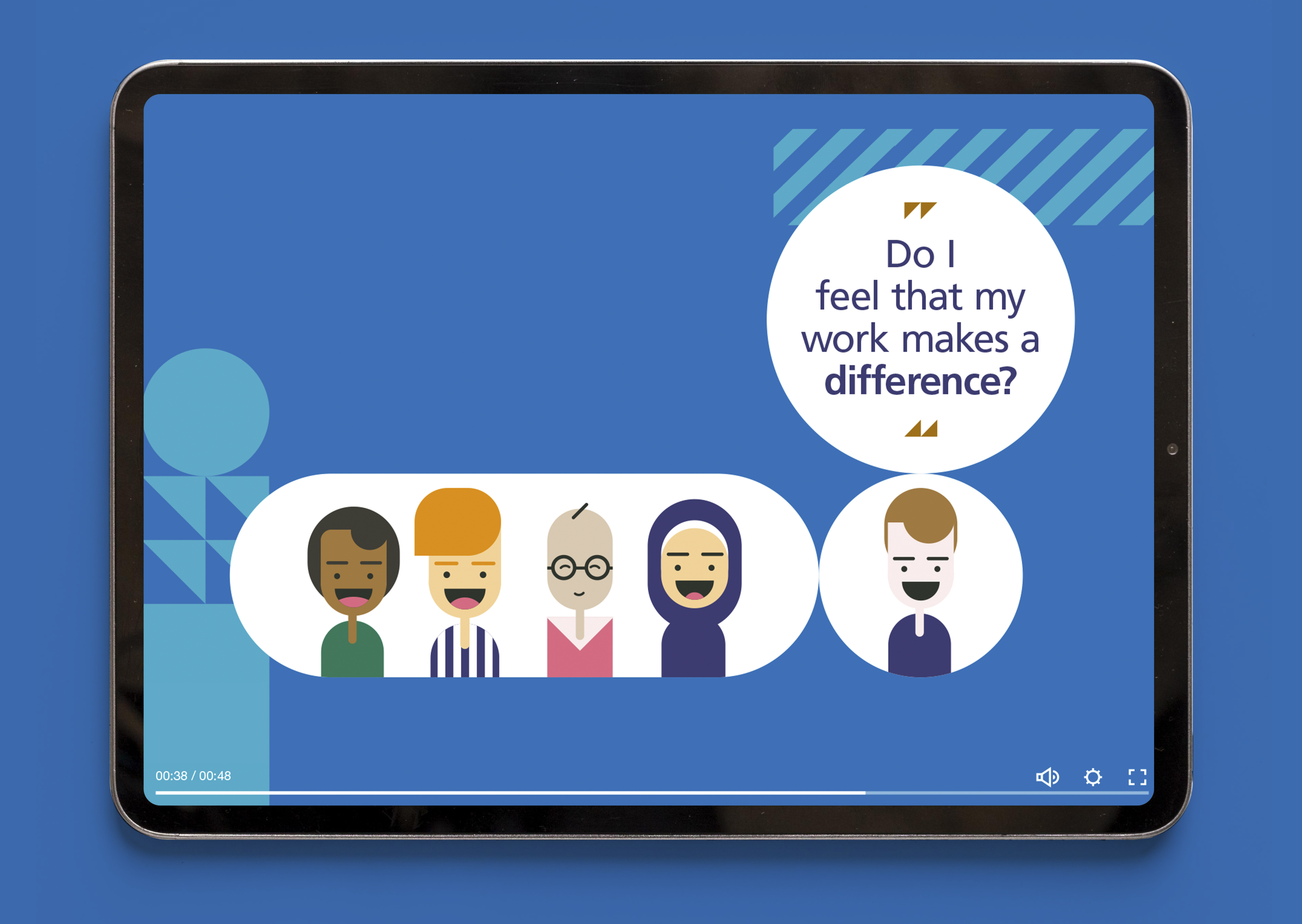
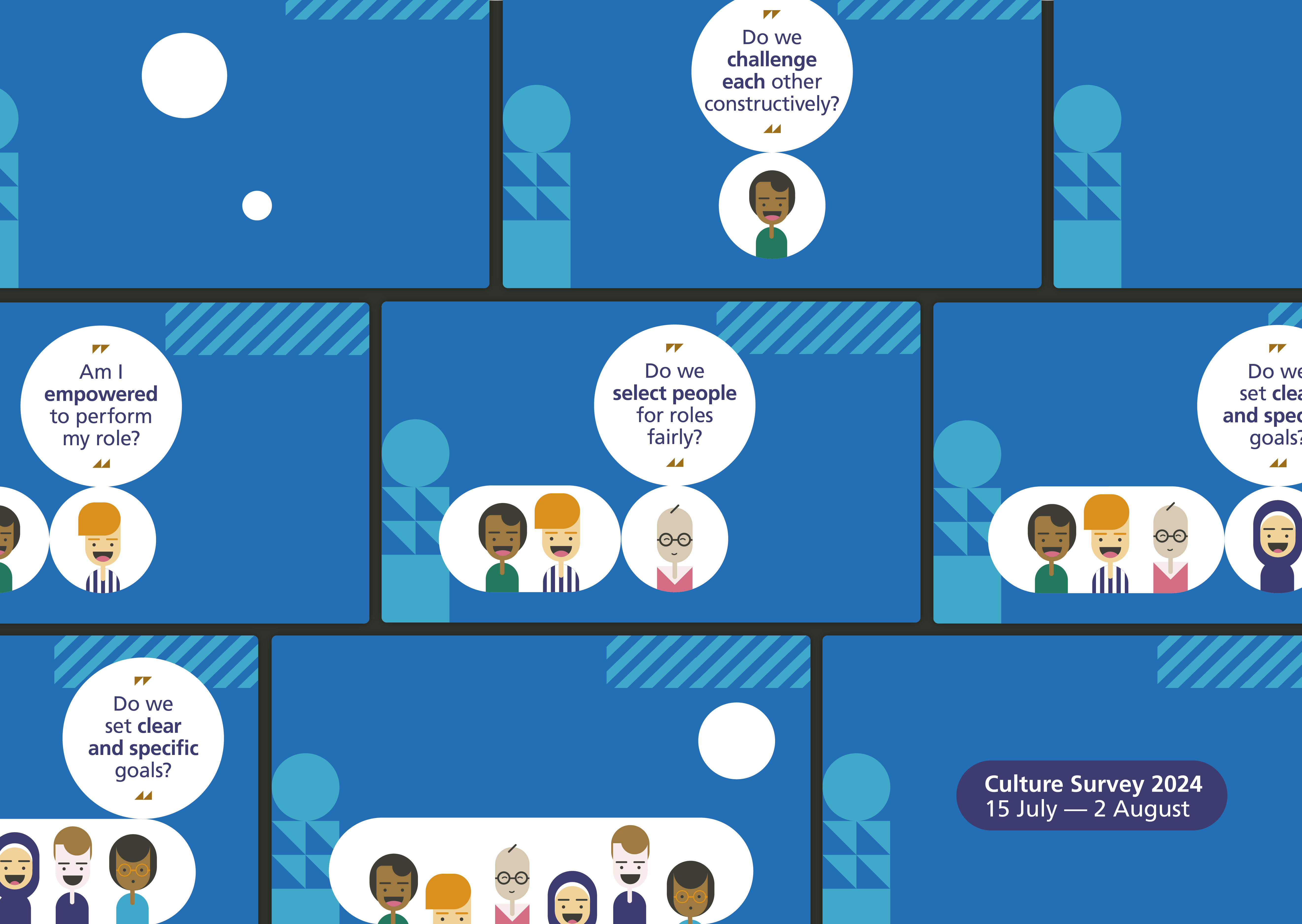
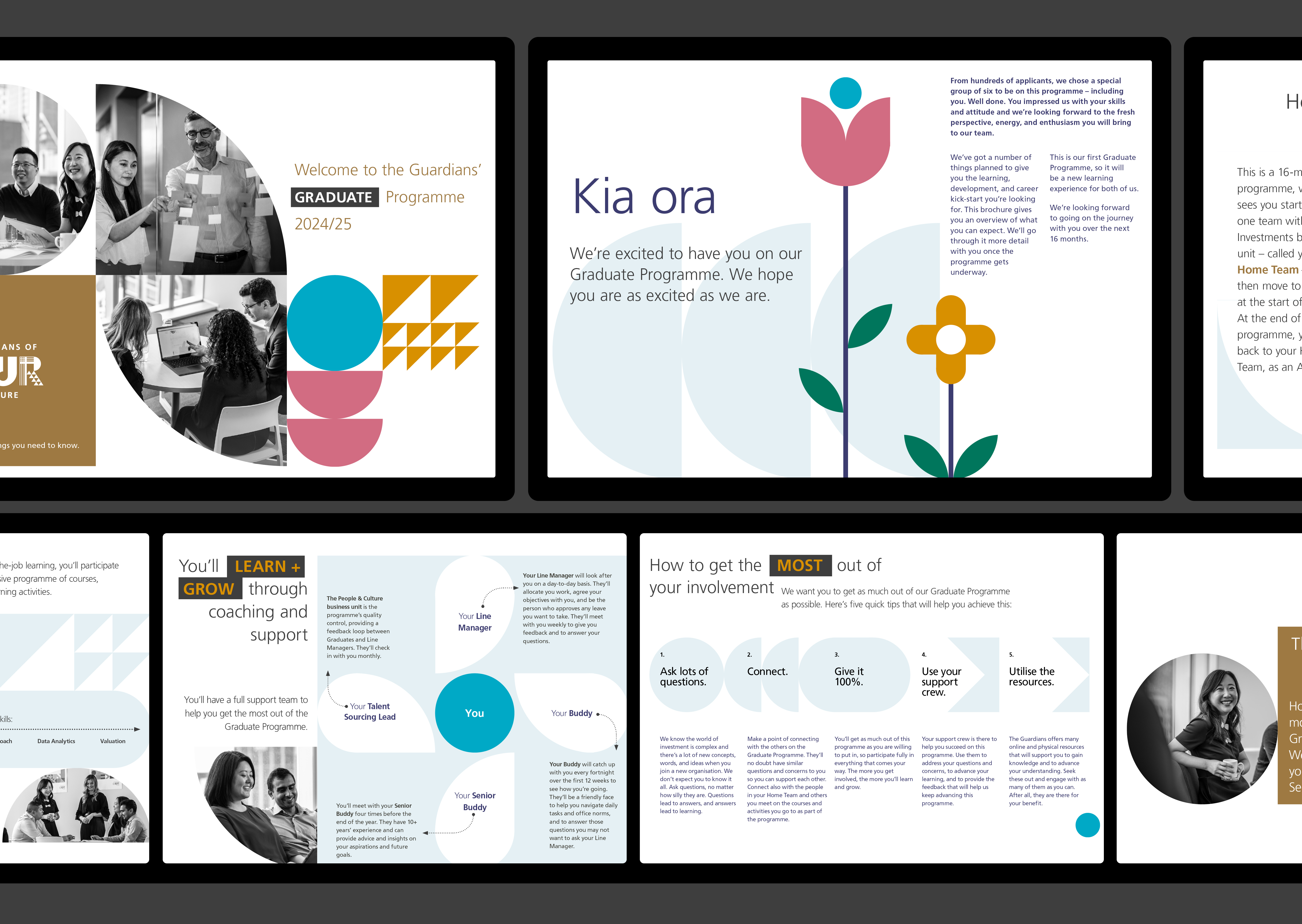
Supporting graphic elements, like arrows, negative space, and visual metaphors added further depth. Shapes combined to create new icons and symbols, embodying the idea of many individuals working together to produce something greater than the sum of its parts. Photography and illustration were integrated thoughtfully too, using scale, colour, and shape to blend imagery with the graphic language in ways that reinforced diversity, inclusion, alignment and high performance.
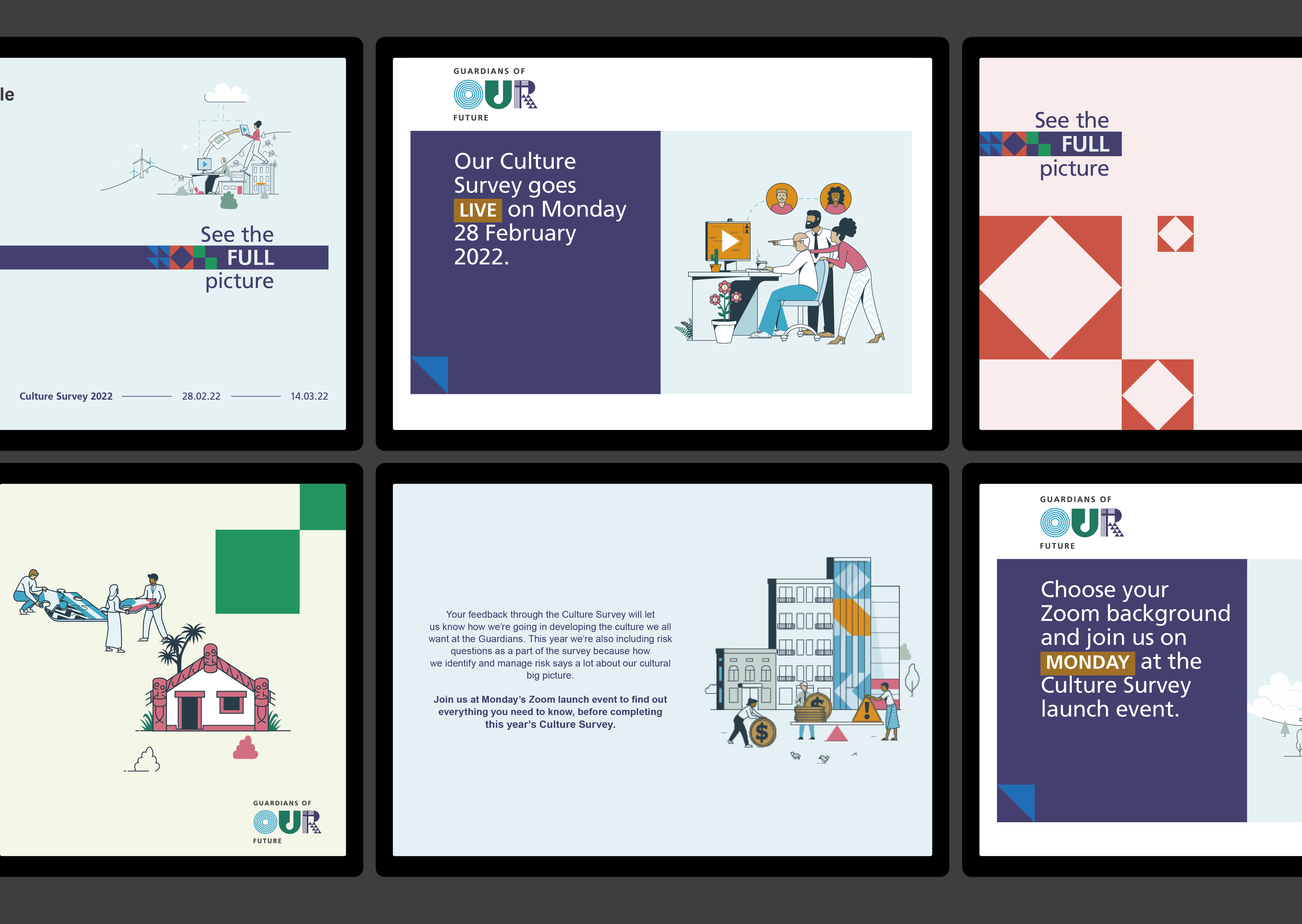
Whether for recruitment advertising, the careers website, diversity and inclusion materials, training and development programme, the intranet, or change communications, the system has provided a consistent visual language while giving the flexibility to tell new stories as the organisation evolved.
The Results
After six years, the EVP identity remains central to all Guardians' internal and recruitment communications - a living system that continues to deliver fresh, engaging, and consistent messages. More importantly, the Guardians have seen steady improvements in culture, staff engagement, and talent attraction over this period. It’s proof that a clear, consistent, insight-driven EVP, brought to life in a flexible, engaging way, can have a long-lasting impact on people and culture.