Taking the ‘Attitude’ online
Client: Meredith Connell
The website was a crucial component in Meredith Connell’s new brand rollout.
Not only did the gutsy brand personality need to be brought to life, but it had a clear User Journey objective.
This surprising and engaging site is well aligned with the brand and the role it plays in Meredith Connell’s marketing mix.
The Brief
The design of the new Meredith Connell website was to represent their new brand and visual identity. A site that is responsive and focuses the user journey towards the people in the firm.
The Solution
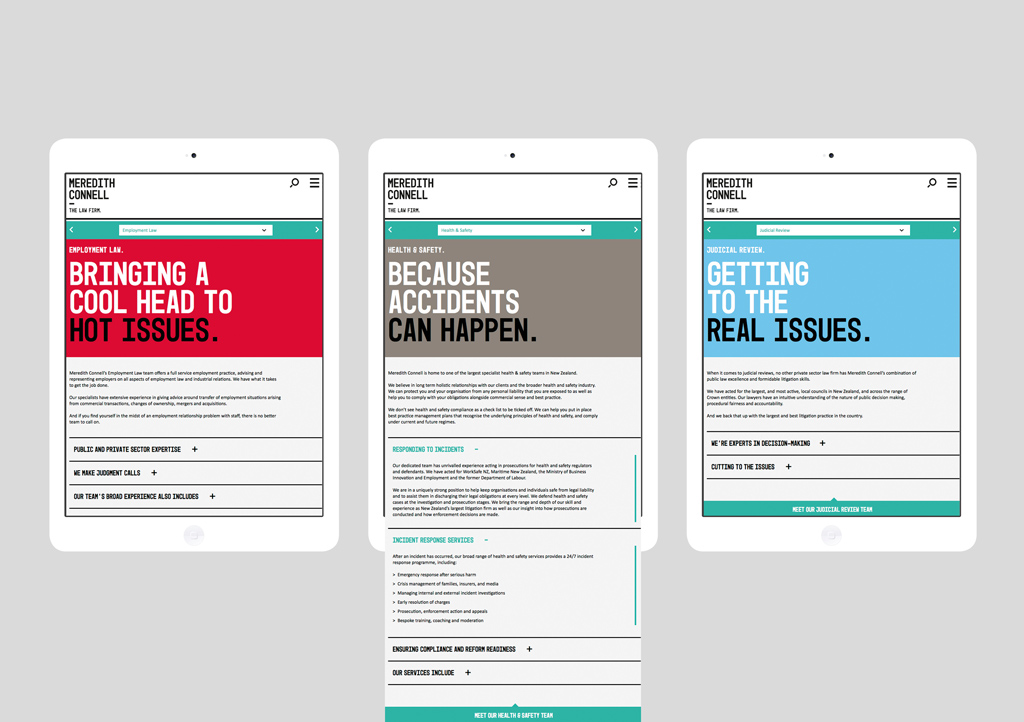
As the core idea for the brand is ‘bringing the right attitude’, we wanted the site to reflect this, going against what is expected of a law firm. We wanted to get to the point quickly, reflecting Meredith Connell as the firm that will get the job done – no unnecessary posturing, legal padding or complicated jargon.
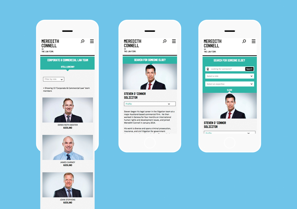
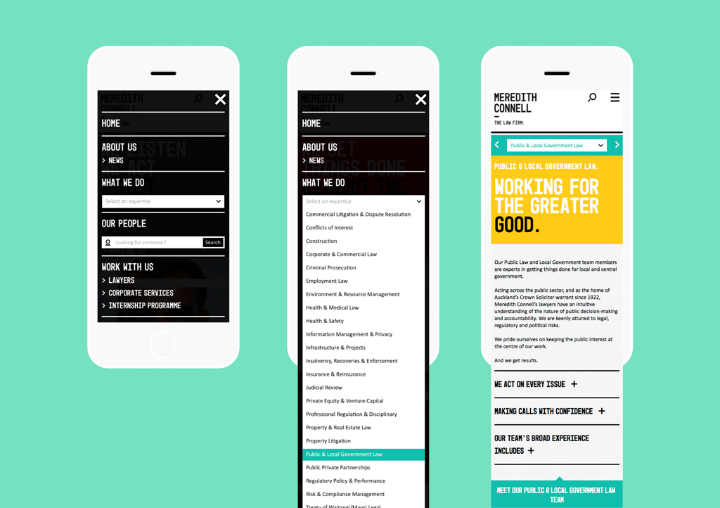
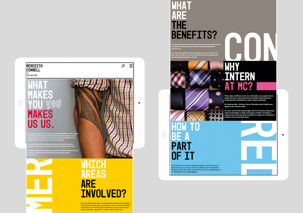
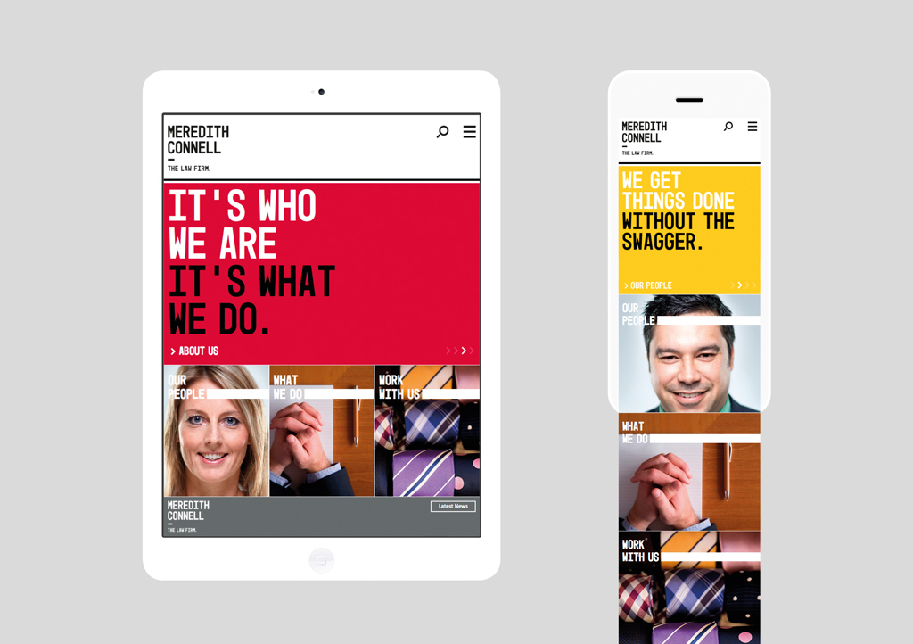
We wanted visitors to the site to be surprised and engaged. Navigating around the site reinforces this. One of the first decisions was to use ‘burger’ navigation, not only to eliminate the amount of screen furniture, but with the majority of websites now being visited on smartphones and tablets, it made sense to go down this route. The home page carousel allows the brand story to be given prominence and provides users with multiple ways to dive deeper into the site.
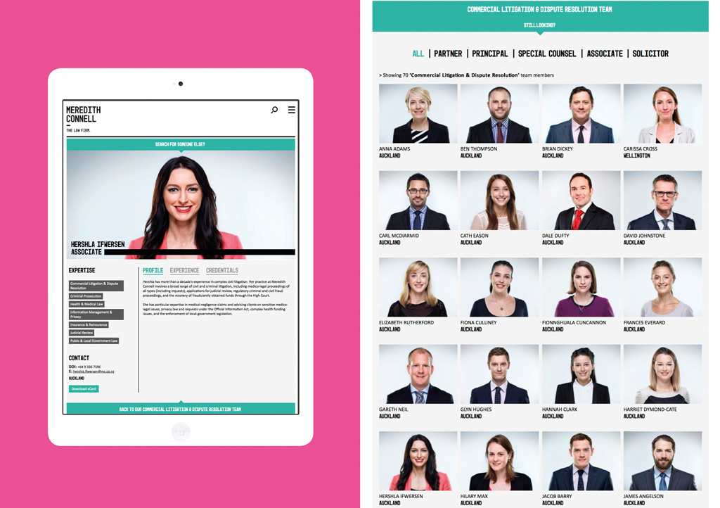
The driving force for the site’s design is typography. Headlines don’t use lawyer jargon but earthy plain-english, high on attitude and confidence. Coupled with bold use of colour, they make for a more engaging read. Large portrait photography complements the bold design, and positions employees as the primary focus in both the brand and the desired user journey.
Content at the higher levels of the site is kept to a minimum, as legal text isn’t something to digest on phone or tablet. On the pages with more detail, we used an accordion device or tabs to deliver content in smaller chunks. For other sections, we took a story-telling approach, spreading the copy over one long continuous page and dividing it up with bold design. Key pages offer ‘meet the team’ options, driving the user journey towards the people pages.
The final solution is contemporary and engaging and well aligned with the brand and the role the website plays in Meredith Connell’s marketing mix.
The Results
Even in the short time since launch, Meredith Connell have experienced significant increases in key site analytics like visitor numbers, number of pages visited and average time on the site. It’s also clear that the design is helping people engage and explore, ultimately driving them to the people pages.