Embedding brand into the workplace
Client: Mercury
Staff engagement with their brand is taken to a new level in Mercury’s new office building.
The Brief
To bring 600+ staff together in one office, Mercury commissioned a new building and asked us to deliver the brand experience that turns an architectural structure into a unique home for staff and visitors.
The list of requirements was exhaustive:
(1) Demonstrate the ‘energy made wonderful’ brand promise;
(2) Reflect the energy and attitude of the brand;
(3) Make everyone feel connected with the business, its history and its culture;
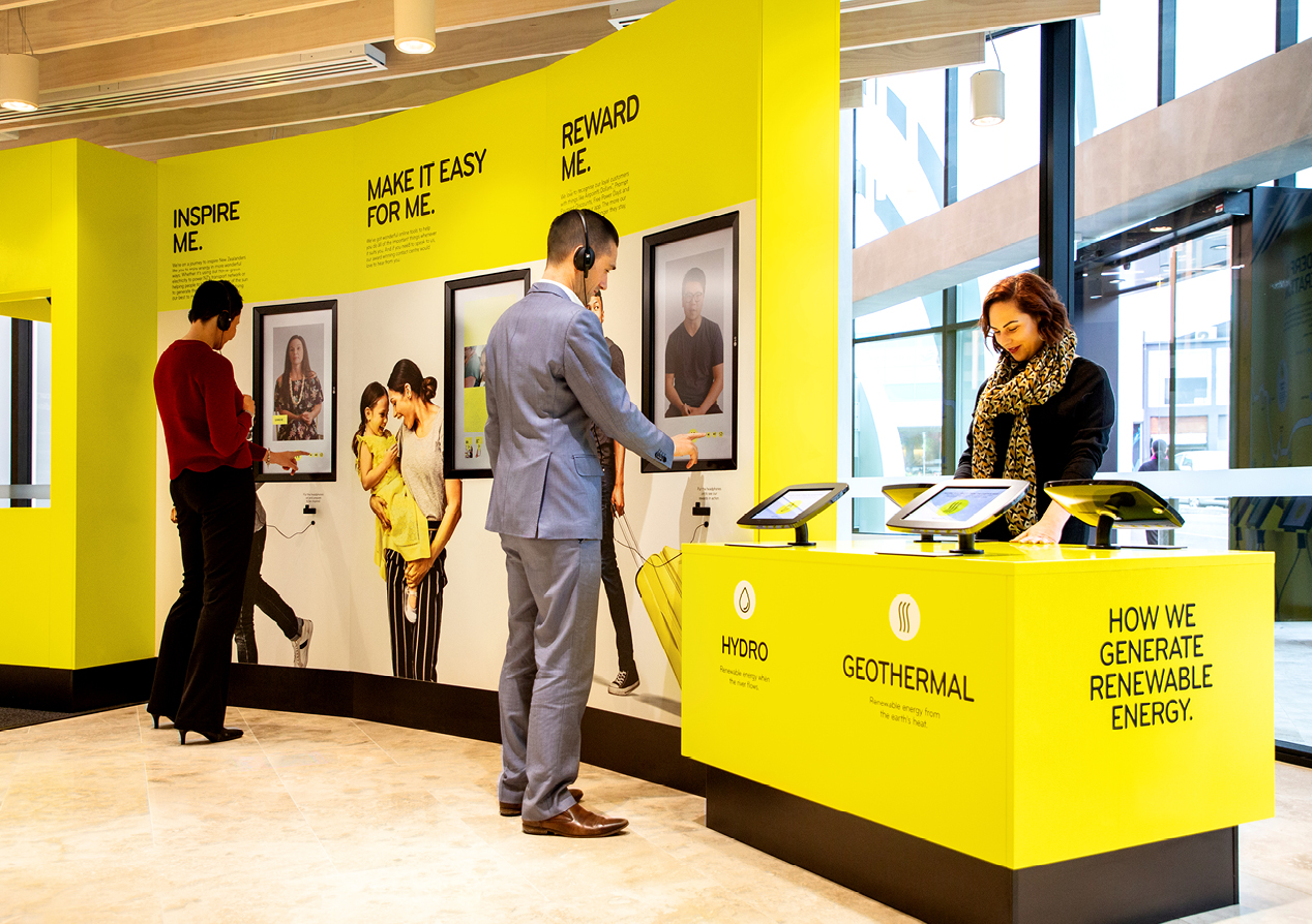
(4) Highlight how we inspire, reward and make it easy for customers; and
(5) Deliver a functional wayfinding experience.
The Solution
We started by mapping out two very clear journeys - the first for visitors and the second for staff.
Visitor journey
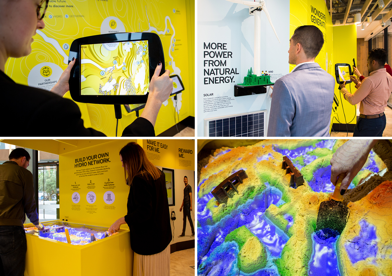
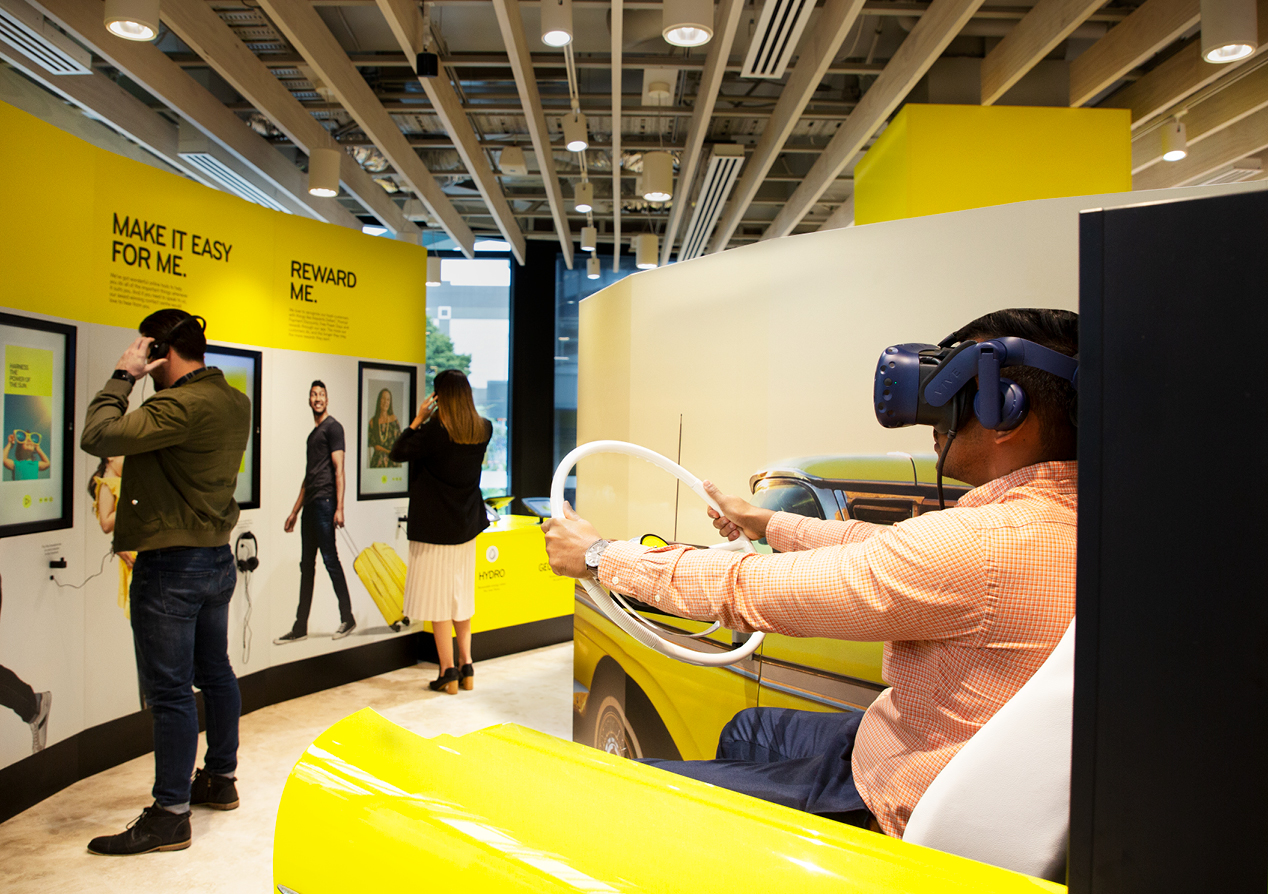
The visitor journey starts in reception with an immersive brand experience showcasing many elements of the Mercury story –
- a Waikato River augmented reality (AR) experience
- the client's virtual Evie experience turned into a physical ride
- a make your own hydro-system sandpit
- a Lego wind tower
- numerous videos
- and much more.
We deliberately incorporated the waiting area into the experience, enticing visitors to engage with Mercury while waiting. Staff come to get guests and find them in the showcase, sparking a conversation about what Mercury does and stands for. The visitor journey continues on the fifth floor with a generation wall and history display. See our dedicated case study on the visitor brand experience showcase here.
Staff journey
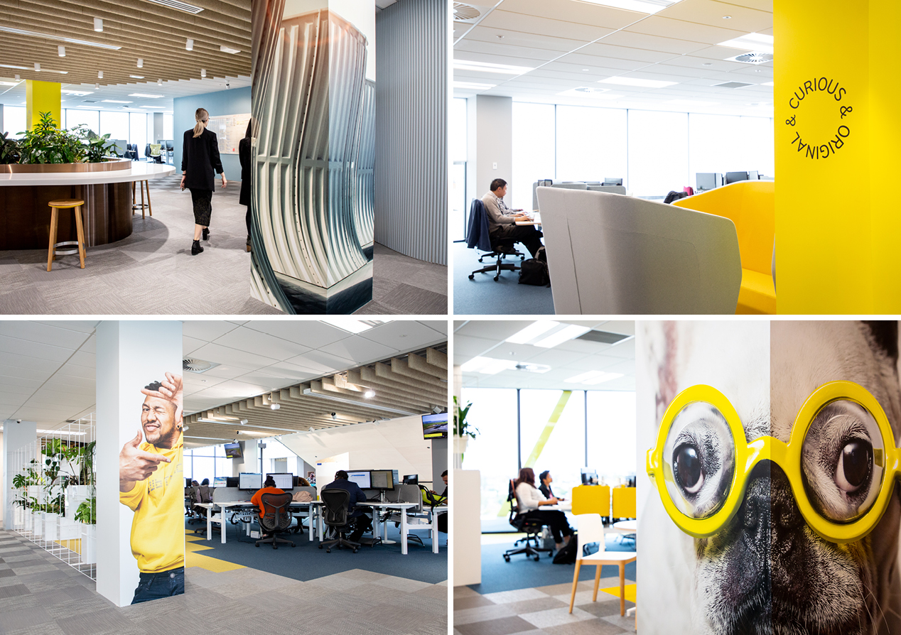
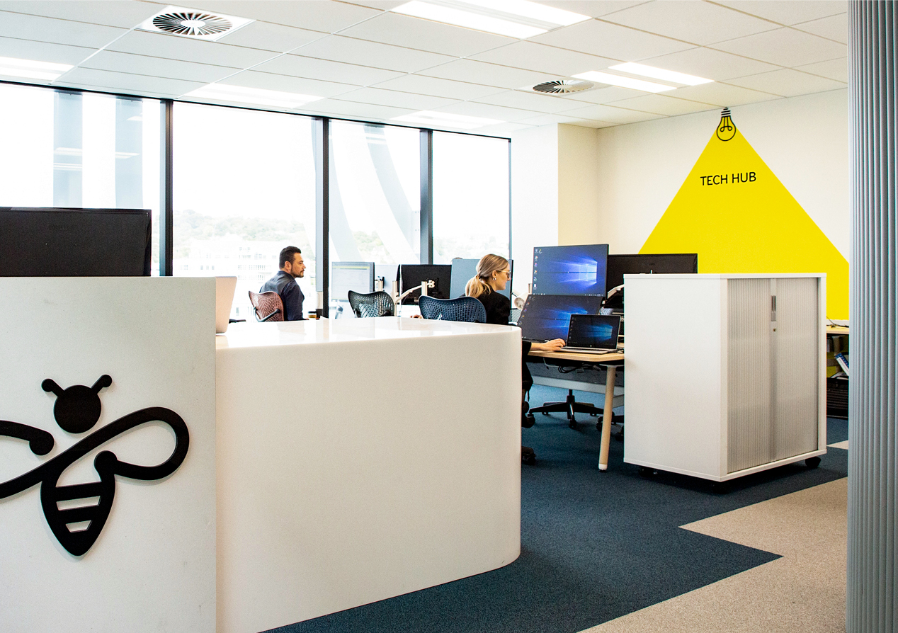
Unlike the reception showcase, the staff journey wasn’t as clear-cut. With an open plan layout, we needed to be savvy in how we engaged staff with key messages. We identified numerous high-traffic, congregation areas including key thoroughfare walls, pillars, digital display walls, kitchen areas, break-out spaces and meeting room windows.
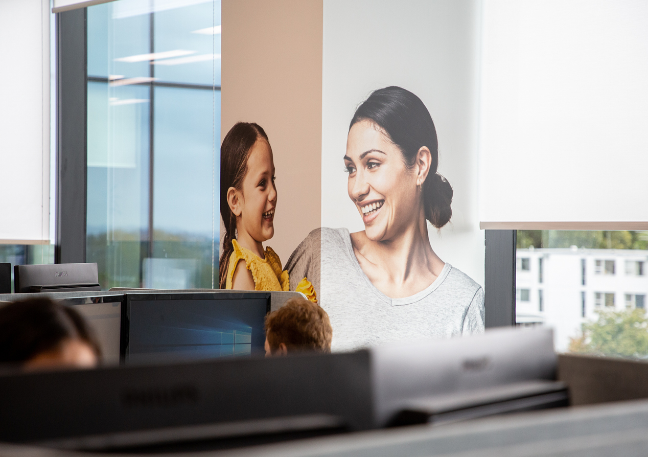
A series of photo-frames were used in workspaces to inject Mercury colours, language, imagery and attitude. The frame approach provides flexibility to move things around, keeping the space fresh and the messages always relevant.
The attitudes continue on a variety of pillars across all three floors – each time presented in new and engaging ways. Pillars and walls were also used to promote energy generation imagery and to bring the face of customers - enjoying wonderful energy - into the space. Lightboxes housed longer messages, utilising movement to communicate in bite-sizes chunks. Inclusiveness was a key theme for the fit-out and we created a number of strong messaging displays including a multi-language magnetic wall.
A very simple and stylised approach made wayfinding easy and on-brand. This attention to functional detail carried through to Health & Safety messages, recycling bins and the creation of electronic displays by lifts and other public spaces. Regular changing noticeboards allow the building to be an effective communicator.
A strong brand typographic pattern became a feature on meeting room walls and other spaces, helping add colour and movement into the large space.
The Results
The feedback from staff has been overwhelmingly positive. The project manager described the fit out as “energizing” and “bringing everyone together in an exciting and unified way behind our amazing brand.” She points out that engagement is high and that staff have a new sense of pride in Mercury, often bringing in friends and family to show off their workplace.
See our case study focusing on more aspects of the visitor experience showcase here.
