Communicating in a scary world
Client: Insight Creative
2024 INTERNATIONAL DESIGN AWARDS (IDA) - GOLD
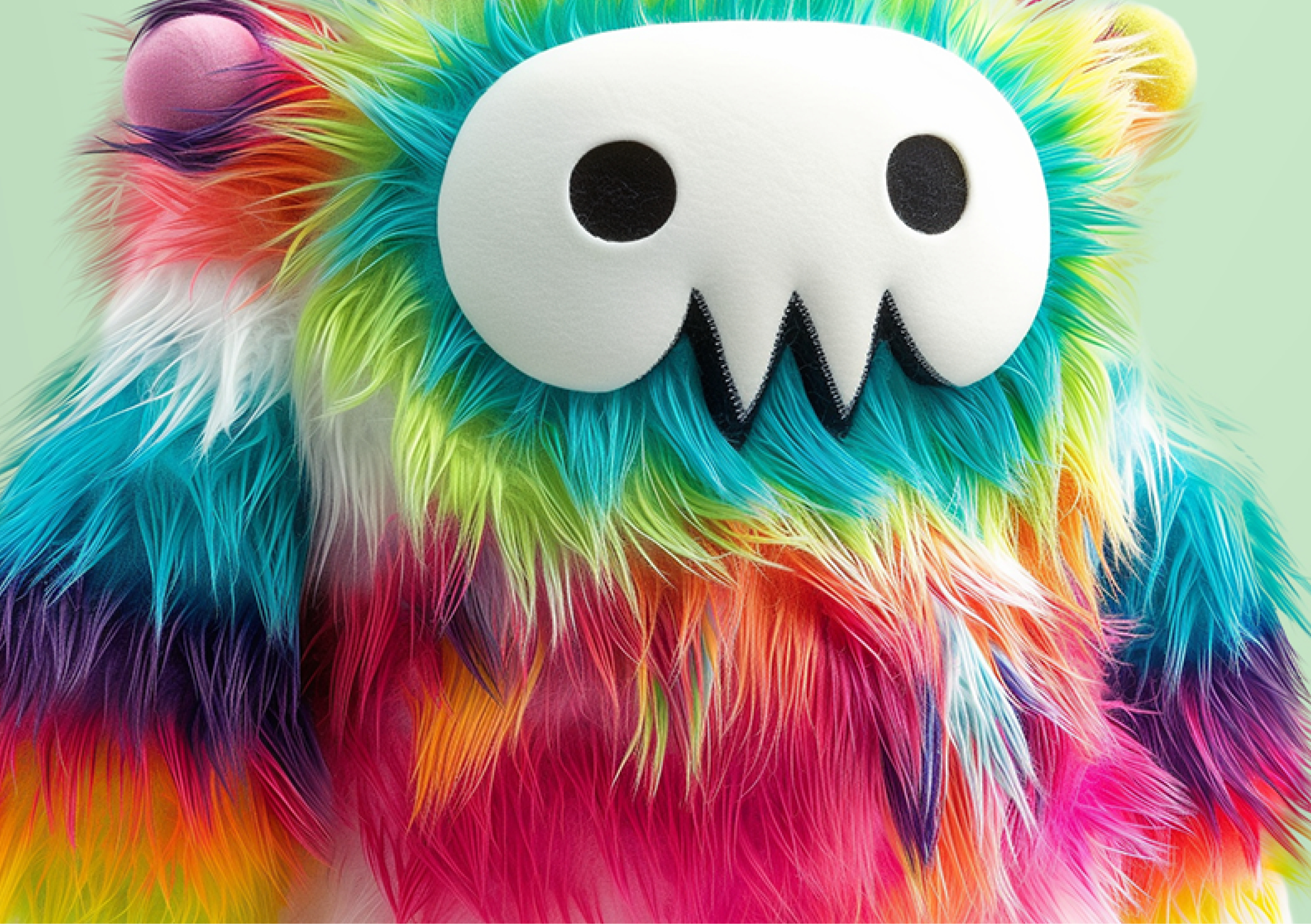
Our new monster family made a difficult strategy conversation with staff, when facing a period of economic uncertainty, a little easier.
The Brief
It’s a scary world out there, with economic uncertainty, political unrest, wars, rising crime and many other social issues. As we prepared to launch our 3-year strategic plan to staff, we wanted to show them how we’re responding to these unsettling ‘here and now’ factors and the many others – like AI – that will shape our future.
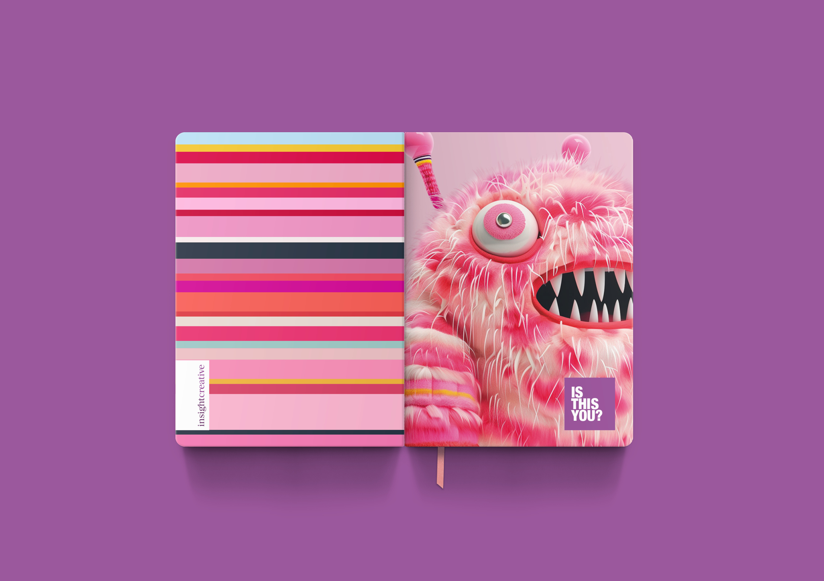
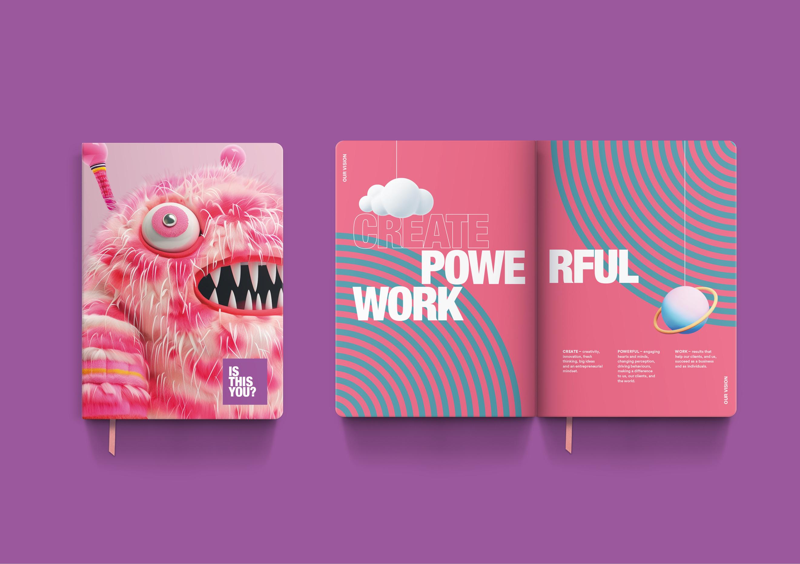
The design brief was to develop a creative concept that acknowledged the scary things in our world and to express that the more you know and understand them the less scary they are. It needed to be a concept that could be applied to all our strategy material including presentations, posters, merchandising and staff notebooks.
Adding an extra degree of difficulty, the brief asked for an idea that could be extended to our clients, expressing that we’re focused on understanding them, and their needs, so we can better help them get through the scary things they’re also facing.
The Solution
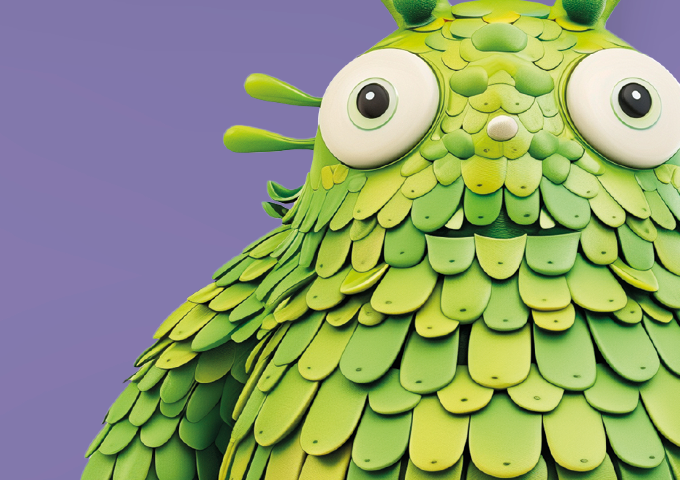
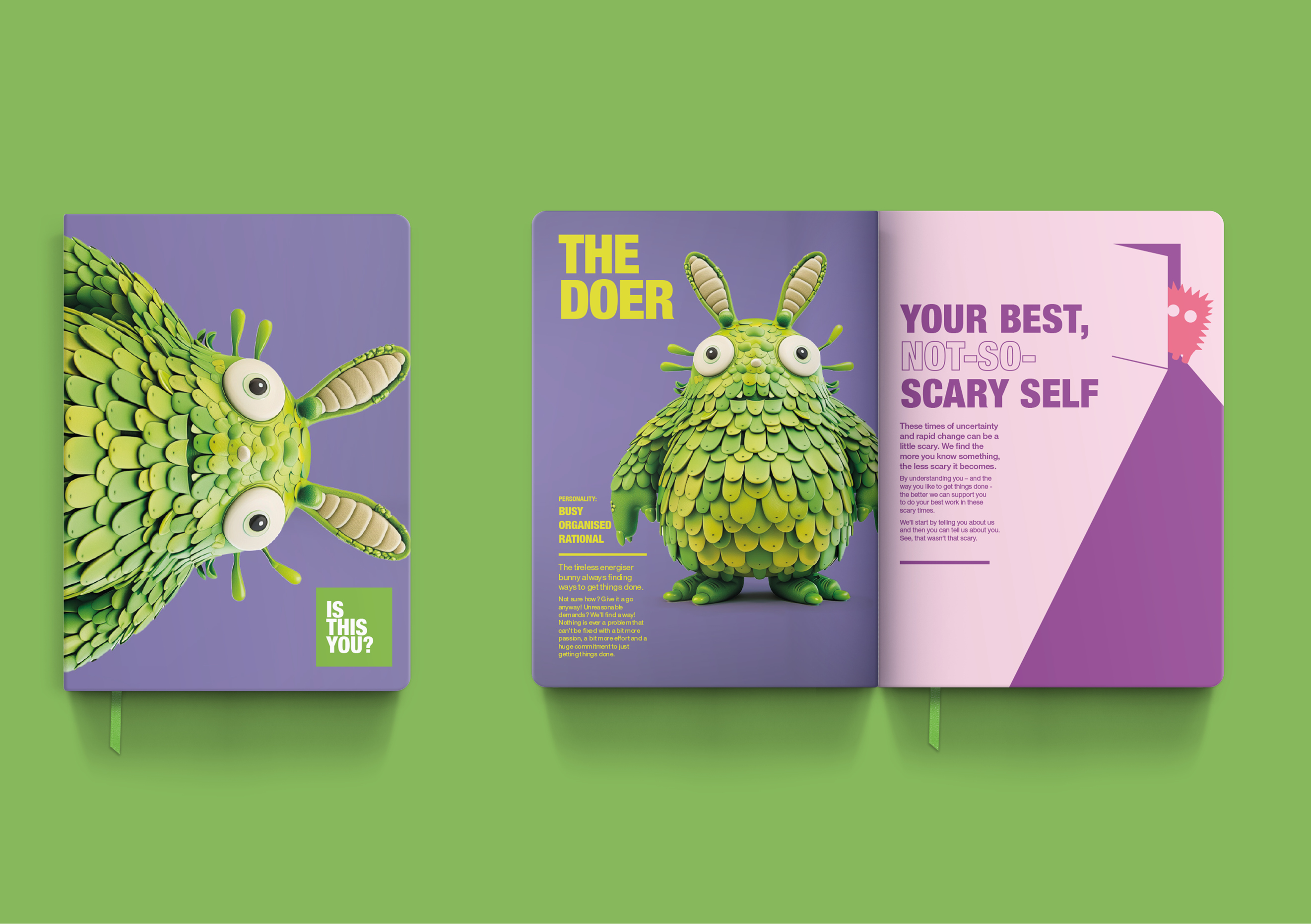
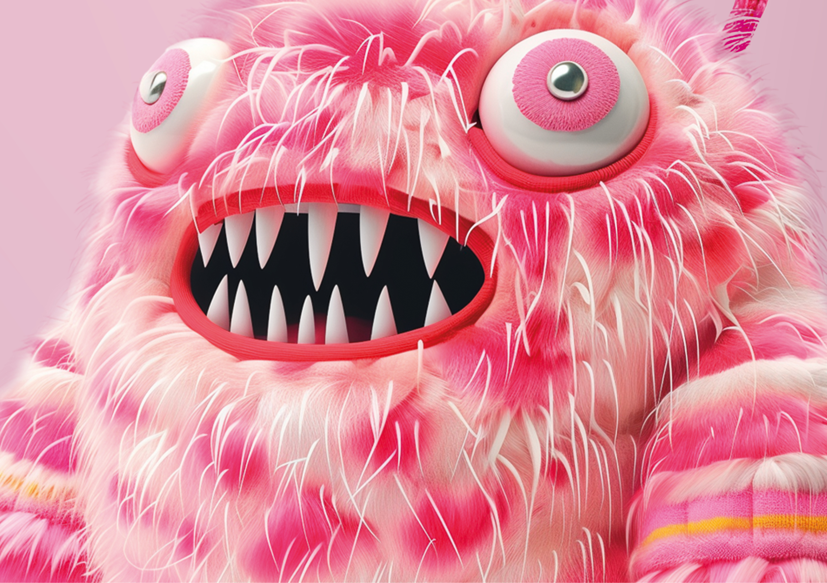
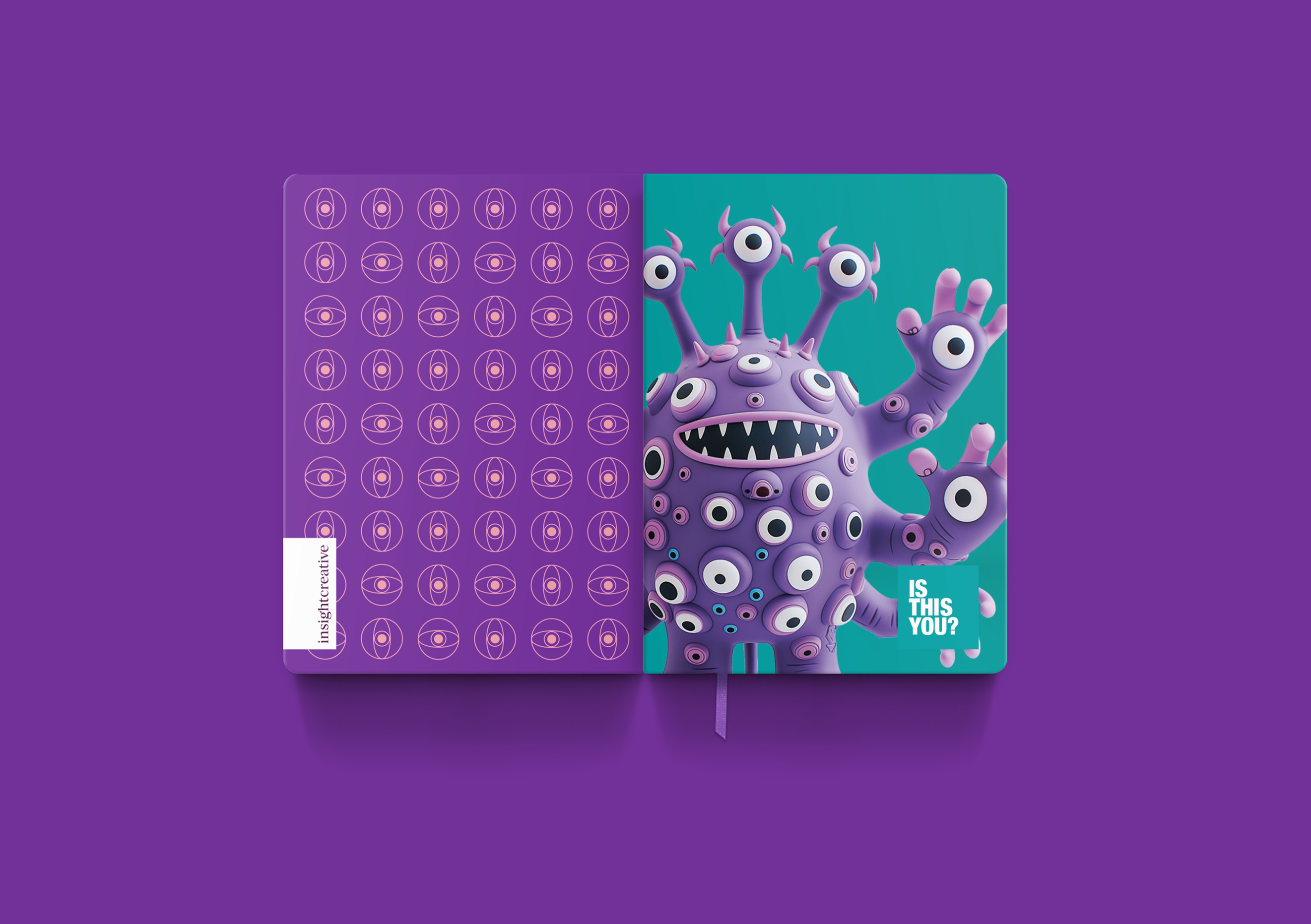
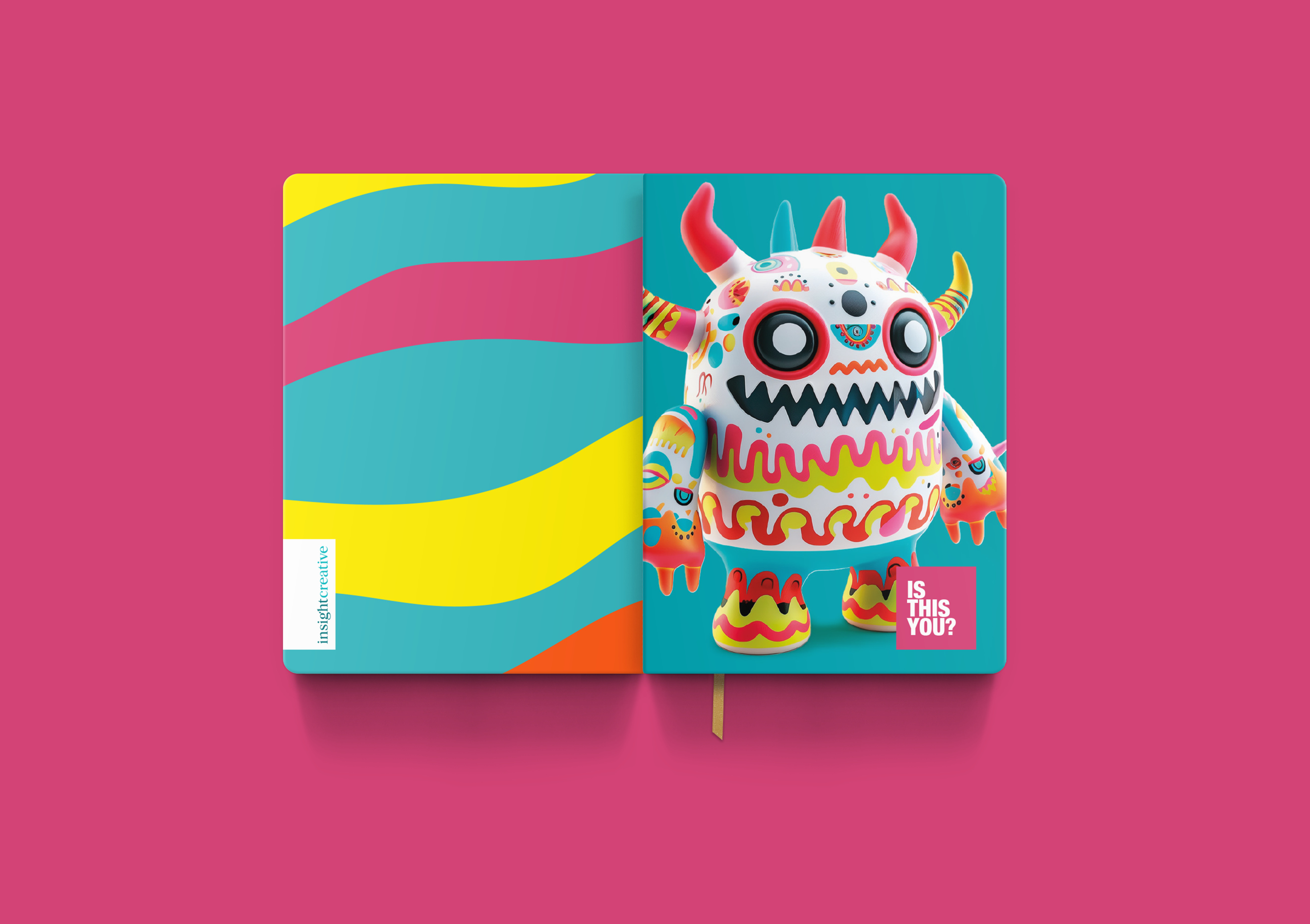
Meet our Monster Family – a set of six ‘not-so-scary’ monsters with a strong Monsters Inc vibe. Each monster has their own personality traits and unique creative aura. Because they are different and new, they may seem a little scary at first. Once you get to know them, there’s more to love about them than there is to be scared of.
The six monsters are each based on common personality traits of our clients and staff, allowing us to align a monster to each of our individual audiences. A profile was written for each monster, using recognised archetypes and personality profiles as a basis. These profiles became the design input for making each monster unique.
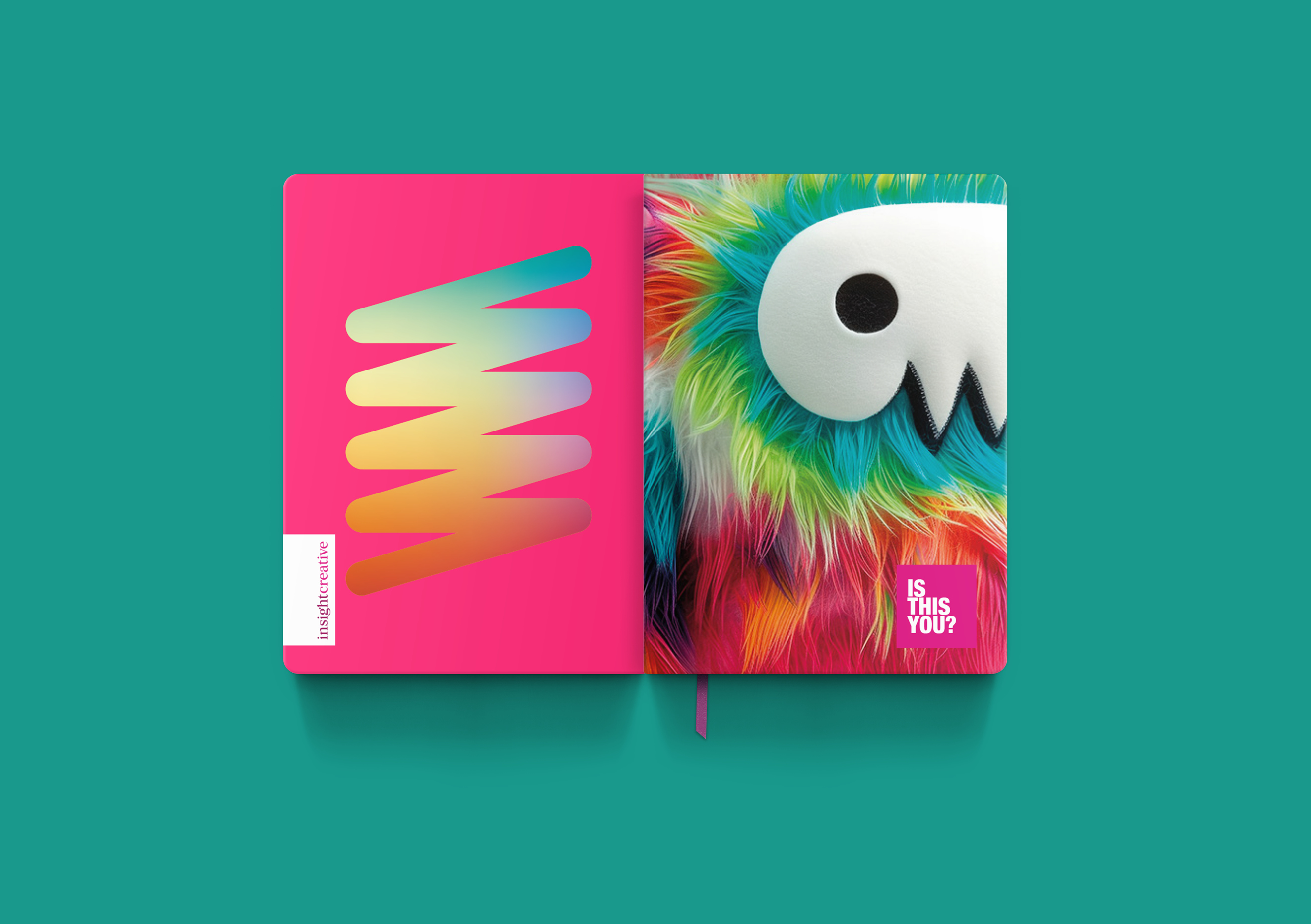
The desired creative feel was designed sophistication with a strong fun overtone. Each monster has a 3D, pop-art, tactile-toy feel, meaning a sense of depth and texture was important. The Connector for example, has a soft and cuddly personality, so a fluffy outer texture was required.
The monsters were developed using Mid-Journey and then crafted in Photoshop. The use of AI reinforced the idea that scary things are less scary when you understand them. Using AI gave the designer the opportunity to trial different approaches and inspirations, before deciding on a strong illustrative approach.
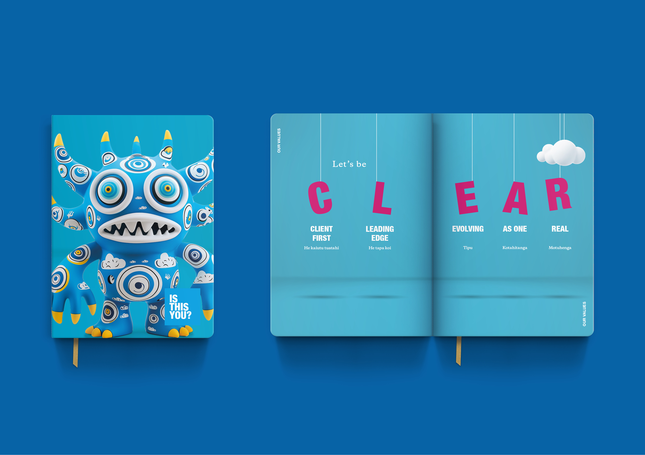
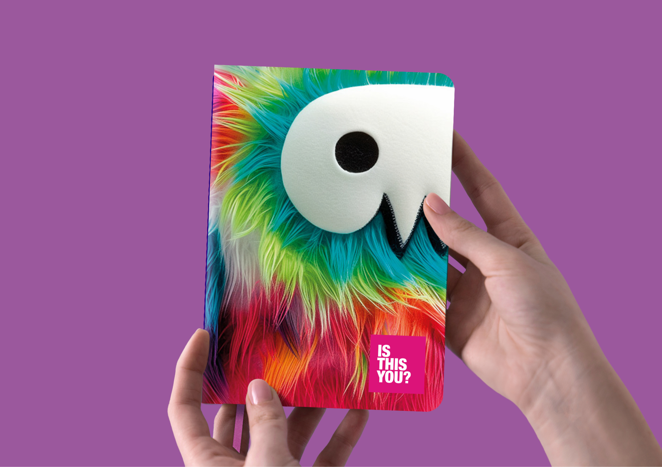
Each monster has a unique colour palette and graphic approach, inspired by their personality. The Creator, for example, has bold confidents colours; The Visionary is sky-blue for ideas; while The Ideator is made up of multi-coloured scribbles and doodles.
A series of additional graphics were created to tell our strategy story. These represent the wider 3D ‘toy world’ our monsters live in. The applied typography is a variation on our corporate font, representing the parallel universe our monsters live in.
The Results
The Monsters Family were a huge hit, making a difficult strategy conversation with staff a bit more palatable. Staff loved their personally selected monster notebooks. Clients are constantly asking us about the monsters when we take our notebooks to meetings, opening a conversation about understanding their scary world and how we can help them better. And we’re starting to develop the idea into a client engagement campaign, even exploring ideas of collectable toys bought to life with augmented reality.
