Intensifying employee connection
Client: Insight Creative
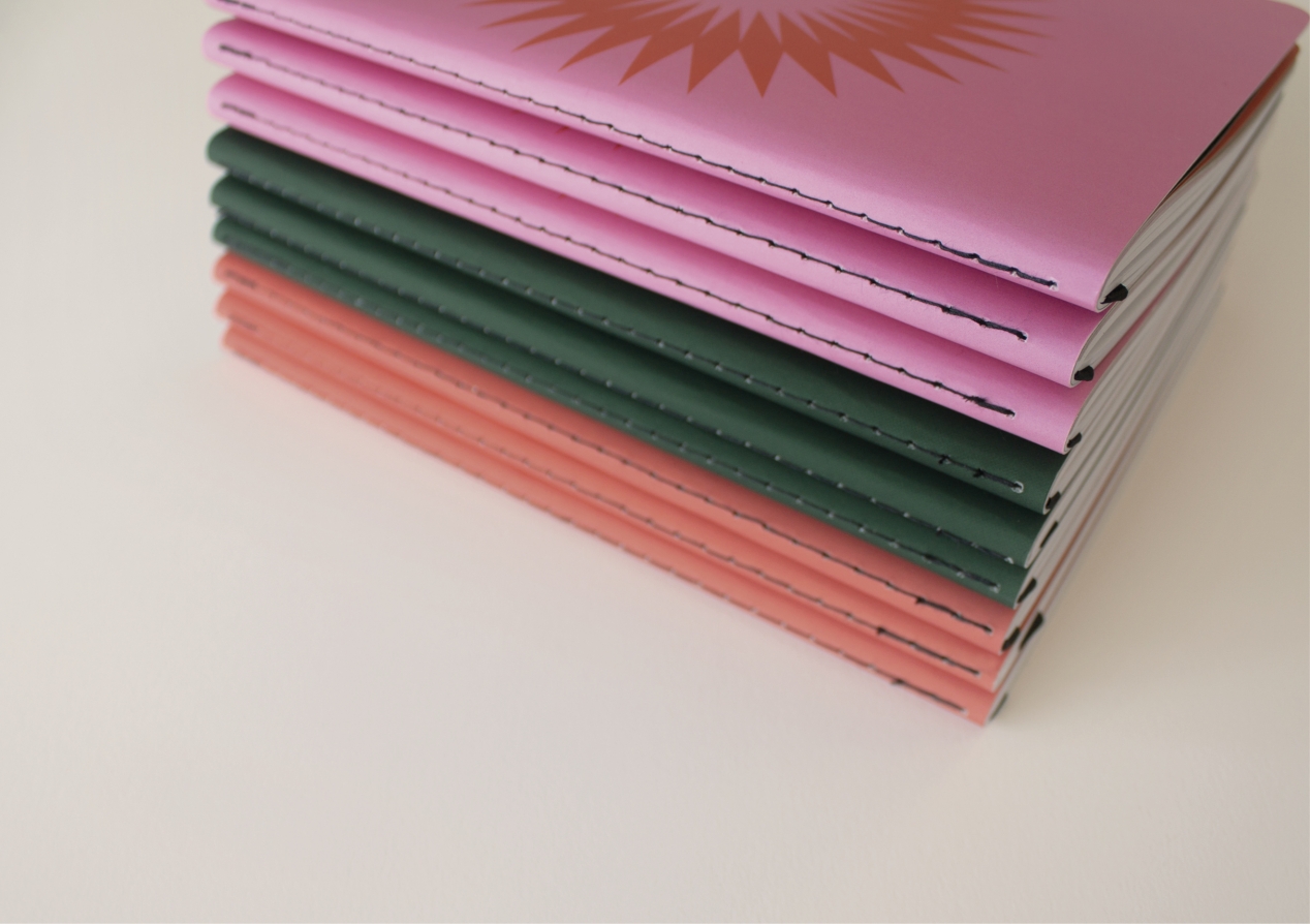
Each year, our staff notebooks reinforce our purpose, vision & values and capture our strategy for the year ahead. This keeps these guiding principles front of mind all year.
The Brief
Every year we run a team Strategy Day to review and learn from the year that was, and to reinforce our vision, purpose, values and key business initiatives for the year ahead. At the end of the day staff are given a notebook that acts as a memento of the day, allowing our key goals and drivers to be top-of-mind as we go about implementing the strategy.
The brief to our design team was to create a notebook that staff could take to client meetings all year round. Something crafted, elegant and stylish that captures the essence of our strategy and showcases the quality of our creative thinking and design.
The Solution
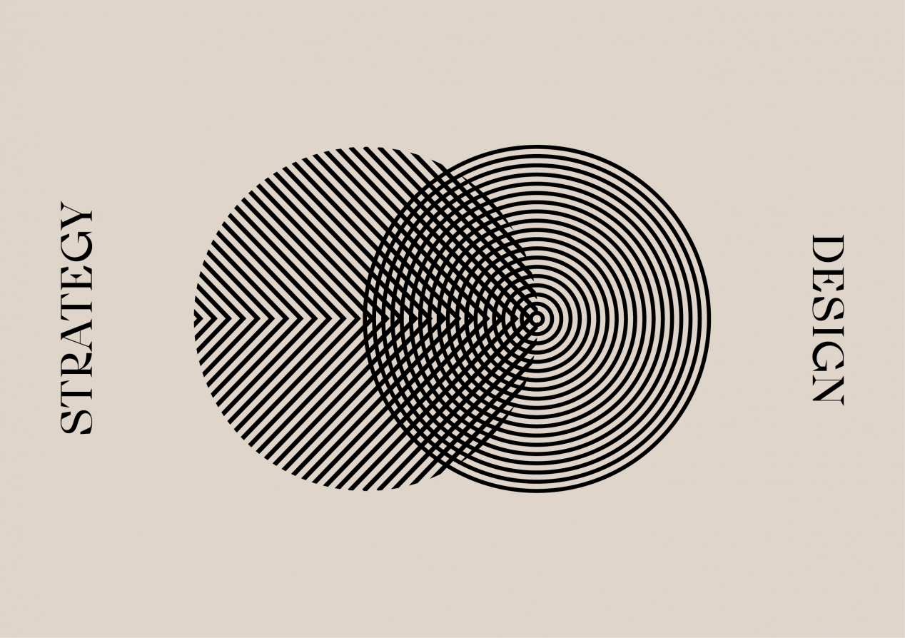
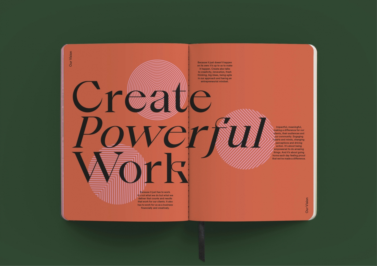
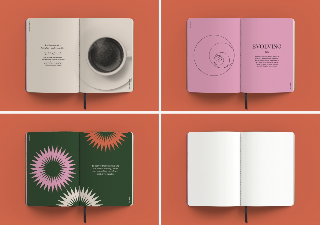
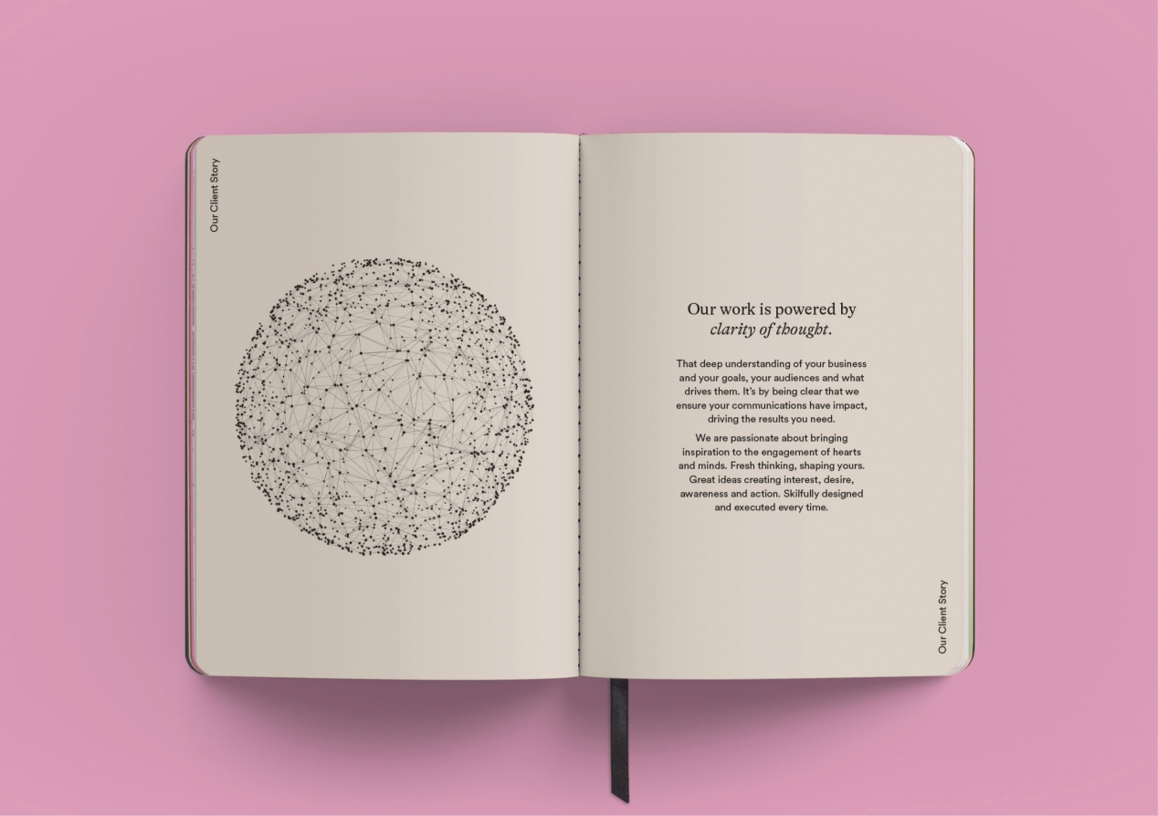
The notebook’s design is led by the year’s strategic theme – create powerful work – expressing the power of good ideas in delivering client results, driving audience perceptions and actions, and shaping how we and our clients feel about our work.
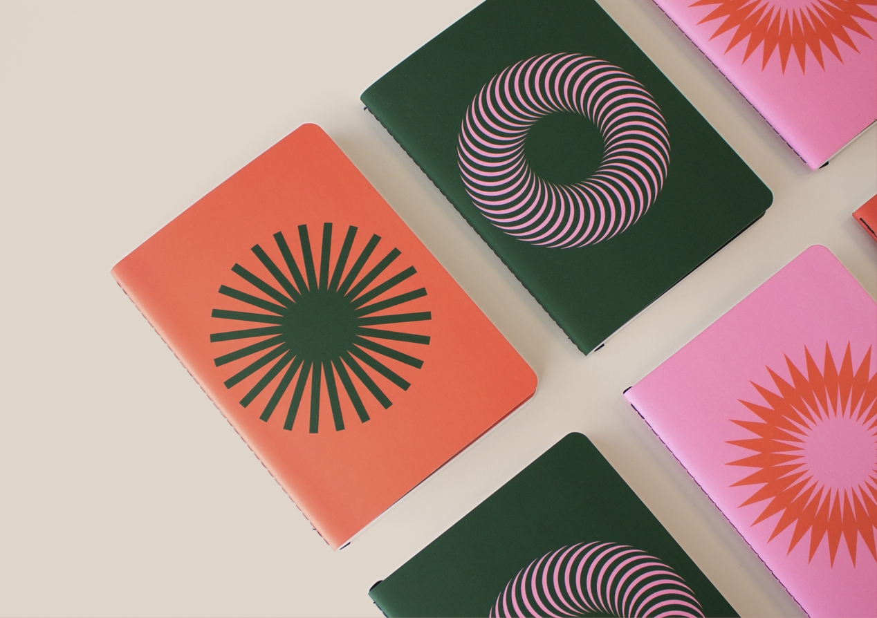
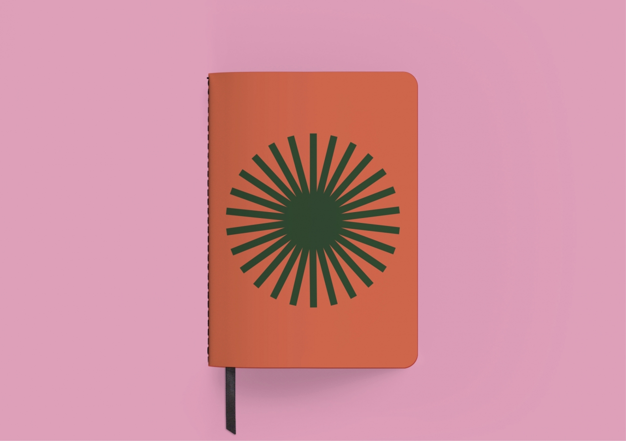
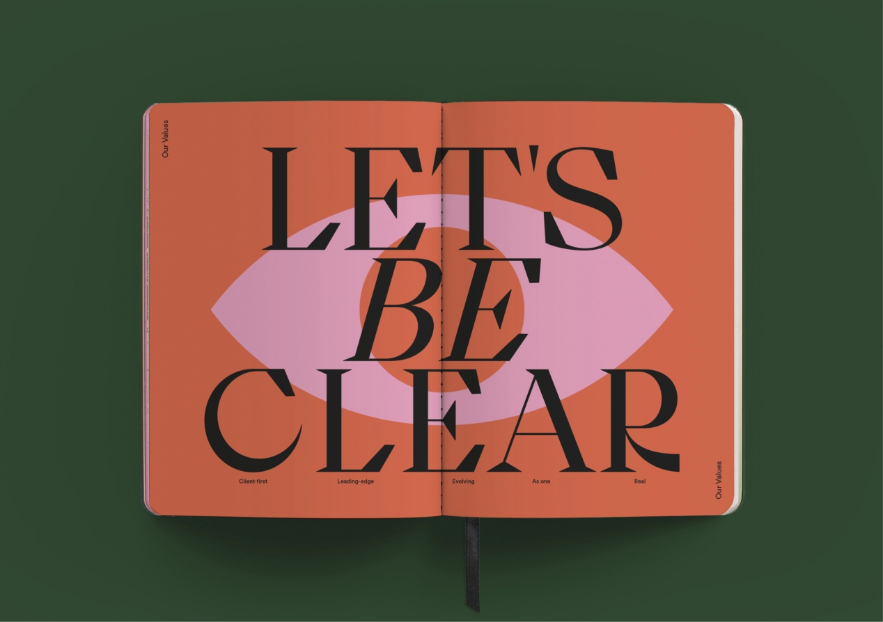
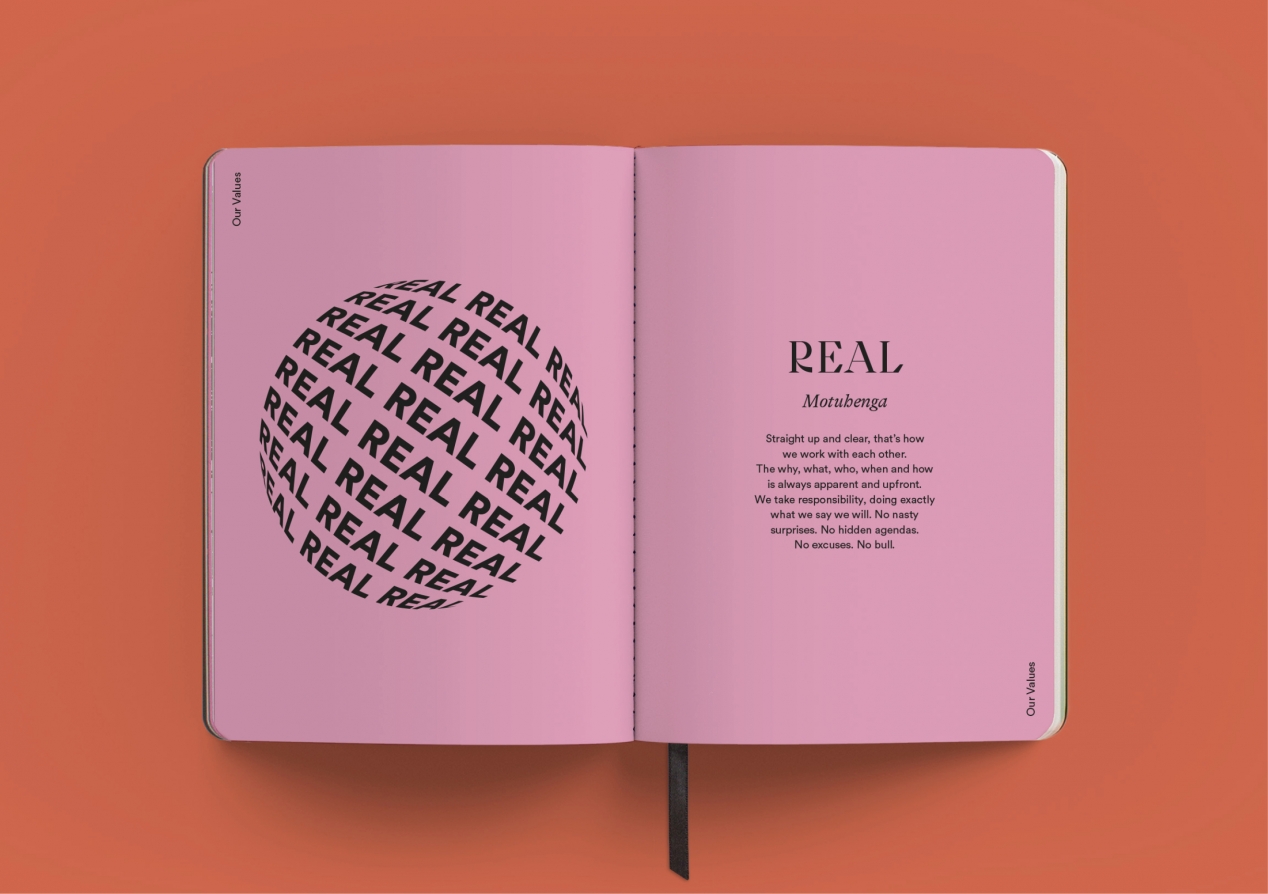
The notebook’s single minded design idea is a simple circle, representing the ‘starting point of a good idea.’ It speaks to a broad perspective, imagination, possibilities, forward momentum, collaboration and clarity, all messages that are key to our plan. This central circular idea creates a powerful and hard-working communication device to build each design element on.
The overall tone is considered and purposeful - like our strategy. It feels sophisticated, combining a timeless quality with a modern aesthetic. At the same time, it’s not overly serious, leaving space for a sense of fun.
Revolving around a variation of Insight pink, colour combinations challenge the norm to deliver fresh, new and exciting outcomes. The font is also a take on our brand font, with added levels of elegance and personality, to enhance that refined thinking vibe. Images, consistently delivered within the circular theme, use a range of content specific approaches including typographic, diagrammatic, simple vector, line, and photographic. This variety speaks to the possibilities for creating powerful work. The page layout reinforces focus and simplicity, making the content the hero with centred layouts, large lettering and colour to aid with navigation.
One of the most important design elements is the cover. The choice of three cover designs reflects the strategic message of tailoring solutions to the needs of our clients. The choice of a cutting-edge microfibre ‘suede-like’ material, speaks to both the need for us to ‘feel our work’ for it to be powerful and our desire to push boundaries in the solutions we create.
The Results
The combination of strong messaging and design elegance ensures our staff love the notebooks, carrying them proudly to every meeting. Seeing the different covers has a powerful effect on clients too, quickly becoming an invitation to ask us about them. We’ve now even got some clients carrying our notebook around with them. One client loved it so much they’ve asked us to design a version of it for their own team.

.gif)
.gif)
