Stronger signals. Fewer pages. Still integrated.
Client: NZ Post

Sharper story, fewer pages. We evolved NZ Post’s integrated report to feel more commercial and focused, while keeping the discipline readers expect from an integrated reporting framework.
The Brief
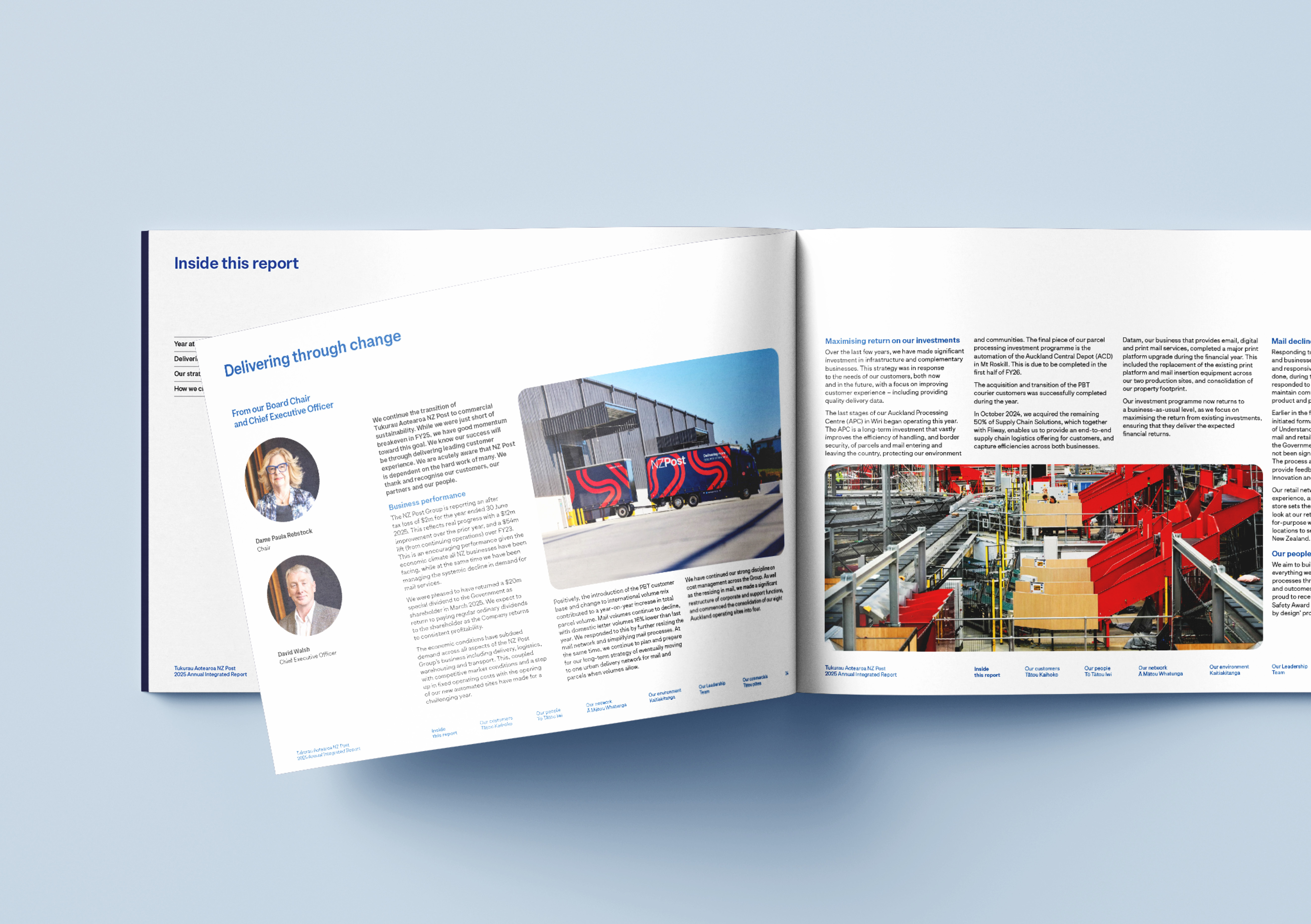
NZ Post wanted this year’s report to evolve the established style for continuity, but signal a stronger commercial orientation. The aim was to show a government-owned business thinking and acting like a standalone enterprise — efficient, disciplined and performance-minded. At the same time, they asked for a more concise, quickly scannable report, while retaining the hallmarks of integrated reporting: a clear value creation model (VCM), identified material issues, and visible “join-the-dots” linkages across the narrative.
The Solution
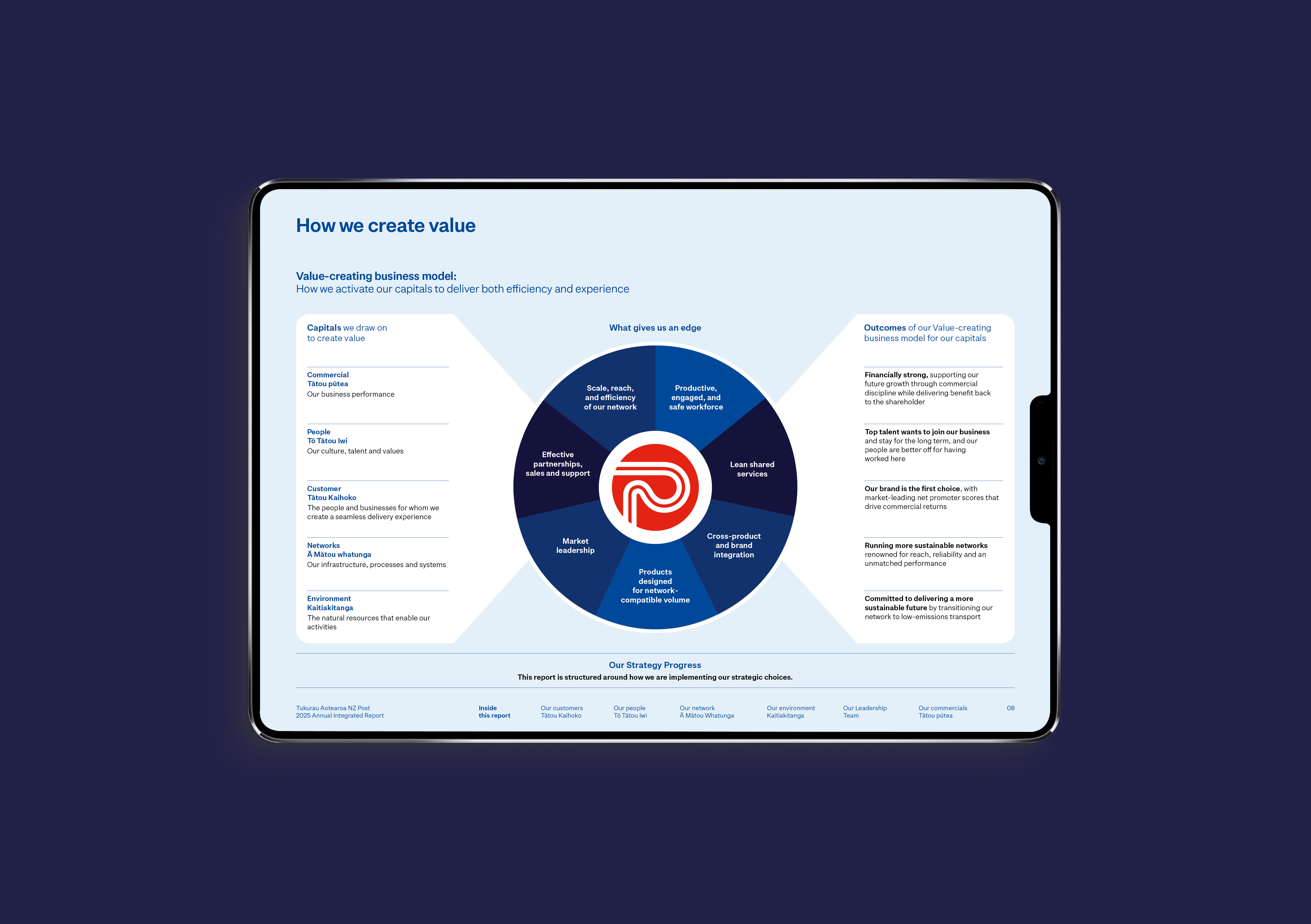
We reframed the story architecture around commercial clarity. The hierarchy puts performance signals and strategic choices up front in plain language, with tighter headings, shorter intros, and clear signposting that helps readers get to what matters faster. Throughout, cross-references guide readers from each choice to the relevant capitals in the VCM and to where top material issues are addressed — reducing hunting and reinforcing cause and effect.
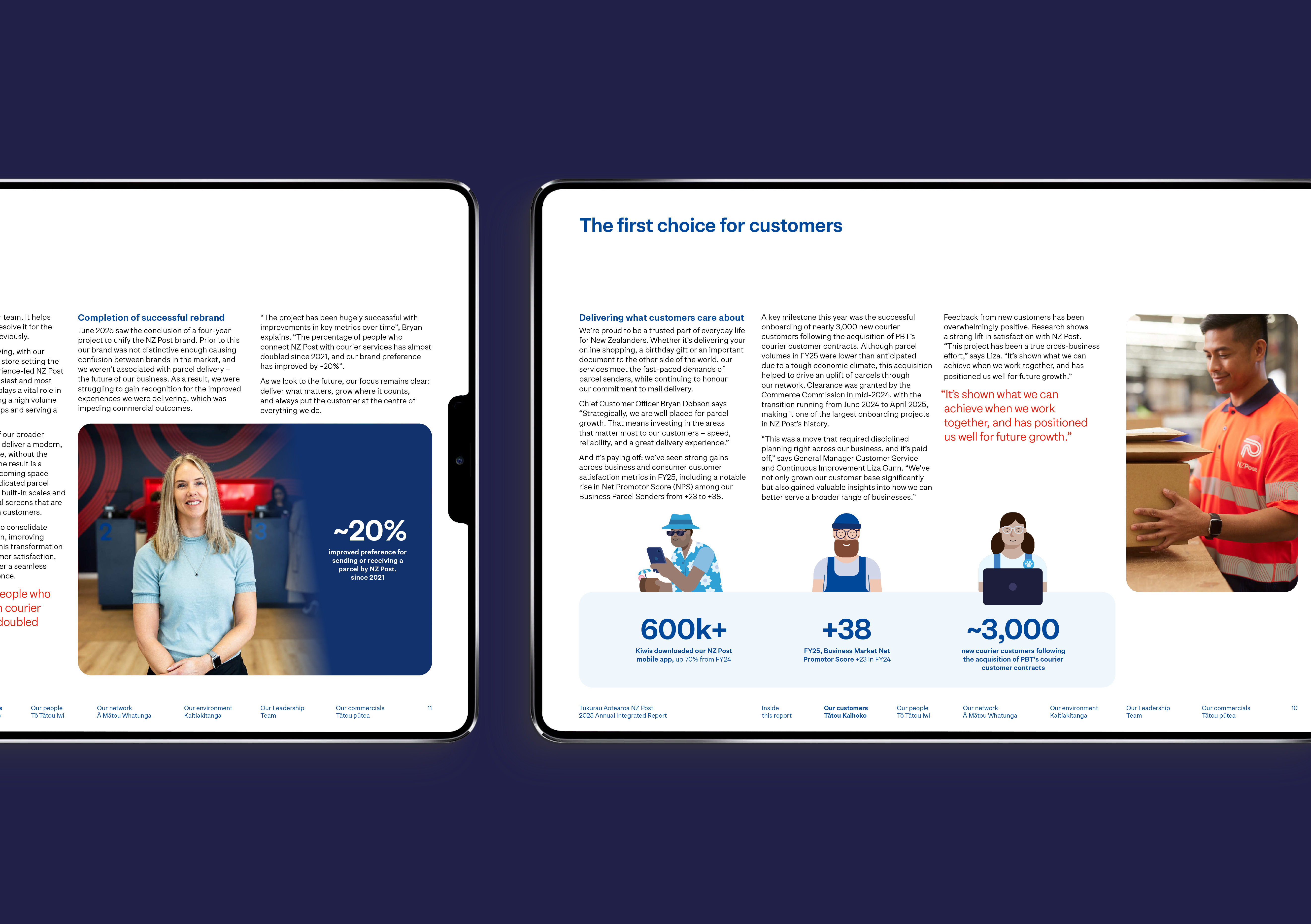
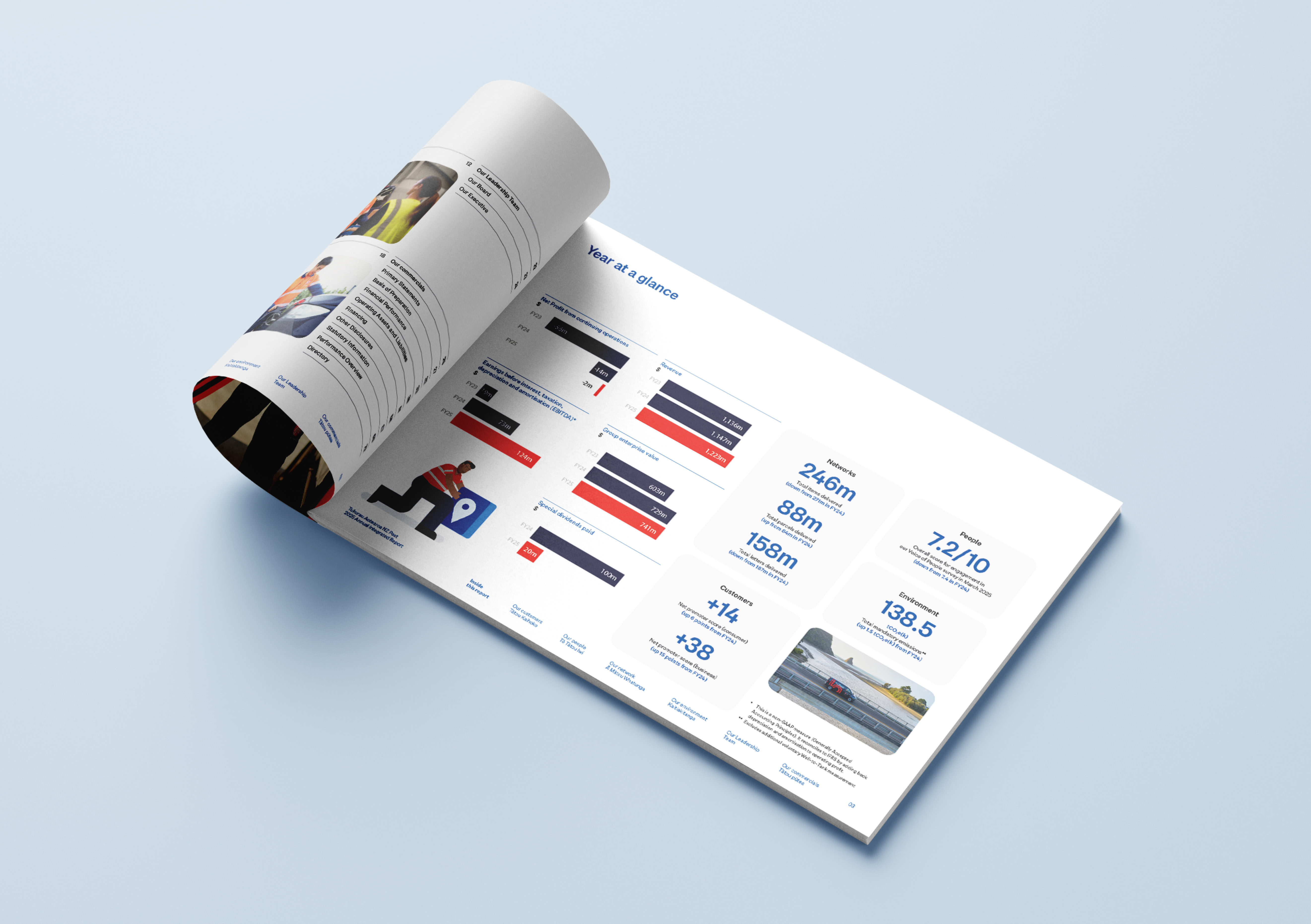
Design-wise, we kept the familiar NZ Post system and evolved it to feel more business-first. A simple, modular design approach to group data make results easier to parse. A circular device and rounded modules echo existing brand assets, while new pattern fills and journey lines add depth without visual noise. Considered use of illustration elements to create simple infograhics appear only where they add explanatory value (for example, processes and KPIs), helping keep page counts tight.
We edited for pace. Long, multi-idea paragraphs became short, purposeful units; more arcane detail of interest to a small subset of readers moved online; and sectional intros now lead with the commercial takeaway before supporting detail. Tables and charts prioritise “current year first” with restrained colour, so trend lines and year-on-year changes are obvious at a glance.
To preserve integrated reporting rigour, we refined the VCM layout so the central narrative — purpose, strategic choices, capitals — lands quickly, then used consistent iconography to connect those choices through the chapters: delivering for our customers, our people, our network, and for a more sustainable future. Material issues appear where they influence outcomes, not as a standalone compliance box, making the link between risk, action and performance explicit.
The Results
The final document is shorter, faster and more commercial in tone, while staying recognisably NZ Post. Investors get to the signals sooner; operational stakeholders still see the depth behind the numbers. We maintained integrated reporting discipline — VCM, materiality and cross-linkages — but expressed it with clearer hierarchy and fewer pages.
Early internal reviews highlight improved scan-ability of key metrics, stronger line-of-sight from strategy to performance, and a design system that feels more deliberate and business-ready without breaking brand continuity.