Spatial, structural and architectural.
Client: CPRW
A leading architectural firm rebrands with a dynamic new brand system.
The Brief
CPRW are a leading kiwi architecture firm based in Auckland. Over the past 80 years they’ve altered our skylines. Fine examples of their work include some of Auckland’s first high rises, the University of Auckland library, and the Petone Settlers Museum. Today, under the leadership of Dave and Wade, they continue to produce award winning work such as the Air NZ check in experience, the Generator Building and ASB Bank’s spatial experiences. They continue to building their legacy by constantly pushing innovation and customer experiences.
We were tasked with developing a visual identity for CPRW.
The Solution
We started by developing a clear positioning and brand story that spoke of creating unique spatial experiences, designed by humans for humans. Along with this client focus, the brand personality is high on innovation, a technology-bent and a rebellious streak that challenges convention.
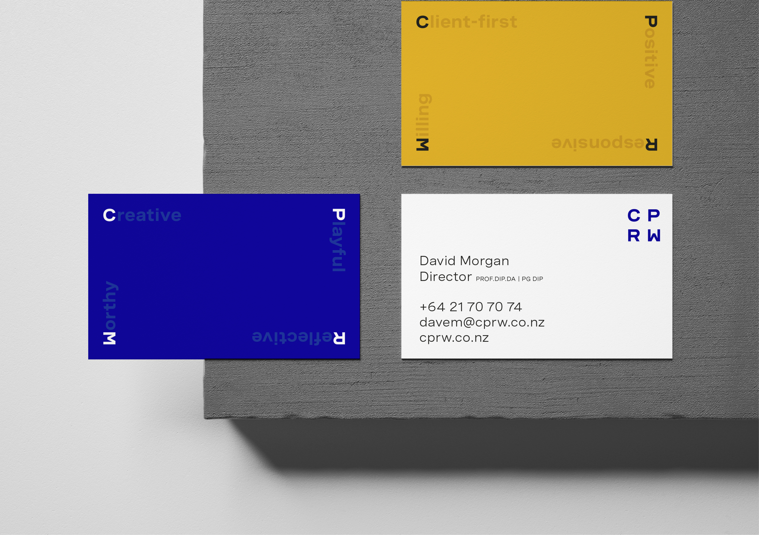
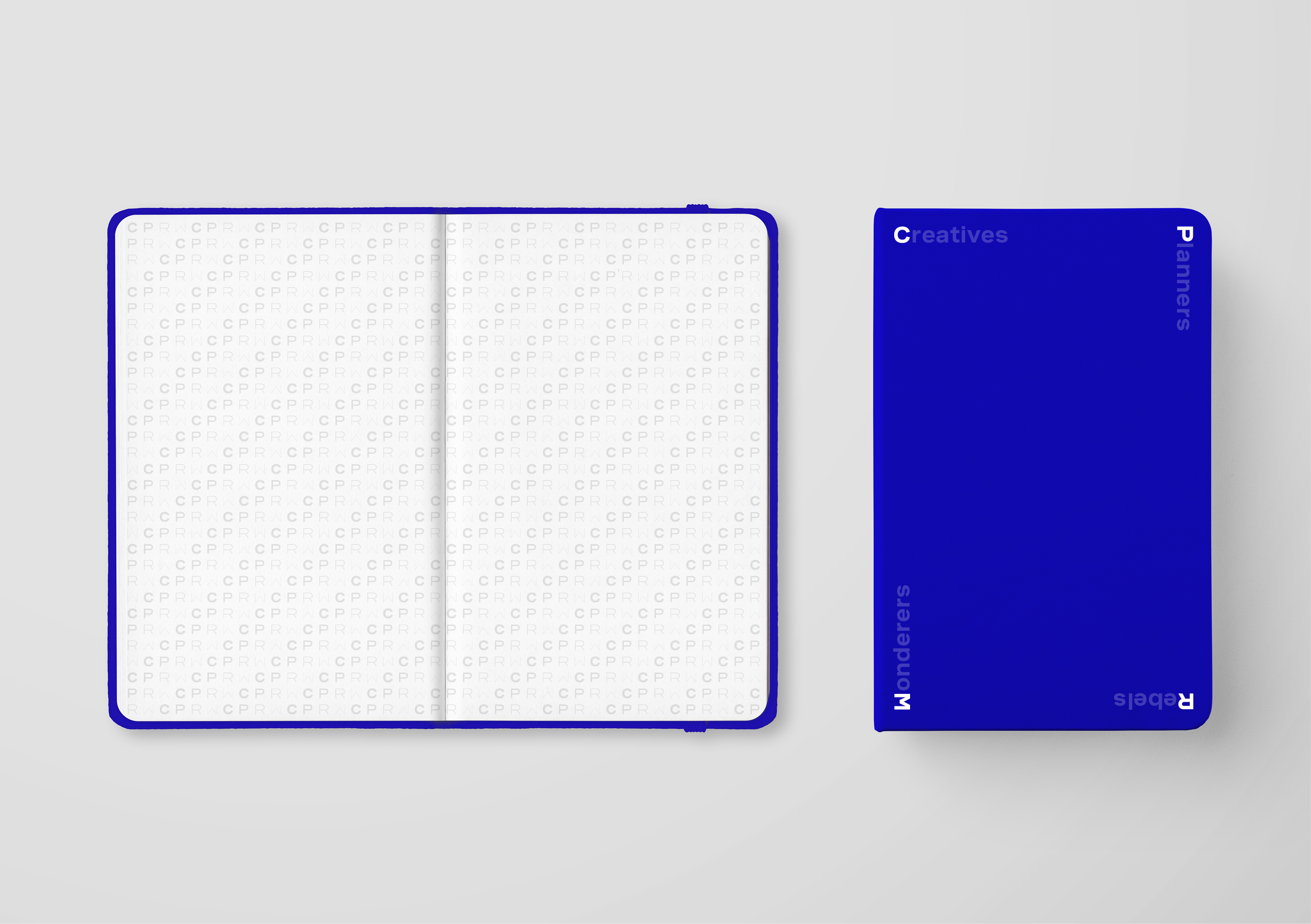
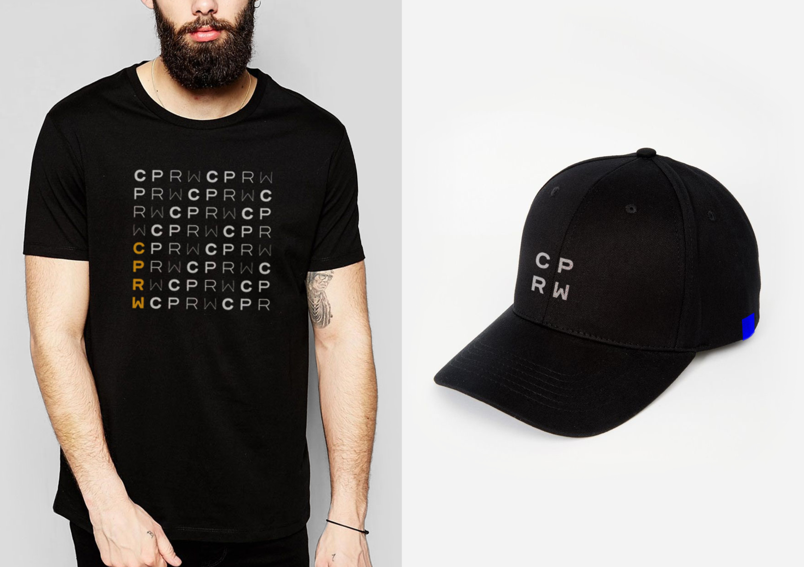
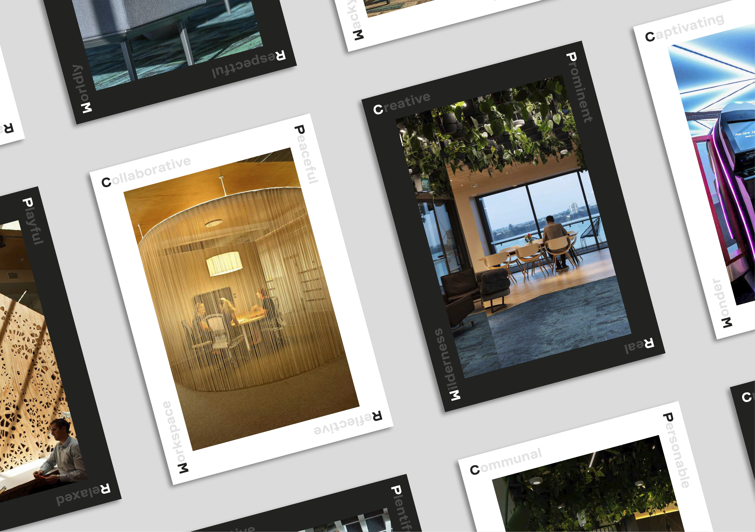
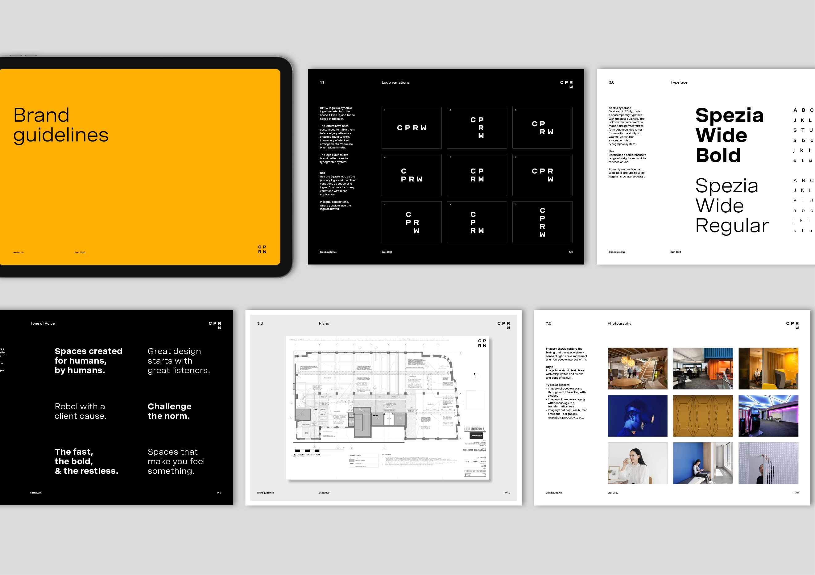
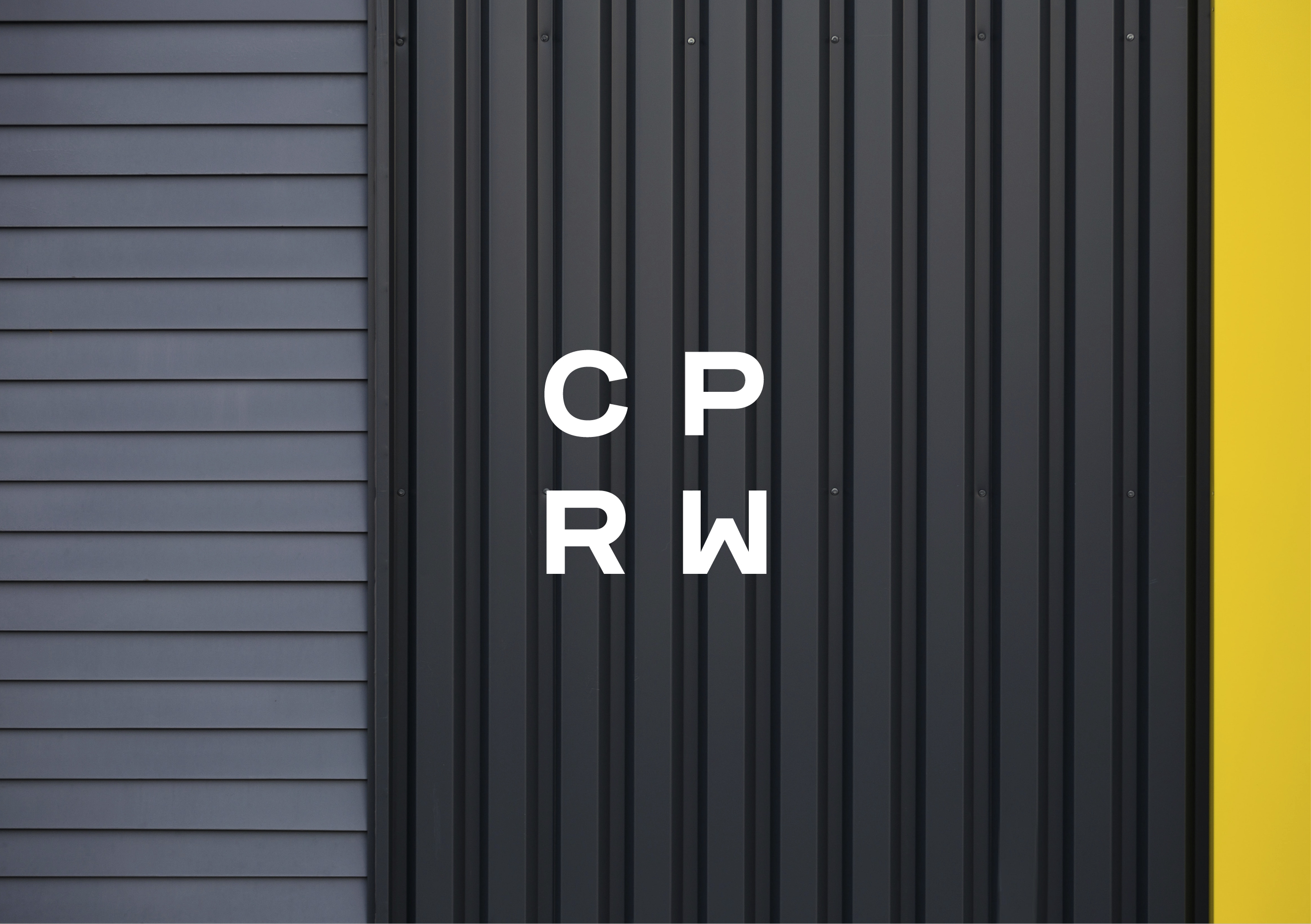
Out of the brand story, we landed on the idea of ‘who we are’ to inform the identity. The brand needed to say a lot so we created a dynamic typographic system to do most of the talking. The system formed from the letters C-P-R-W becomes a language to express thinking and ideas. It can be used in a variety of ways to talk directly about the company, to describe their work, and to show their attitude.
Most importantly the typographic system gave new meaning to their name. CPRW was historically named after the founding members initials, but over the years this has lost its relevance. The new brand system retains their historic foundations while giving it a new modern, client-focused, meaning.
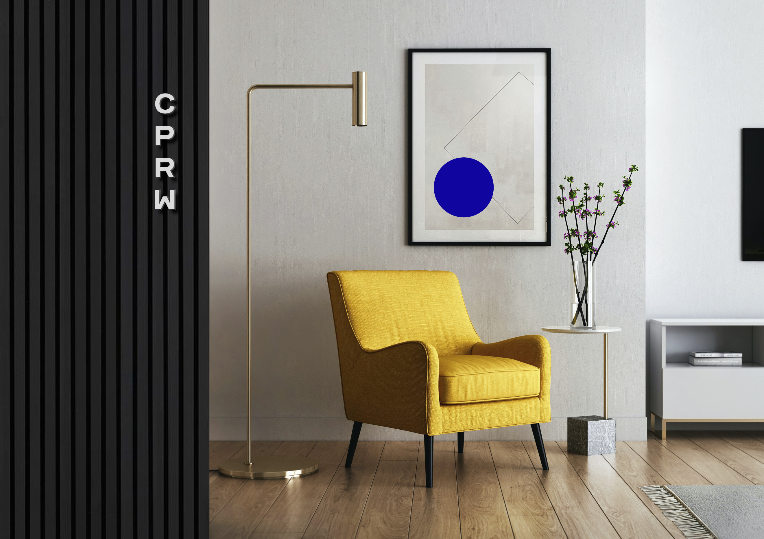
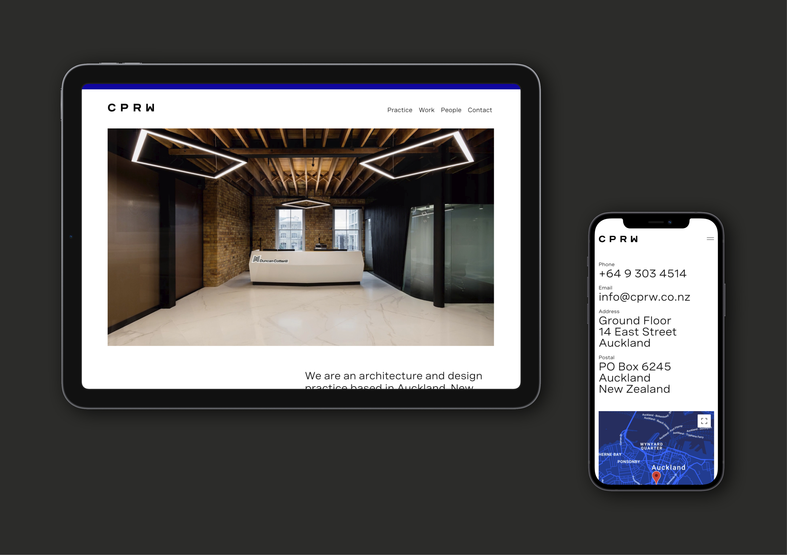
The dynamic logo builds in unique ways each time, just like CPRW themselves. This logo and changeable brand system is particularly effective in a digital and spatial settings and lends itself nicely to animation and other forms of dynamic transformation.
The pared-back look feels relevant to the industry and lets their beautiful work be the hero. It’s stylish and clean yet bold in its colour choices and strong architectural lines.
The Results
Shortly after launch, Dave sent us a note to say how much they loved the new brand and how it’s galvanised the team behind their story. He also shared some great feedback from their clients and prospects, all praising the new look. Now, that’s what we love to hear from our clients.