A single source of truth
Client: Canterbury Earthquake Recovery Authority
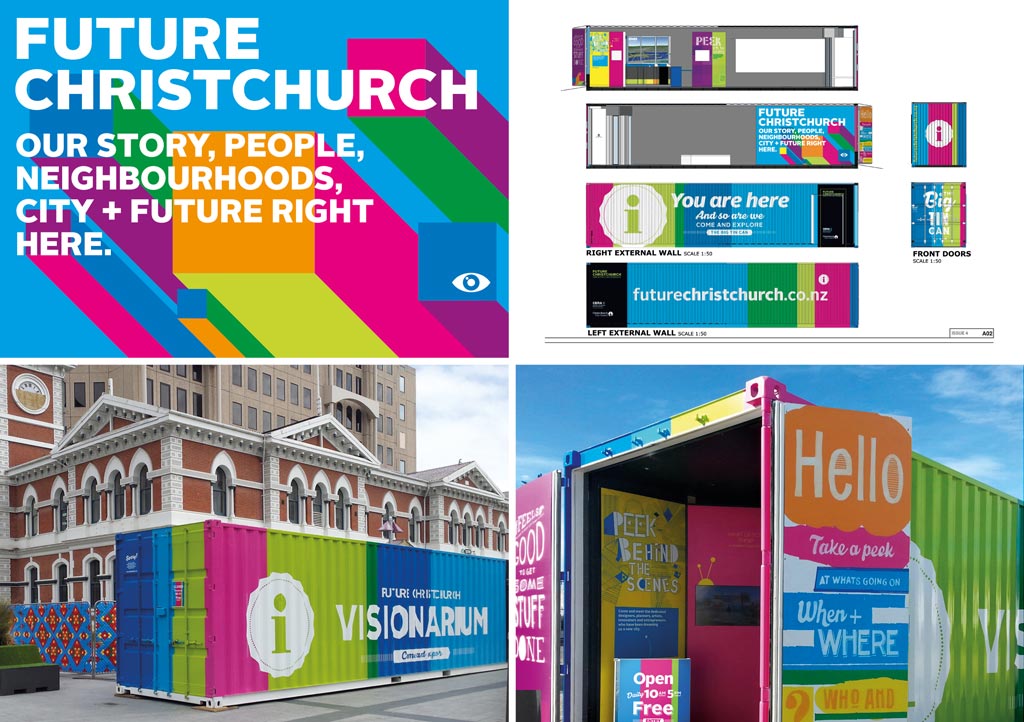
Future Christchurch is the foundation communication brand for delivering the future vision for greater Christchurch to multiple audiences.
Originally developed by Christchurch City Council to communicate its response to the earthquakes, CERA identified its ongoing potential as an essential and timely vehicle to deliver the future vision for greater Christchurch; to fill the gap for a single source of truth; and a banner under which partner recovery operations could tell their stories with a cohesive voice.
The brief
CERA asked us to redevelop and extend the existing Future Christchurch visual identity, to support the new goals of the brand going forward. This involved developing the right strategic framework to give the work that followed the foundation it needed.
The solution
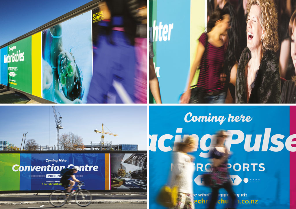
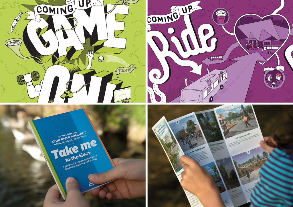
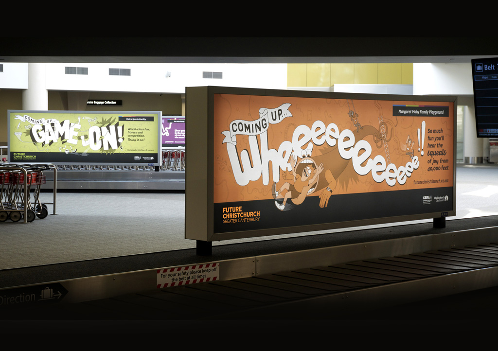
The essence ‘feel good about your city’ informed our thinking on the brand messaging and we aimed for a visual identity that clearly expressed this sentiment, with strong cut-through. Given the breadth of audiences and communication vehicle types, a broad visual language with real stretch was essential.
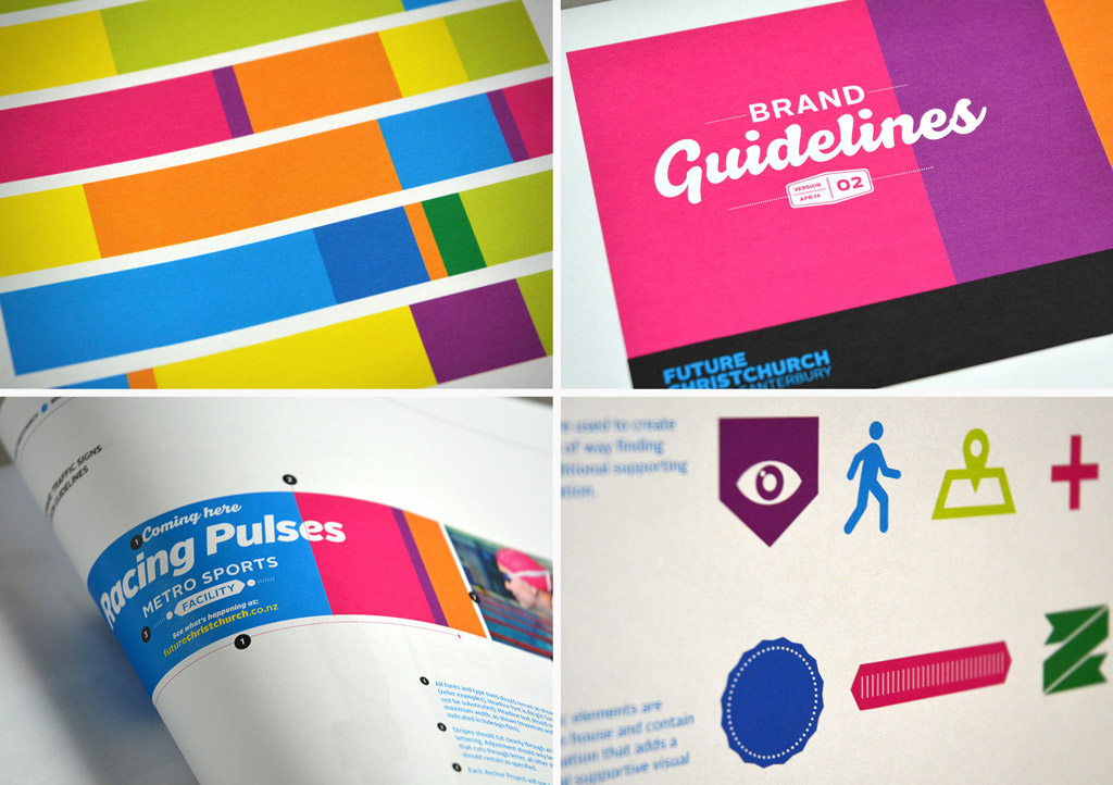
We stripped back the bare essentials of the existing creative until all that was left was the key attributes that spoke to the strategic intent: the existing name and the idea of using a multi-stripe broad colour palette approach.
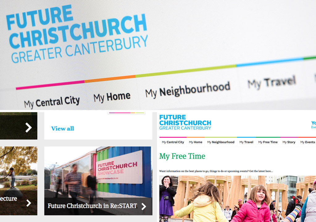
We then rebuilt. We needed to broaden the reach from just the city to encapsulate the whole of Canterbury, rationalise the colour palette, overhaul the wordmark and develop a structured system that enabled broad flexibility while affording cohesion and consistency. We extended the visual identity elements to provide a broader visual language and created a distinctive tone of voice, turning the Future Christchurch brand into an identity with generous stretch. The overall approach injects energy and vibrancy into the messages.
The colour palette was a distinctive feature we retained and refined further, resolving how much colour to use where and in what form, and how to manage colour in conjunction with text, graphics and images. Working on a series of live applications during the development process proved a good test for system, resulting in a very robust visual identity which made it easier to implement by the various design teams engaged by CERA.
The results
Today, Future Christchurch is focused on participation and partnership and has become a collaborative, unified, non-partisan brand that removes confusion over where to go for information and who is leading what. It cohesively communicates information about a wide range of initiatives that improve Christchurch including anchor projects, suburban centres, facilities rebuild, transitional city projects, transport and ‘smart’ living. Walking around the city, the colours and messaging of Future Christchurch can’t be missed.