Artisan Attention-grabber
Client: Breadcraft
In your supermarket bakery, bread brands have to work hard to get noticed next to the just-baked loaves produced on-site.
The Breadcraft team set us the challenge of freshening up their Cottage Lane bread brand to ensure it grabbed shoppers' attention in a busy store and it told a compelling story.
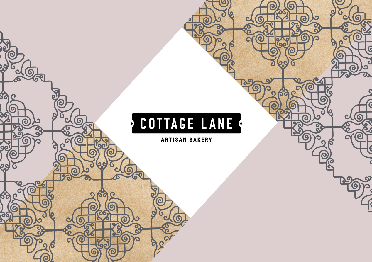
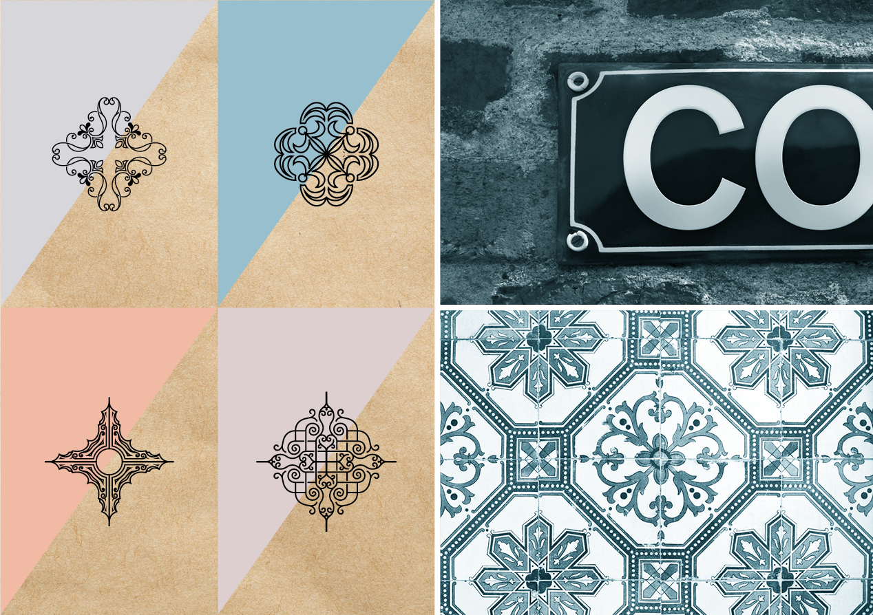
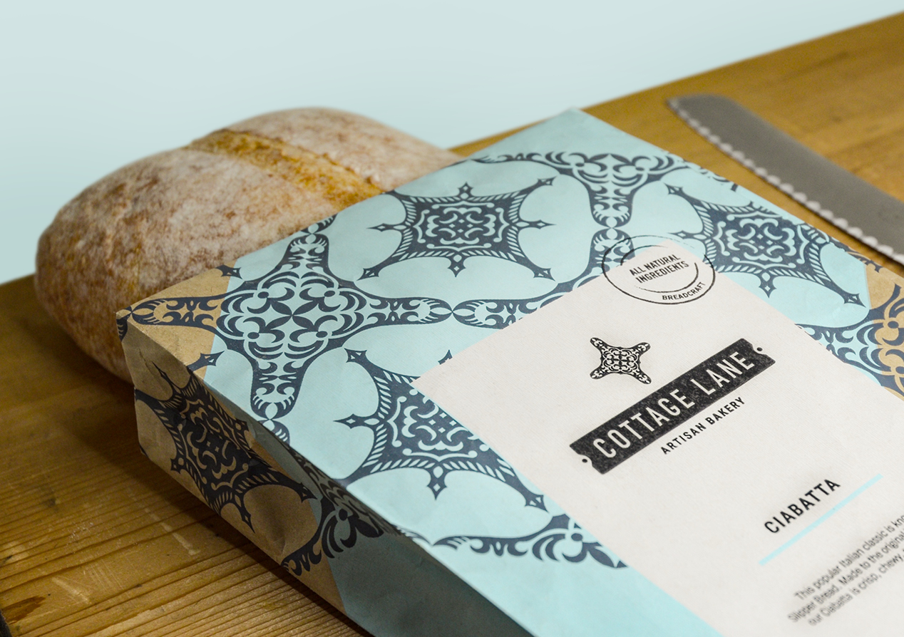
Revisiting its origins, we wanted to play up the heritage of the artisan breads bought to NZ by European immigrants over a hundred years ago. We captured this heritage strongly in design, using classical French-street signage shapes to house the logo, a classic font and bold European inspired colours and patterns. Combined, they tell an engaging story of quality and tradition.
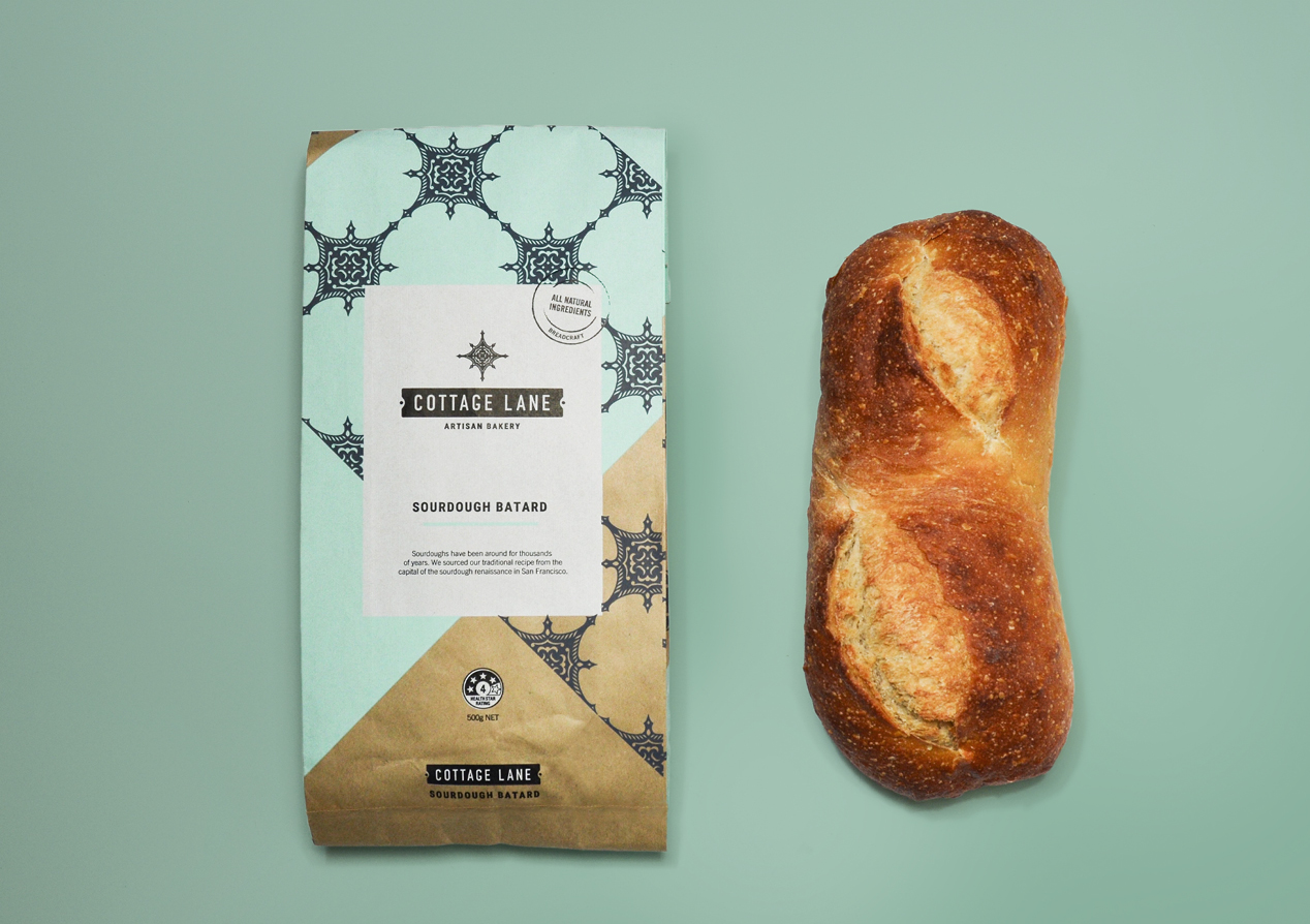
For the packaging we moved away from the plastic bag for environmental reasons, but also because fresh bread is usually presented ‘naked.’ The half-sized paper bag allows the unique colour, texture and shape of the bread to be part of the sales story. And the bold bag design, strong labelling and supporting origin stories, deliver real cut-through. The overall feel is of quality hand-made bread made with passion and care, using time-honoured recipes and techniques.