Aiding ACT’s election fitness
Client: ACT Party
Clarity on positioning, audiences and refreshing the brand to suit were important catalysts for achieving a best-ever election result.
The Brief
Two years out from the 2020 election, David Seymour, leader of the ACT party, approached us to develop a new brand and visual identity for the party. The goal was to resonate with a wider audience in order to grow the party faithful, attract high calibre people to the party list and, ultimately, win enough votes (2%) to have at least two seats in parliament.
The Solution
The first challenge was identifying exactly what ACT stood for. Through a series of discussions with David and key members of his team we explored the overall philosophy of the party today and where is had been historically. We probed voter sentiment, nationally and internationally, and what would motivate someone to support an alternate right-leaning party like ACT.
As a result of this initial work, we developed five territories (stories and mood boards) that captured five possible ACT positioning stories. These became the basis for an all-day workshop with the party’s Board and inner circle, exploring each territory before narrowing it down to the two preferred territories that most reflected what was core to the ACT proposition. For these we discussed the potential audiences, who they were, where to find them and why they’d care.
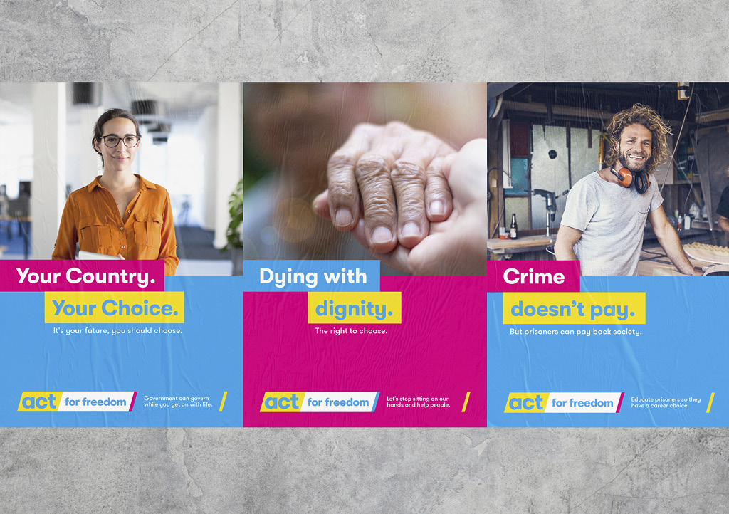
We ended the stakeholder workshop with an in-depth discussion on how each territory would translate into their position on key issues like health, housing, justice, crime, social welfare and government intervention. Considering the uniqueness of each territory and position, and its alignment with potential partners, led to further refinement and the creation of a final positioning story.
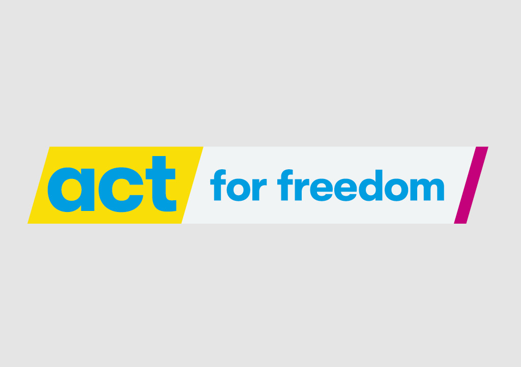
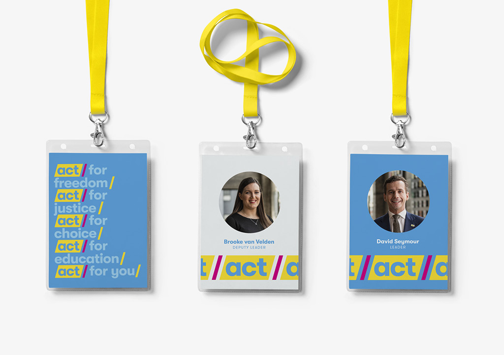
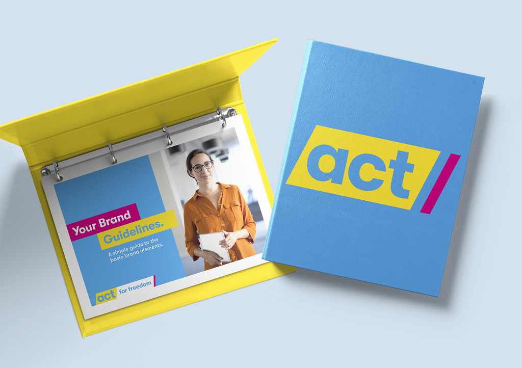
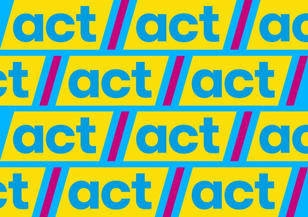
With clarity of what they stood for, Act for freedom became the platform for building a new identity. ACT is an acronym but we wanted to build new meaning into it. More than just a name, the ACT logo moved from a passive entity to an active, emphatic and urgent platform to drive change – ACT for justice, ACT for personal choice, ACT Now, etc.
They already owned yellow as their political colour, which we made bolder, and supported it with more contemporary colours – pink and light-blue - and more youthful fonts. We also recommended a photography style that reflected the target audiences and a less formal, and more inclusive, tone of voice.
Through a series of stakeholder workshops, we worked through how far to push the new identity to attract new supporters without alienating the existing.
The Results
The new positioning and identity were launched in mid-2019 to a rousing response from the party. Within weeks, David told us the party was feeling reenergised, getting better at telling a cohesive story and connecting with new people wanting to be involved. The media also found the ACT story clearer and this resulted in more media time.
Momentum continued to build over the year leading up to the election, resulting in ACT getting 8% of the party vote and 10 seats in parliament. While we can’t say our work is fully responsible for ACT smashing their goals, David is clear that getting clarity on their positioning, their audiences and refreshing the brand were important catalysts for achieving their best-ever election result.