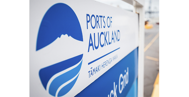
While the Ports of Auckland are currently embroiled in a public standoff over wharf extension into the Auckland Harbour, there's still no doubt about the short- and long-term economic impact the Port has on our city. And their visual identity needs to operate by the rules of commercial necessity too. And so, in mid-2014, we embarked on an evolutionary update of their logo, colour palette and typography to keep them fresh and contemporary. Creative Director, Brian Slade talks about the process and the lessons for other companies looking to refresh their visual identities in this article in the May/June edition of Marketing magazine. You can read it online at StopPress here.