A compelling investment story shines through
Client: Waterman Capital
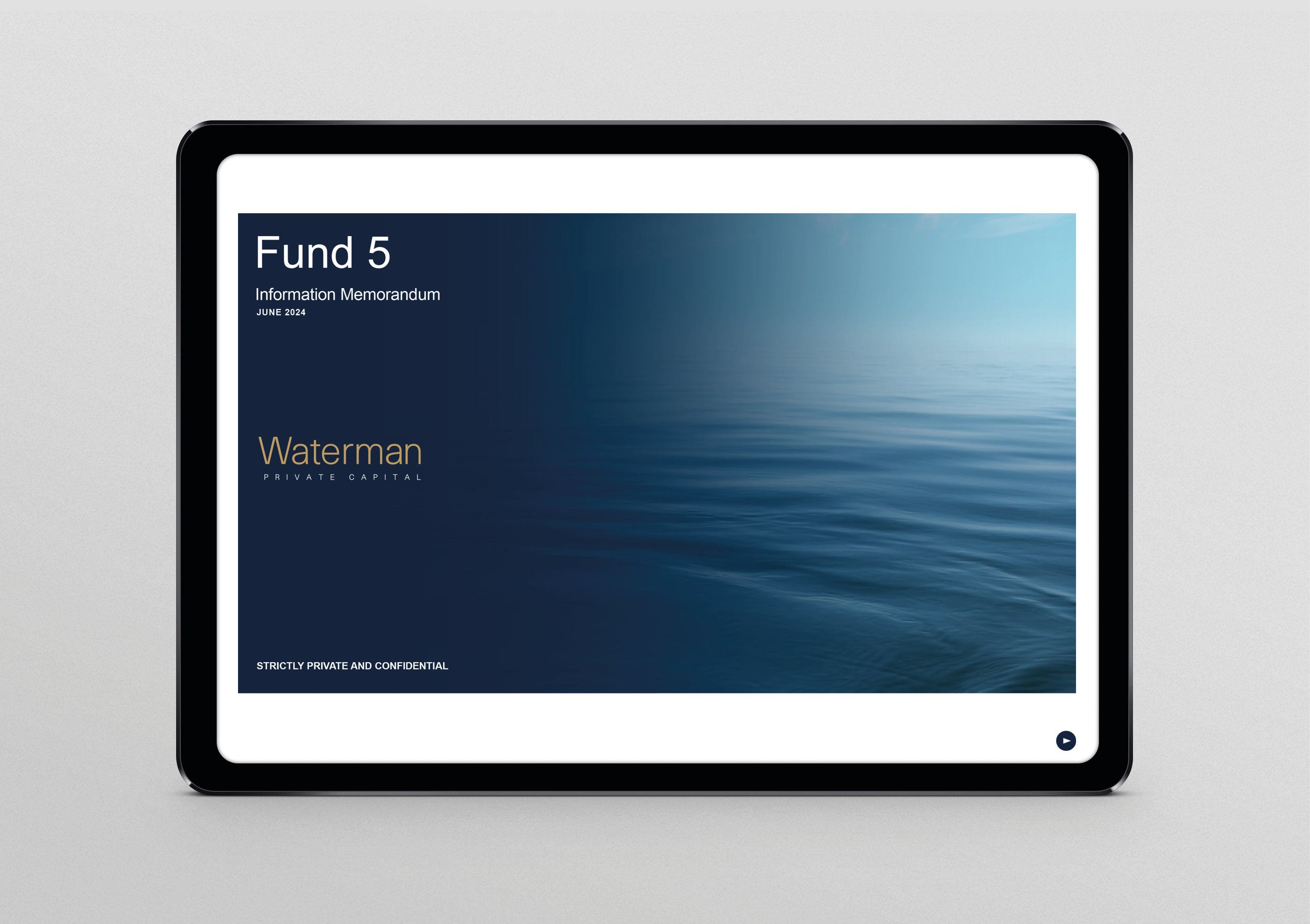
An engaging information memorandum and investor presentation with cut-through.
The Brief
Private equity firm, Waterman Capital, approached us to develop an engaging information memorandum (and companion investor presentation), with cut through, for a new investment offer. With an 80+ page briefing document crammed with facts, figures, diagrams, charts and written content, the challenge was to make the compelling investment story shine through the wall of details.
The Solution
Our overall approach was threefold:
- Introduce a series of pages at the start that tell the strongest and most compelling investment story and opportunity;
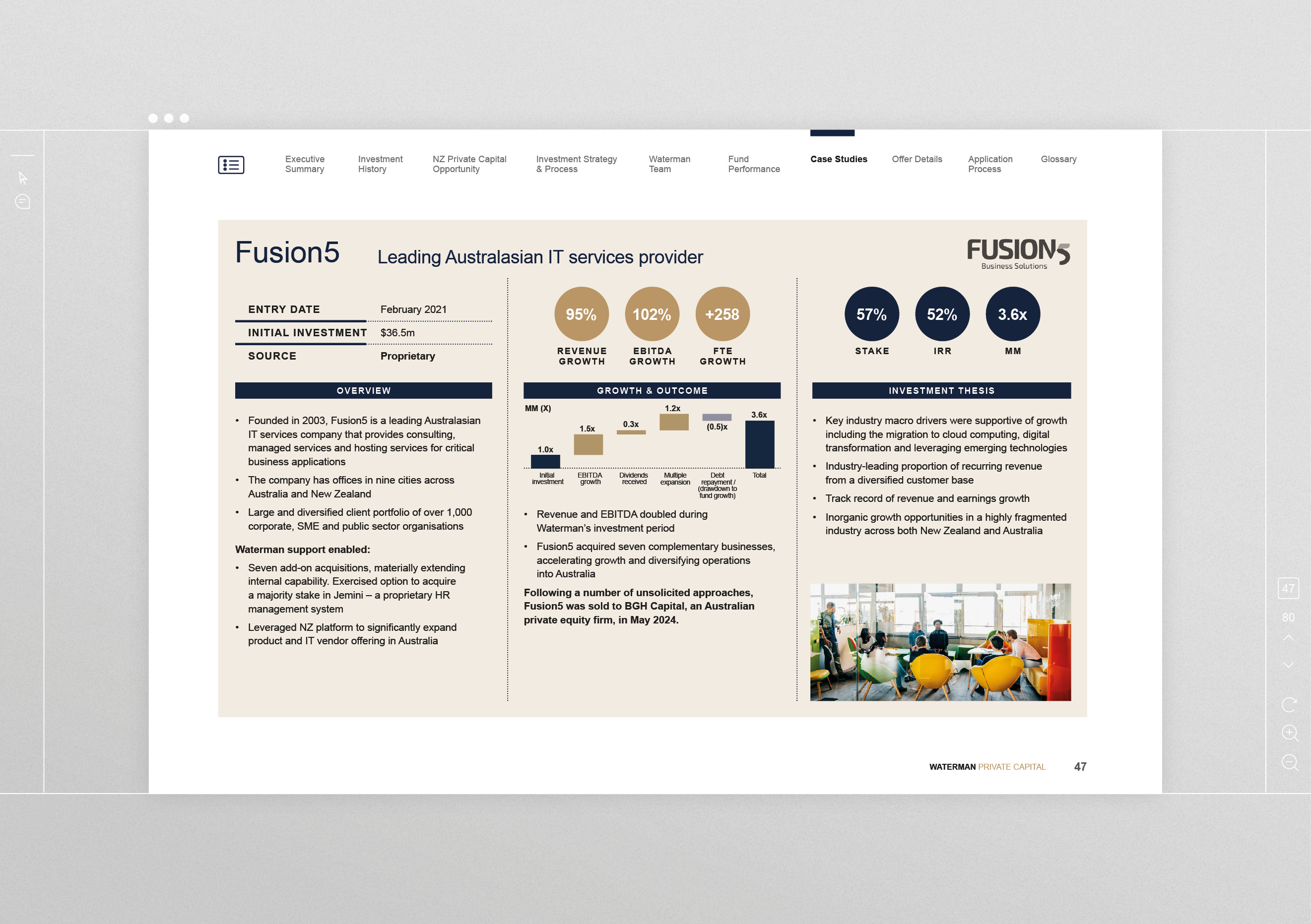
- Add clear signpost navigation throughout to make it easy for audiences to follow the story and find the details that support it; and
- Design for an online viewing experience, using dimensions that translate seamlessly into PowerPoint slides.
Creatively we wanted an overall feel that was strong, professional, accessible, unique, and uncluttered.
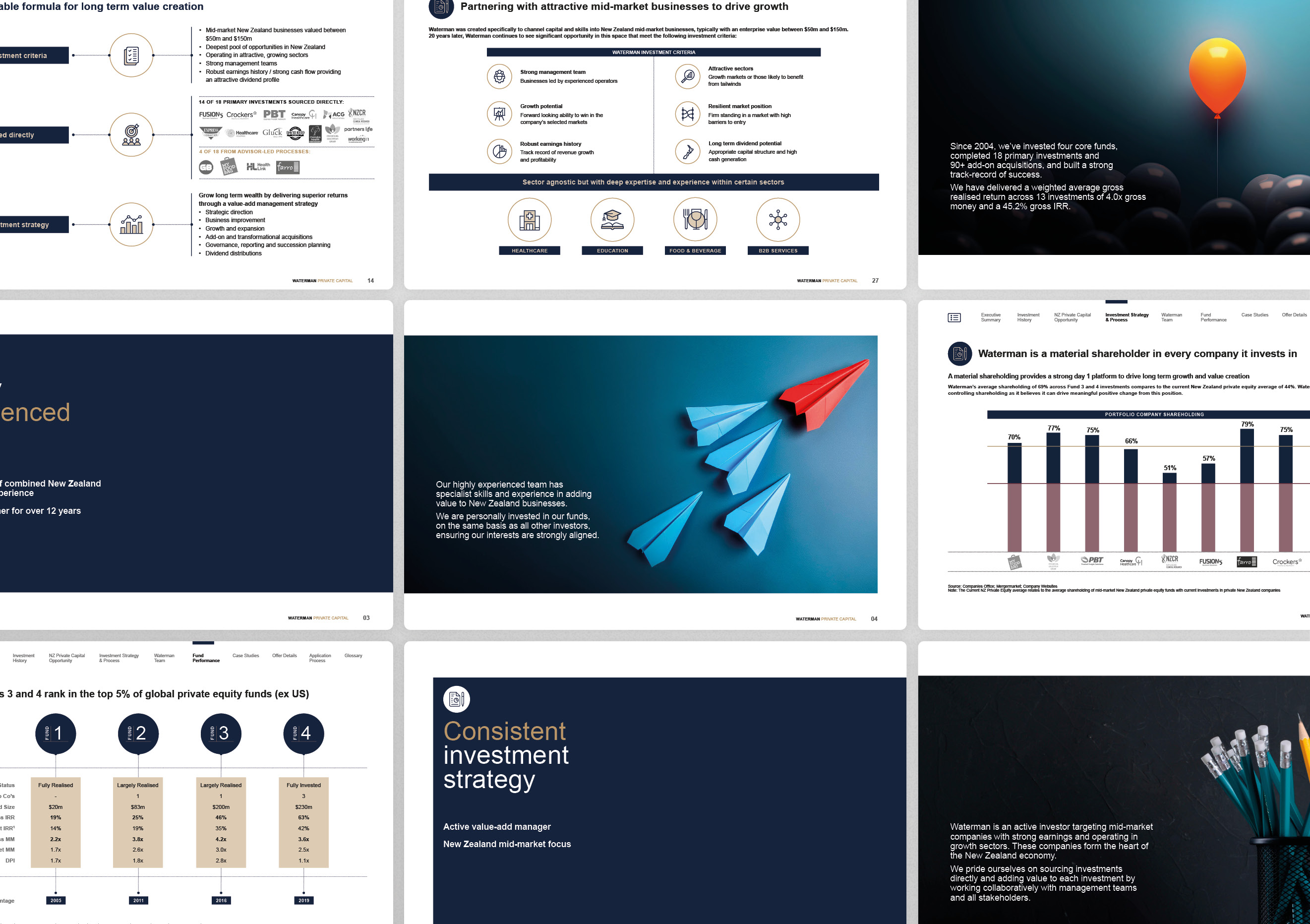
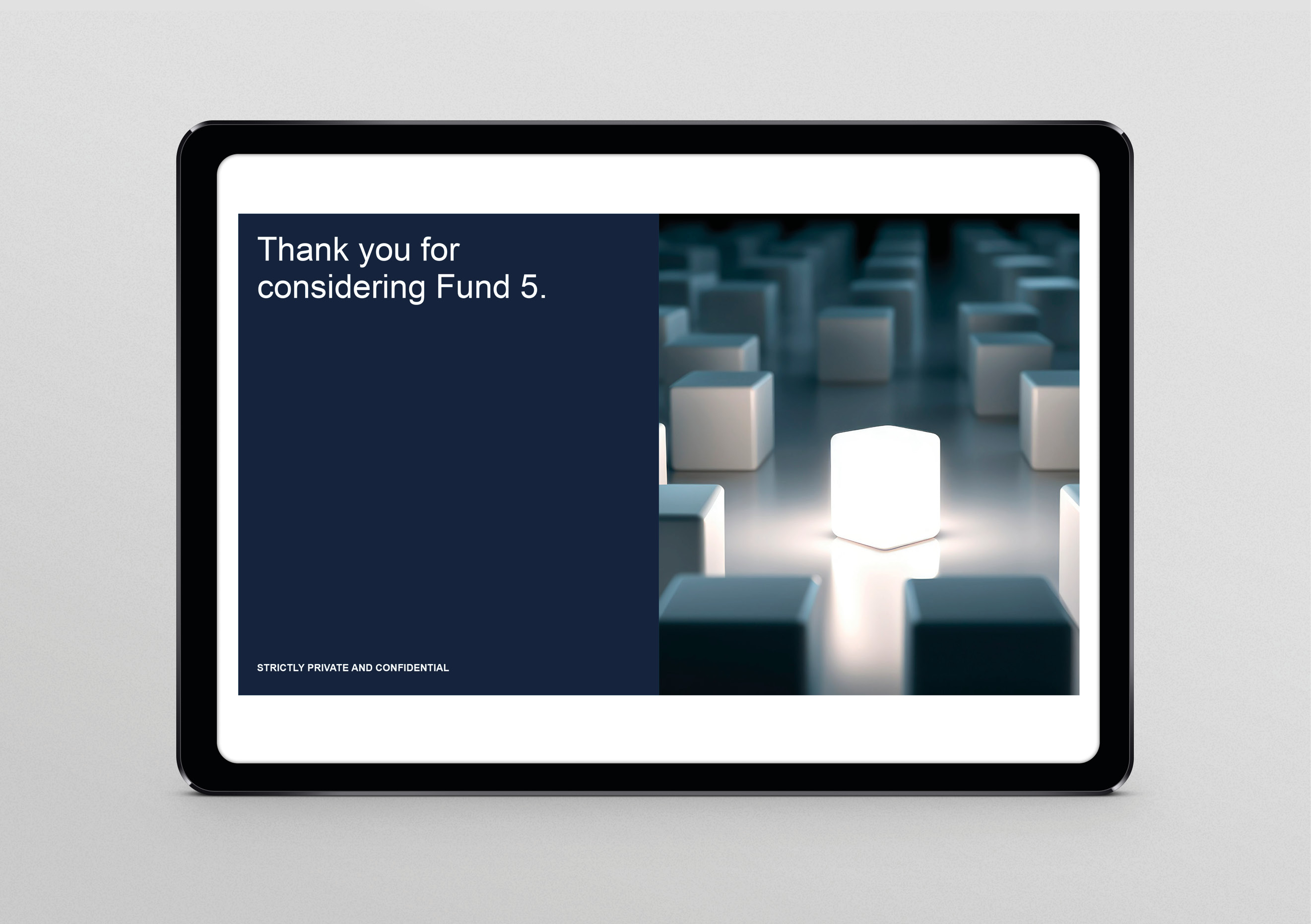
The creative idea was the best of the crop. The idea positions the investment as a unique opportunity to invest in a collection of strong performers, in sectors with the strongest prospects. It also positions Waterman as a high achiever, delivering top quartile results through a highly capable, specialist team and a unique approach to working with companies to achieve high-performance.
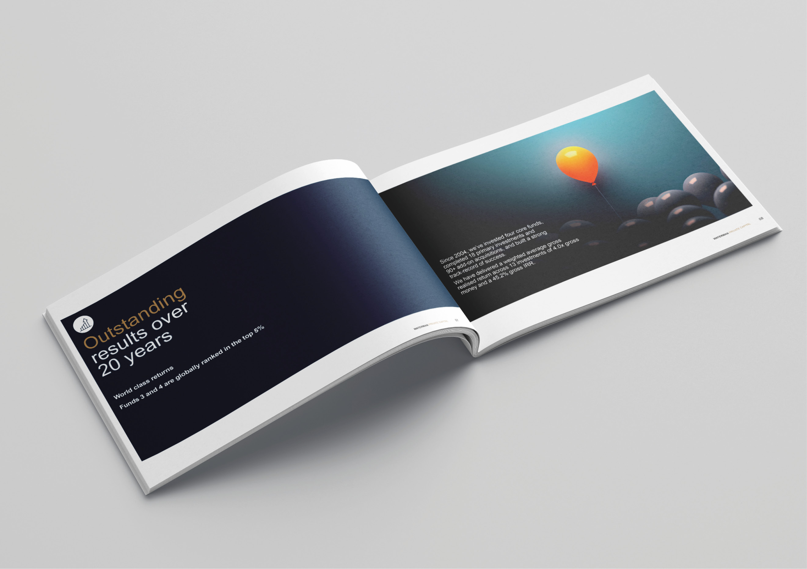
The images on the initial storytelling pages support the three key reasons for investing while metaphorically reinforcing the best of the bunch idea. The early introduction of ‘key marker’ icons makes it easy for audiences to identify the details that underpin the three key messages throughout the document. This iconography is used consistently throughout the document, supported by other ‘bespoke’ icons.
Divider pages allow the story to be paced and also offer the opportunity to translate the best of the crop idea into real examples. Successful brands that have been part of previous investments are highlighted, further elevating the idea of investing in high performers.
An ever-present navigation bar on the top of the page, and number in-page links, allow audiences to move through the document based on what’s important to them, rather than the traditional sequential book approach.
Despite being jammed-packed, there is an uncluttered, information rich feel, aided by visual space, solid brand colour accents, clean typography and the use of fine detailing line work.
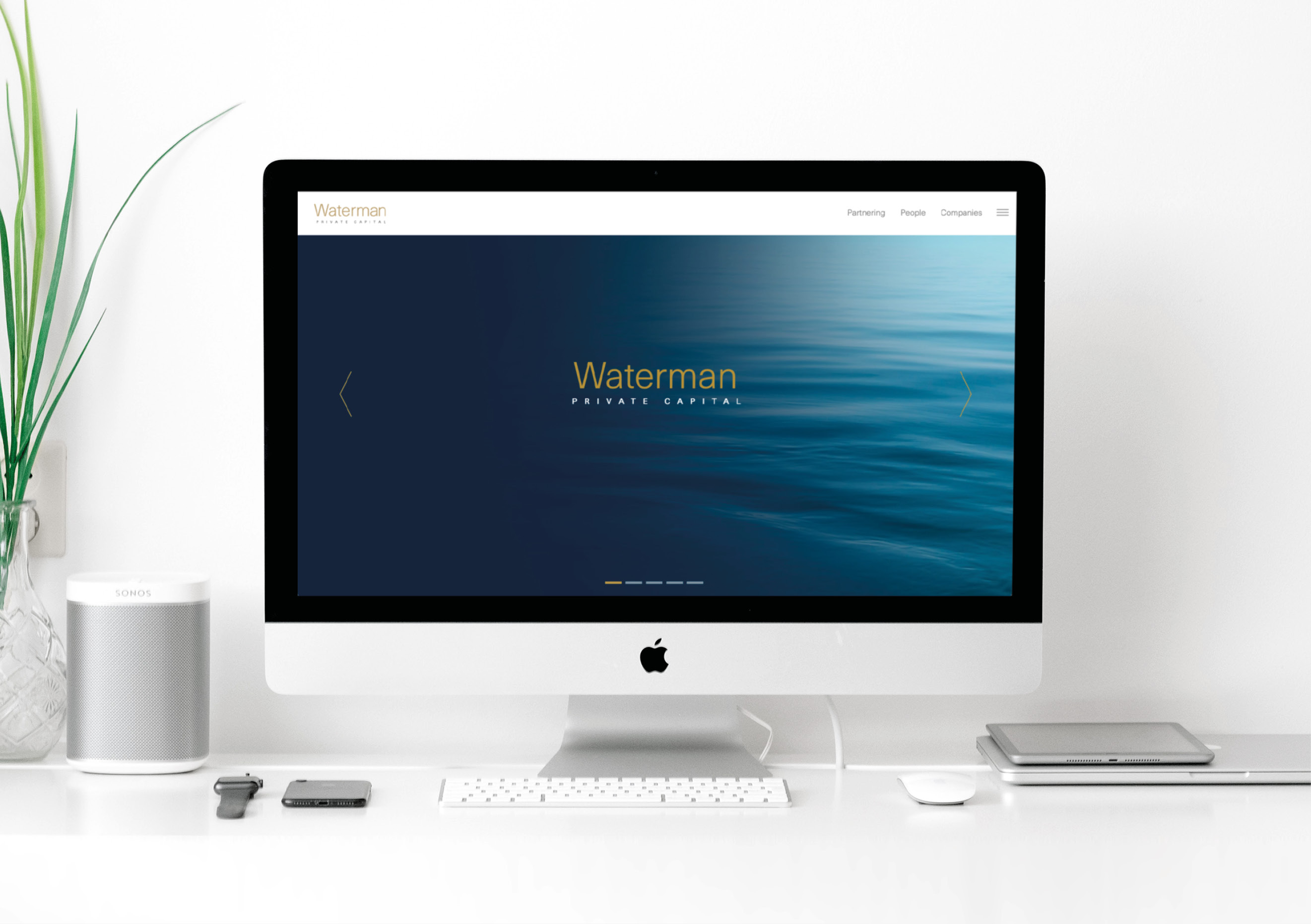
The Results
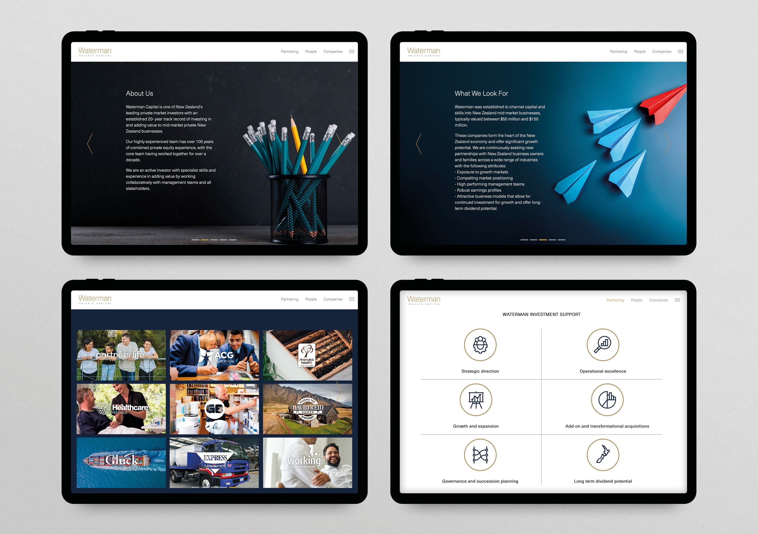
The client was delighted with the finished product. It told a strong story and offered clear reasons to invest. As a result, there has been positive interest, and they are well on track for reaching their subscription targets. Waterman was so pleased with the design and storytelling that they wanted to incorporate it into their core brand presence. As a result, we updated their website, adding a visual story carousel, applying icons, colours and other information design features to mirror the memorandum.
