Exude the qualities of your target audience
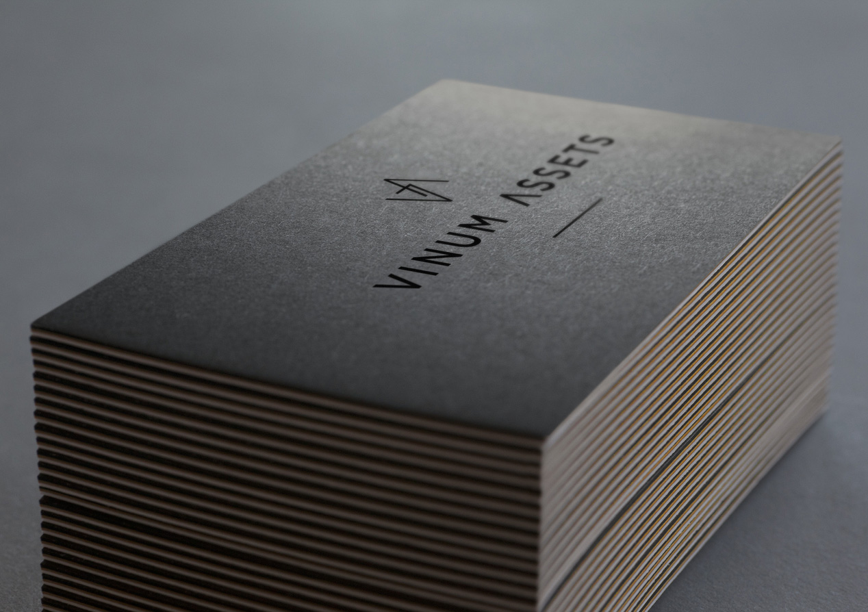
Client: Vinum Assets
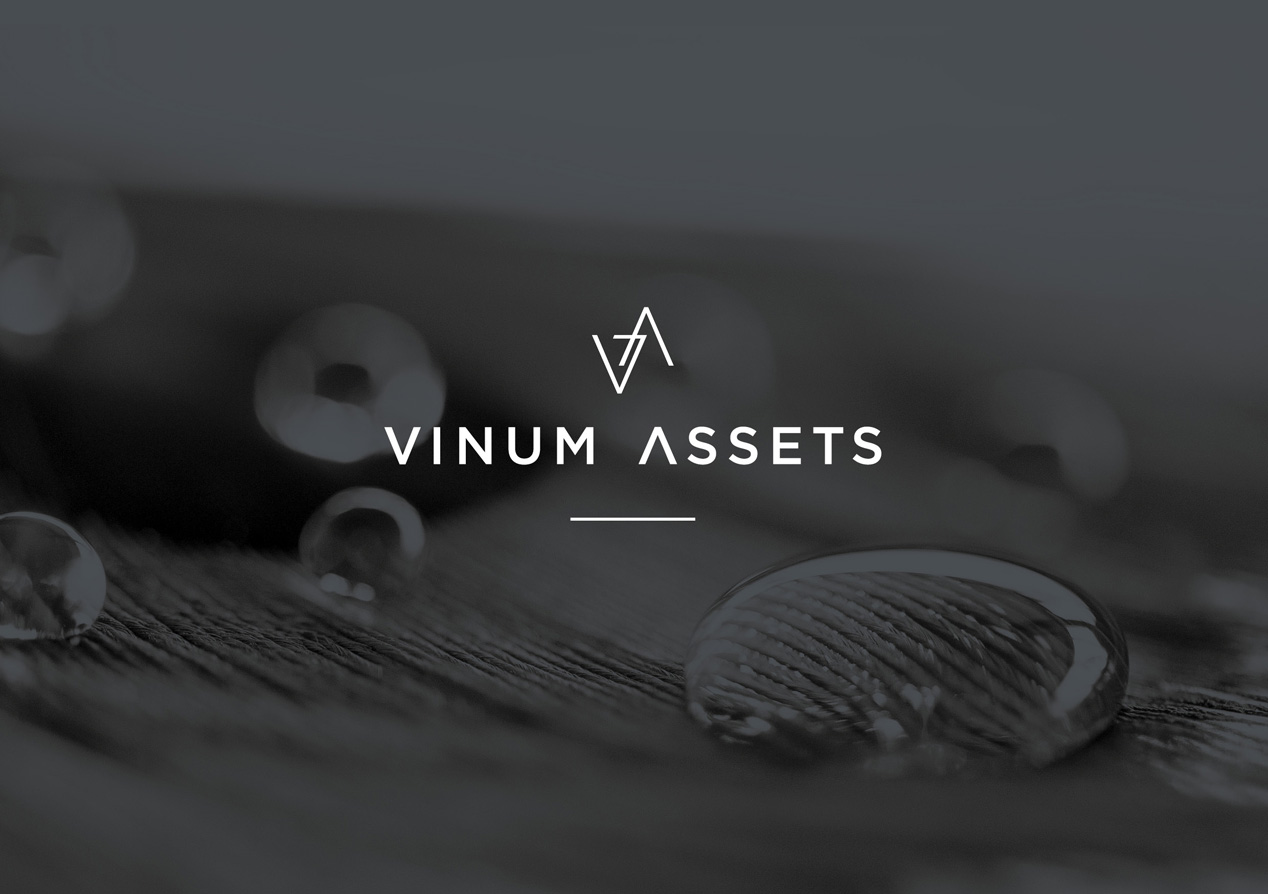
To attract sophisticated local and international investors, Vinum Assets asked us to create a premium international brand identity that reflects the refinement of the discerning wine investor.
Our approach was to make their visual identity a metaphor for the fine wines they work with. The result is a brand of sophistication, refinement, timeless beauty and uncompromised quality.
The Brief
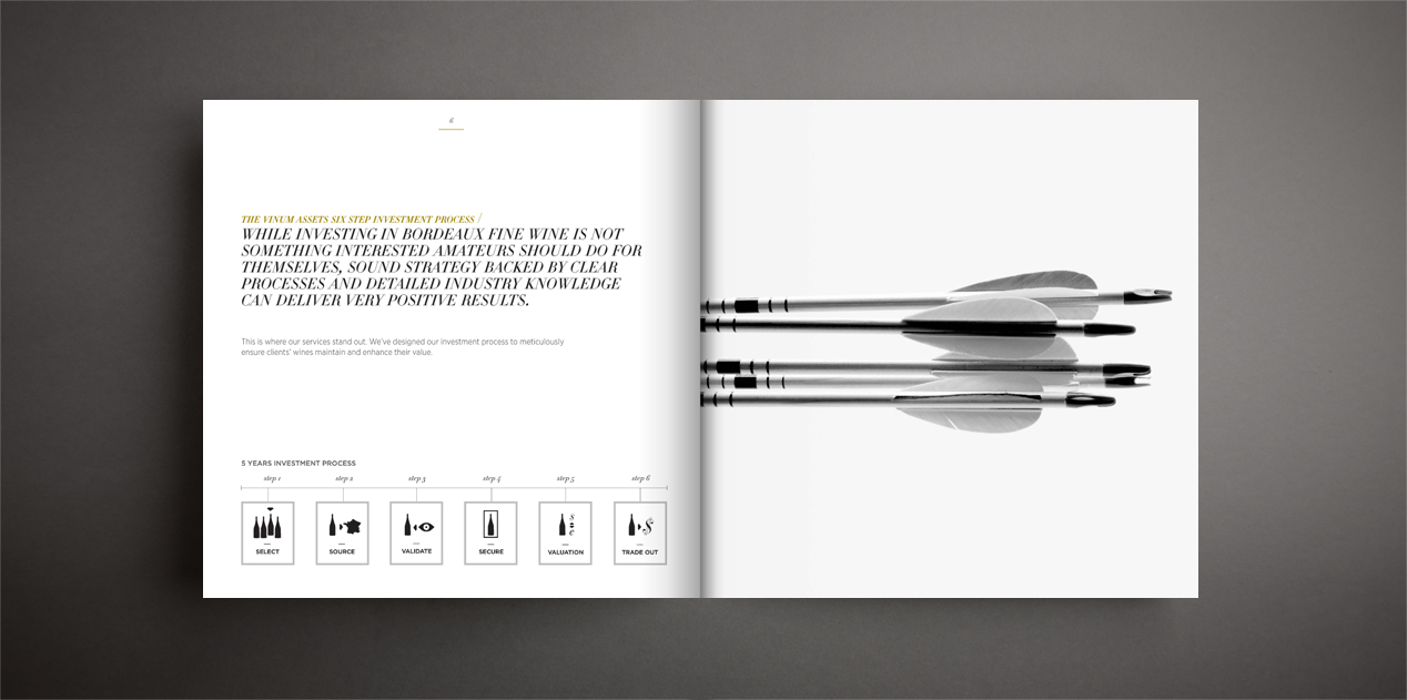
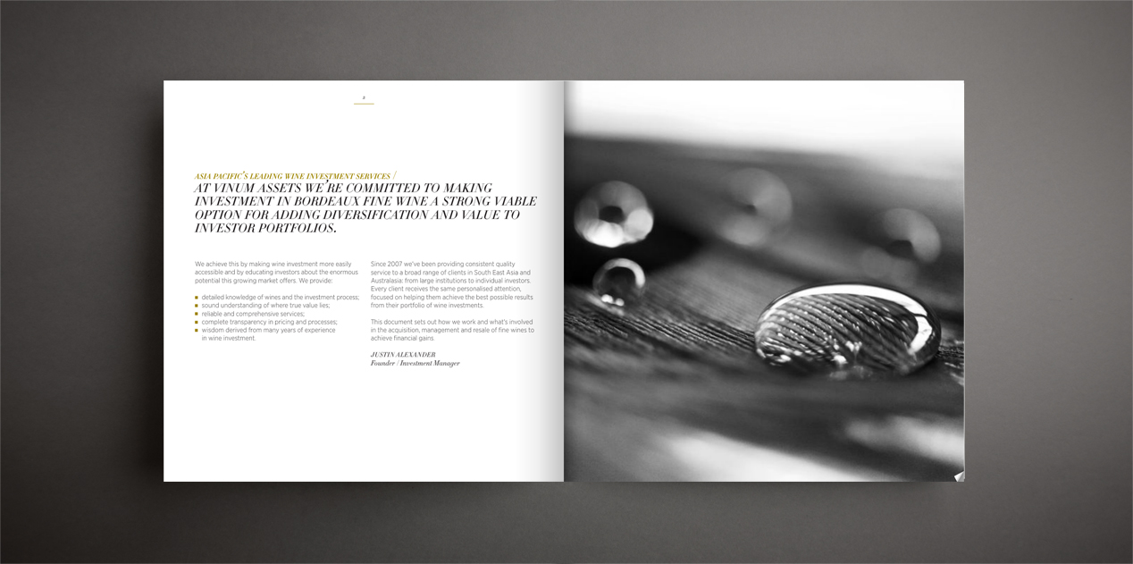
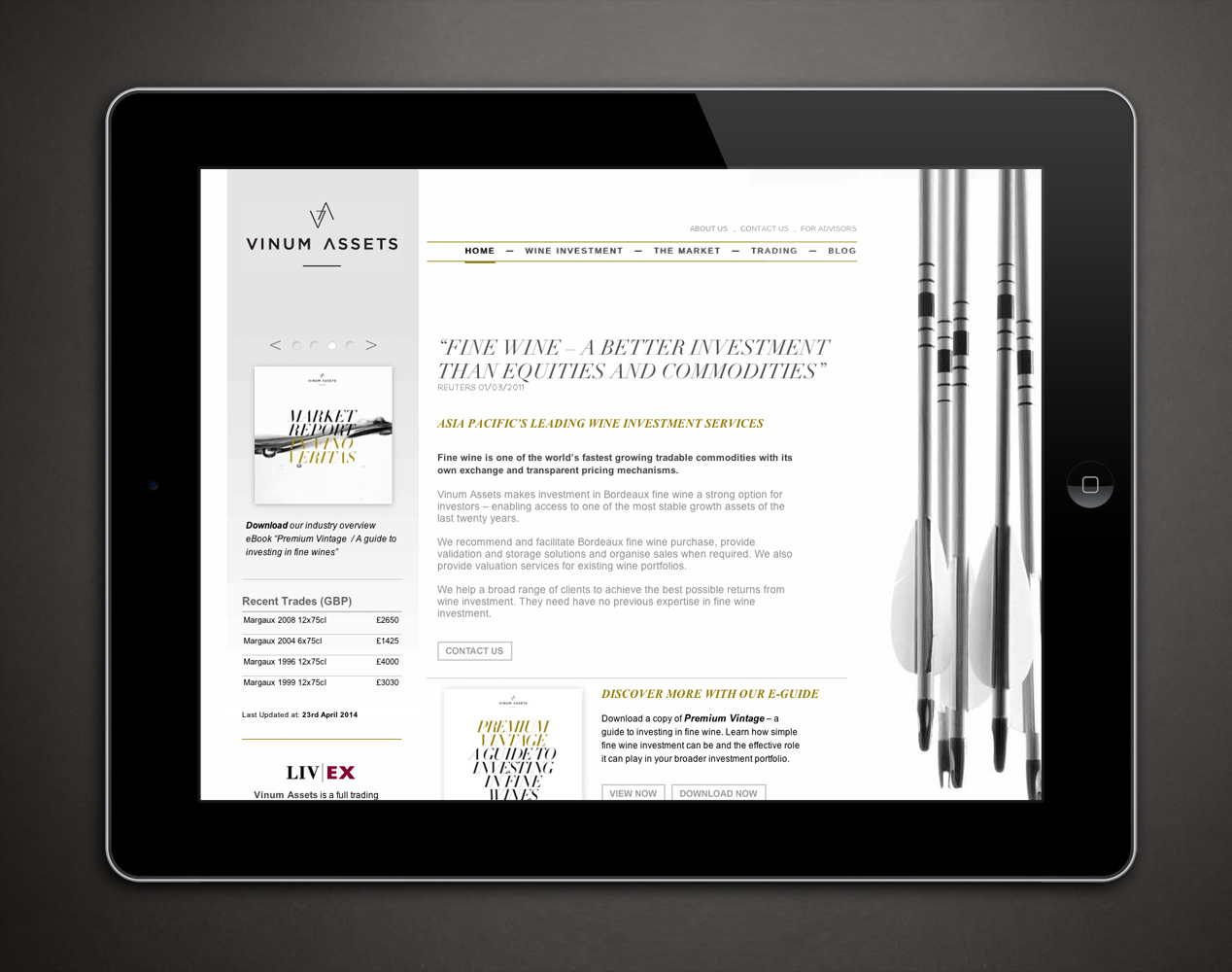
Fine wine is one of the world’s fastest growing tradable commodities with its own exchange and pricing mechanisms. Vinum Assets makes investment in fine Bordeaux wine a strong option for investors – recommending and facilitating wine purchases, providing validation and storage solutions and organising sales when the time comes.
Australian based, Vinum were looking to attract sophisticated local and international investors. Our brief was to create a premium international brand identity that reflects the refinement of the discerning wine investor and the qualities of conservatism, security and transparency.
The Solution
Our creative response was to make the Vinum identity a metaphor for the fine wines they work with. We wanted to avoid all the obvious imagery of wine, bottles, casks, vineyards and currency, so that the creative treatment could reflect the emotional values, rather than the physical attributes, of wine or investing. This is reflected in the typography, rich colour palette and photographic treatment.
Because Vinum was a new company, and wine investment a new financial service in Australasia, we elected to keep the company’s positioning statement descriptive – simply stating their offering “ Fine Wine Investments.”
Our brand assets included a logo and brand mark, photography, typography, colour palette, graphics and iconography. Applying these assets we produced an e-book profile brochure, website, marketing collateral, merchandising and a series of on-going communications such as a newsletters and term sheets.
The overall look is one of sophistication, refinement, timeless beauty and uncompromised quality.
The Result
In the 12-months following the new visual identity launch, Vinum has experienced double-digit growth in its investor numbers and revenue, largely through the Asian region. By the end of 2012, Hong Kong had become of their primary base. The client loves our work and how it allows a “boutique agency like us to look just as professional, sophisticated and credible as the big investment houses our clients also deal with.”