The Full Process
Client: TDX
With a changing world around them, TransDiesel needed a fresh visual identity to carry them into their next 40 years.
The Brief
TransDiesel, a Kiwi success story with over 40 years of selling and servicing heavy machinery, approached us to help them advance their brand. With a changing world around them, they were up for the full process – a complete review of who they’ve become and where they’re going – including a fresh visual identity to carry them into the next 40 years.
The Solution
We started where all good brands start, by talking to customers and staff about what TransDiesel means for them. Through a series of focus groups, we discovered a much-loved brand that has a real competitive advantage in the products they offer and the amazing people who work there. In a market of global players, their grounded Kiwi personality, local know-how and ‘get things done’ approach was seen as a strength. But we also heard it was time to drop the ‘dirty diesel’ association and to get ready for a more sustainable and innovative future.
We presented the leadership team with a series of strategic recommendations, including changing their name and their approach to brand architecture. We also presented a positioning matrix with four directions we could take the brand in and worked with them to narrow it down to two. We then developed a story and mood board for each and re-engaged with customers and staff to develop a final brand positioning story that resonated with everyone.
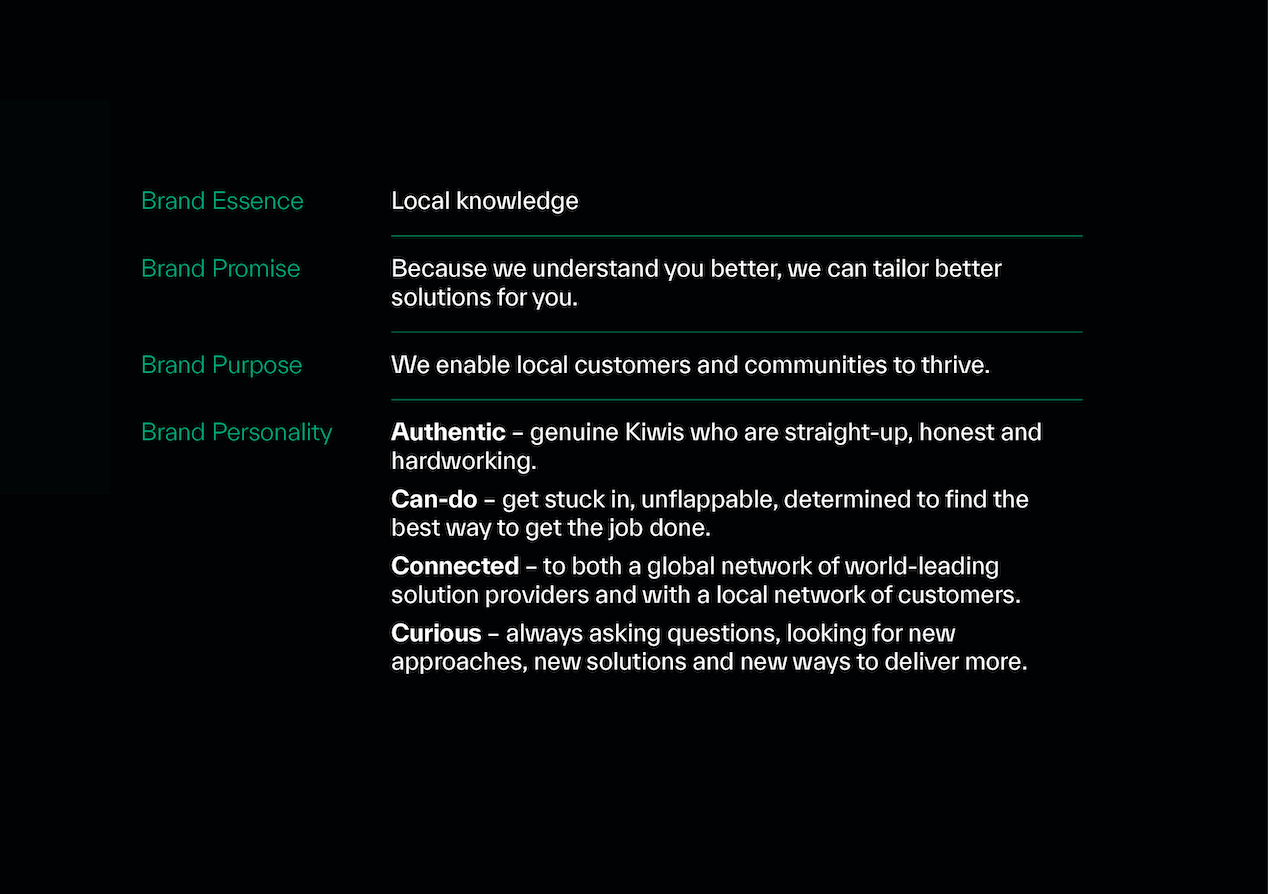
The agreed positioning, Local Like You, plays on TransDiesel’s understanding and affinity with local people, conditions, and industries and how they use this to deliver better solutions and experiences for their customers.
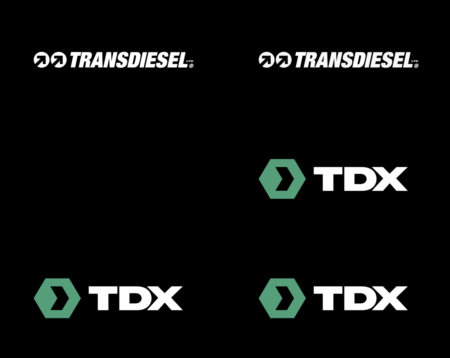
A few different naming approaches were explored, resulting in hundreds of potential names. The final choice TDX was deceptively simple. TD to capture heritage and X to represent the world-class service experience that underpins their brand proposition.
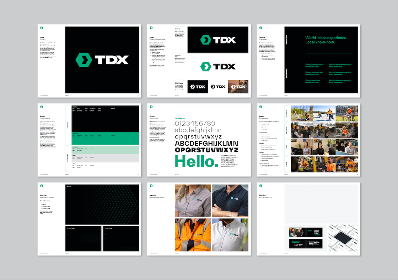
The arrow in the new logo signifies moving forward with customers, supporting each other to succeed. And the surrounding hexagon talks to helping surrounding communities to thrive. A flexible tag-line system reinforces the core brand promise while providing options for more tailored messaging.
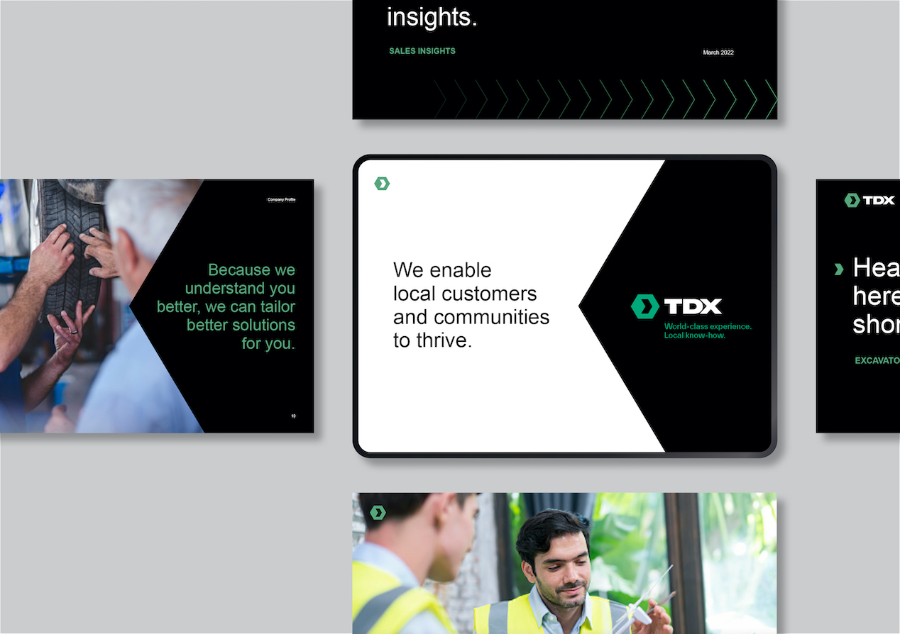
TransDiesel had built equity in black. We partnered it with a fresh colour palette led by green to reflect a sustainable future, Kiwi heritage, and a connection to the local land. The dynamic green and black combo really stand out in an industry dominated by blues, reds, and yellows.
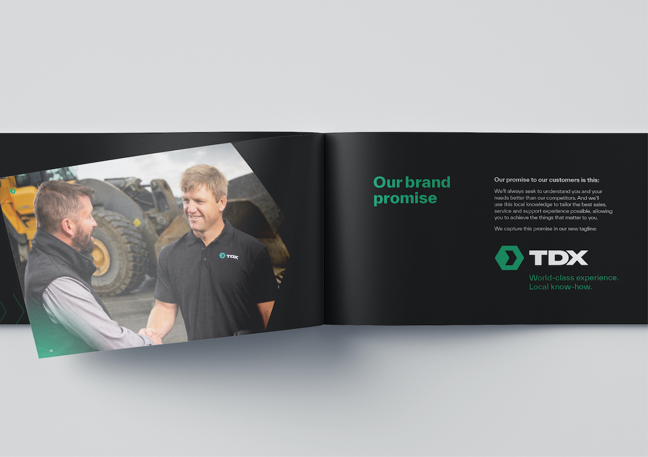
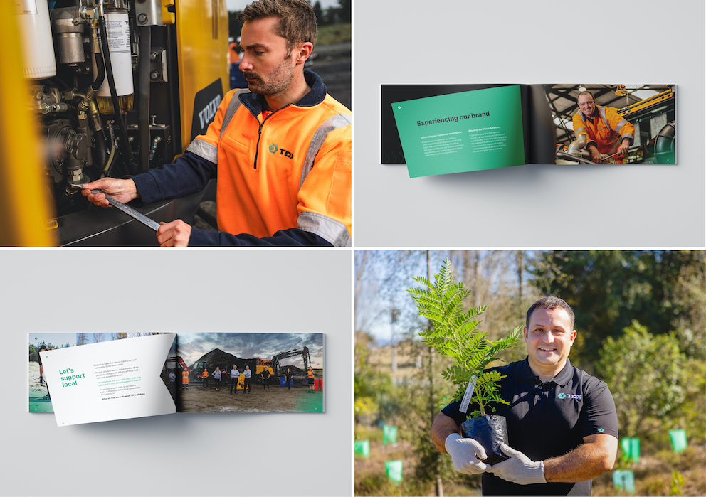
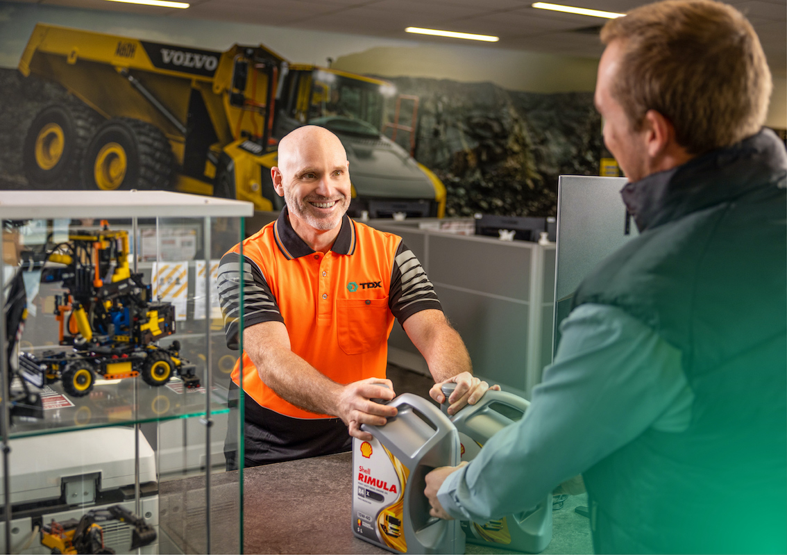
Tone of voice was always going to be critical in capturing a local essence. The focus was on creating communications that feel like real conversations between mates. The new hero font TWK Everett is local, open, and easy to work with. But it’s the authentic photography that really brings the local story to life, pairing product images with those of customers achieving results, staff in action and of local communities thriving.
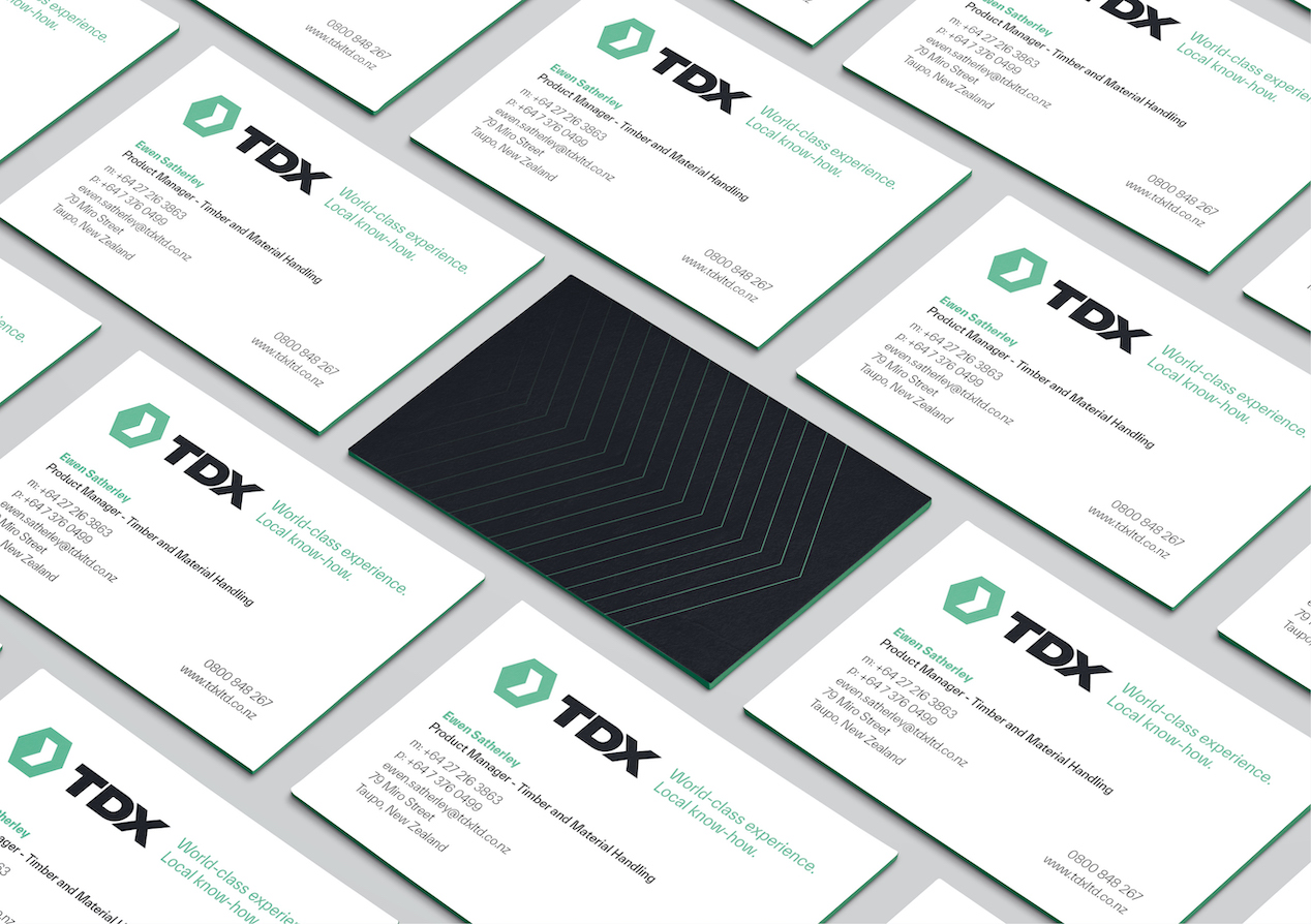
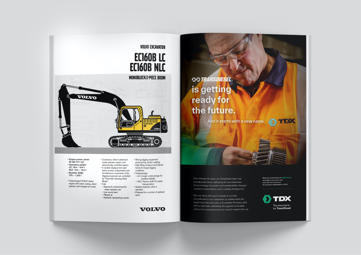
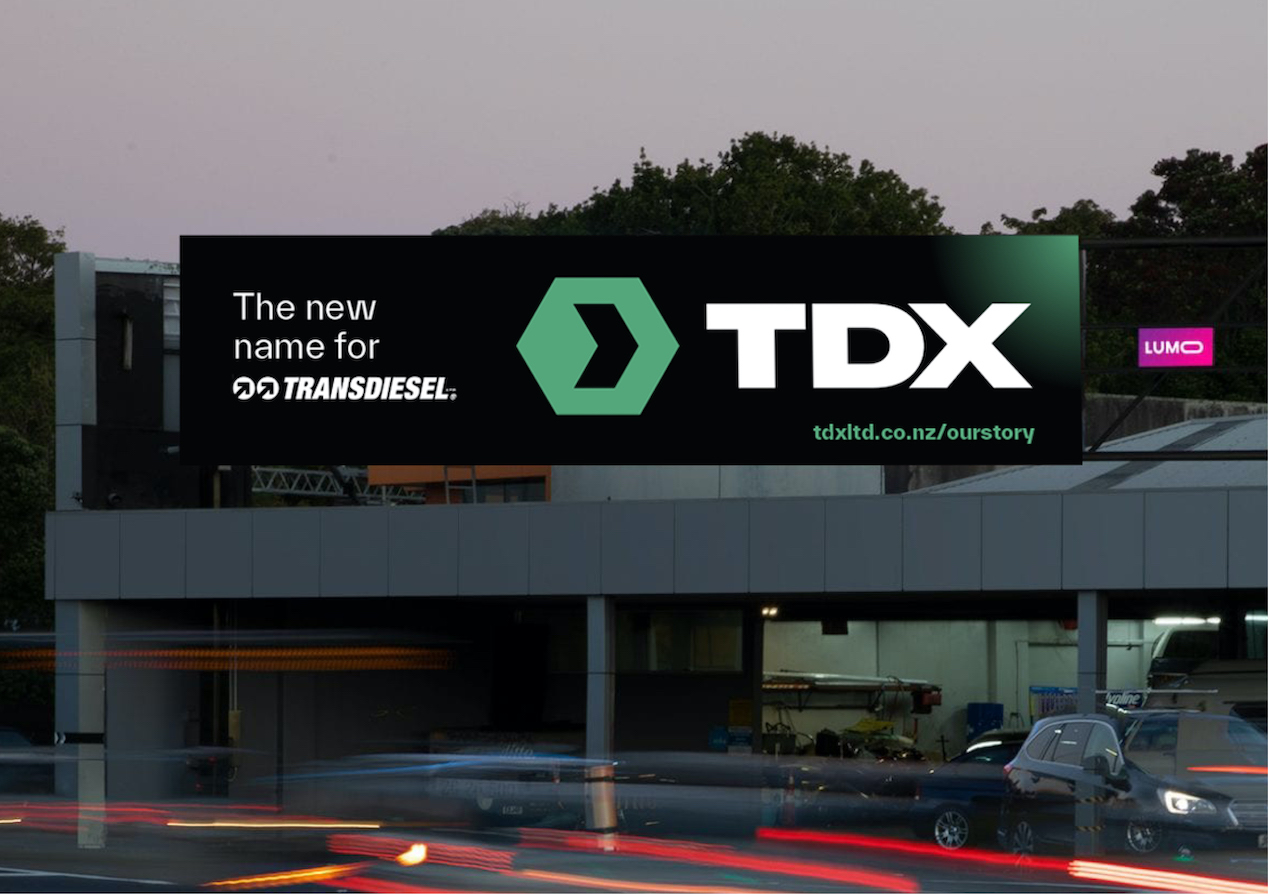
The final visual identity was tested again with key customers, resulting in small tweaks, before we launched into designing key rollout elements like uniforms, vehicles, signage, and stationery. We also took the lead in the brand launch programme, developing the brand book, brand video, customer communications and advertising campaign.
The Results
It’s hugely satisfying to see a customer trust us, and the process, to deliver the best outcome for them. And that’s exactly what we feel we’ve delivered here, something that really captures their legacy while also setting them up for an exciting future as TDX. Staff and customers have responded with overwhelming positivity and that makes our client – and therefore us - very very happy.
