A new tikanga typeface
Client: Insight Creative
2022 INTERNATIONAL DESIGN AWARDS (IDA) - GOLD
2022 GRAPHIS AWARDS - SILVER
Māori Language Week was the trigger for us to design a bespoke typeface celebrating Te Reo.
The Brief
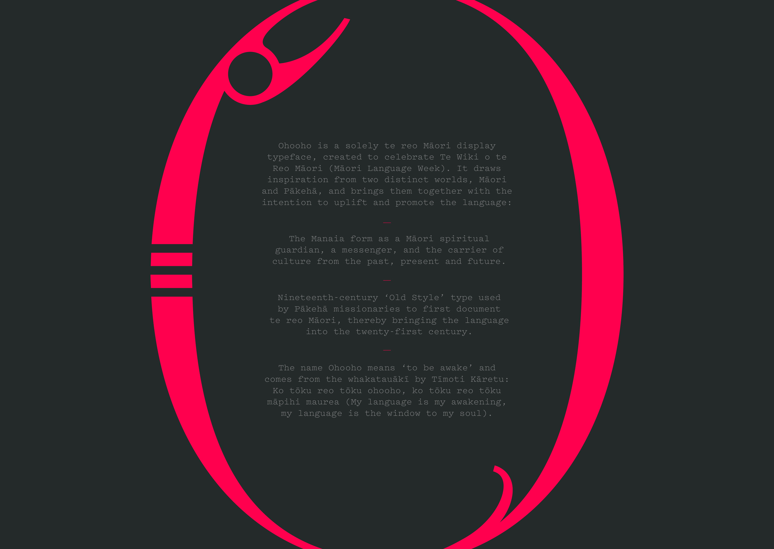
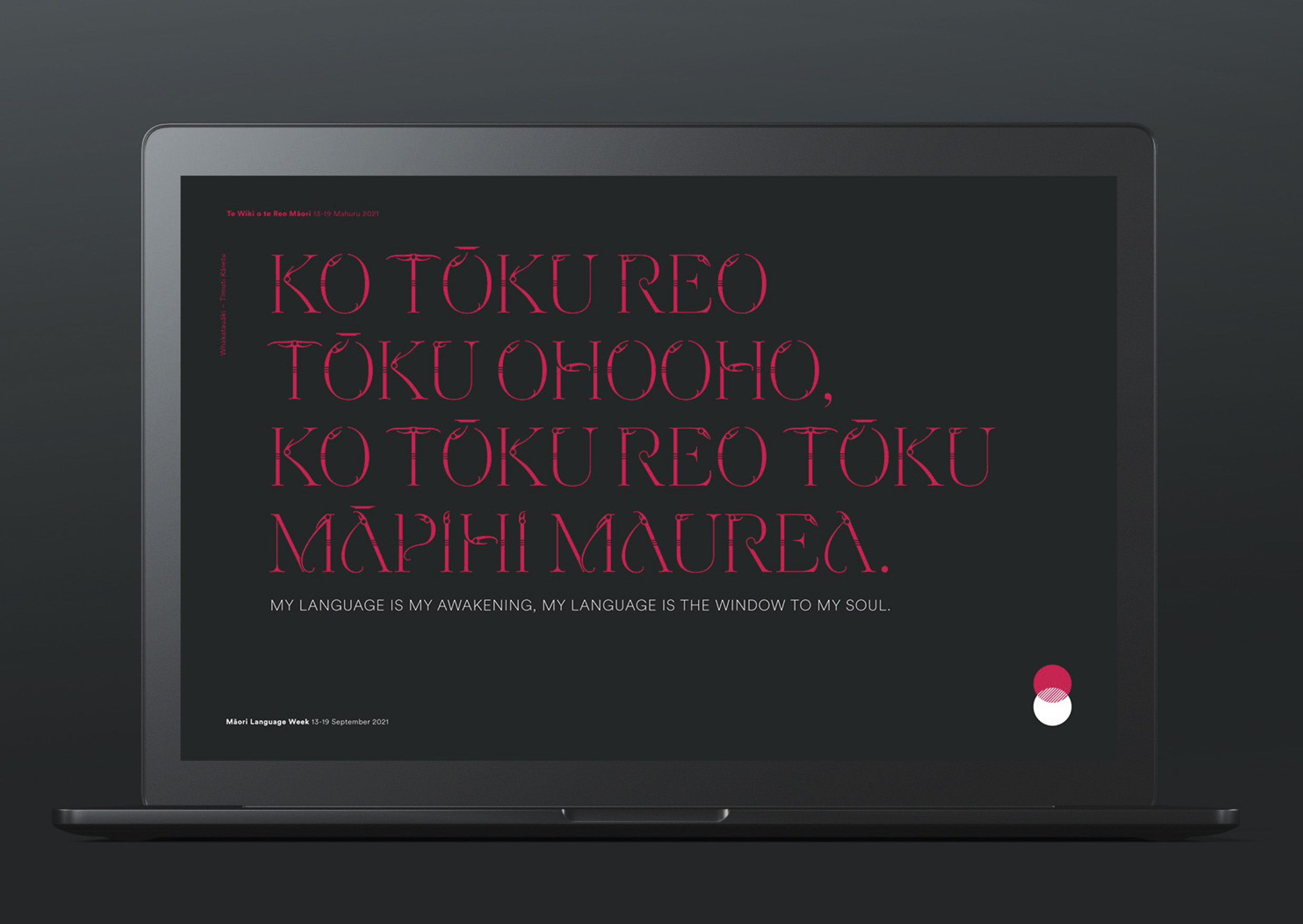
To celebrate Māori Language Week, we took inspiration from the whakataukī: Ko tōku reo tōku ohooho, ko tōku reo tōku māpihi maurea – My language is my awakening, my language is the window to my soul. In researching the history on Māori language, and the story behind this famous proverb, we found inspiration in two, seemingly opposite, extremes.
The Solution
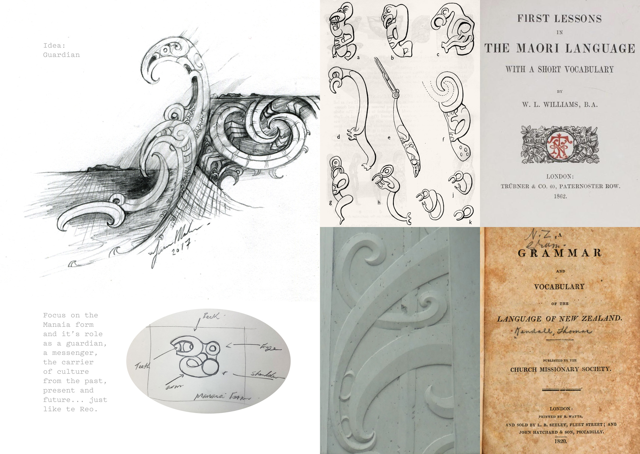
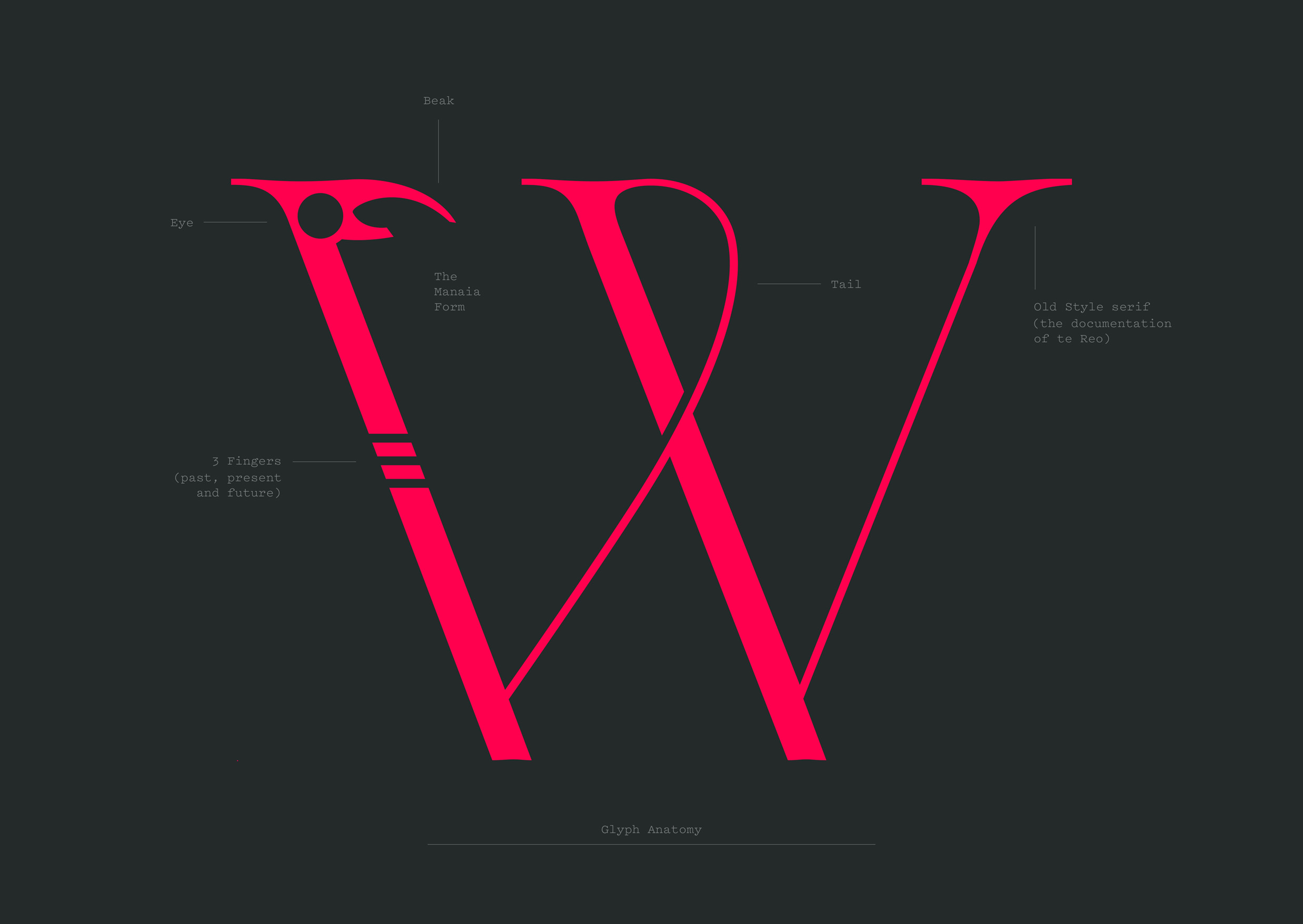
The most important influence comes from the sketches and stories of James Molnar. He’s an acclaimed Māori artist and a design partner we consult with regularly when expressing tikanga design thinking. James often uses the Manaia symbolism in his art and carvings to tell stories.
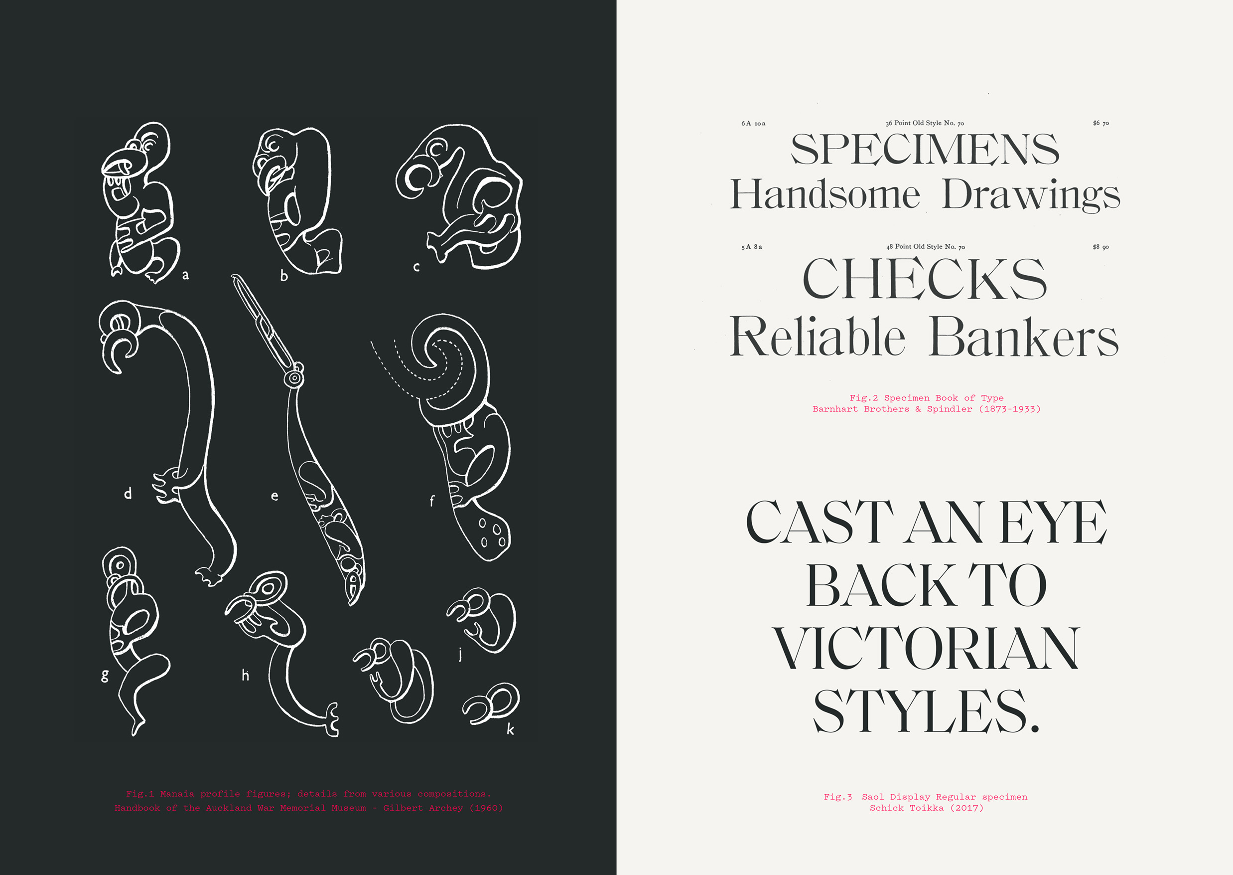
The Manaia is usually depicted as having the head of a bird, the tail of a fish and the body of a man, though it is sometimes also depicted as a serpent or a human figure in profile. The Manaia is believed to be the messenger between the earthly world of mortals and the domain of the spirits - a guardian against evil.
The decision was made to create a typography based on the Manaia form, expressing its role as a guardian, a messenger and the carrier of culture from the past, to the present and future. It’s a metaphor for the relationship between language and culture.
The second inspiration came from a collection of early-European settler documents that sought to document the Māori language. These used ornate and stylised ink characters, each finely crafted for display. We love the irony in the idea that those who sought to oppress the Māori language also documented it, giving it one of its most important tools for survival.
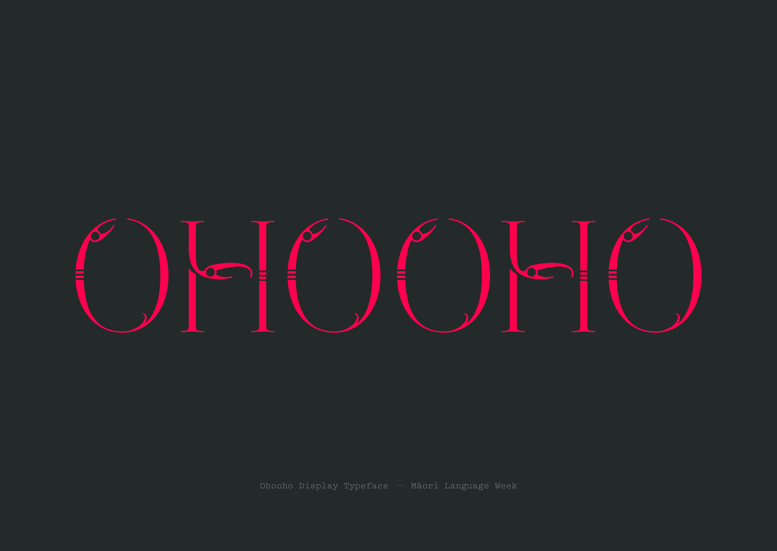
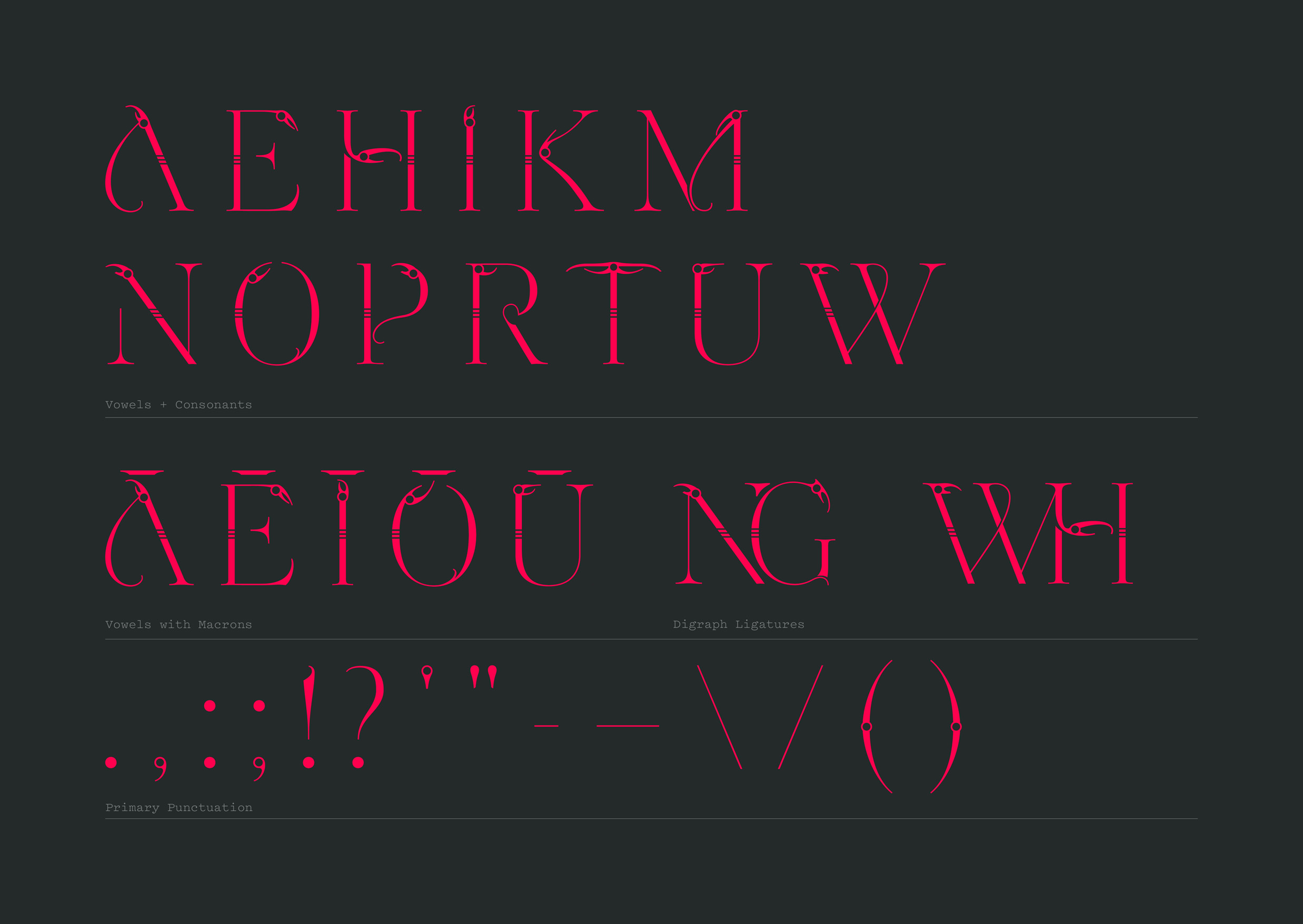
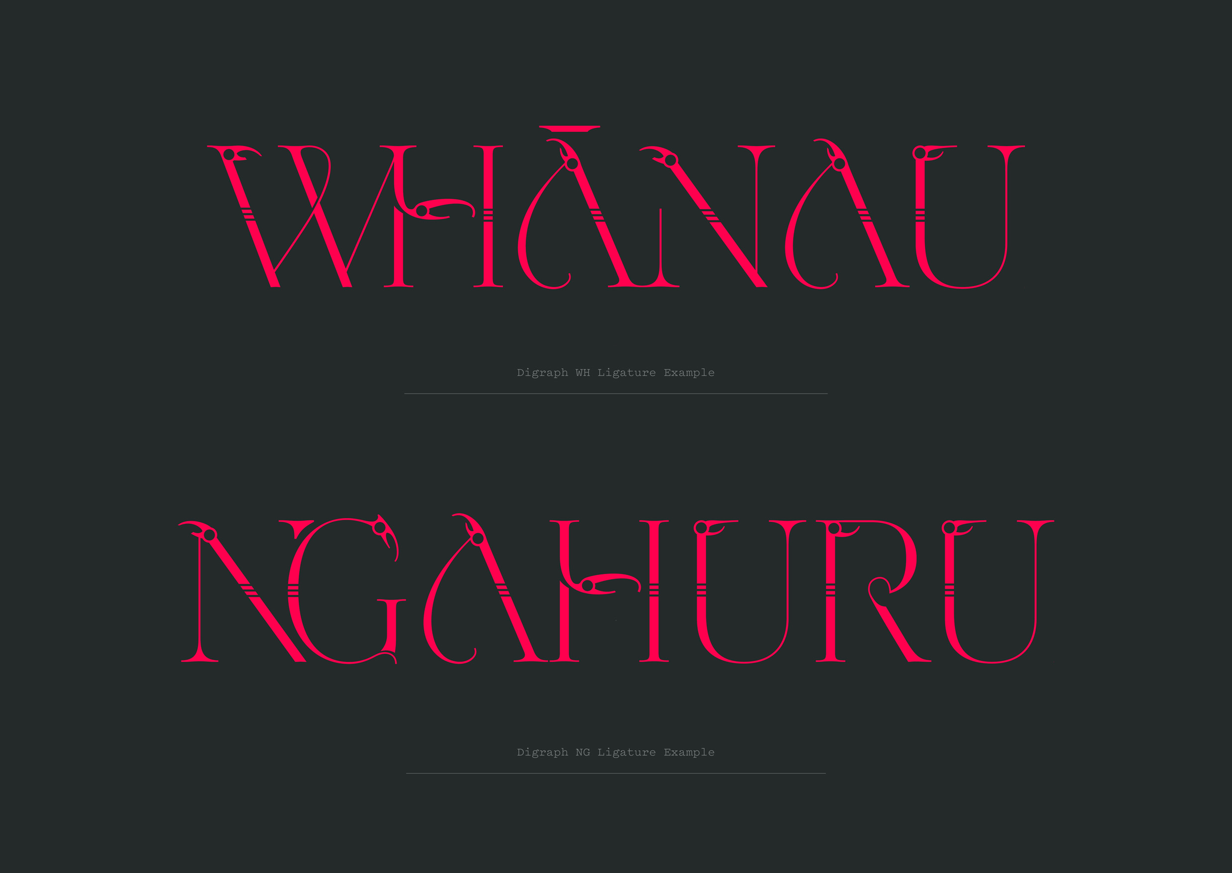
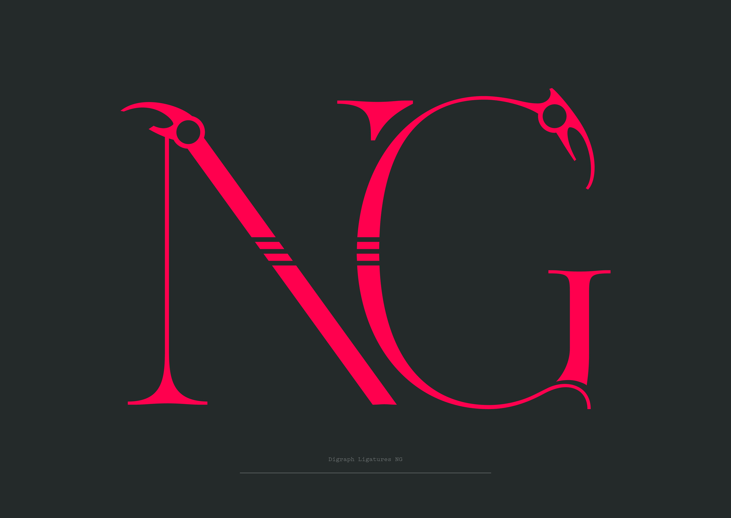
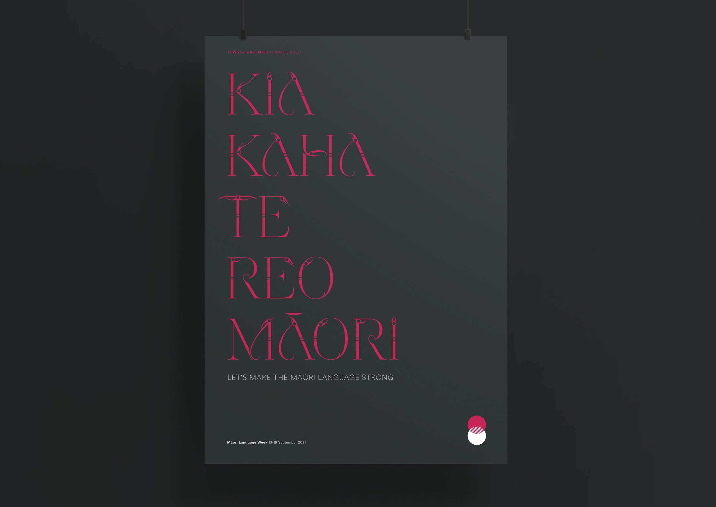
With these two inspirations we created the 15 characters that make up the Māori alphabet, including the two digraphs (character pairs). Named Ohooho (meaning awakening or gift of precious value), the font only exists as bold upright capitals, reflecting the pride of the people and the mana of the language. With its intricate Manaia inspired detailing, it is designed to be a display typeface – used only to tell the deepest stories with the most impact.
Once designed, the characters and supporting punctuation elements were digitised to be used across multiple mediums. The first execution was the design of the whakataukī as both a static print display and an animated digital experience. These were displayed proudly across screens and walls in our offices, electronically sent to our clients and used proudly at the forefront of our Māori Language Week social media campaign.
The Results
Since then, Ohooho has been used, with and without other visual elements, as a powerful language to tell a number of stories, pass on wisdom and to connect with audiences. Just like Te Reo itself.