Engage different audiences
Client: Tamaki Regeneration Company
Getting both local community and government support to the vision for Tāmaki Transformation, New Zealand’s largest urban regeneration programme, required speaking to different audiences but with the same voice.
Making a business case to decision-makers and engaging the enthusiasm of the local Tāmaki community required different messages – but they were two sides of the same coin, both sides capturing the colour, energy and spirit of the people of Tāmaki and the vision they have for its future.
The Brief
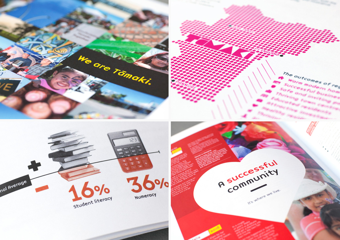
Tāmaki Regeneration, born out of the Tāmaki Transformation Programme is the largest urban regeneration programme in New Zealand. It is a unique partnership between the community, central and local Government agencies and private investors. The aim is to regenerate Auckland’s Tāmaki community of over 16,000 people, through housing, education, employment, transport and social infrastructure initiatives.
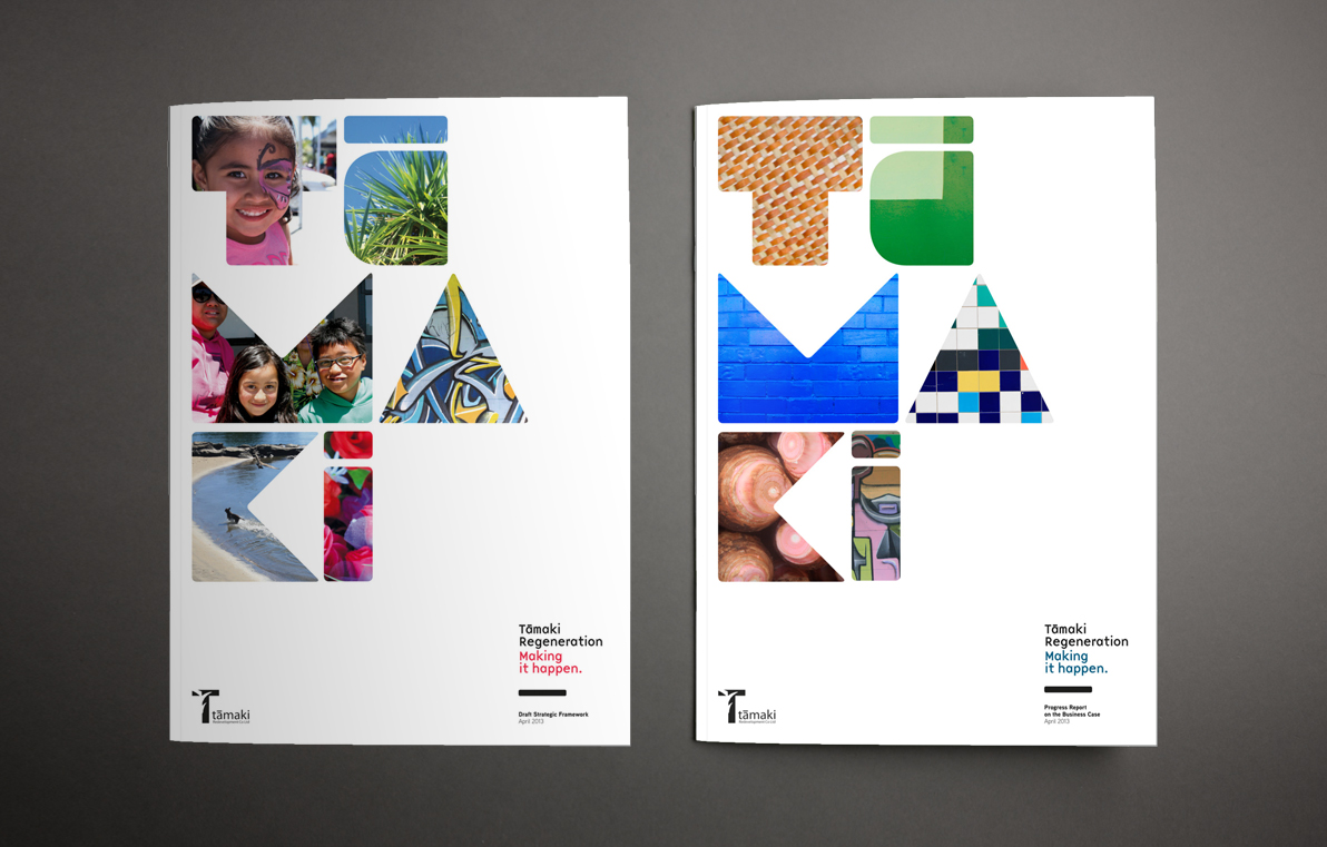
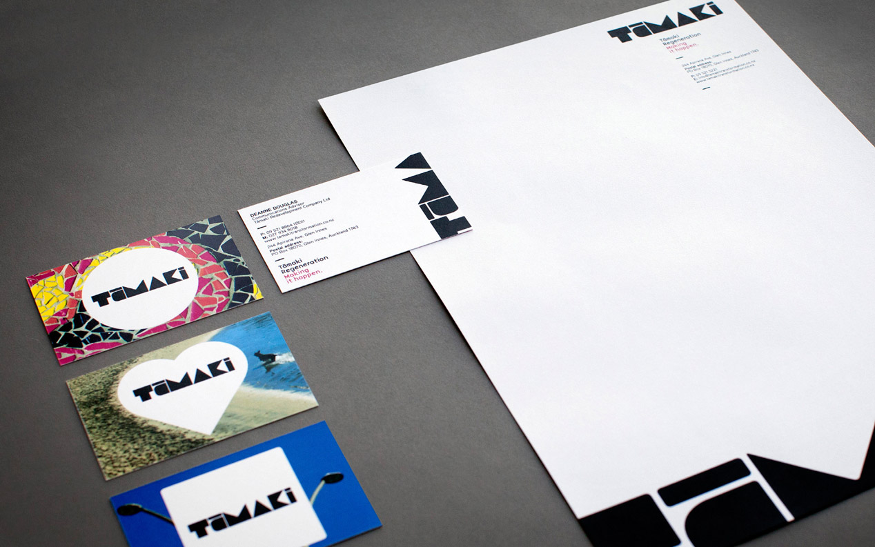
After creating the core brand for the Tāmaki Regeneration Programme, we were asked to communicate the vision for Tāmaki to two distinct audiences:
- A commercially compelling business case document for shareholders, iwi and other key influencers and decision-makers; and
- An engaging strategic framework document that captures the local’s vision and the hearts and imagination of the Tāmaki community, investors, developers and the many other parties who will contribute the success of the transformation of Tāmaki.
The real challenge however was to use these documents to create a progressive visual identity that resonates with a youthful community while also appearing professional and well-considered to capture the interest (and wallets) of outside partners and stakeholders.
The Solution
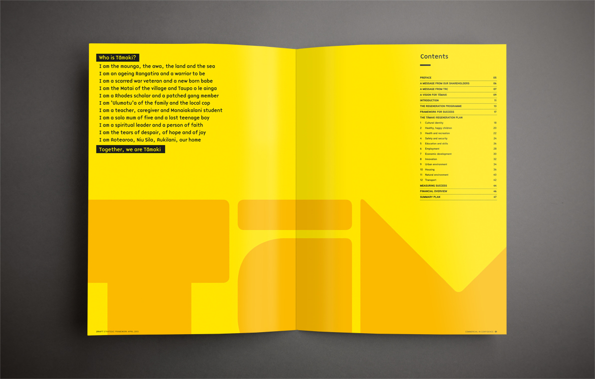
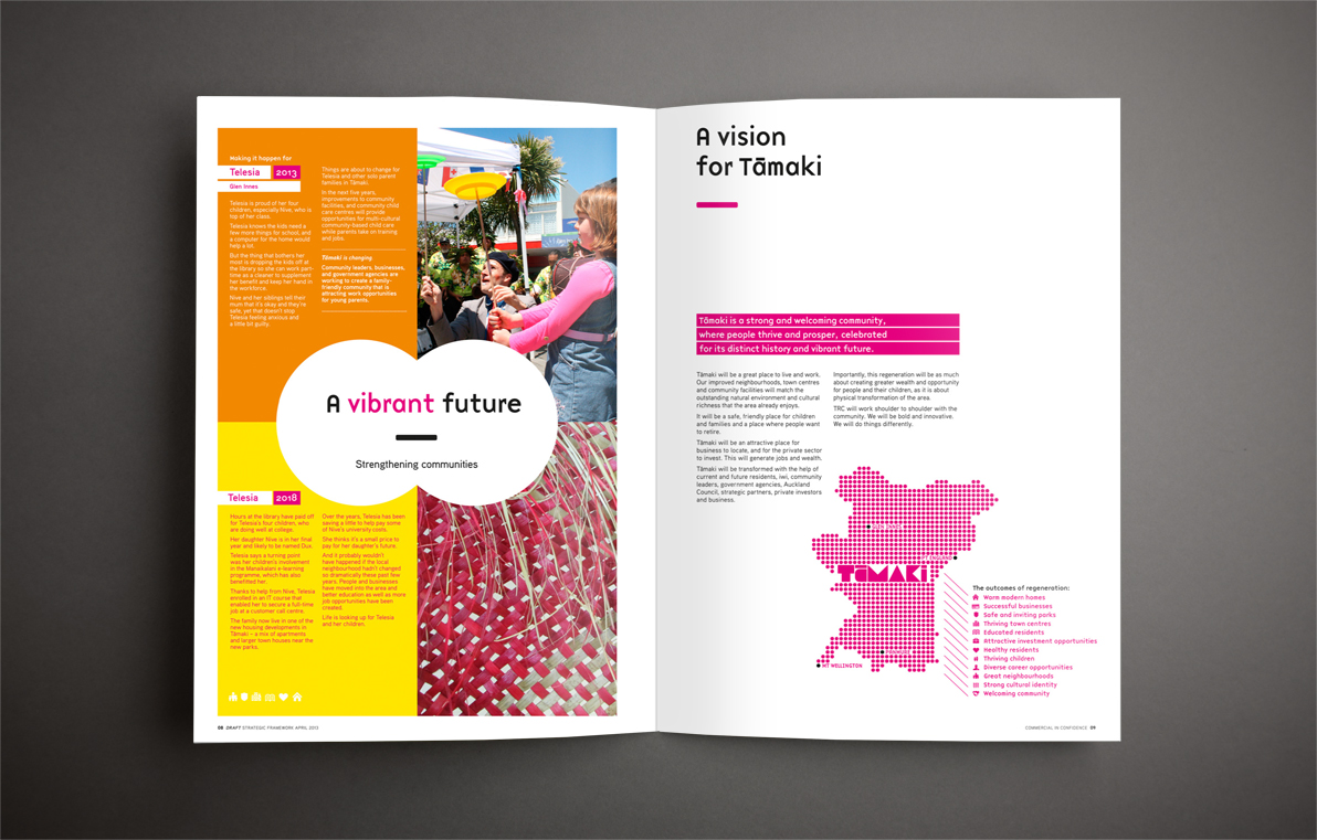
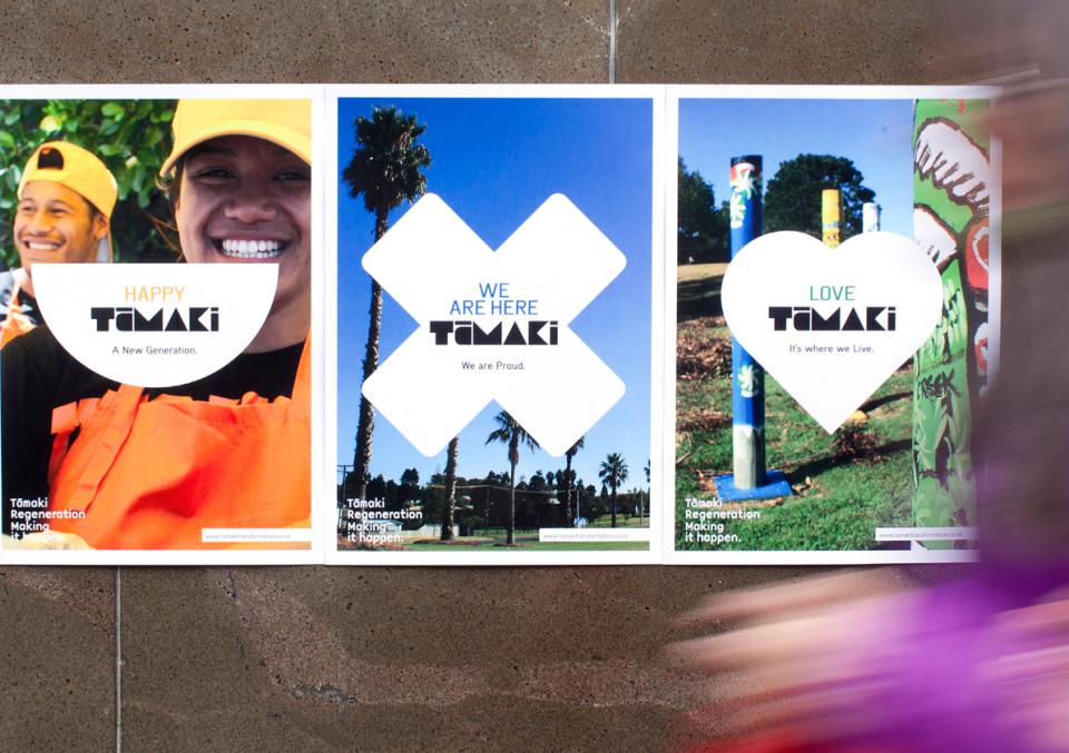
Our communication materials focus heavily on the people of Tamaki and the pride they have in their community. Our aim was to reflect the colour and energy that cultural diversity brings to the area. This was supported by imagery of the area’s natural, historic and cultural assets. The inspiration for our design approach was the strength - deeply grounded in history and culture - expressed in the ‘We are Tāmaki’ poem provided to us as part of the brief; and our immersion into the Tāmaki area where we were struck by the vibrancy, rhythm and energy of the area and its people. We were overwhelmed by the strong sense of community pride beautifully reflected in the well-maintained houses, gardens and neighbourhood parks.
The resulting creative concepts are bold, colourful, expressive, proudly Tāmaki-centric, aspirational, unified by culture and heritage, fresh and youthful, professional yet approachable and inviting – while connecting relevantly to the two discrete audience groups.
The Results
The initial feedback, from these first two documents, is that the key target audiences have really embraced the vision for a regenerated Tāmaki region. For a programme designed to effect change, this is a great place to start.