Stand tall like the mighty Totara
Client: Stand Children's Services
Children’s Health Camps asked us to develop a brand identity that resonated with funders and partners, as well as the families and children they seek to help.
Stakeholder feedback indicated that their name and identity conjured up images of an organisation quite different from the reality today. Our new name, Stand, reflects who they are and what they do and formed the creative platform for uniting people behind the cause.
The Brief
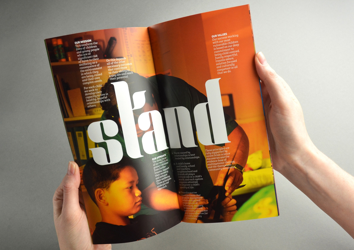
Te Puna Whaiora Children’s Health Camps (CHC) work to transform the lives of children (aged 5-12) who are at significant risk of harm as a consequence of the environment they are being raised in and their own complex needs.
Driven by stakeholder feedback, Children’s Health Camp felt their name and identity conjured up images of an organisation that may not be so relevant in today’s world. This hindered their ability to attract funders, who didn’t fully understand what they stood for or the services they provided. The brief was to develop a name and visual identity that “captures the magic we perform with New Zealand’s most vulnerable children and to express the passion and urgency we bring to our work.”
The Solution
Following work to define CHC’s brand positioning, persona and attributes we developed a list of possible names. The inspiration for Stand was Tane Mahuta, the mighty Kauri, which stands tall and proud. Standing together its canopy protects and nurtures its seedlings to grow and reach their full potential.
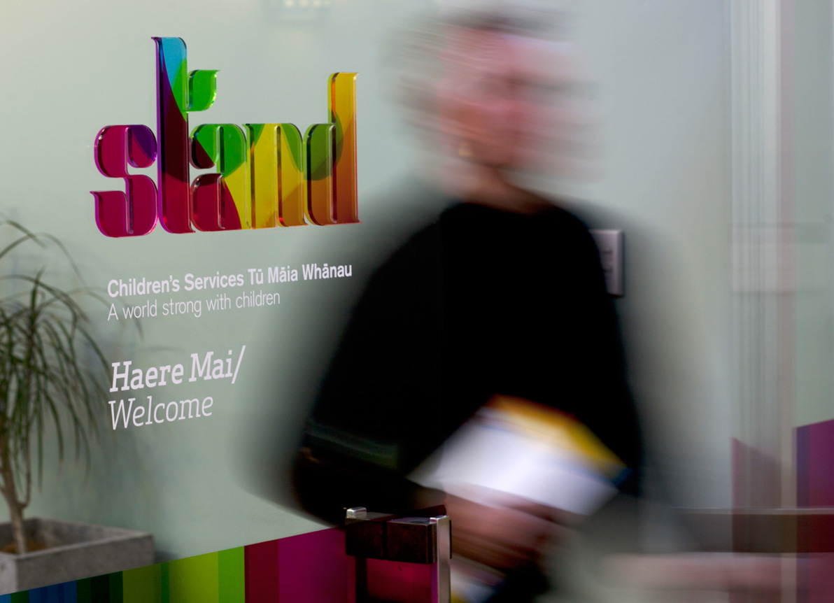
We wanted to convey a real sense of urgency and Stand, as both a noun and a verb, isn’t just a name but also a call to action. Coupled with a clear descriptor, Stand Children’s Services Tu Maia Whanau works from both an emotive and functional perspective.
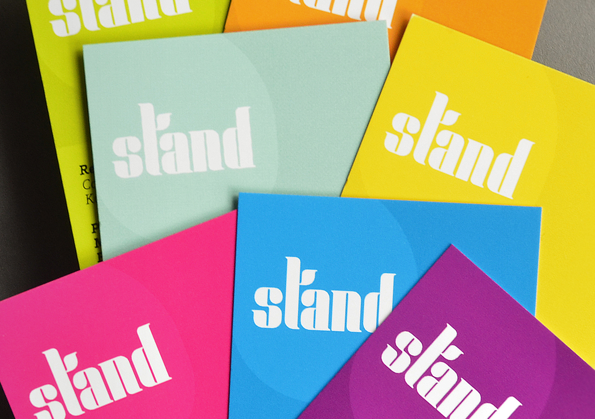
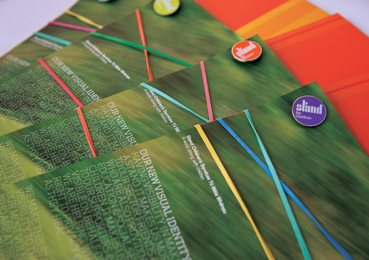
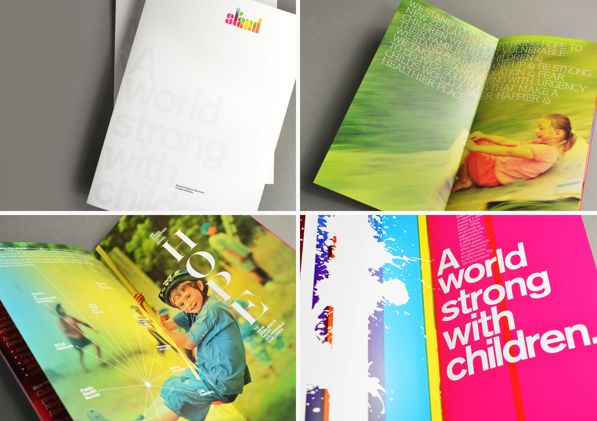
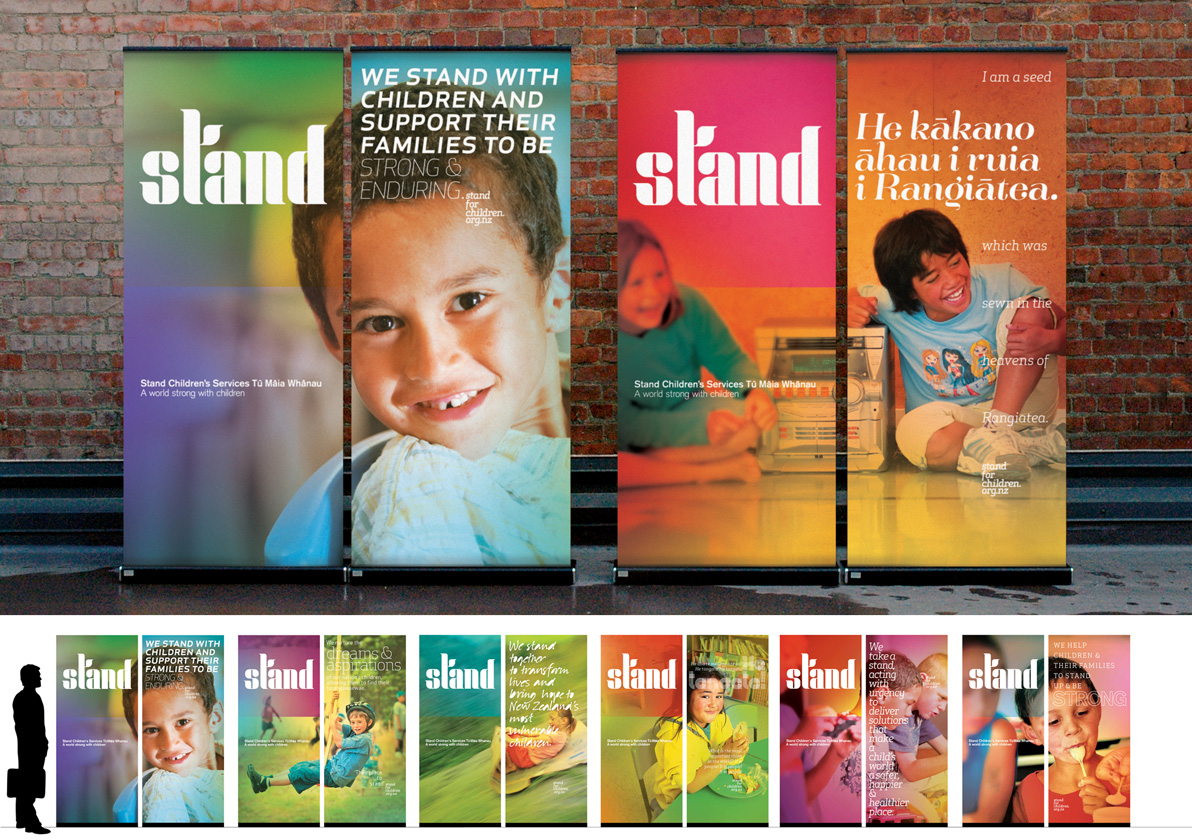
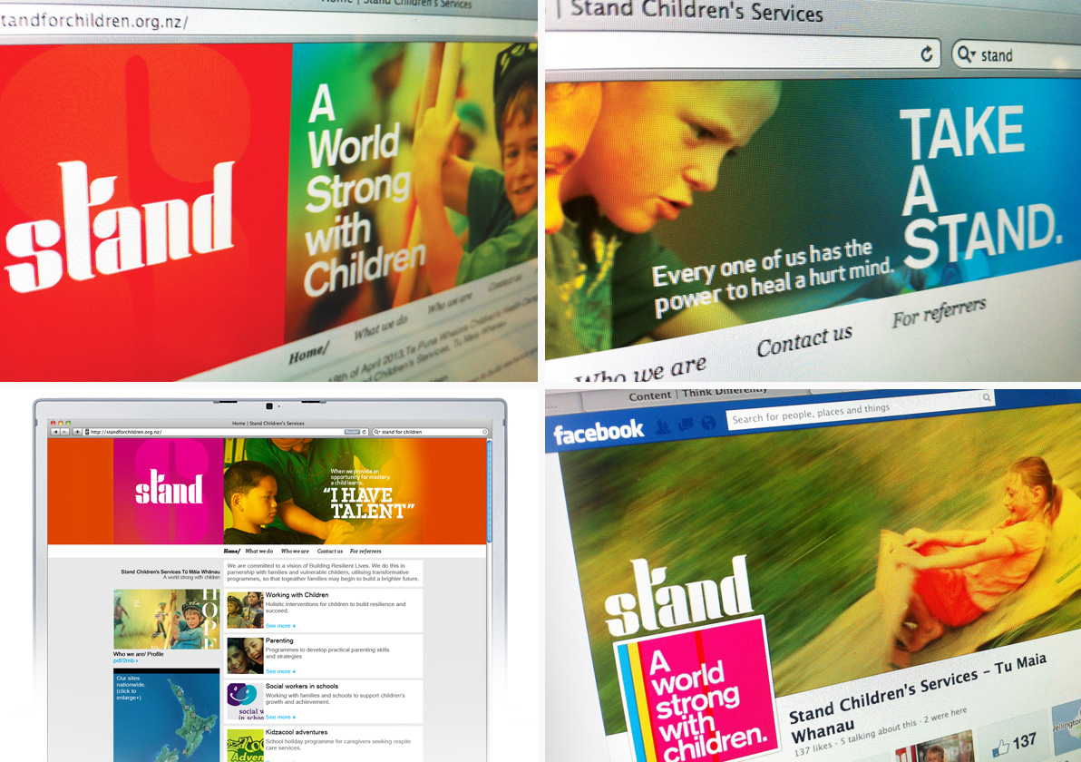
The creative idea ‘A brand of colour’ depicts the journey Stand take children on, from darkness to light. Colour transition is a metaphor for bringing hope.
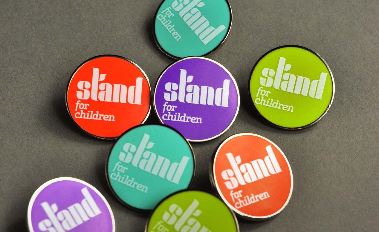
Bold colour, along with a strong word mark, expressive typography, photography and graphic treatments, form the basis of an open and adaptable visual identity framework that allows visual messages to be tailored to audiences without compromising the overall cohesive feel of the identity. This flexibility is highlighted by the multitude of launch executions including a new website, social media pages, stationery, banners, brochures, signage, presentation material and much more.
The Results
We knew this work had the potential to inspire a step change in the organisation but none of us foresaw the extent by which the name and identity would unite people behind the cause. The positioning statements ‘Stand for Children’ and ‘A world strong for children’ have become rallying cries for change which have united staff, politicians, funders and other child-support agencies.