Designed for Safety
Client: Ministry of Social Development
Good design sets the feel of a communication.
Designing a sexual violence helpline meant creating a user experience that felt safe at every touchpoint.
The Brief
Ministry of Social Development selected us to develop a brand and website for their new helpline service that captured the empathy and support that everyone impacted by sexual violence needs. Regardless whether they are a survivor, a perpetrator or a family member, the service needed to offer help, not judgement.
Most branding and web projects start with a discovery workshop but our initial session with MSD was truly unique. The statistics, and stories of sexual violence, really shocked us. At the same time, we were inspired by the courage of individuals to speak up and take action. We felt compelled to deliver something that would make a difference to people’s lives.
The Solution
Brand development kicked off by creating four different positioning approaches. These formed the basis for further exploration with the client, and their wider stakeholders. As a result, a brand territory of ‘walk with me’ was established to represent how we wanted the brand to feel. This informed the development of names, descriptor statements and visual identity directions. A shortlist of names, logos, colours and photographic approaches were tested with multiple audiences and stakeholders.
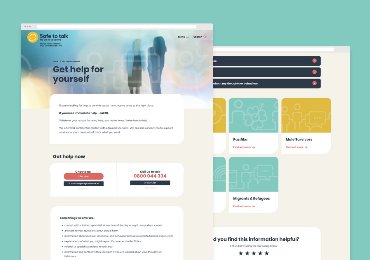
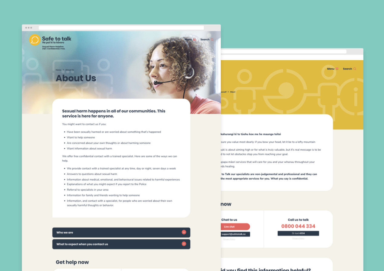
The name Safe to Talk helped position the safety of the service while also encourage people to speak up. The colour palette is warm and inviting while the photography style reinforces diversity, confidentiality and a sense of inclusiveness.
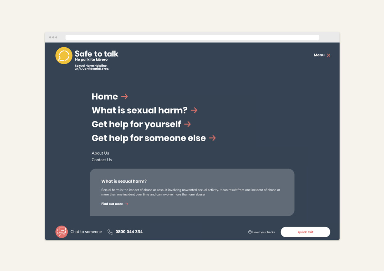
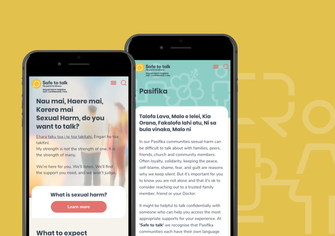
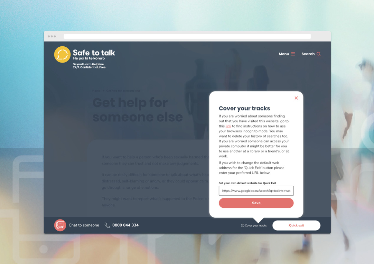
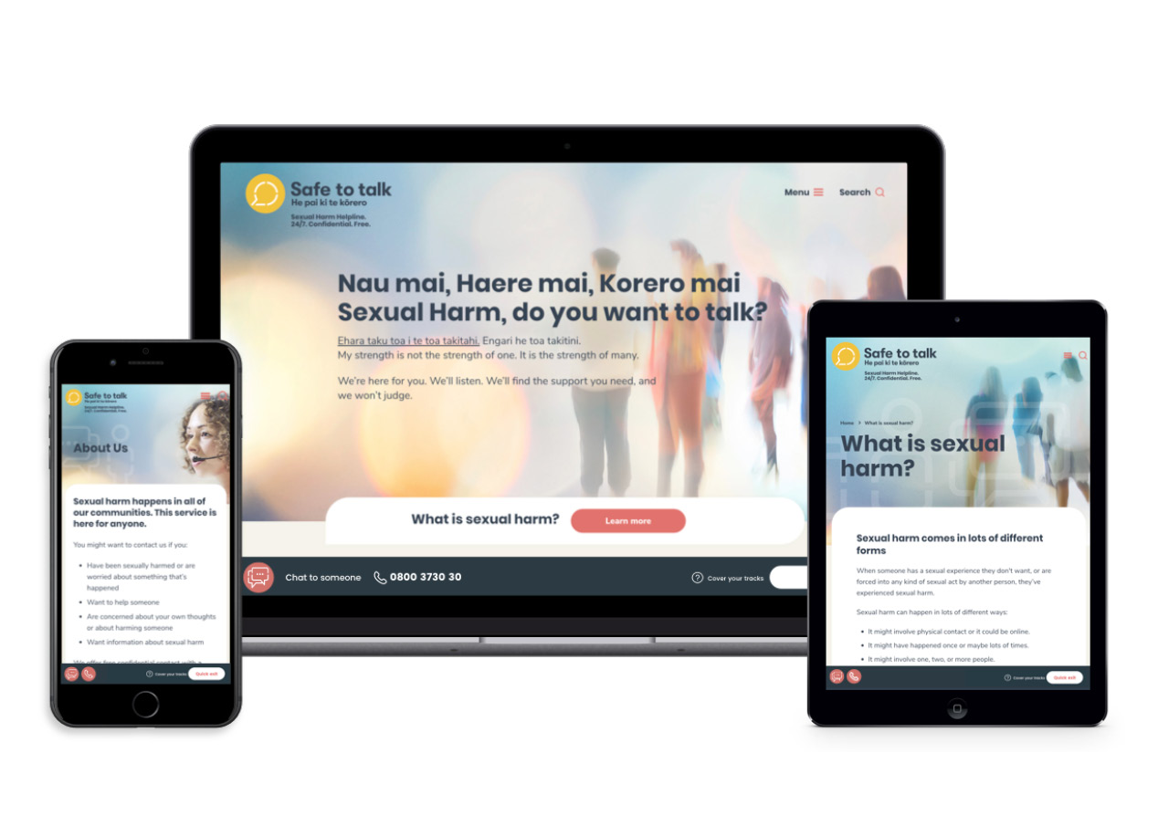
The website was designed for simplicity, further adding to the brand's feeling of safety. Targeted content, and the highest standards of web accessibility, allow audiences to feel that specific needs are understood and catered for. We carefully considered user journeys and interactions, leading to two design sprints and user feedback, at both the wireframe and initial design stages. Web Chat, email, social and phone options made it easy for audiences to connect with the service. And a clever Quick Exit feature added to that sense that the service had really thought about keeping individual’s safety.
The Results
At the time of writing, the brand and site have been up live for two months. Initial audience numbers are good and analytics show us good site engagement, with most user journeys resulting in a contact with the service. The client is extremely happy, as are the many support services they work with.
We are proud, and honoured, to contribute to the delivery of Safe to Talk.
