Reinventing a classic
Client: Sanford
How we broke the model of the successful Sanford Integrated Report - a necessary reinvention.
The Brief
The Sanford Integrated Report has become something of benchmark for integrated reporting in New Zealand over the years. A constant winner of local and global awards since the first attempt at ‘integrated’ in 2014, it set the local standard that many companies sought to emulate.
However, as reporting requirements escalated enormously in recent years, the page count of Sanford’s report began to become a burden in more ways than one. Internally, the time and resource requirements was putting unsustainable pressure on a small team; and externally, feedback from audience groups was that the report was becoming somewhat intimidating and key messages were becoming harder to discern.
In 2023 it was decided that it was time to reinvent this perceived pinnacle of integrated reporting. With two key objectives: reduce page count dramatically and achieve greater clarity of key strategic drivers.
The Solution
Our first step was to sit down with the full board to seek their views. That triggered a reconfiguration of the report to realign its narratives with recent strategic shifts within the company. And consider the resulting trade-offs in reader expectations: reducing the page count considerably necessitated a requisite reduction in content.
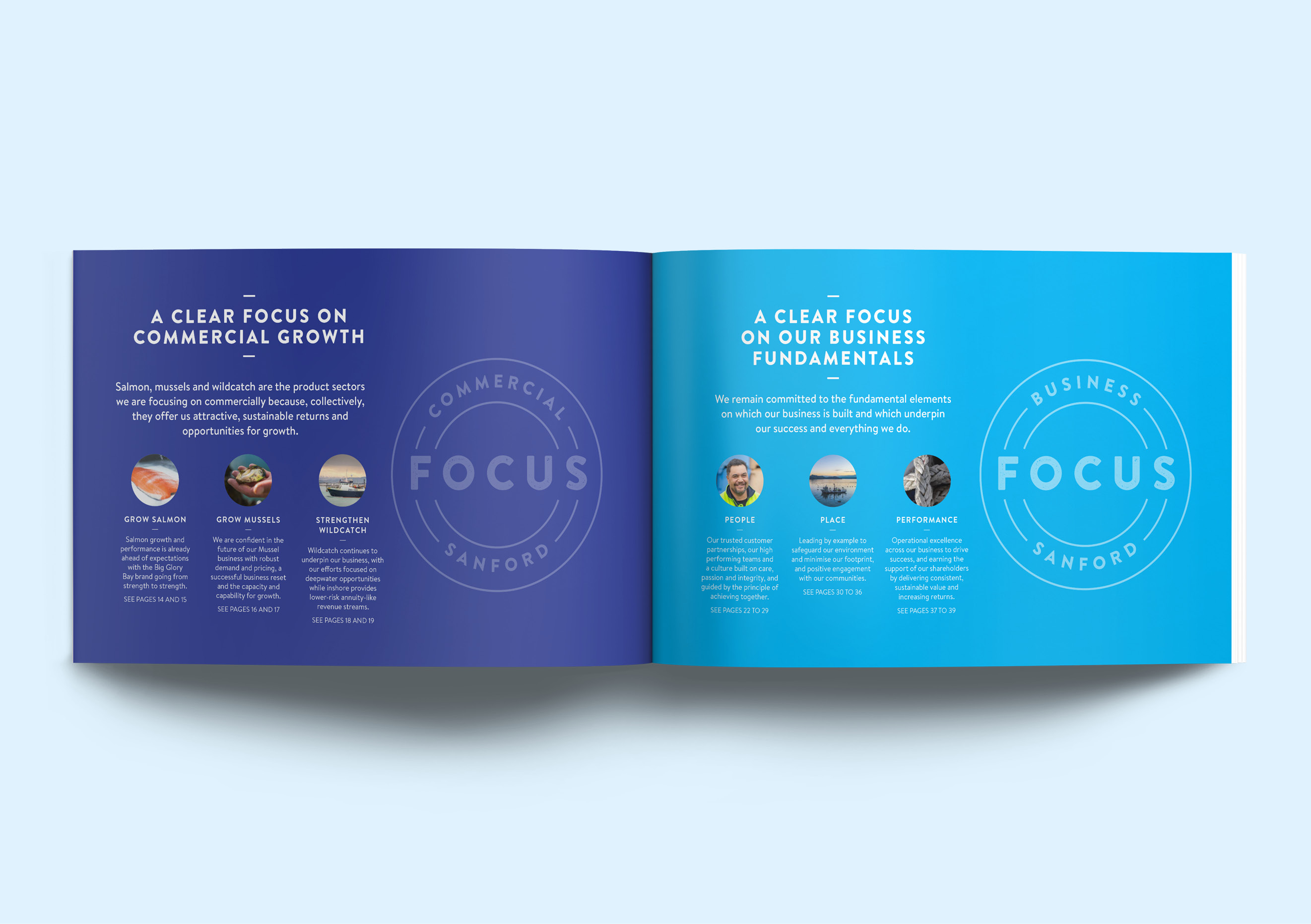
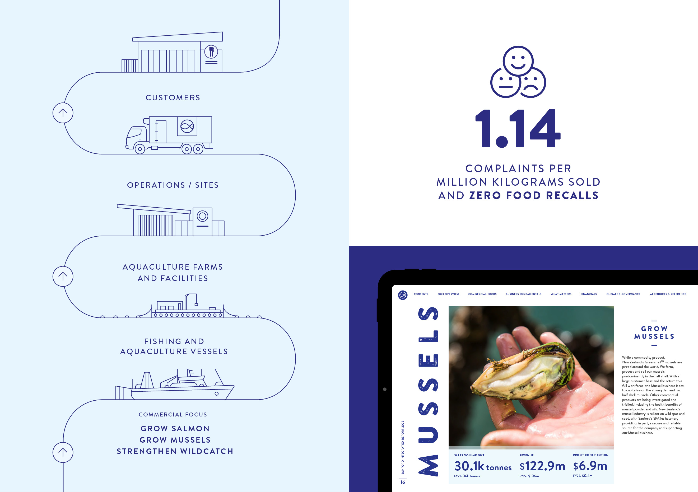
A total rethink of the report’s structure followed. The opening pages would now be devoted to key commercial messages, making crystal clear where the company’s priorities lay for value creation in the years ahead. The second part of the report would then be devoted to a simplified sustainability narrative around people, place and performance.
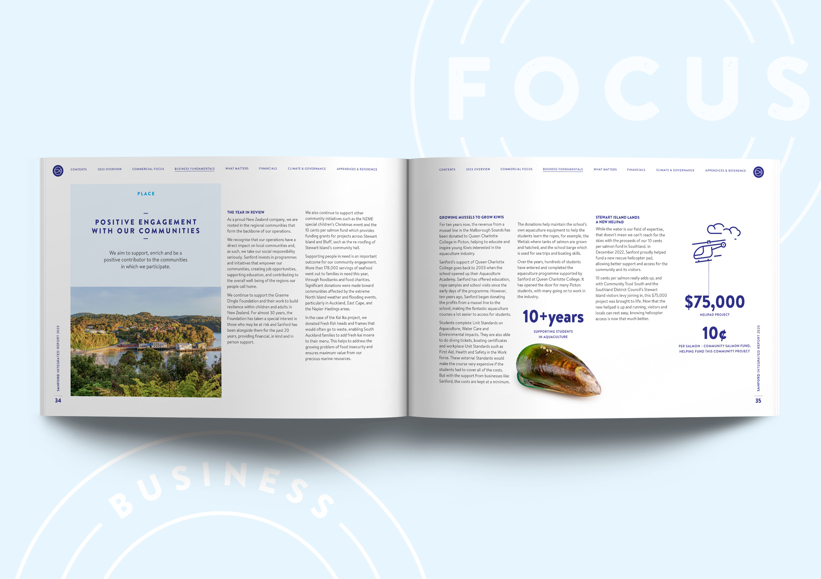
These decisions reduced the storytelling half of the report (i.e. not including the financial statements) from 116 pages to 52. A great deal of effort went in to ensuring that disclosure of all material issues was still recorded while overall content was reduced significantly. This required much judgement and debate.
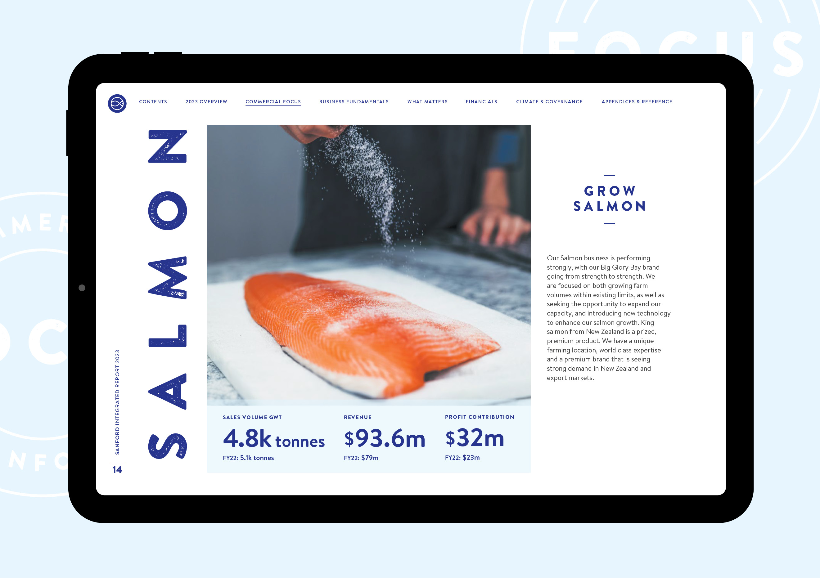
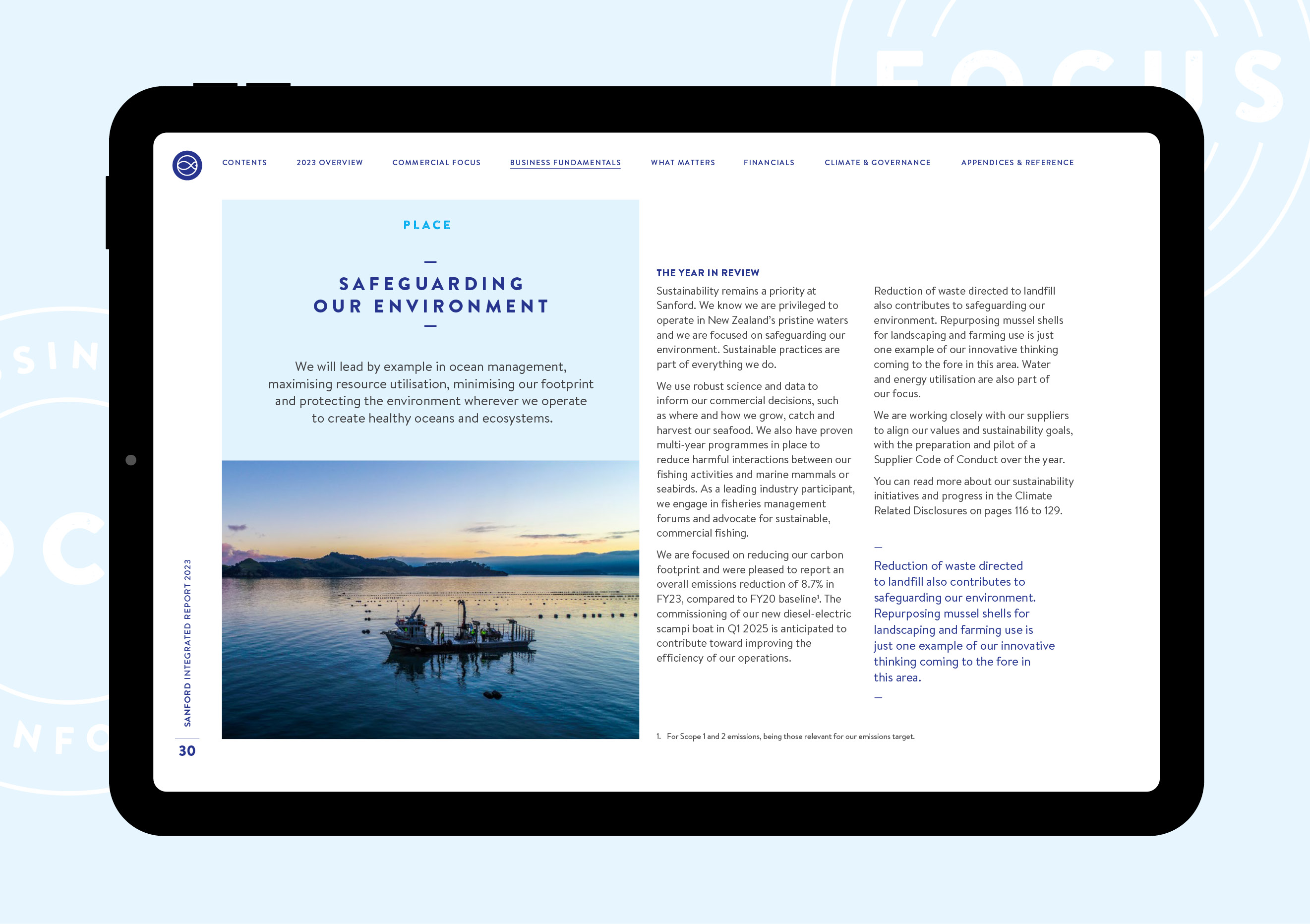
The previous visual vernacular remained, however. The digital-first delivery channel dictated the continuation of landscape screen orientation and clickable navigation. But less content enabled more white space and fewer elements fighting for attention on a page, resulting in a cleaner design and greater accessibility and reader engagement.
The Results
While such significant change of direction carries expectation risk, the final report was successful in many ways. The messaging was clearer; the report was more accessible for its multitude of audiences; and the workload on Sanford’s team was significantly reduced. As a result the overall cost decreased significantly too. For readers, much more effective communication was a highly meaningful result.
For technical audiences, whether the reduction in detailed disclosure is perceived as a step backwards remains to be seen – the upcoming awards season where analytical judges from the various local and global annual reporting assessments will weigh in on that. In the meantime, the general market has reacted positively with minimal concern about the less detail incorporated.
