Evolving a perennial winner
Client: Sanford
2022 INTERNATIONAL ARC AWARDS - SILVER
ARA AWARDS 2022. WINNER - ARA SUSTAINABILITY REPORT OF THE YEAR
Sanford changes tack to stay one step ahead.
The Brief
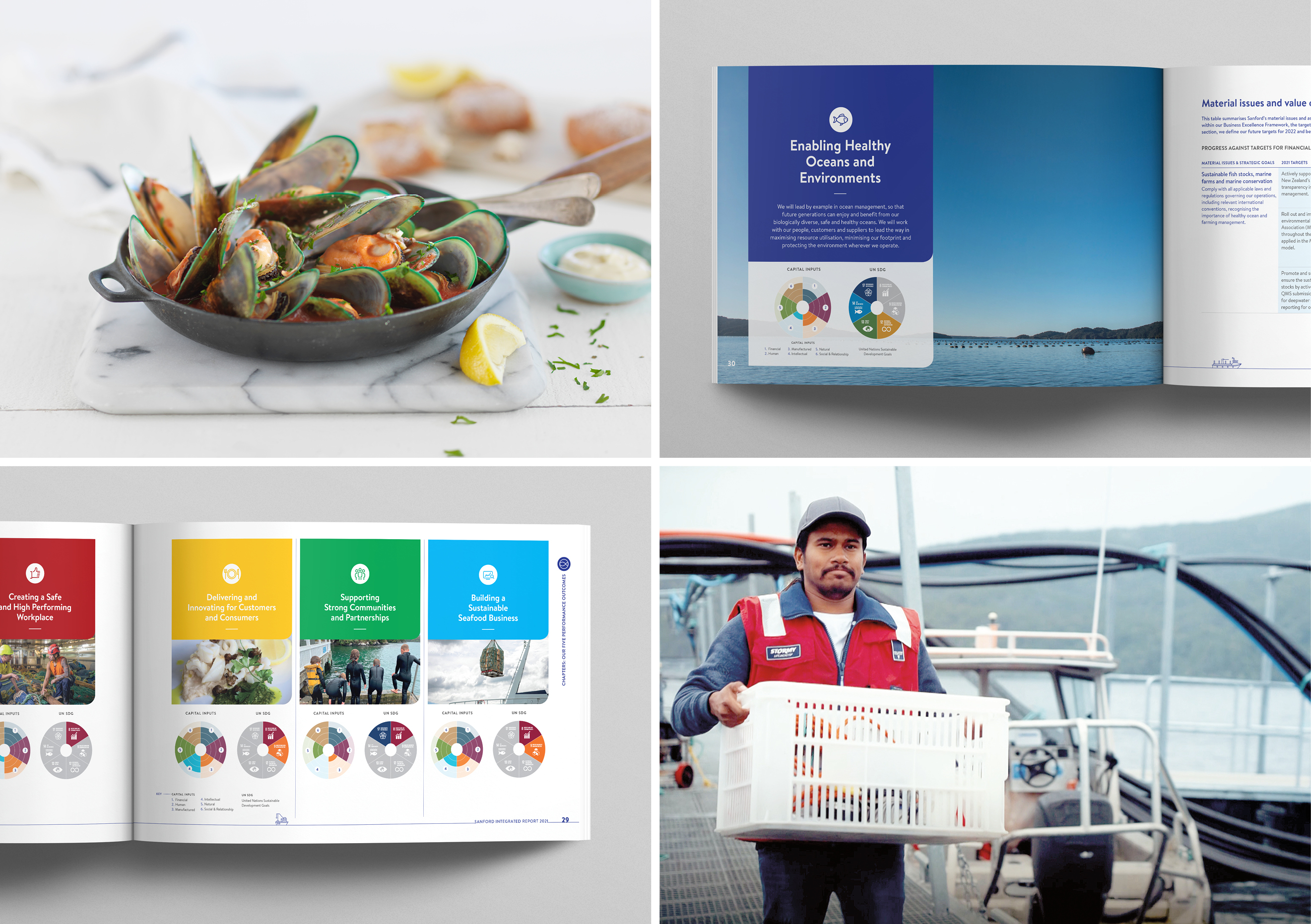
After accumulating local and global awards for the Sanford Integrated Report every year for many years, it’s tempting to rinse and repeat a literally winning formula. But dynamic markets create evolving expectations, so we constantly look for ways to keep Sanford’s reporting at the leading edge.
As print quantities reduce, the importance of the digital delivery increases. For Sanford’s 2021 report, we felt that the tipping point had been reached so we decided the time was right for a ‘digital first’ approach. This manifested in the biggest change from prior reports – from portrait orientation to a more screen-friendly landscape format.
From a business perspective, Covid-19 had continued to disrupt global supply chains and foodservice as it had in 2020, but the company could see calmer waters ahead. The report needed to convey that shift in outlook.
The Solution
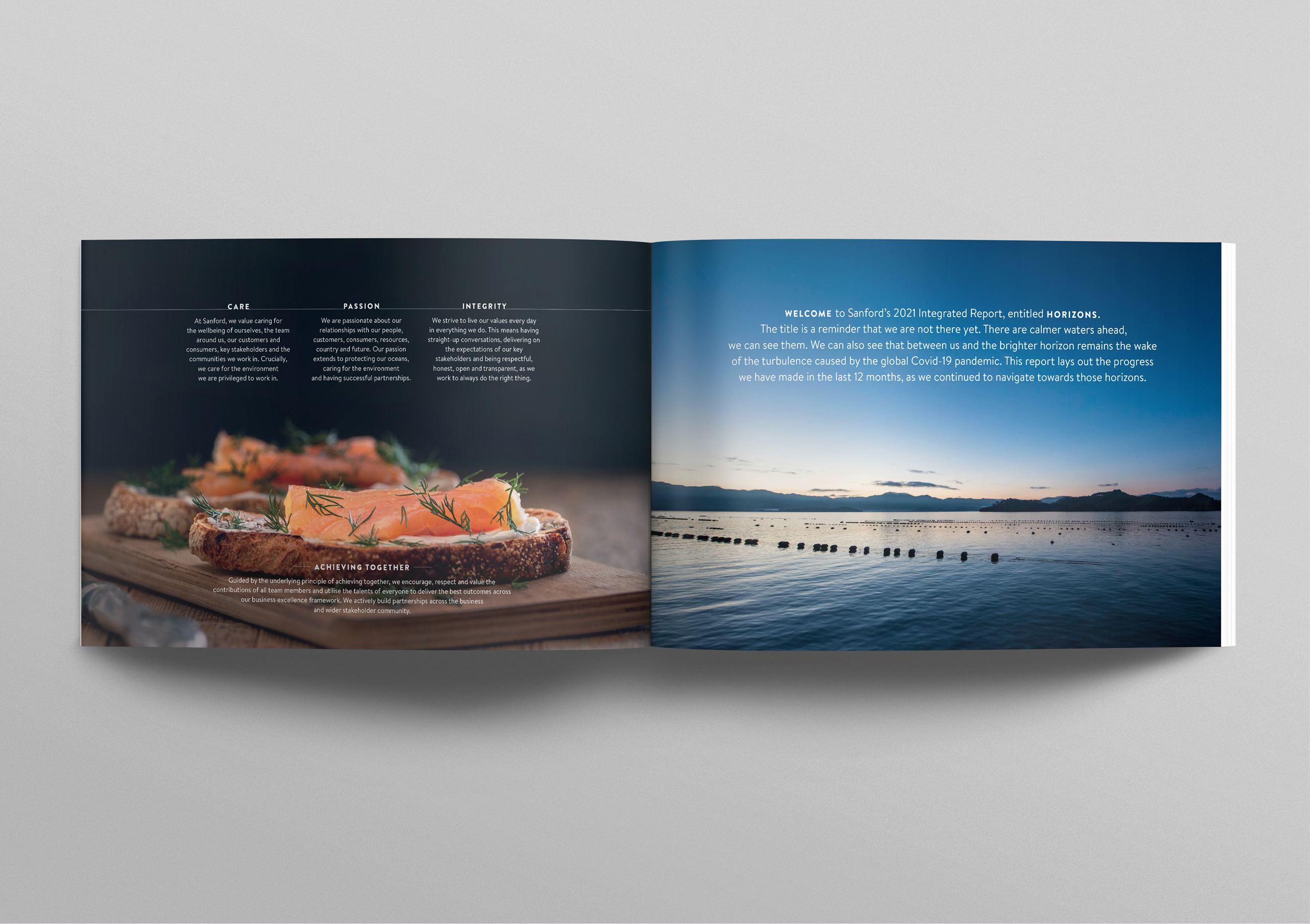
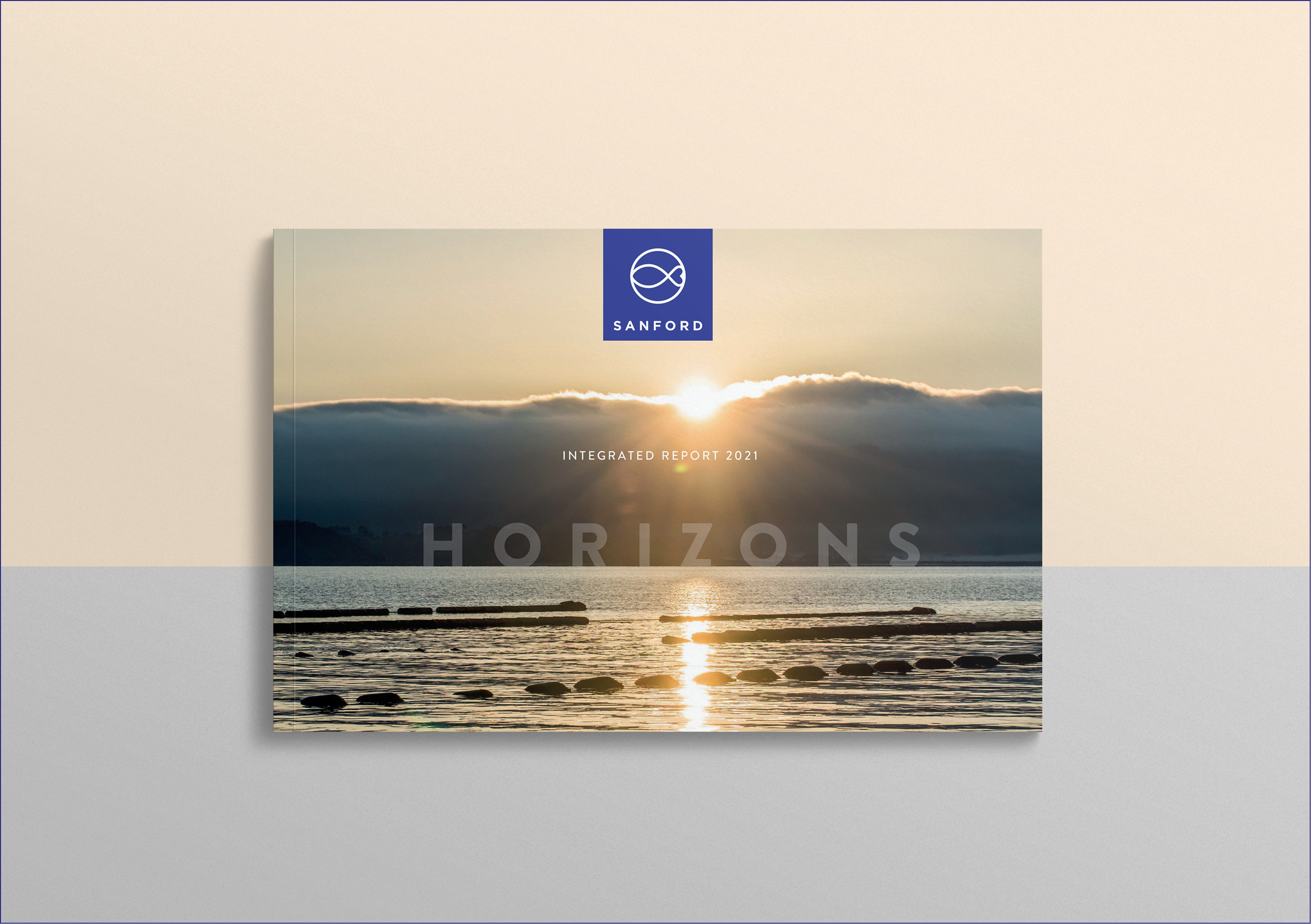
The 2020 report’s title, Navigate, reflected the massive disruption and uncertainty that coronavirus had unleashed. In 2021 the lack of foodservice demand and supply chain logistics still wreaked havoc but the company could see that the world was gradually moving on, towards a brighter horizon. And that word became the title and overriding stance of the communication. Horizons conveys a sense of direction, hope, potential, and encourages us forward, towards goals.
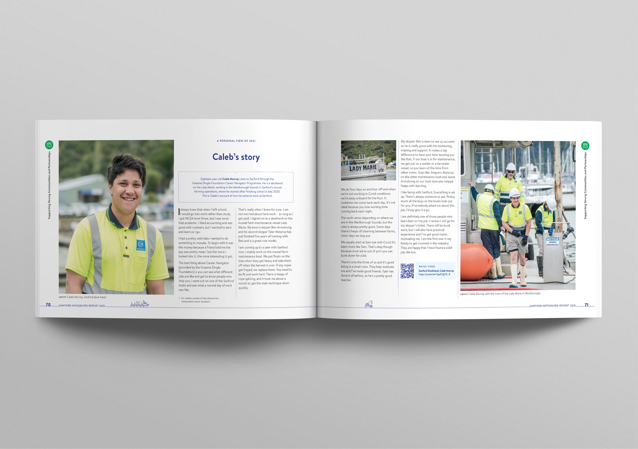
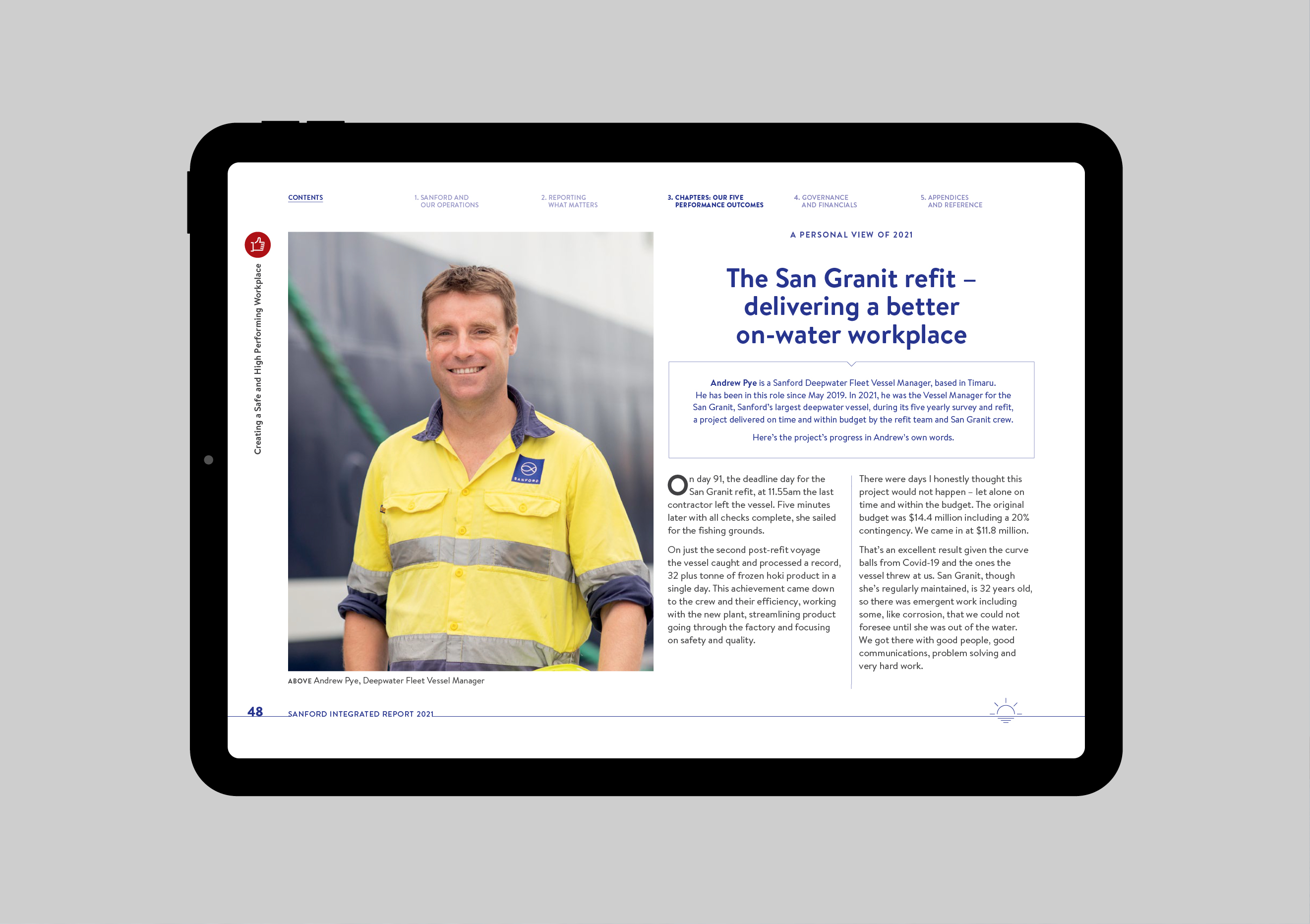
Working with and on the ocean breeds a certain type of resilience and Sanford’s people have demonstrated that for two years now. They had stories to tell, and what better in such circumstances than to let them, in their own words. The Report’s chapters are punctuated with those stories, bringing the evidence of their grit to deliver their elements of the fight back to life for readers.
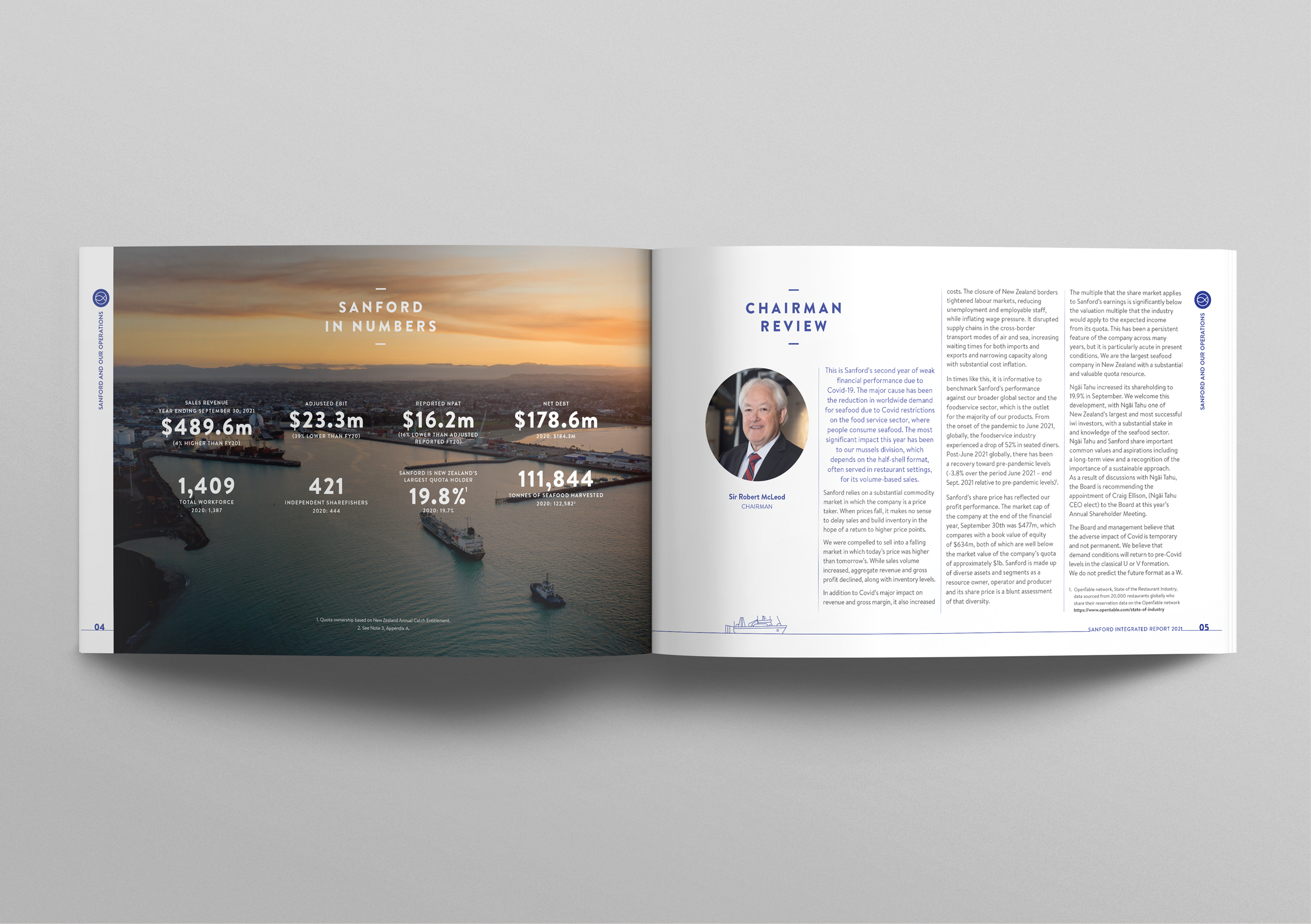
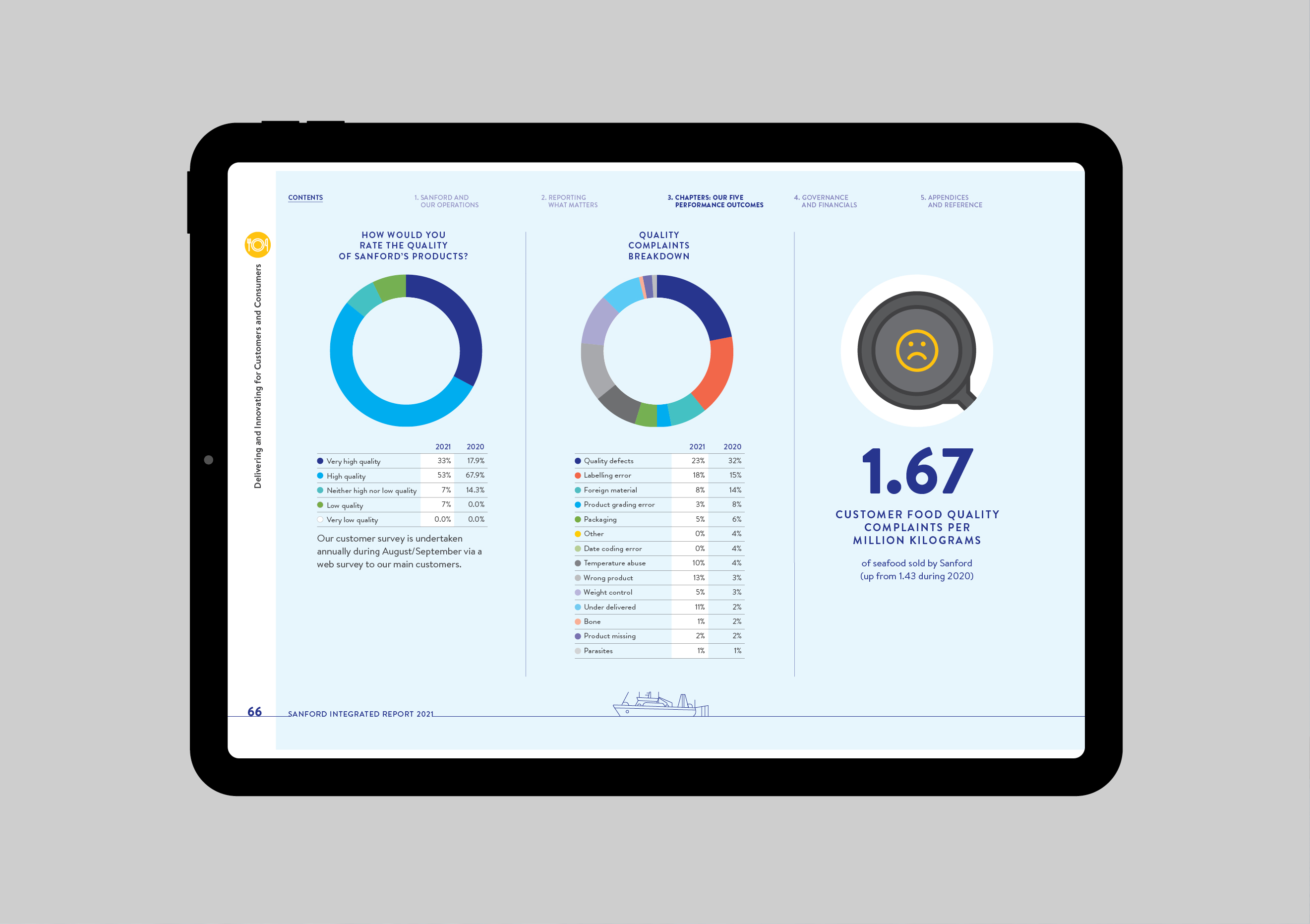
We continued with Sanford’s philosophy of transparency, featuring the ‘lows’ as well as the ‘highs’ in the Highlights section. And we rethought how best to convey the value-creation story. We also fine-tuned the graphics that represented the impact of each pillar of the business excellence framework on their input capitals and the UN Sustainability Goals.
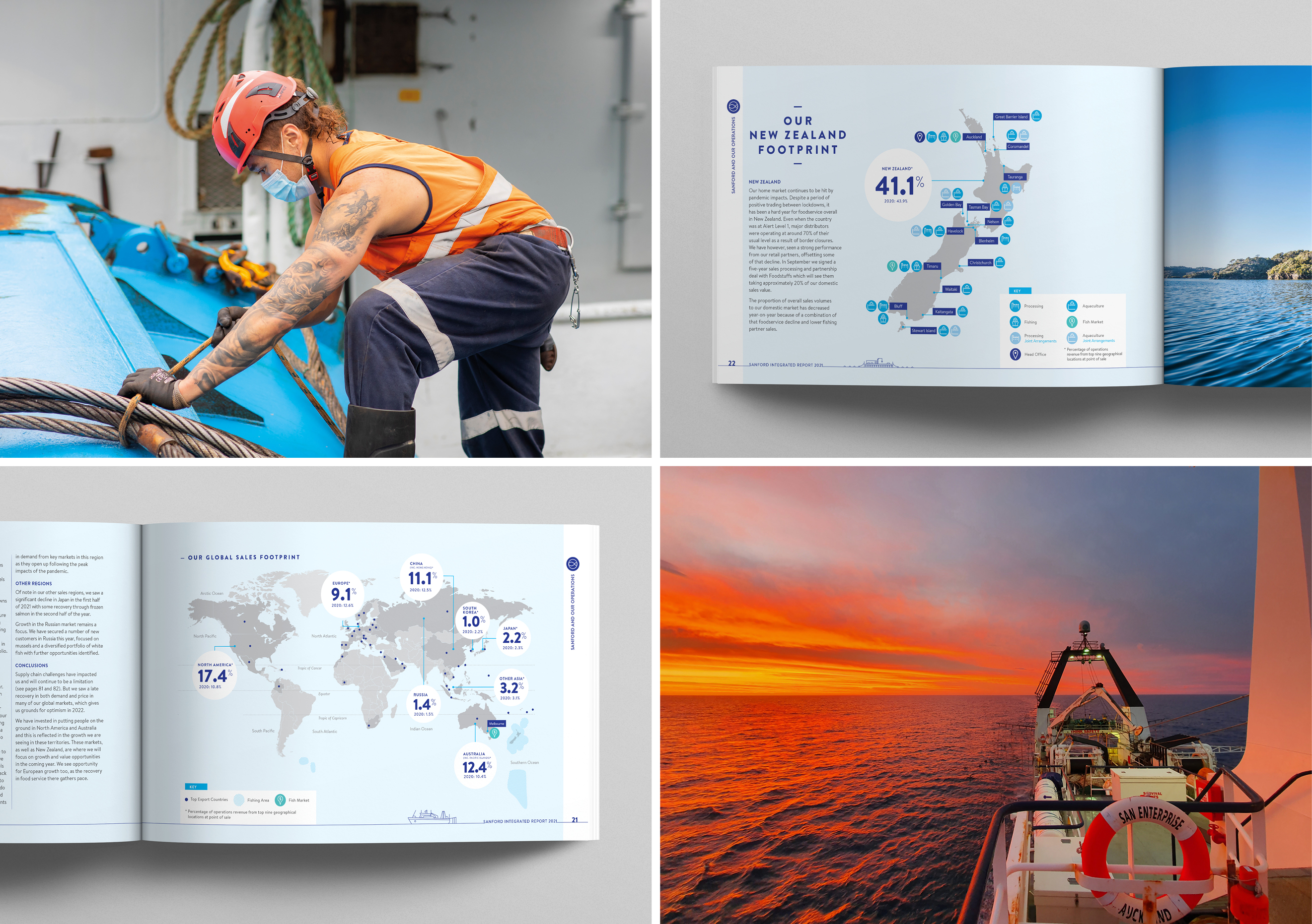
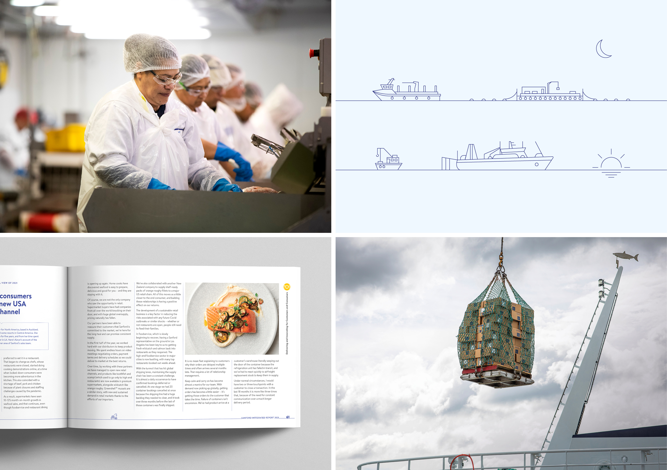
From a design point of view, the switch to landscape format, and primarily on-screen delivery, meant designing both with a view to how the report reads as spreads (printed report) and as single pages (onscreen). Rather than a simple rotate to a landscape version of A4, we instead opted for a custom size designed to present well on-screen as single pages, essentially a ‘widescreen’ format. We added nuanced updates to text sizes and design elements to get the best from both experiences, online and off. While photography was a challenge in the locked down operating environment, we looked to highlight strong horizon-based imagery shot from vessels, or within the aquaculture environment, emphasising the horizontal line.
A simple but powerful design element is a base keyline element evoking a horizon line. The incorporation of simple keyline illustrations, from smaller inshore vessels to large offshore ships and aquaculture farms alongside natural elements such as moon phases and the setting sun are used as a continual element throughout the report.