Enabled storytelling
Client: Reserve Bank of New Zealand Te Pūtea Matua
2022 INTERNATIONAL DESIGN AWARDS (IDA) - SILVER
In recent years, the Reserve Bank of New Zealand Te Pūtea Matua has evolved the way it engages with its many stakeholders.
The Brief
Under the leadership of Governor Adrian Orr, they asked us to help them better tell the story of who they are, what they stand for and how they enhance the economic wellbeing of New Zealand.
The Solution
The new approach to telling the Reserve Bank’s story needed a move away from the technical language of the past, speak to a wider audience and embrace the why, not just the what and how. Along with the words, an enhanced visual toolbox would allow them to tell this story in a more cohesive and engaging way.
Following a review of extensive stakeholder feedback, we facilitated a workshop that included wide internal representation. It quickly became clear that they were an organisation with big ambitions, an external focus, a strong purpose and a driving desire to take New Zealand’s financial ecosystem to new levels.
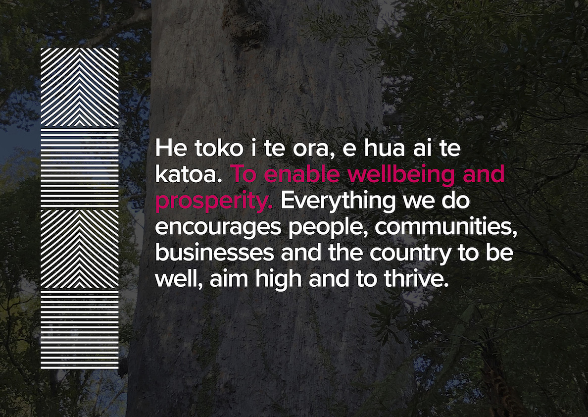
With this insight, we worked collaboratively to create We enable, an engaging narrative that pulled together their purpose, values, intent and focus on an inclusive New Zealand into a story about the value they deliver to market participants and all Kiwis. The story found an instant connection with internal audiences, uniting them behind the common cause of enabling their stakeholders.
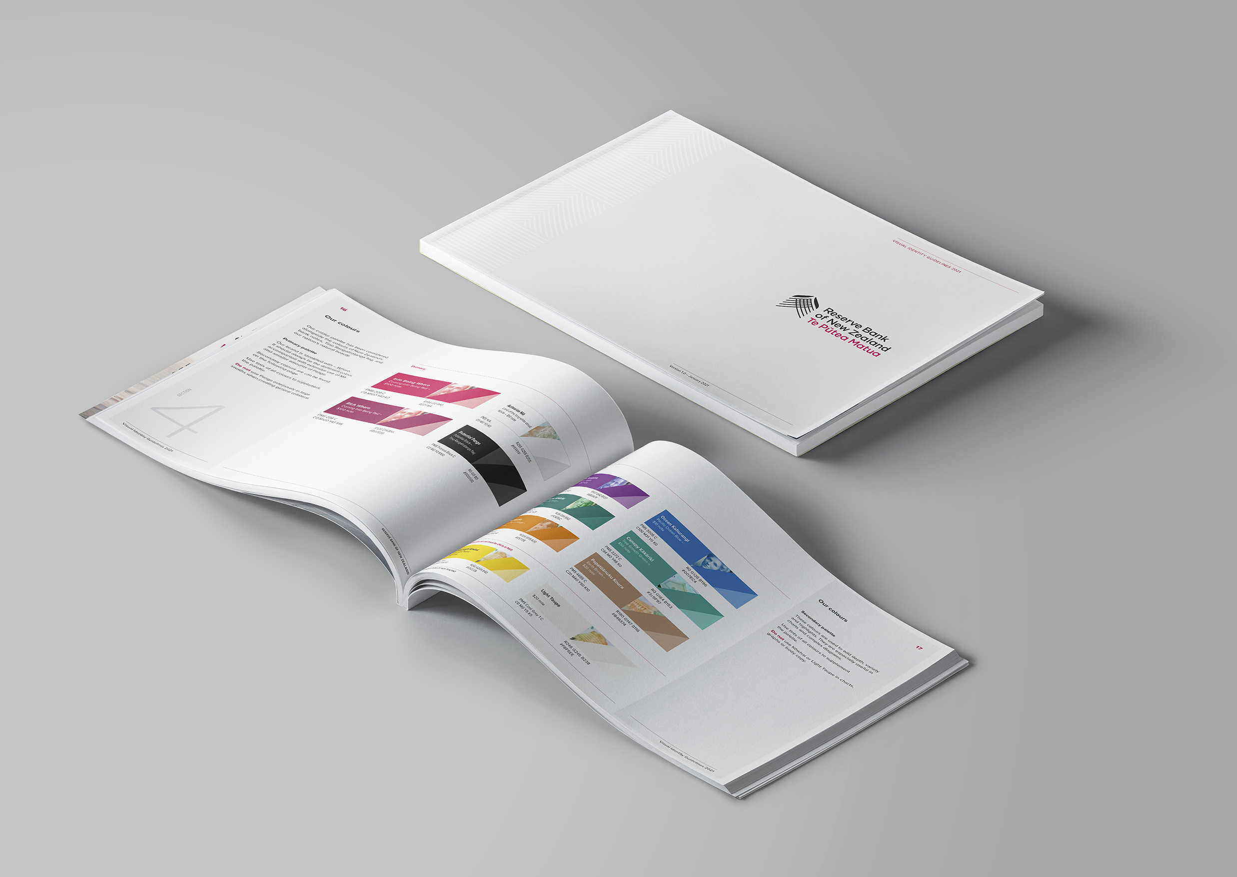
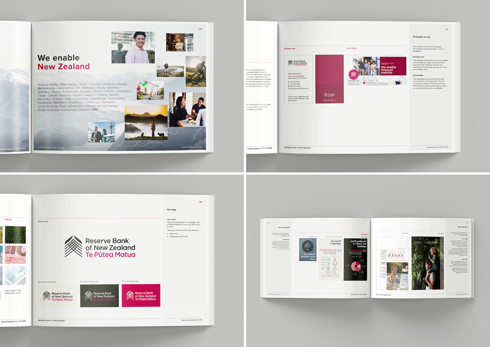
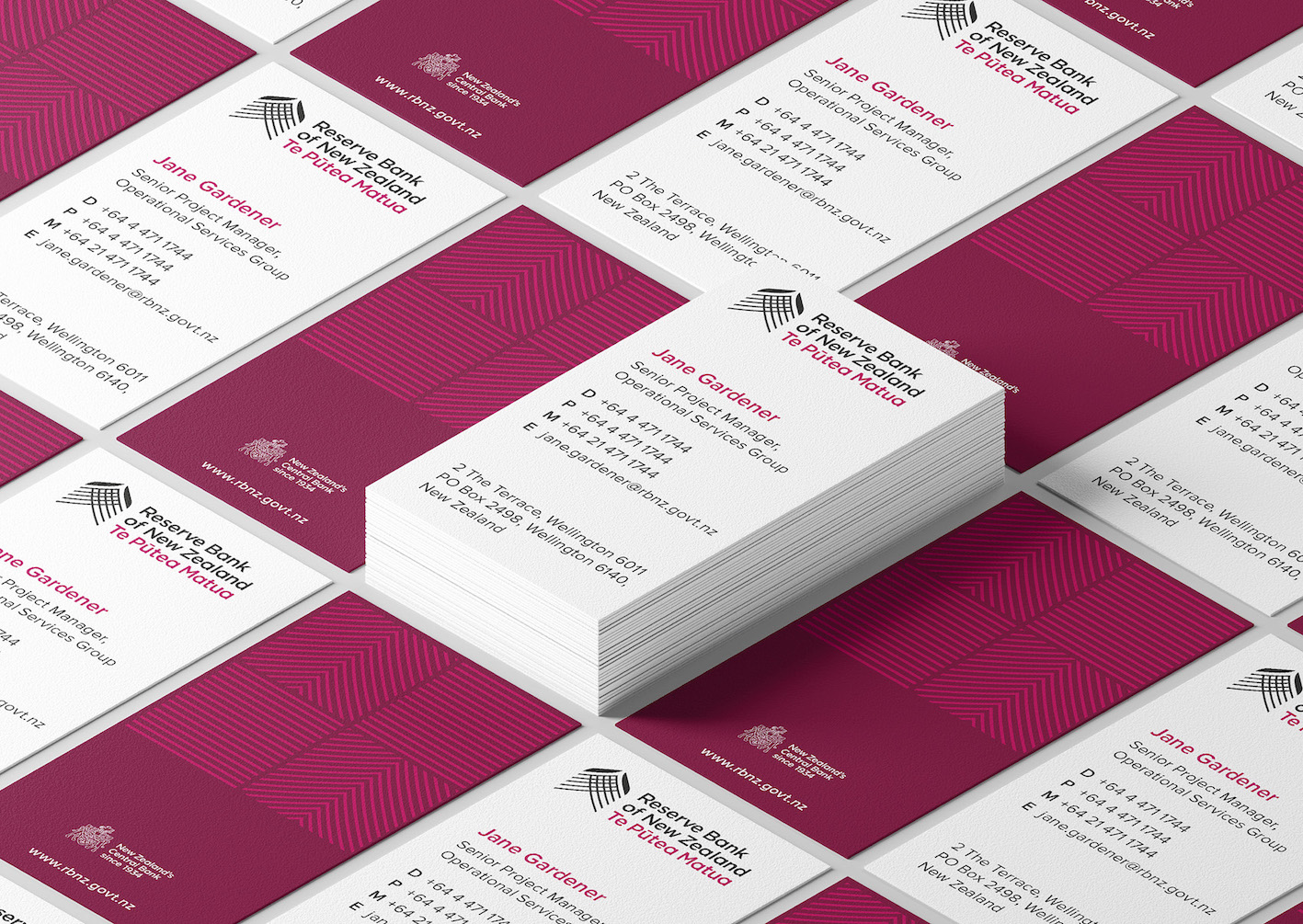
We enable also became the inspiration for reviewing their visual language, starting with the introduction of engaging people photography that depicts enabled Kiwis. The core colour black remained and the red was made richer. The overall palette was enhanced with the hues of our bank notes. A more direct and everyday tone of voice was adopted and enhanced by the introduction of a simplified graphic treatment.
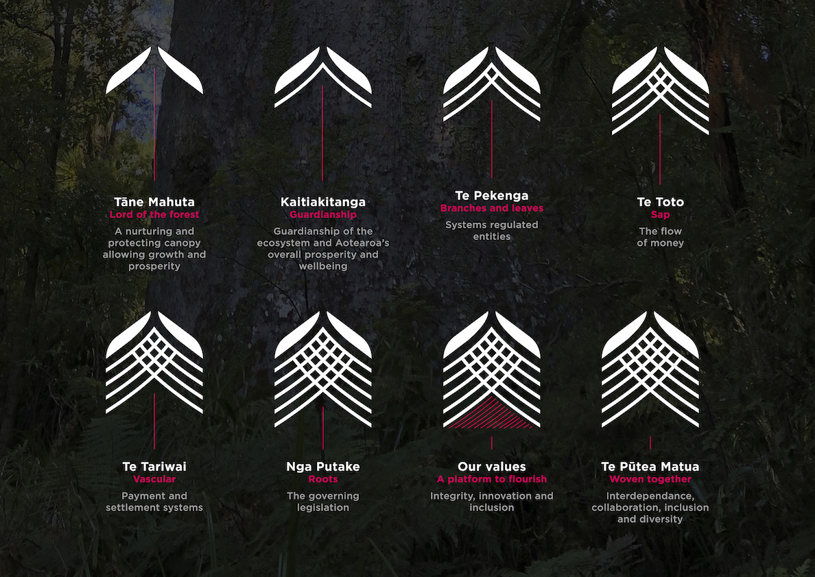
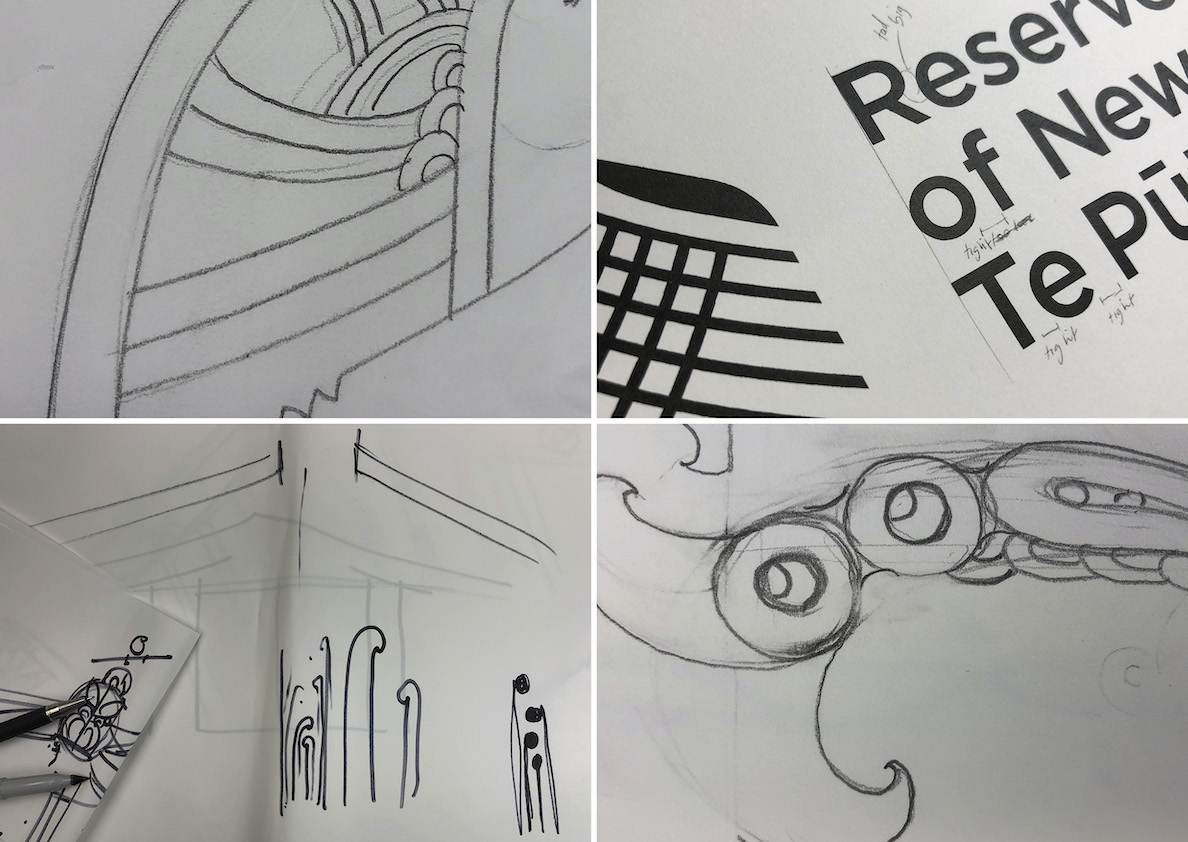
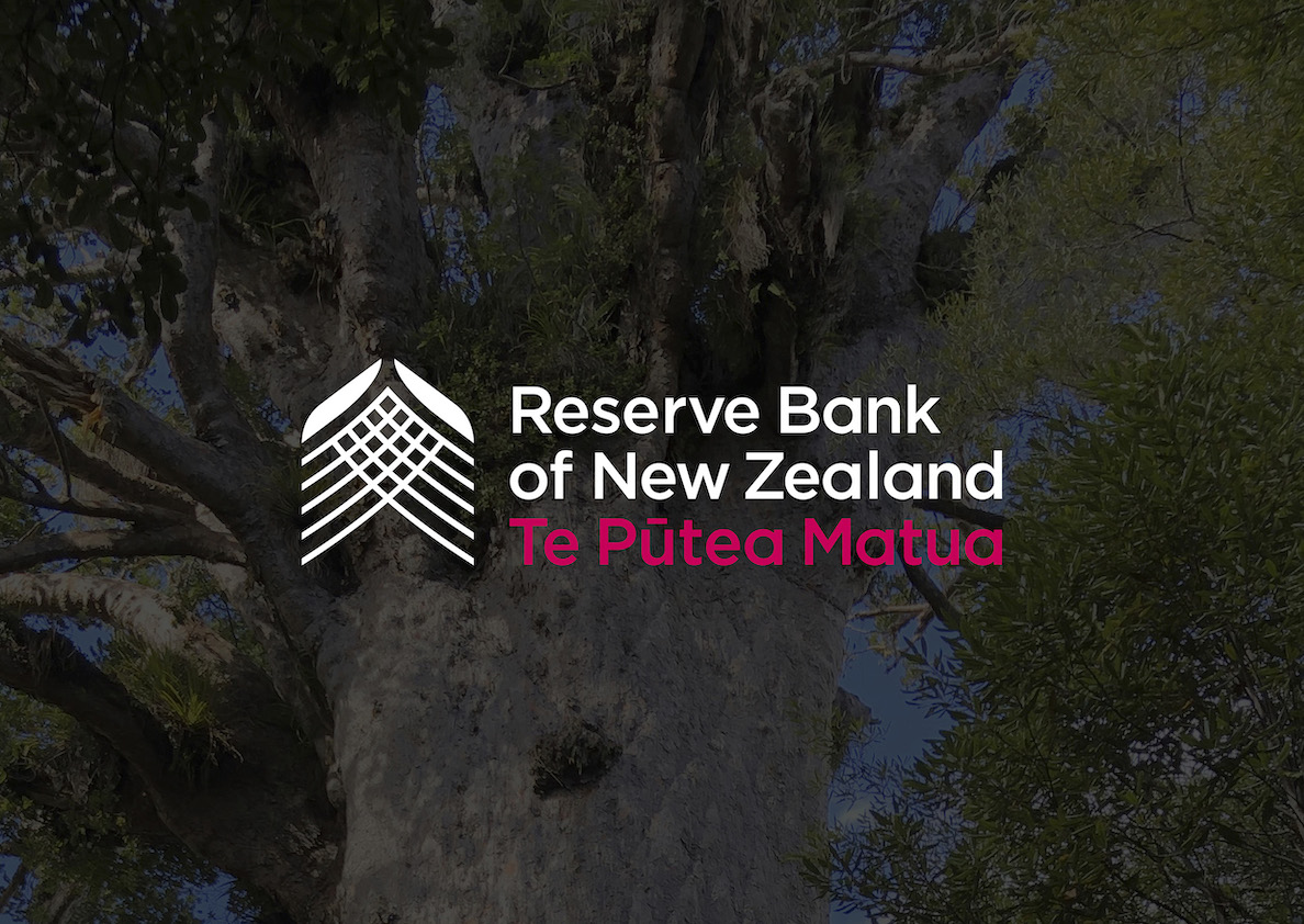
For the logo, the brief was to capture the purpose of the Reserve Bank and to express their role in New Zealand. For some time, they’ve used Tāne Mahuta as a metaphor to explain their role as the kaitiaki (guardians) of New Zealand’s financial ecosystem, nurturing and protecting life under its canopy. With oversight and guidance from a number of cultural advisers, we developed a new logo that brought this metaphor to life.
The logo’s overarching canopy lets the sun in so life underneath can flourish and grow. The five upward lines represent the parts of the monetary system, working together to push New Zealand’s economic prosperity forward and higher. The weave speaks of interdependence and collaboration, promoting an inclusive world where the past, present and future interweave to benefit current and future generations.
The logo feels human and contemporary and is inspired by Māoritanga. Very much like the Reserve Bank of today.
Like with everything they do, making big changes requires careful consideration and consultation. We worked closely with the client to develop a programme to research We enable, the logo and the enhanced visual elements with a wide group of stakeholders: from internal to market players and media. Feedback was incorporated to advance the work further.
The Results
The new story, visual assets and logo were recently launched and have been warmly embraced by stakeholders. The positive response suggests that our work is helping to change perceptions, enabling the Reserve Bank of New Zealand Te Pūtea Matua to have new kinds of conversation with its stakeholder. We’re proud of the role we’ve played in enabling them to tell their story.