Staying Strong
Client: NZ Super Fund
ARA AWARDS 2021. WINNER - ARA ANNUAL REPORT OF THE YEAR
ARA AWARDS 2021. WINNER - BEST COVER DESIGN
ARA AWARDS 2021. WINNER - BEST OF FINANCIAL SERVICES SECTOR
ARA AWARDS 2021. GOLD AWARD
2021 INTERNATIONAL DESIGN AWARDS (IDA) - GOLD
2021 GRAPHIS AWARDS - SILVER
A metaphor to convey a visually reassuring story, to express core messages and to create an overall sense of calm and control through turbulent times.
The Brief
In the midst of the COVID crisis in 2020, the Guardians of New Zealand Superannuation briefed us to develop an annual report creative and messaging platform that speaks to the theme of staying strong. With the global pandemic affecting financial markets it was important to reiterate the Guardians’ core message of staying the course, retaining a focus on the long-term and capitalising on their proven expertise to ride out tough market conditions.
The Solution
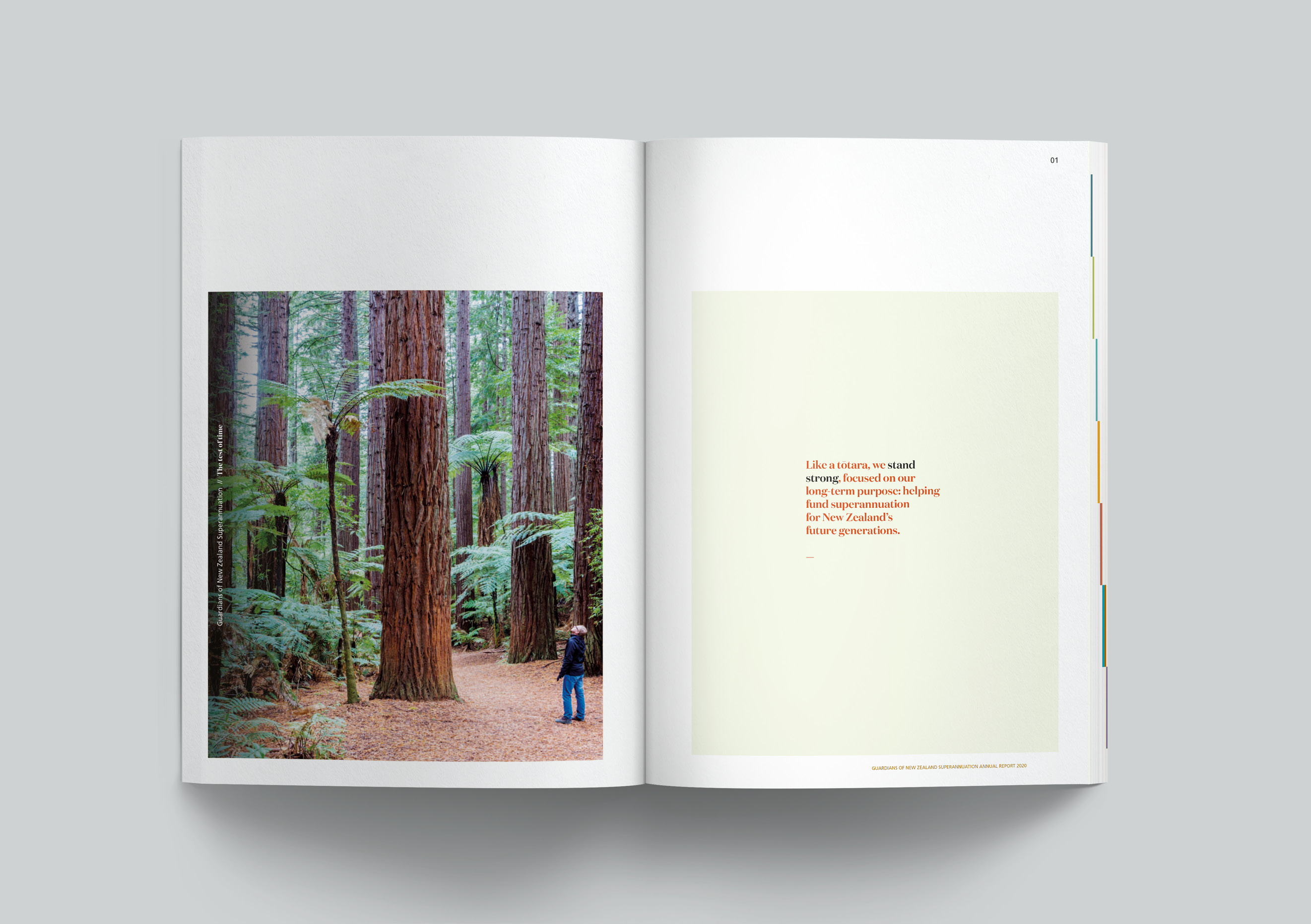
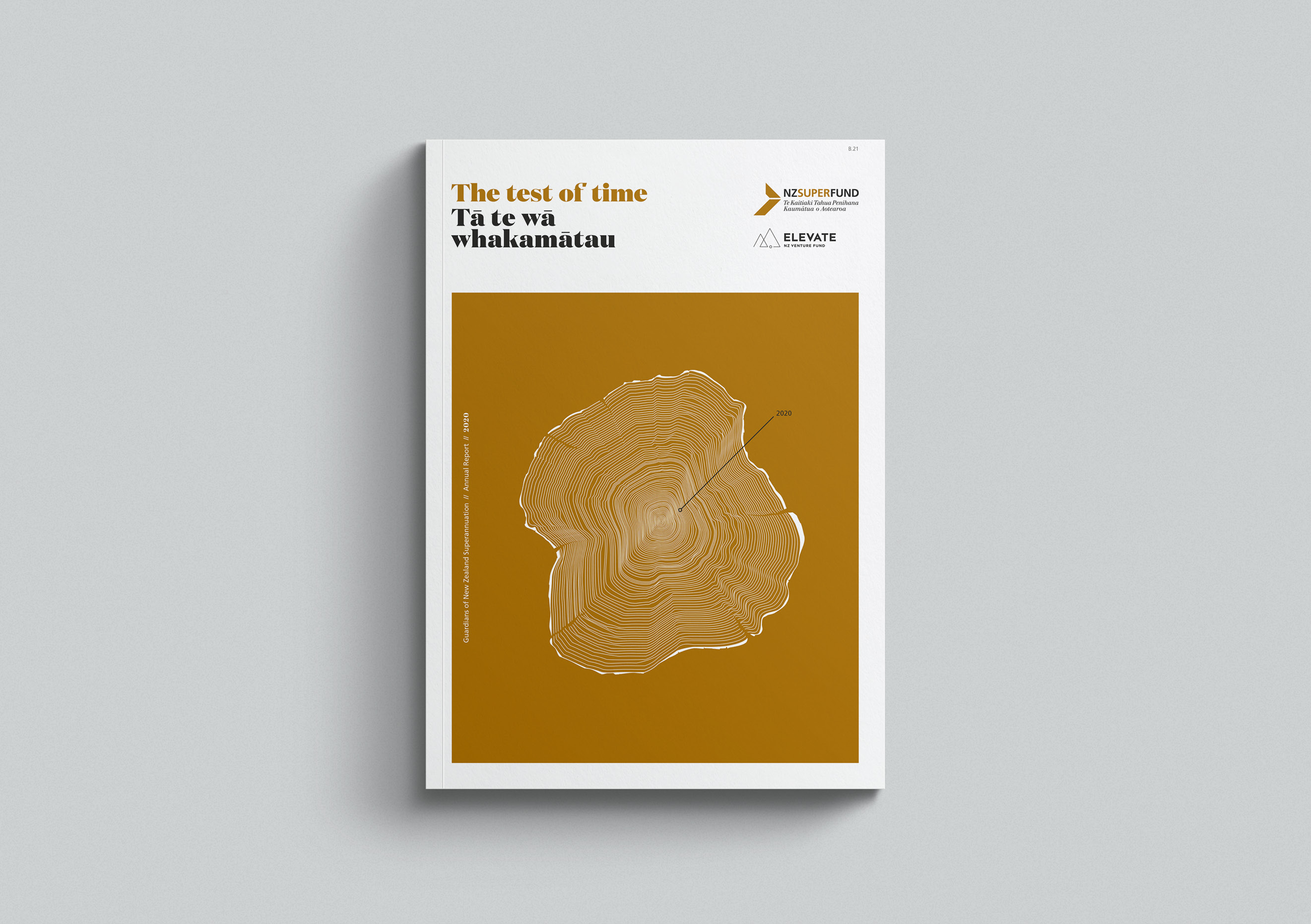
We explored a number of storytelling directions, that looked at concepts of strength, long-term, care and purpose, before recommending the preferred territory called The Test of Time. The idea was bought to life using a metaphor of one of New Zealand hardiest and most valuable native trees, the tōtora.
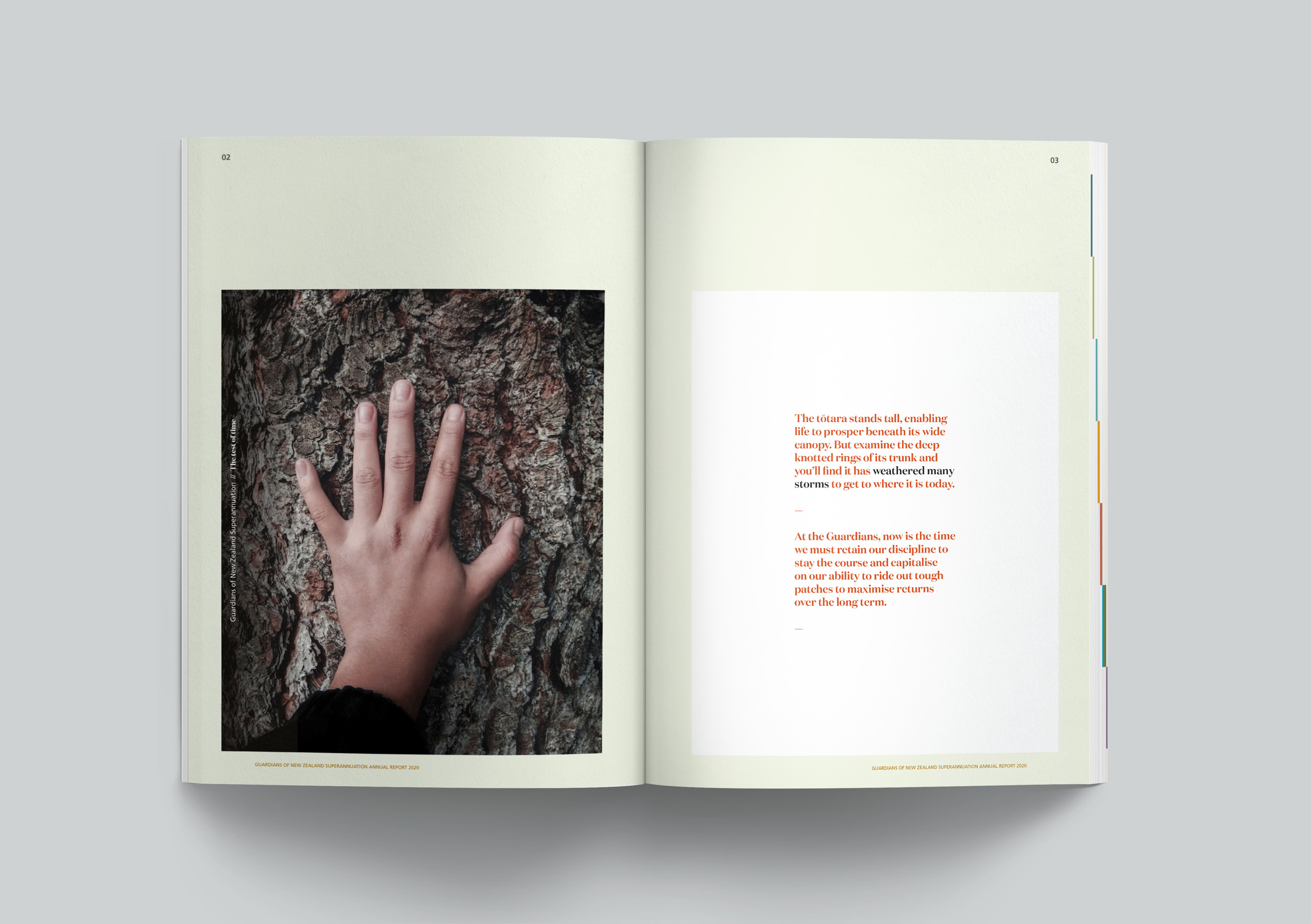
The tōtara, a guardian of the forest, stands tall and proud, enabling life to prosper beneath its wide canopy. This is its purpose. But examine the deep knotted rings of the tōtara’s trunk and you’ll find it has weathered many a storm over the years. Each storm testing its strength and resilience. Throughout, the tōtara has swayed in the conditions but always remained resolute. The storms, rather than weakening the tōtara, have built its character, its ability to adapt and its overall strength. Like the tōtara, the Guardians are standing strong through the crisis, adapting to the conditions while never losing site of their purpose: funding retirement for future generations of New Zealanders.
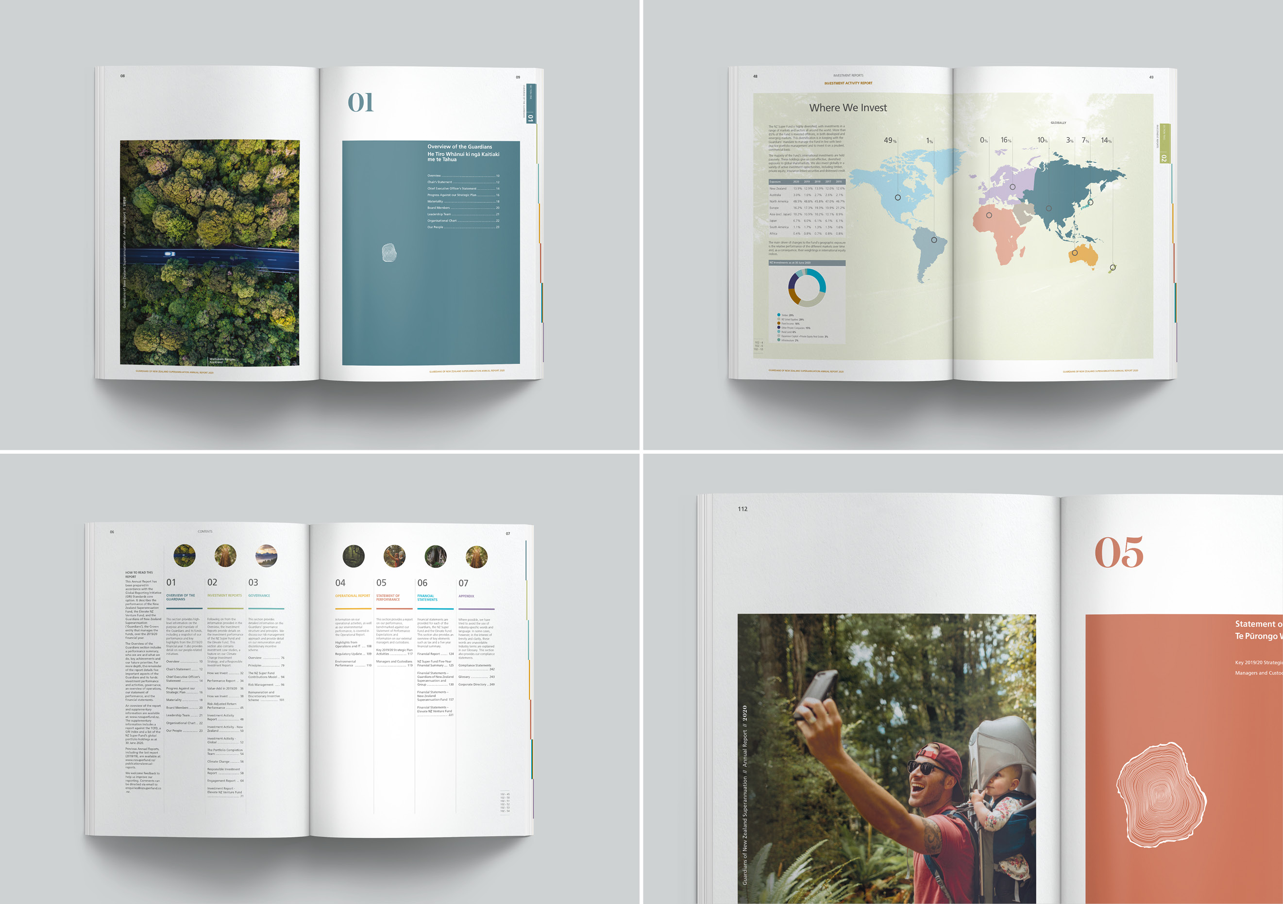
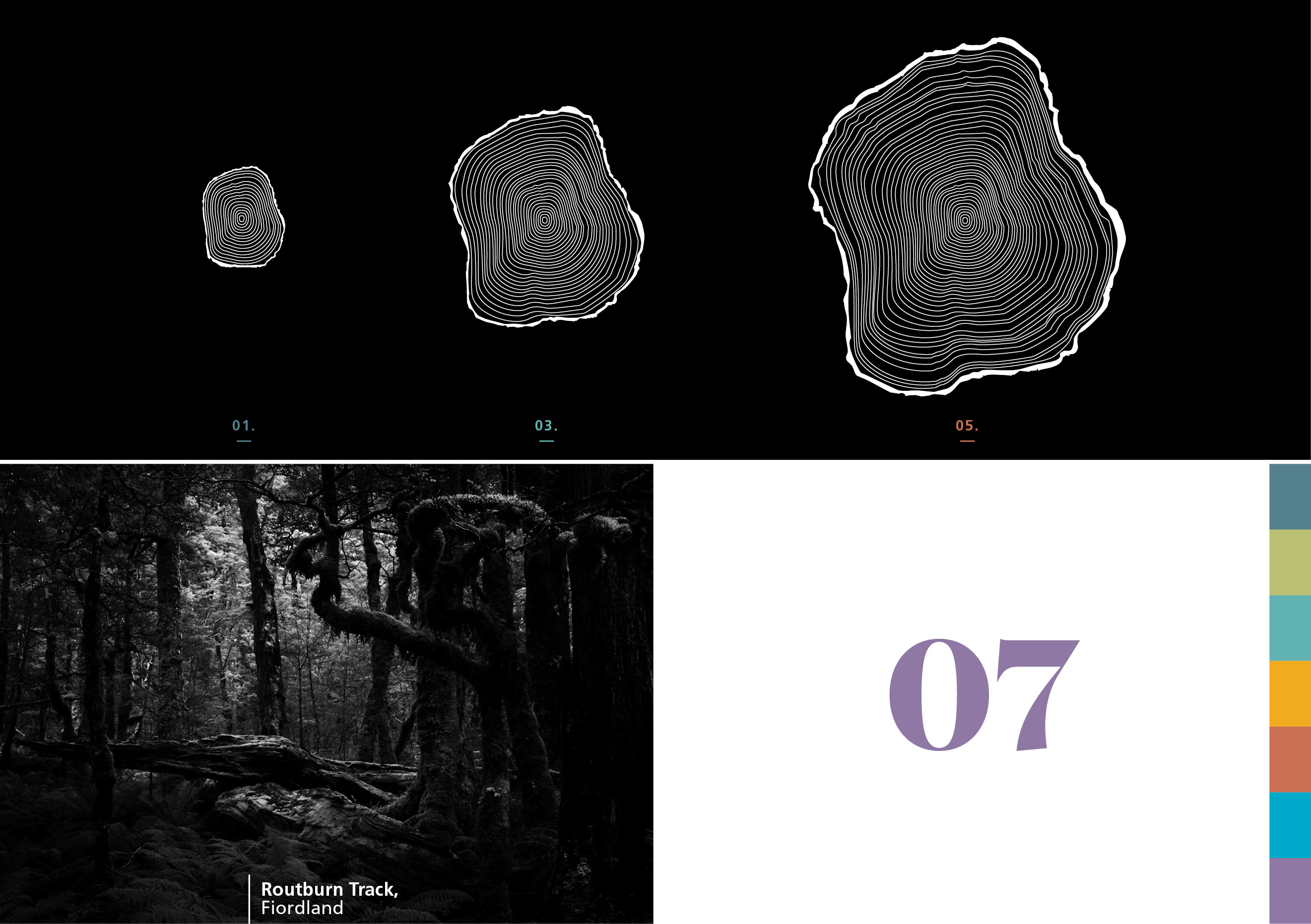
An illustrated cross section of wood was used as a visual device to further express our metaphor. The wider or narrower rings represent the year-to-year fluctuations in growth, influenced by the conditions that year. Despite these fluctuations the tree has become bigger and stronger. This device leads our storytelling, featuring prominently on the cover with 2020 marked as just one ring in the longer journey of getting bigger and stronger.
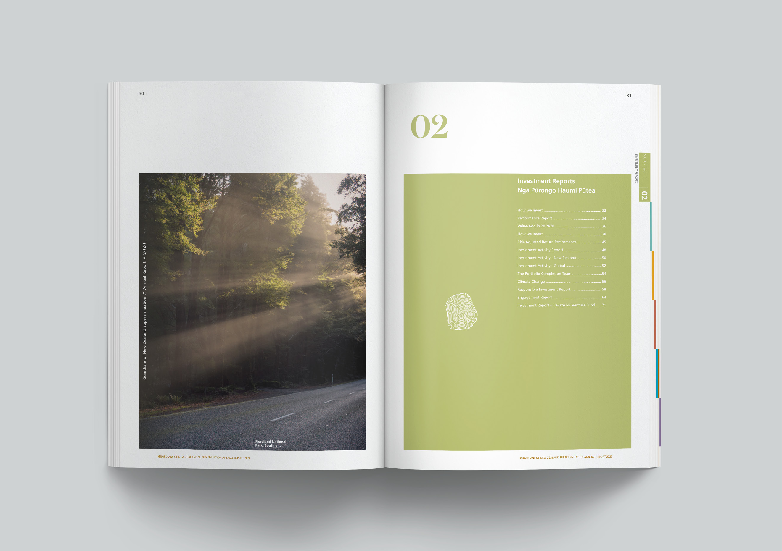
This cross section visual device is continued throughout the document, expanding from the page at a similar point but getting bigger as the document progresses.
Tree photography also plays a key storytelling role throughout the report, providing the vehicle for more visual metaphors. Some images reflect the here and now, others look skyward to the trees to suggest purpose and a long-term focus, while others depict the wider environment a tree lives in. Later in the document, we get a sense of optimism as people enjoy life amongst the trees again. It’s a reflection of less turbulent times that will surely follow but also on delivering on the longer term promise of helping Kiwi’s fund the retirement they want.
A serif headline font was selected for its timeless and enduring qualities, and for its thick and solid ‘tōtara-like’ characteristics.
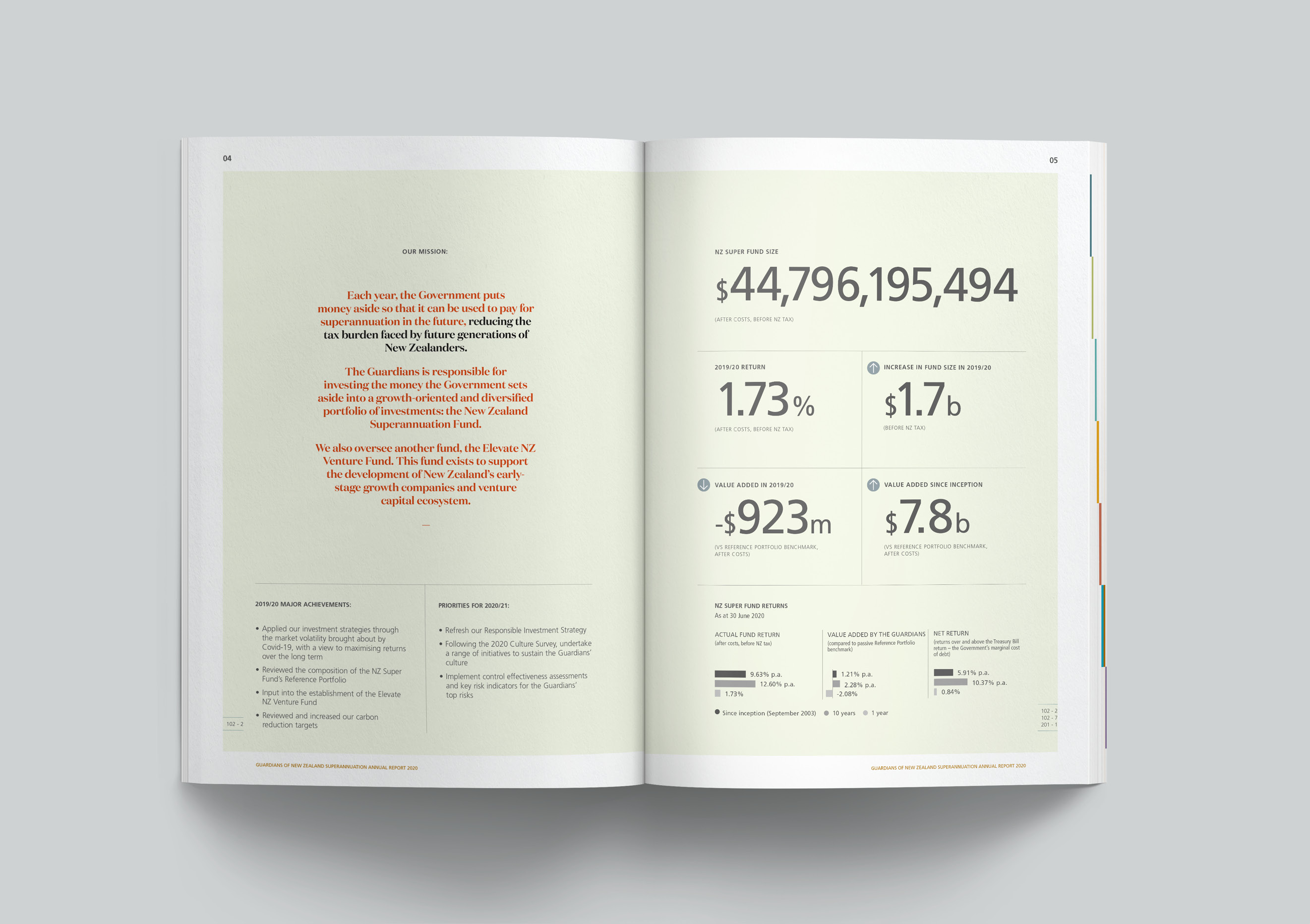
The overall earthy tone of the document supports the metaphorical story but also adds the calm, controlled feeling that the Guardians want investors to have.
The Results
The tōtara concept was extremely well liked by the Guardians’ team. It was felt that it not only expressed the stay strong message well but also spoke to the environment and sustainability, key to how they make investment decisions. The metaphor also captures how the Guardians see themselves and what they deliver for New Zealanders – Kaitiaki of our retirement future. The report found favour with shareholders and the wider investment market and was also judged ‘report of the year’ at the 2021 Australasian Reporting Awards.