Investing for the next generation
Client: NZ Super Fund
BRONZE: 2020 INTERNATIONAL DESIGN AWARDS (IDA)
FINALIST: 2020 ARA REPORT OF THE YEAR
Driven by a Māori world view of the future, this corporate reporting suite for the NZ Super Fund employs a bold intergenerational weave design.
The Brief
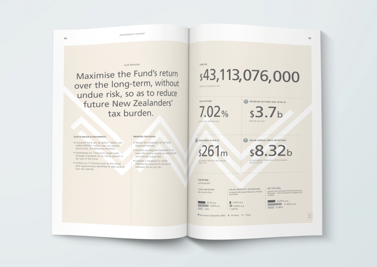
Every year the NZ Super Fund uses the annual report to highlight the year that was and to reinforce its long term strategic direction and its purpose of enhancing the future social and economic wellbeing of New Zealanders. The perennial challenge is finding new ways to reinforce this core message in interesting and engaging ways.
The design of the annual report is the creative source for numerous other statement of performance and intent documents that become the NZ Super Fund’s ‘annual corporate reporting set’. Each document has a specific story to tell while contributing to and reinforcing the wider NZ Super strategy and purpose.
The Solution
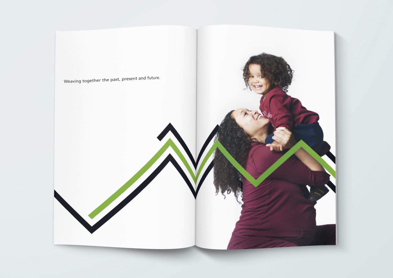
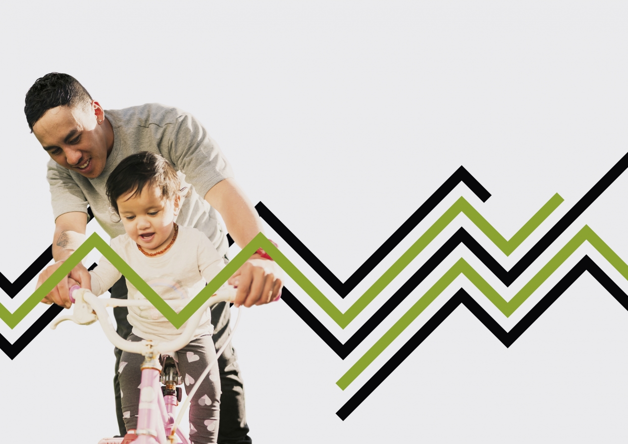
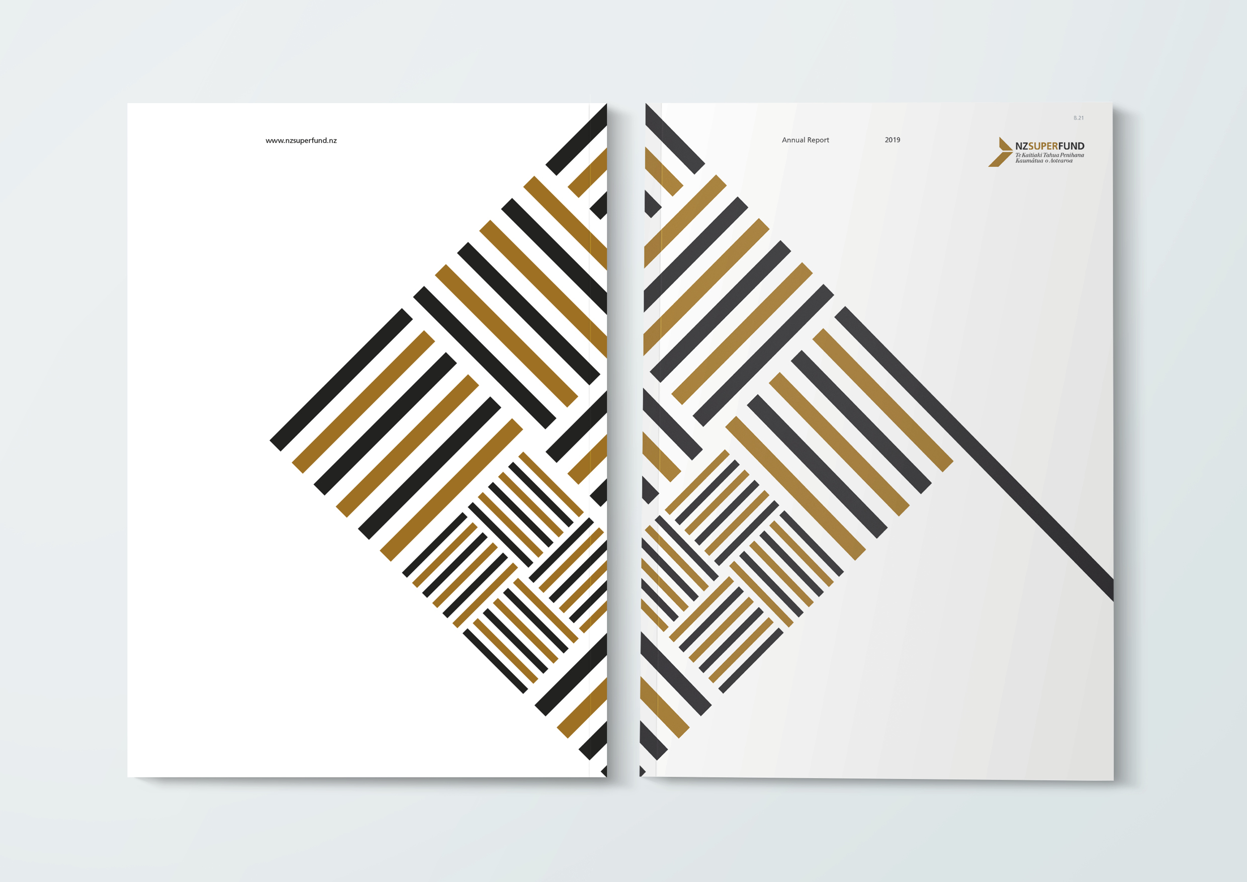
After exploring the client’s thinking collaboratively with them, we agreed on a ‘for the next generation’ messaging platform. This gave rise to the single-minded design concept of the intergenerational weave, a bold visual narrative that brings a sense of connection across pages and documents.
The concept is driven by the Māori world view of the future, shaped by the actions of those who came before us, by what we learnt from them today and for the benefit of those of tomorrow. From an NZ Super Fund perspective, this speaks directly to investment markets and their investment philosophy but also to the long term purpose of saving today to create funding for the next generation of retirees.
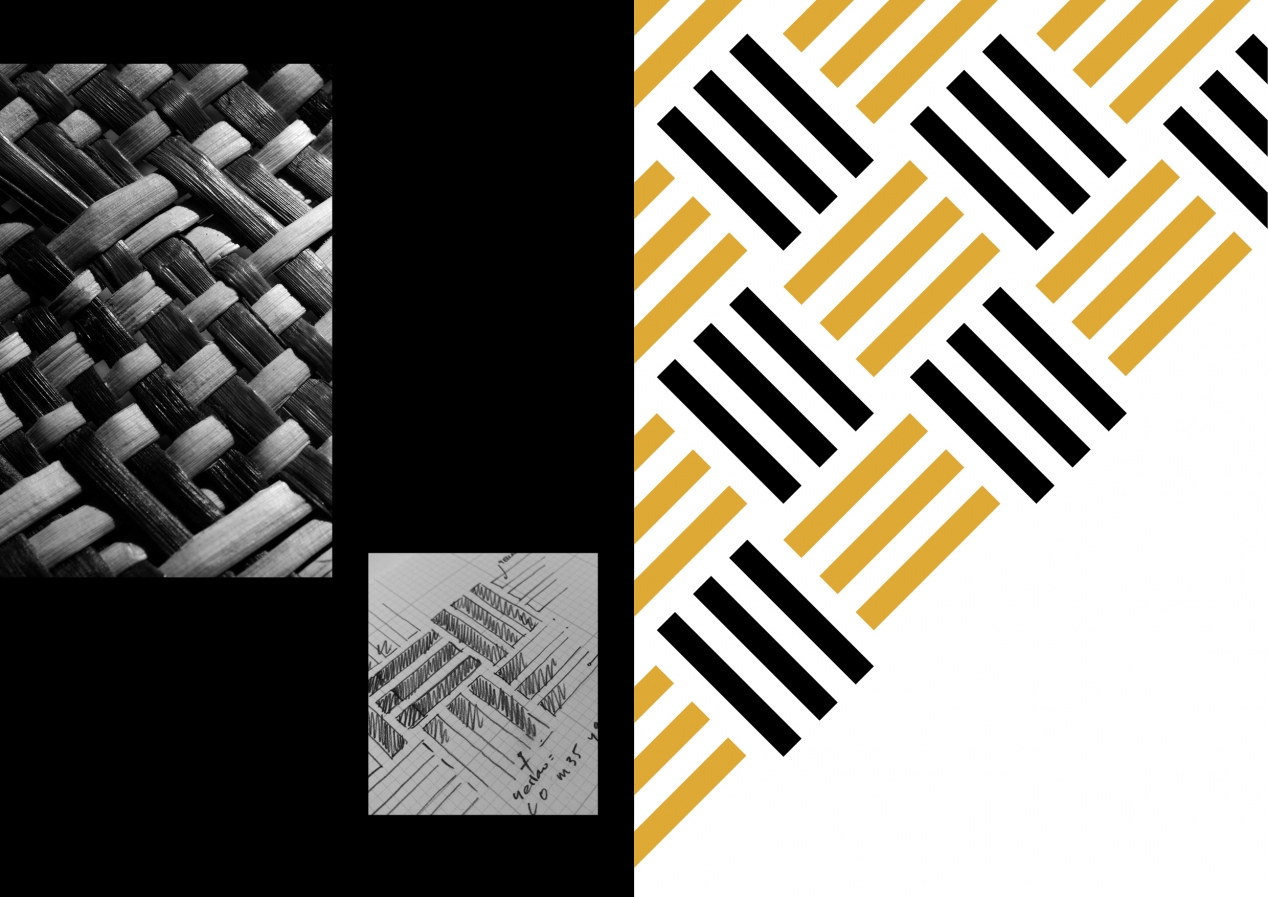
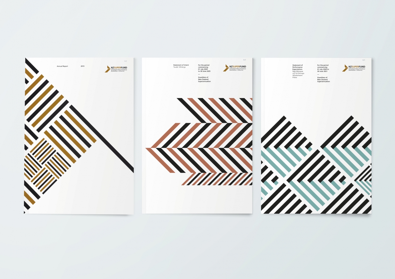
Using the colours and strong linear line that are a big feature of the NZ Super Fund identity, the front and back covers of the annual report present the first in a family of intergenerational graphic weaves. Each graphic draws inspiration from traditional weaves where you find tukutuku patterns, such as marae panelling, Taki Tahi, basket weaves, Taniko and intricate garment detailing.
The visual look and feel is intentionally Māori in its aesthetic, reinforcing NZ Super’s New Zealand mandate and aligning traditional ideas of strength, community and connection. This is enhanced by the prominent bilingual headlines.
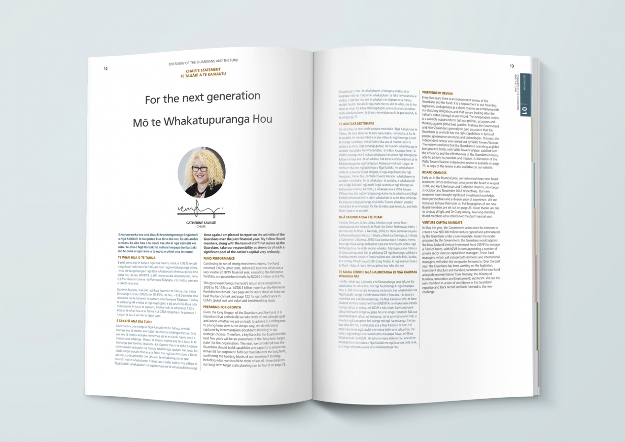
The inside cover and first few pages are used to communicate the core key messages for readers in a strong and single-minded way, based on the overarching concept. The weaving lines carried throughout the document support a connected narrative, taking the reader on a journey from the cover through the information.
Intergenerational images on feature spreads, threading people around the weave, further reinforce the key concepts.
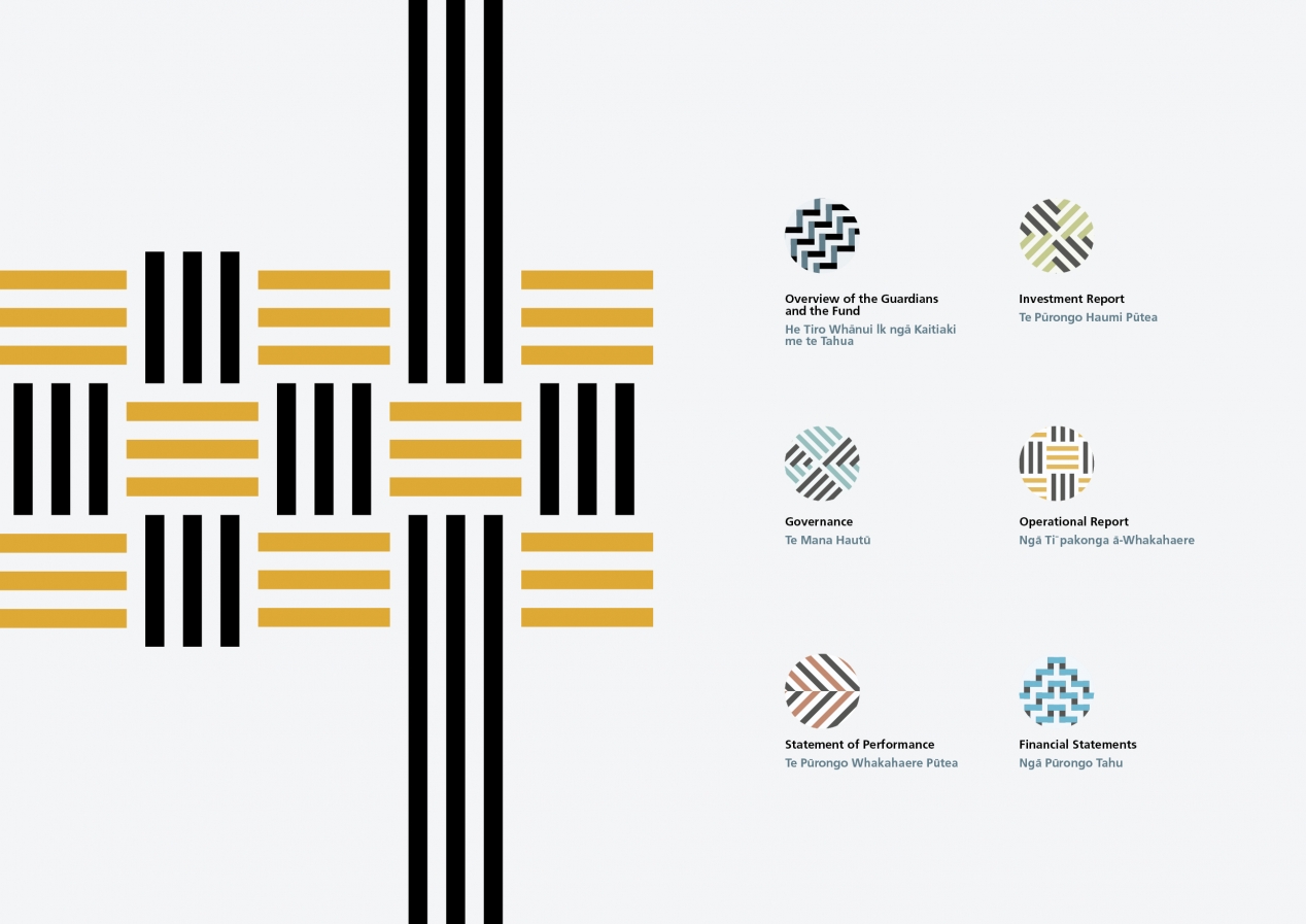
Graphic devices are also informed by traditional weave patterns becoming both a story-telling mechanism and a background texture to bring text heavy pages alive.
The Results
The outcome is a bold, aspirational and connected annual report that has already been recognised for international communication awards, with its strong design themes singled out for praise. As a complete set, the connected theme allows each document to tell its own story, while always weaving in the larger NZ Super Fund intergenerational purpose story.